Brief Overview:
The University of Northampton tasked us with creating an on demand online TV channel/streaming platform to showcase the creative output of the Faculty of Arts, Science, and Technology (FAST). The project included developing the TV channel’s visual identity delivered as a detailed style guide.
The Team: Zachary Sparkes & Shahbaaz Zeb
Key Objectives:
Create a Strong Visual Identity - A cohesive design which captures the essence of creativity and growth.
Broad Appeal - Ensure the platform appeals to students, creatives, industry experts, agencies etc... Balance between unique and professional..
Support graduates and experts - Emphasise the use of the platform as a portfolio and creative finding tool. Create a user profile to accompany this.
Multi-platform/touchpoint experience - Create both a user interface compatible for web as well as mobile. Develop external advertising and merchandise.
Brainstorming
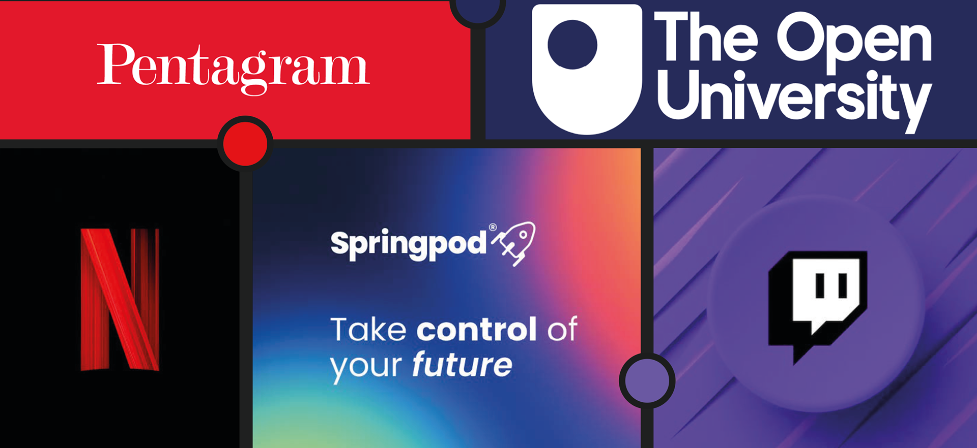
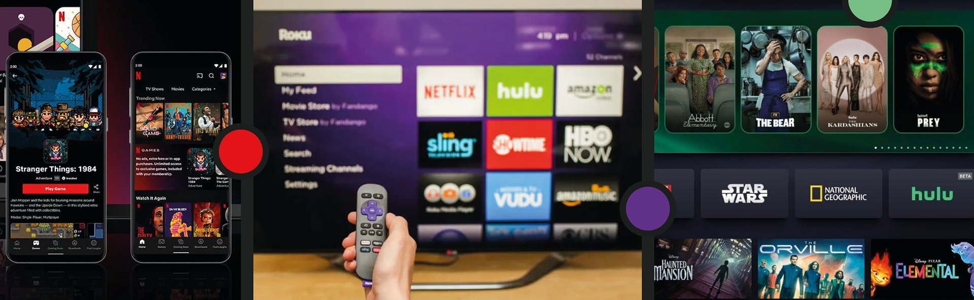
The following mood boards was compiled to visually showcase the main industry tools, businesses and or platforms which occupy, aid or are a part of the creative industry. The services which they offer and role they fill within the industry was analysed to potentially find a gap in the market or adopt what they do well for our own brand.
At First Glance
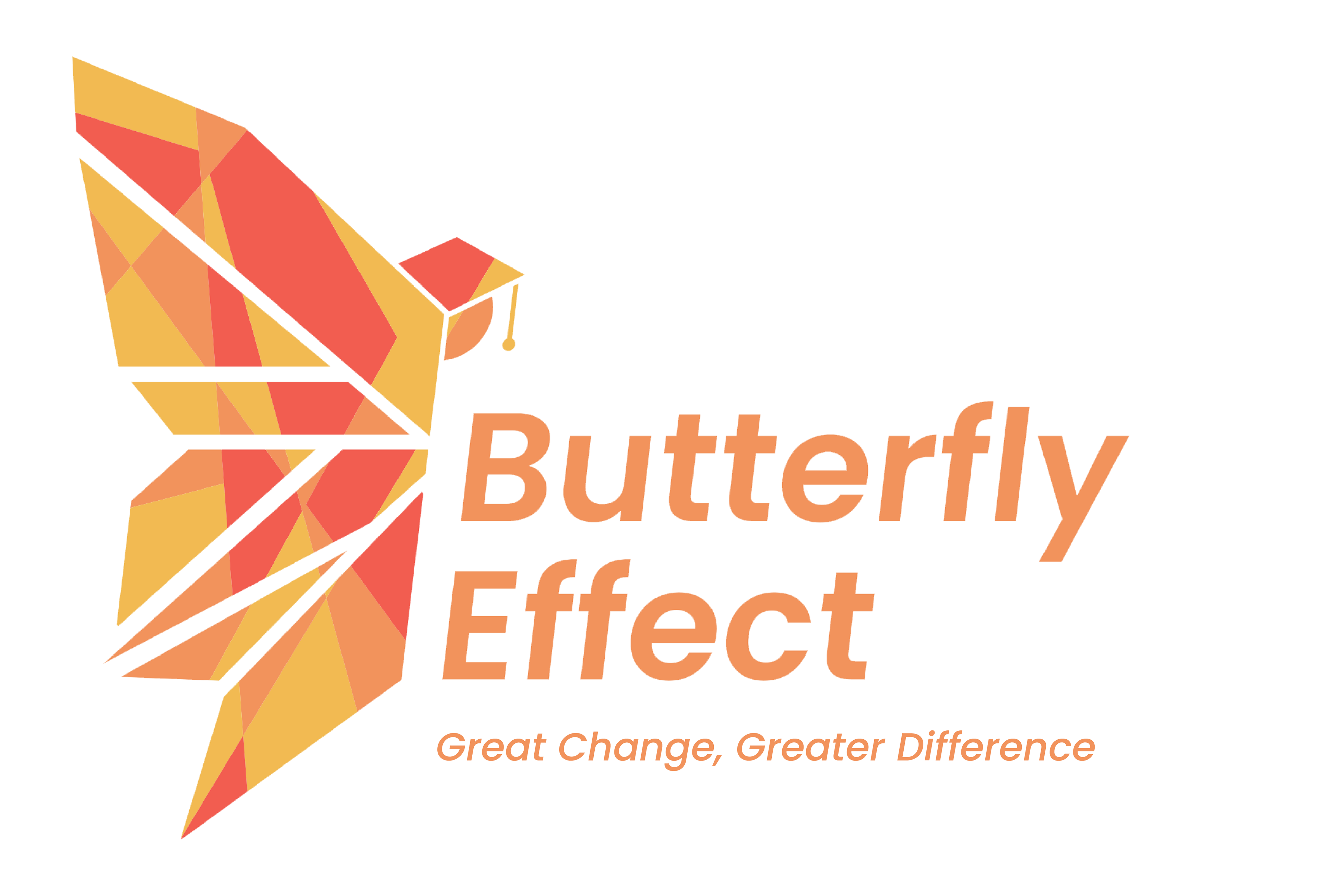
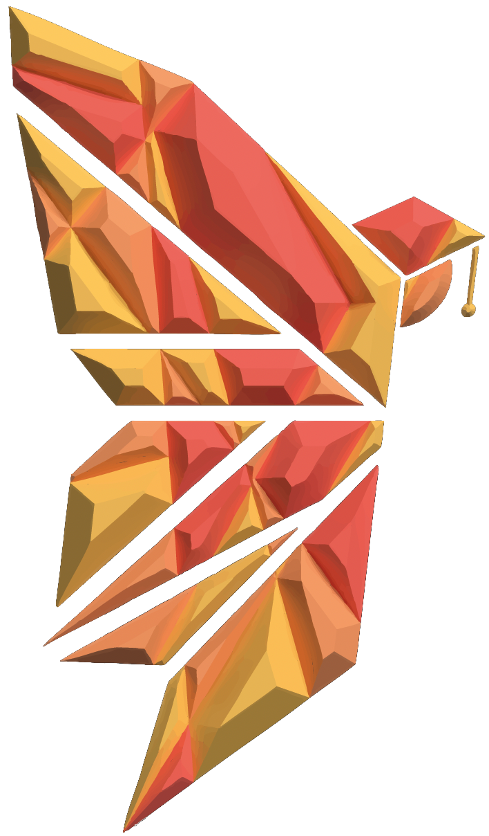
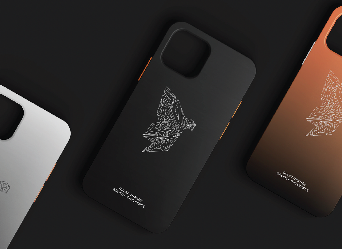
Our visual identity is built around the concept of transformation, reflected in our bold, geometric butterfly logo.
Our vibrant colour palette, blending deep oranges conveys energy, warmth, and passion, while our sleek, modern typography and minimalist design reflect a forward thinking, professional ethos.
At every touchpoint, we aim to inspire the next generation of creatives to spread their wings.

Logo Outcomes
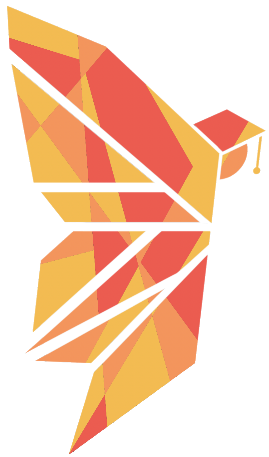
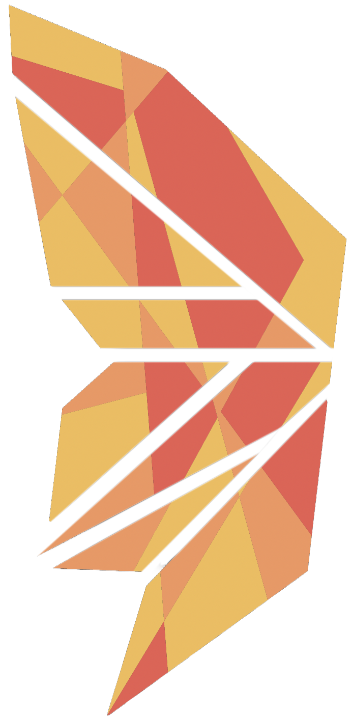
The Butterfly Effect logos is a bold and geometric representation of a butterfly, symbolising transformation, growth, and the ripple effect of creative impact. The design, with its angular lines and modern aesthetic, conveys both precision and innovation, reflecting the brand’s commitment to empowering young creatives.
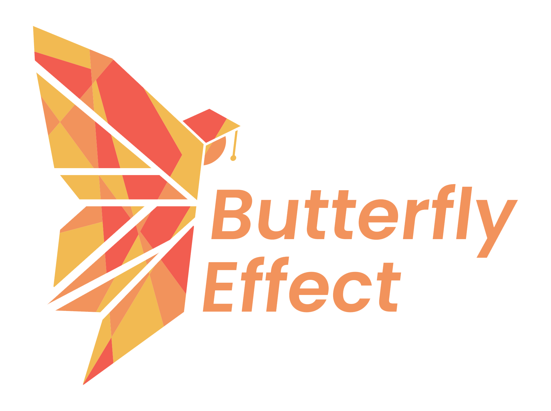
Primary Logo
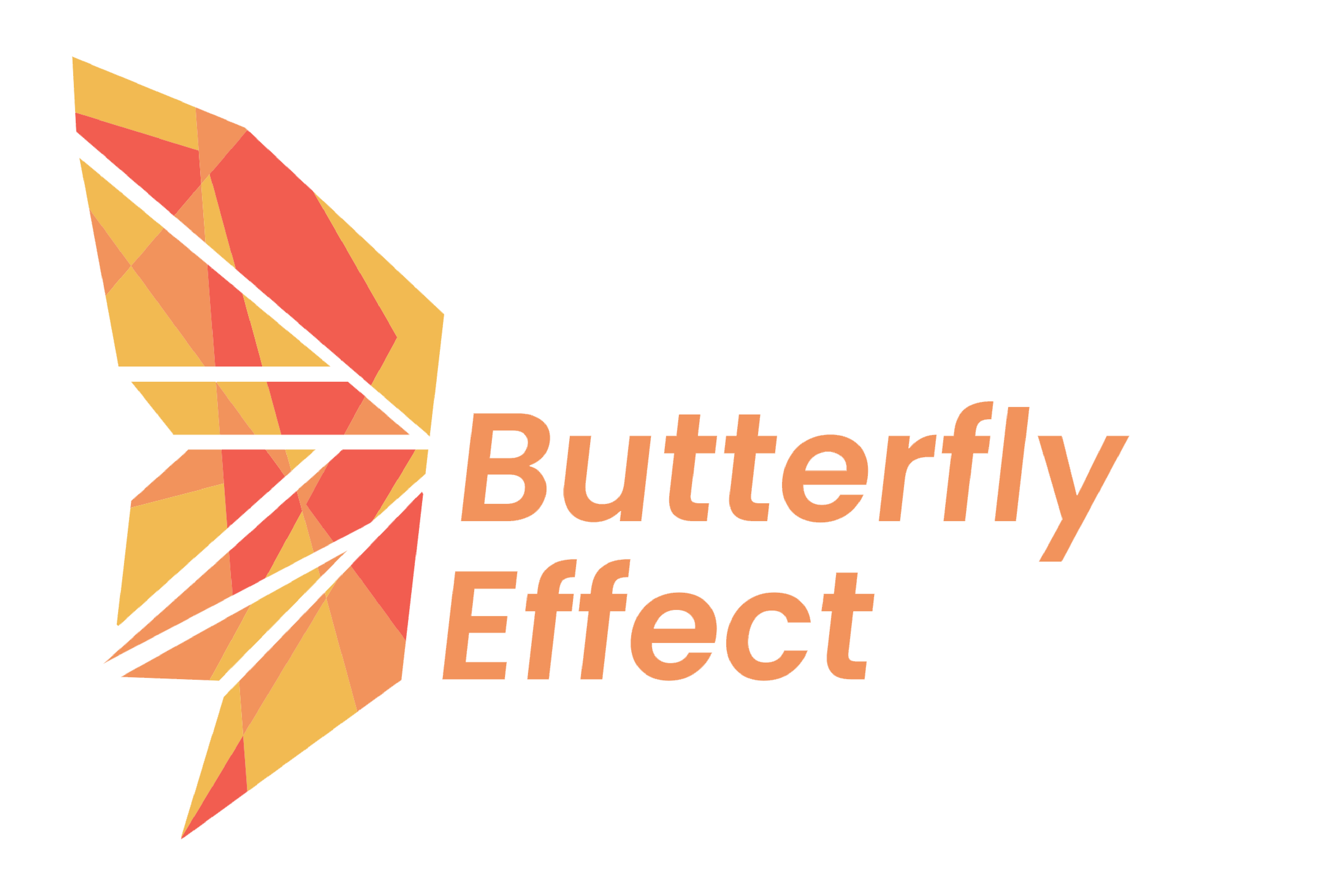
Secondary Logo
Primary Logo With Tagline
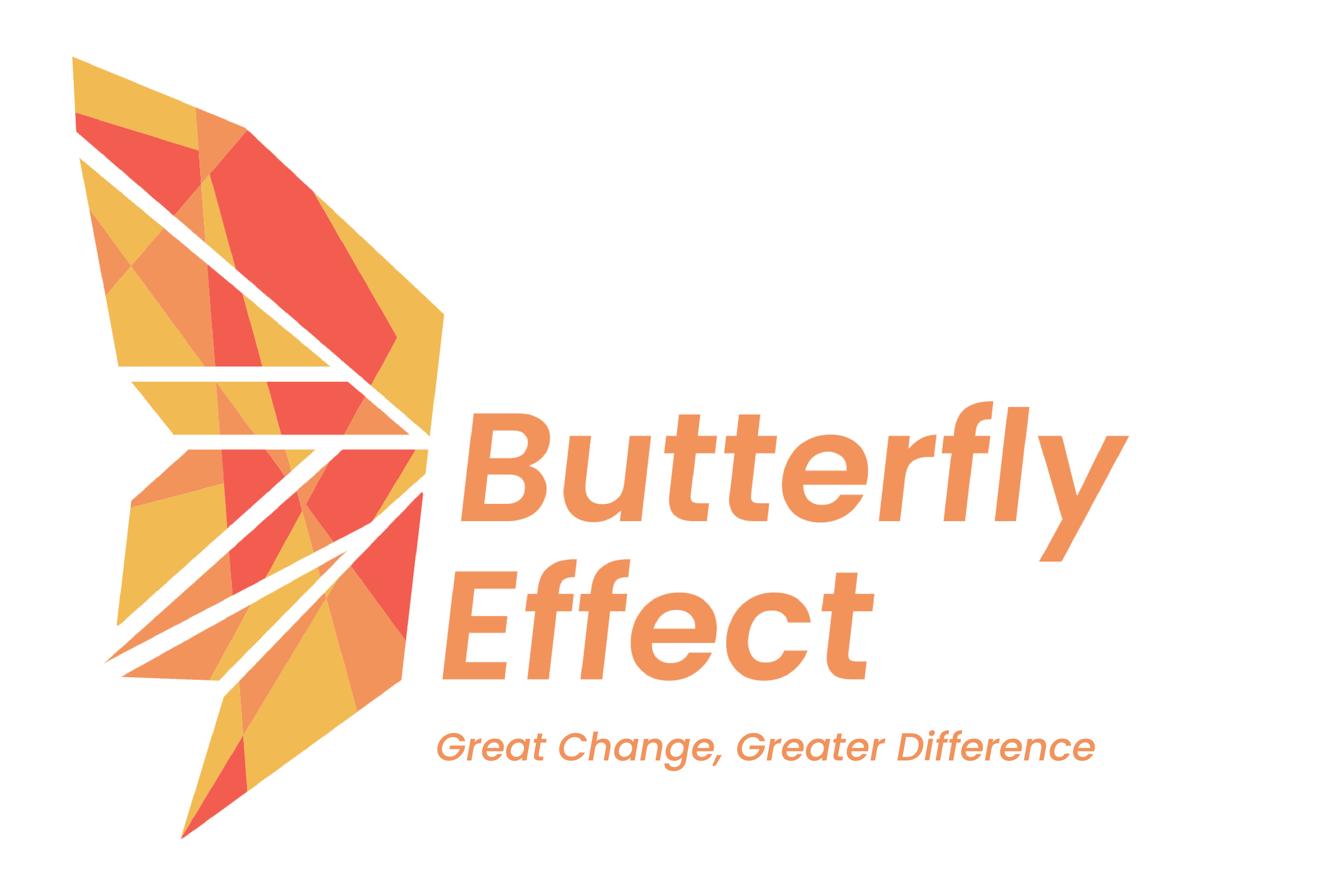
Secondary Logo With Tagline
Logo In Isolation
The butterfly icon may be used in 3D formats to create a sense of depth and modernity. This is ideal for advertisements, promotional videos, or installations where a dynamic and tactile representation of the brand is necessary.
The isolated logo marks are also animated as unfolding like a piece of origami, its use case can be seen on the streaming service.
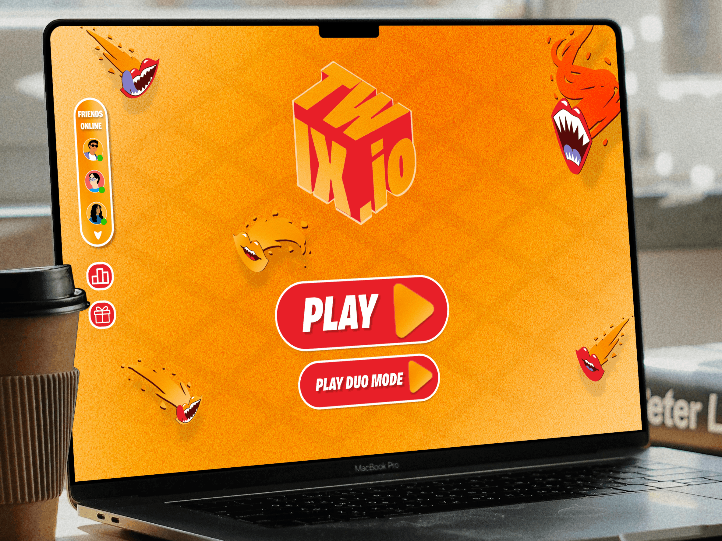
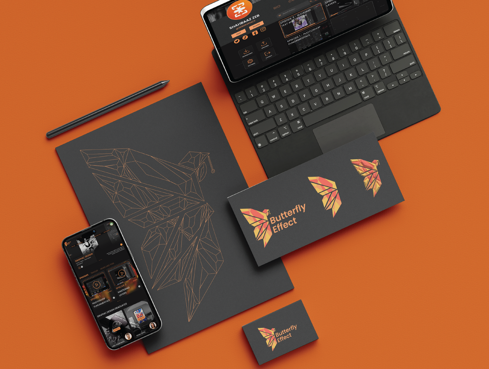
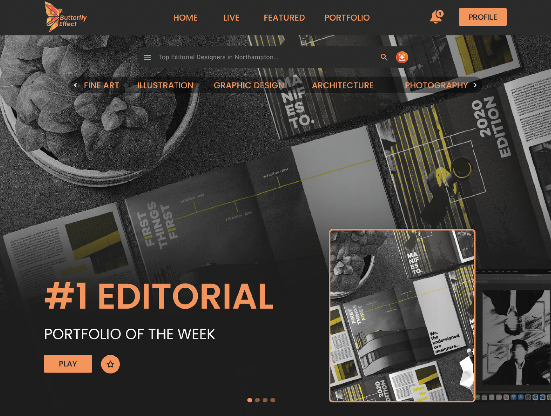
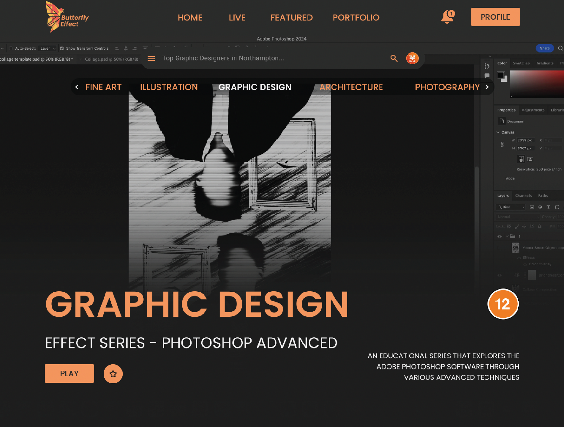
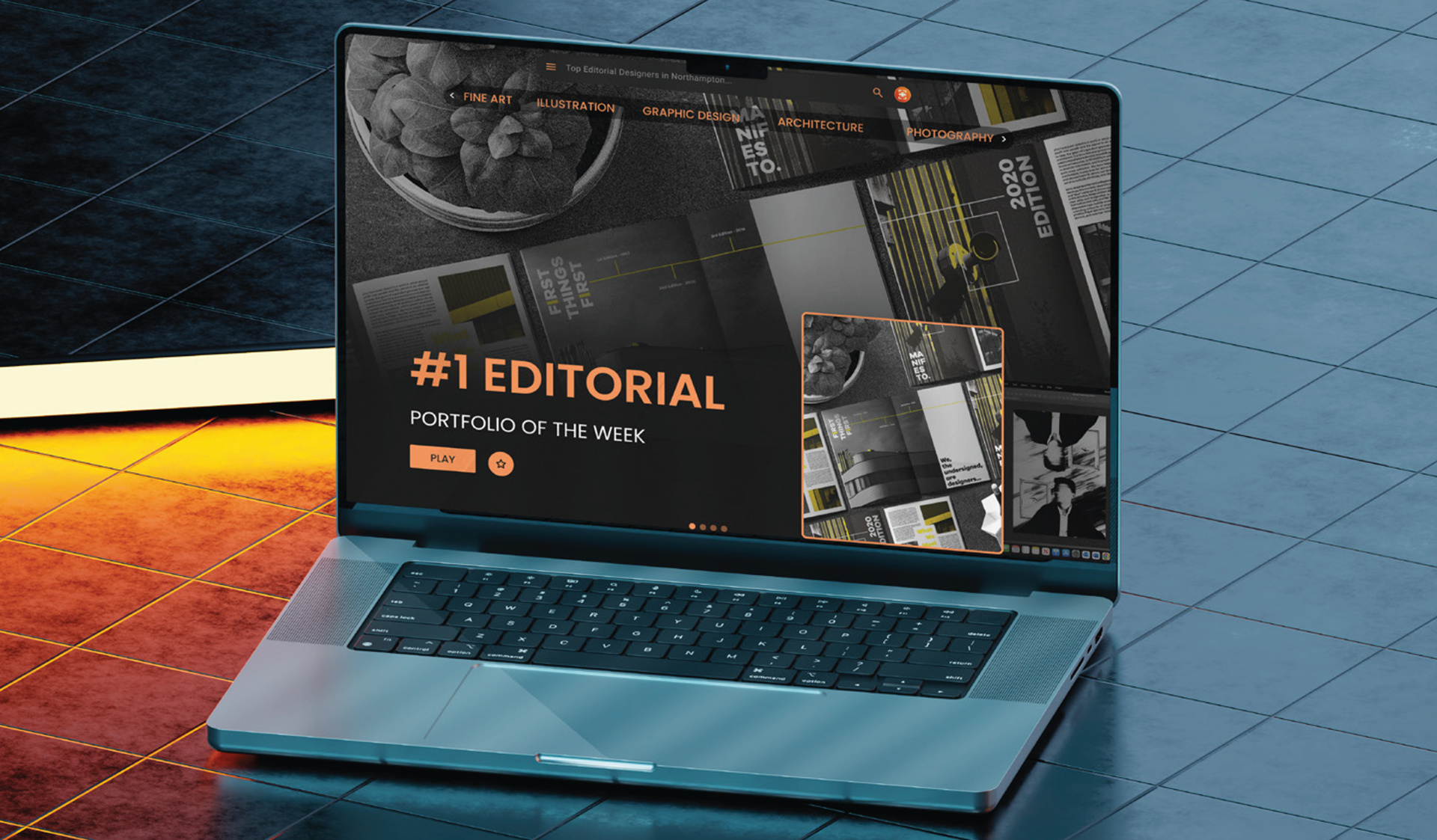
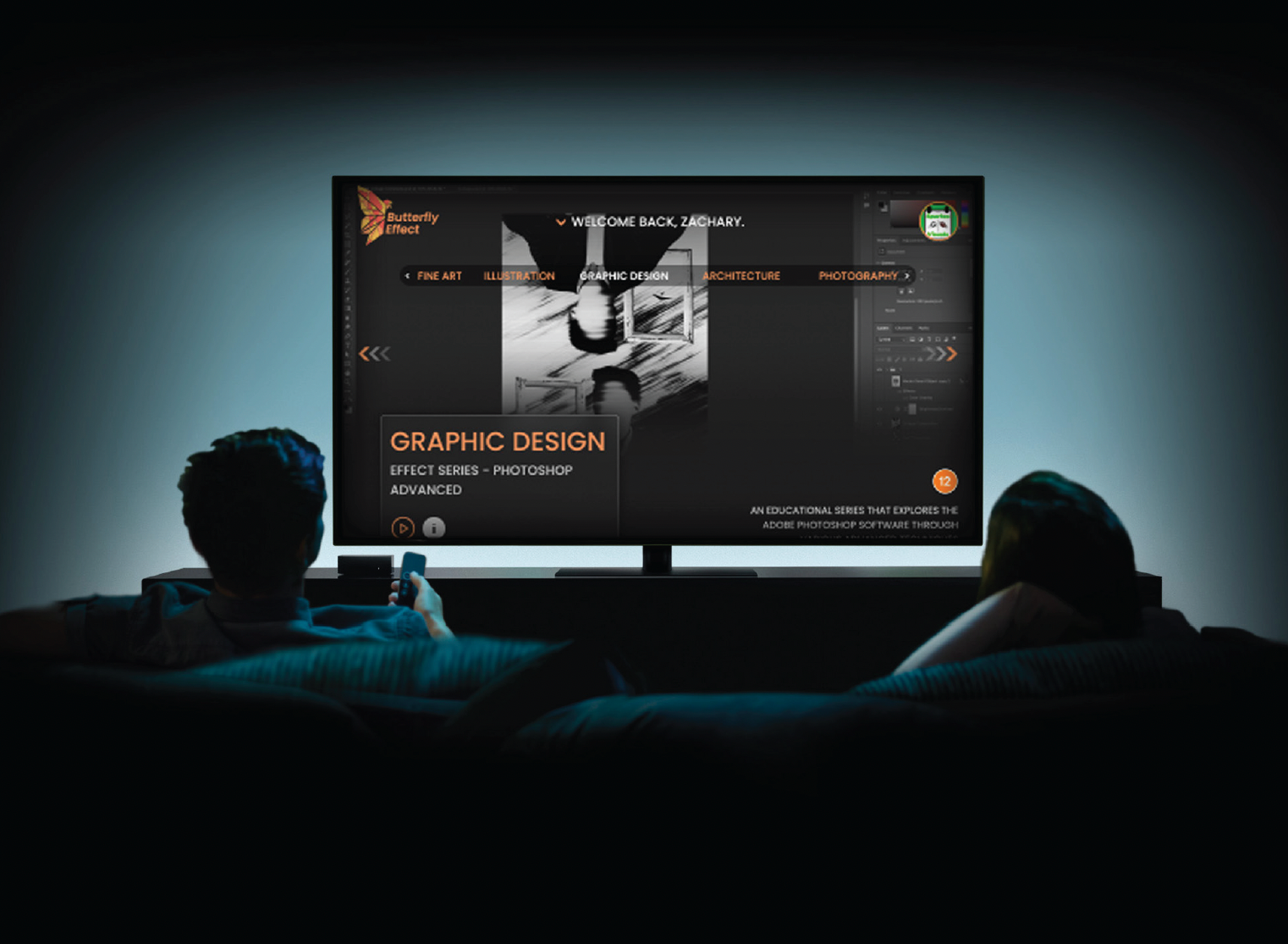
Website - Homepage
The homepage of our website shows the key attributes about Butterfly Effect, from the colour theme to the finalised content.
For example, we present the opportunity of joining the Butterfly Effect program where graduates and young designers can grow their skills, collaborate with others and earn some money through our monetisation scheme.
Agencies as well as fellow creatives can collaborate, learn and engage with each other all on one platform.
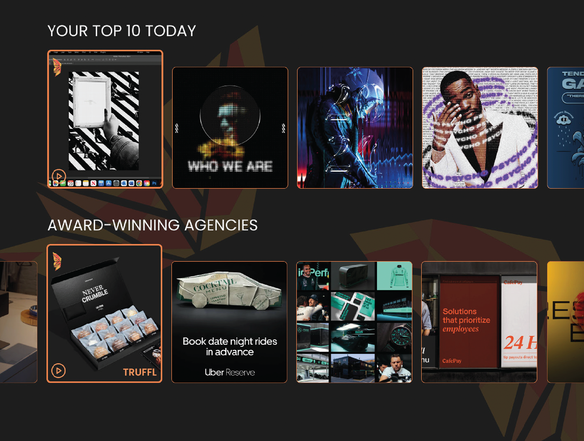
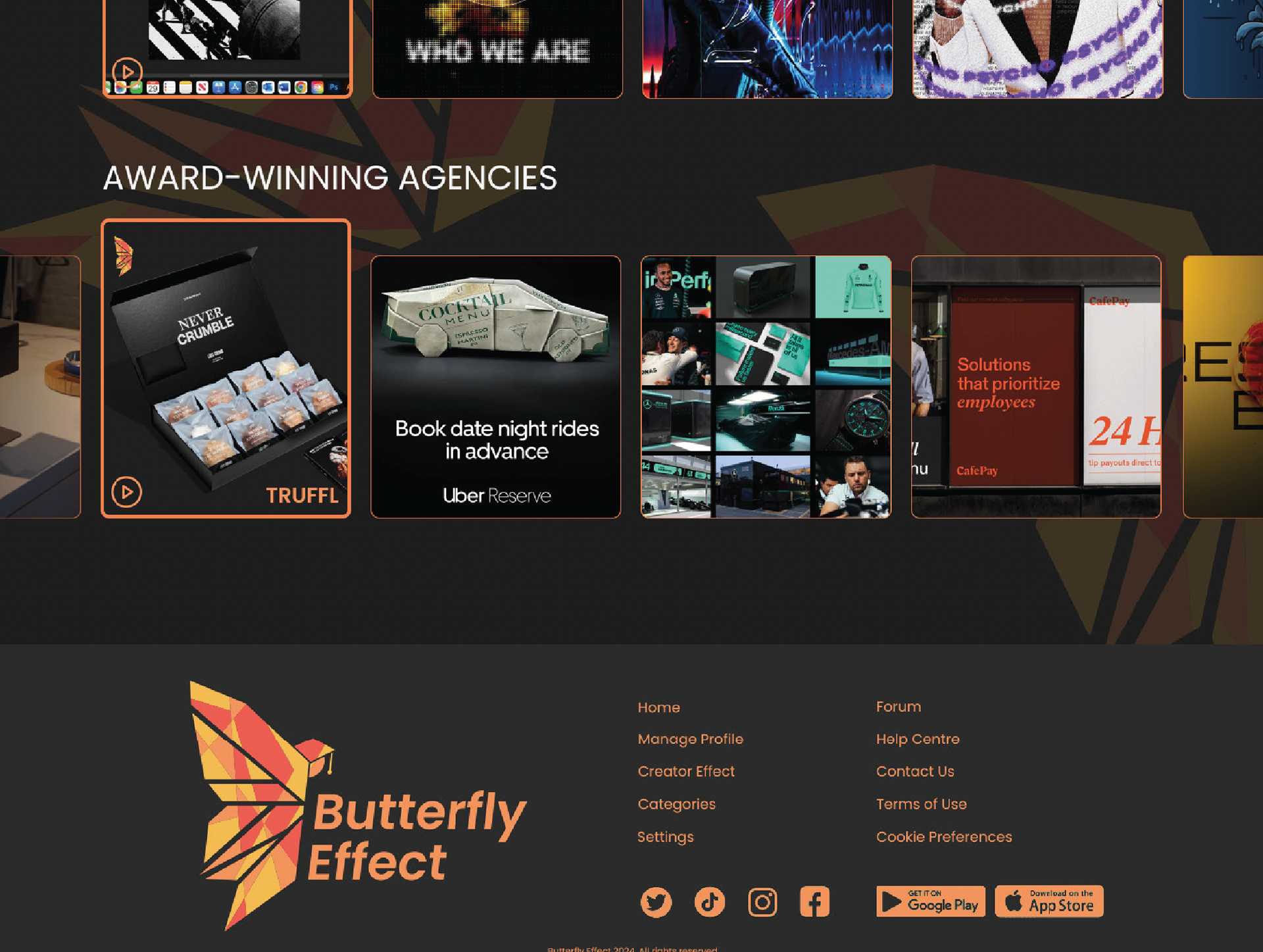
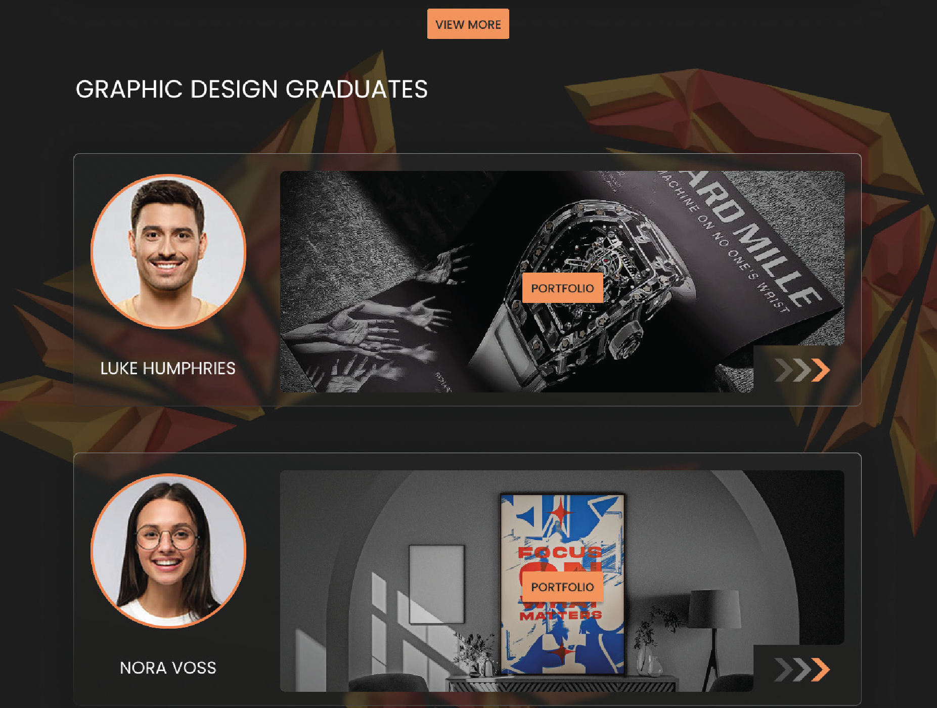
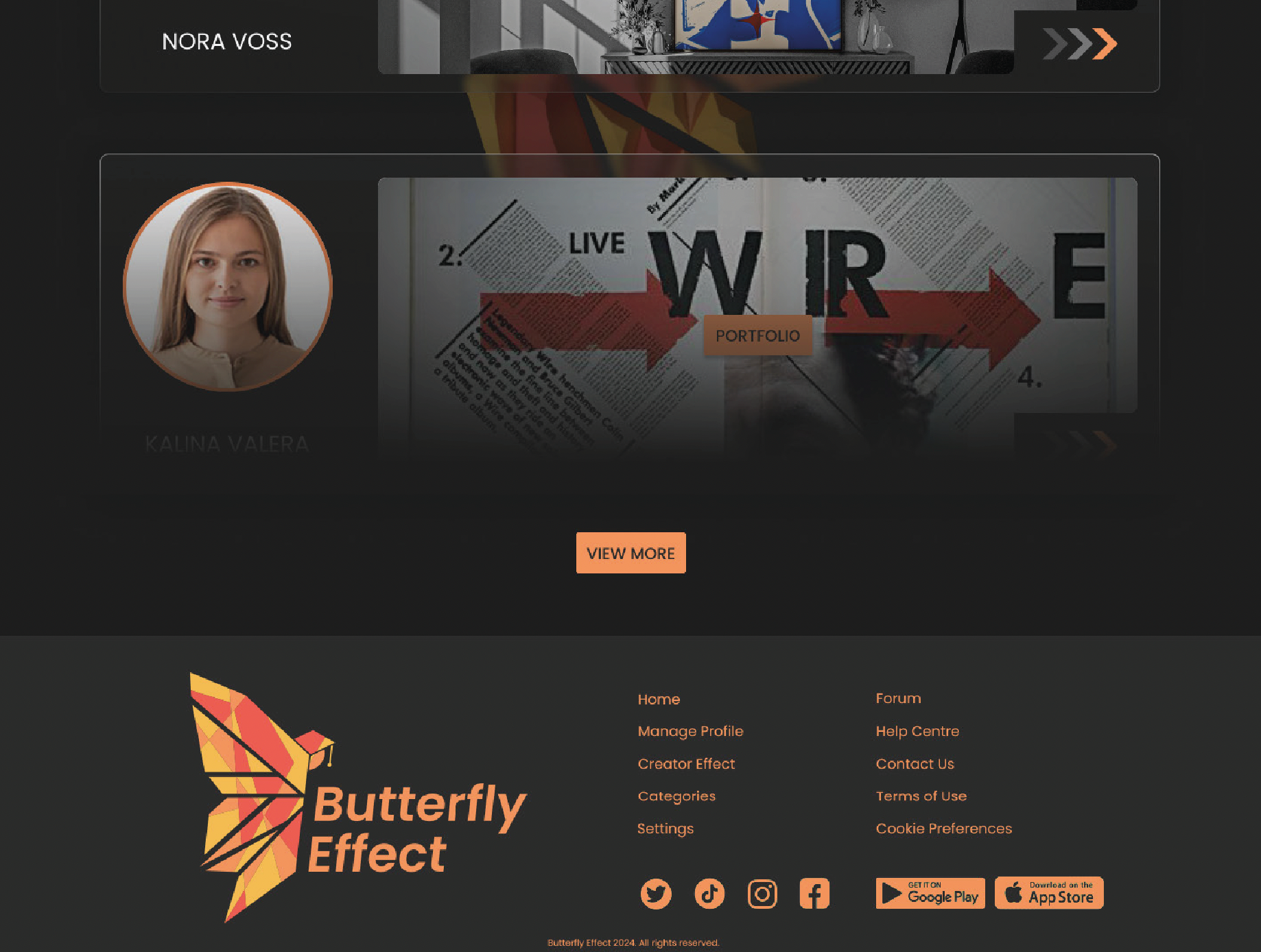
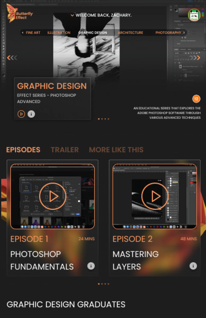
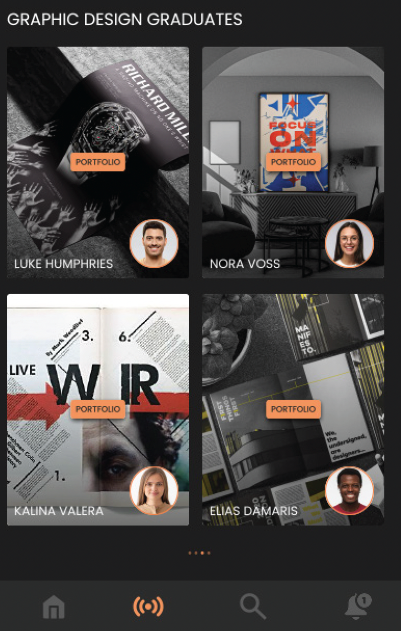
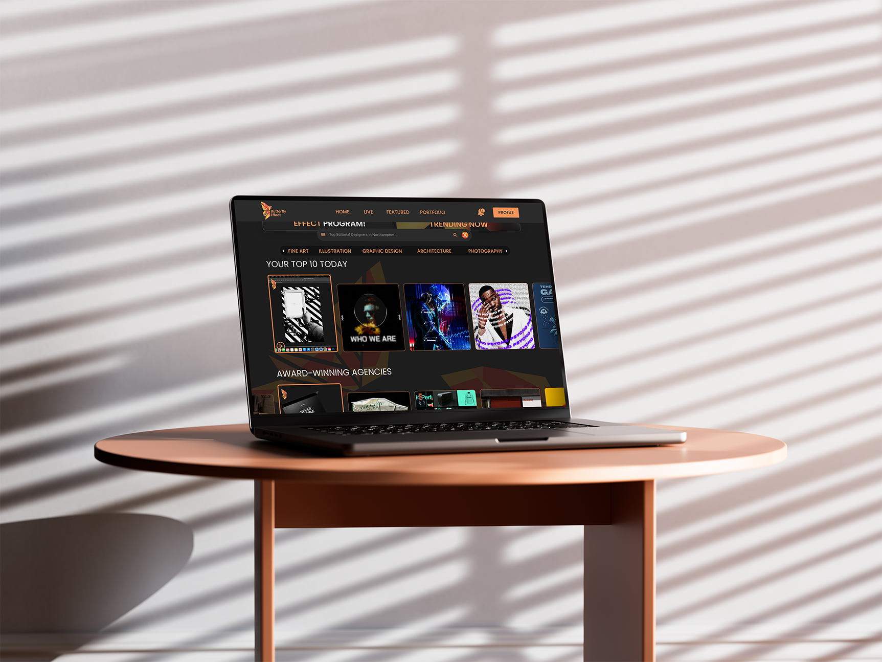
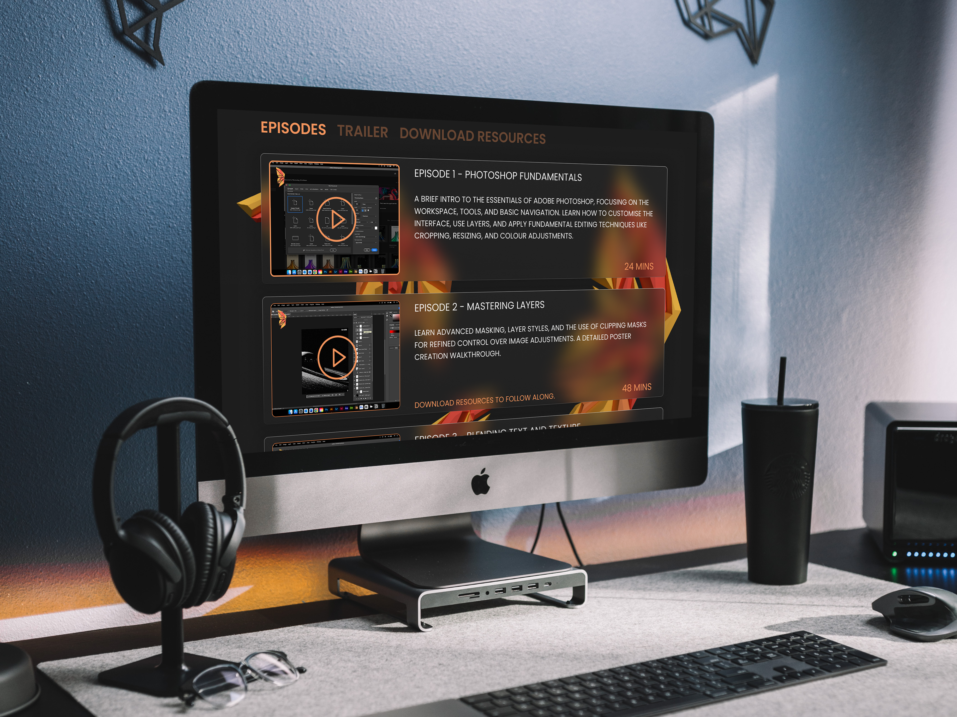
Website - Subject Page
The subject page portrays the important characteristics of our brand, including key categories like, Fine Art, Photography and Graphic Design.
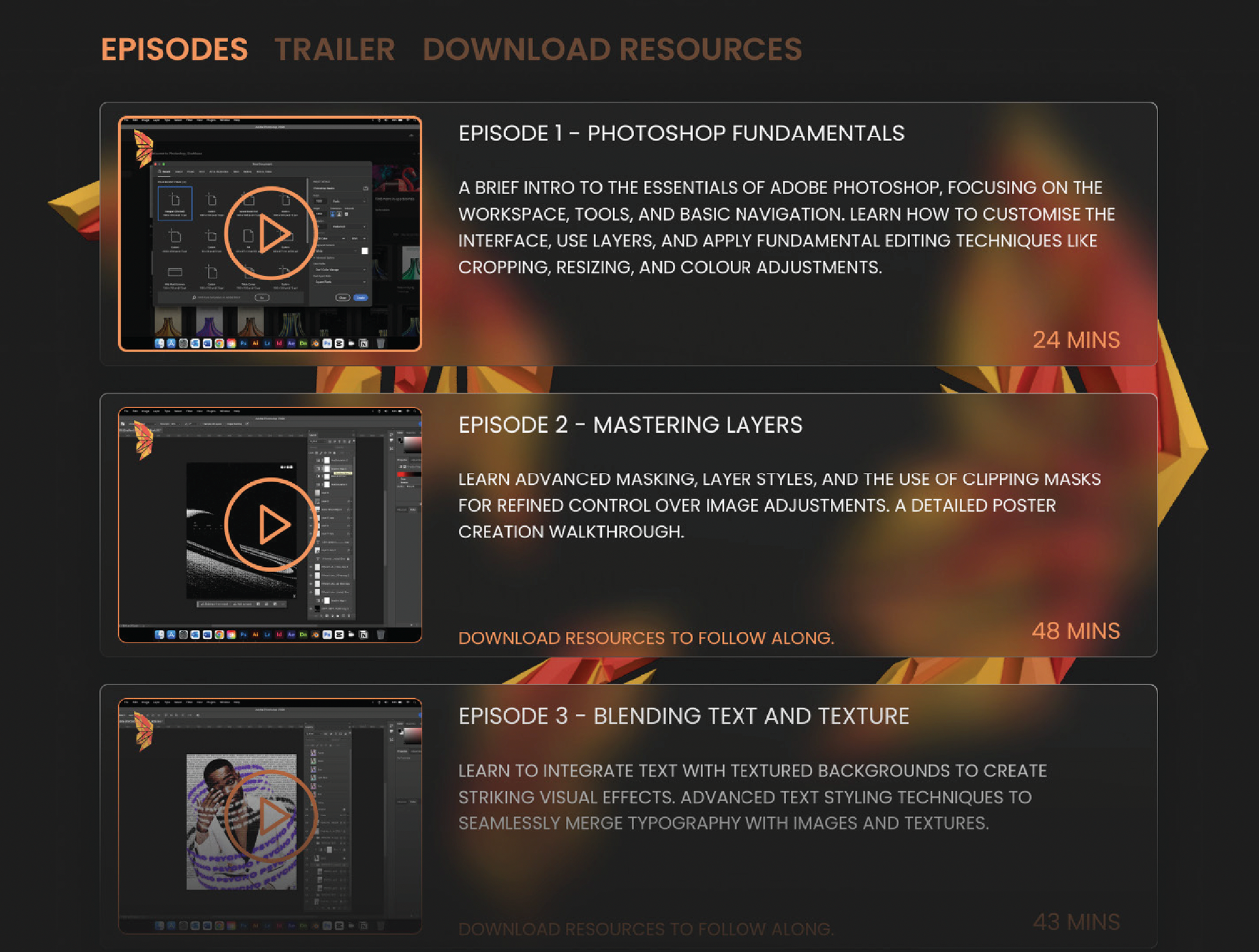
Our site contains video resources for people who miss a live to watch it on playback. Our webpages show signs of glass-morphism because we wanted to express our logo in a visually stunning and eye catching way.
Agencies can easily find recent graduates and view their portfolio and contact them through their profiles for potential jobs, internships and other opportunities.
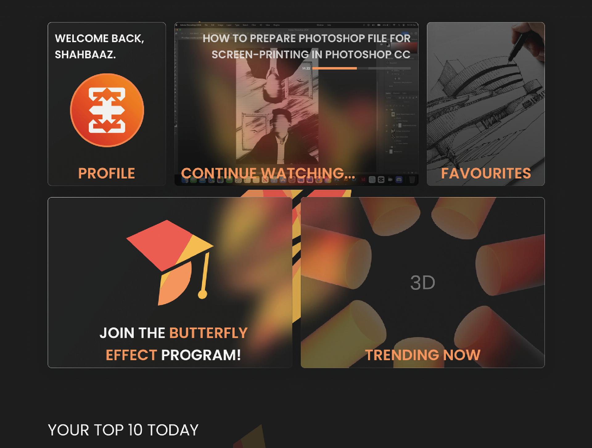
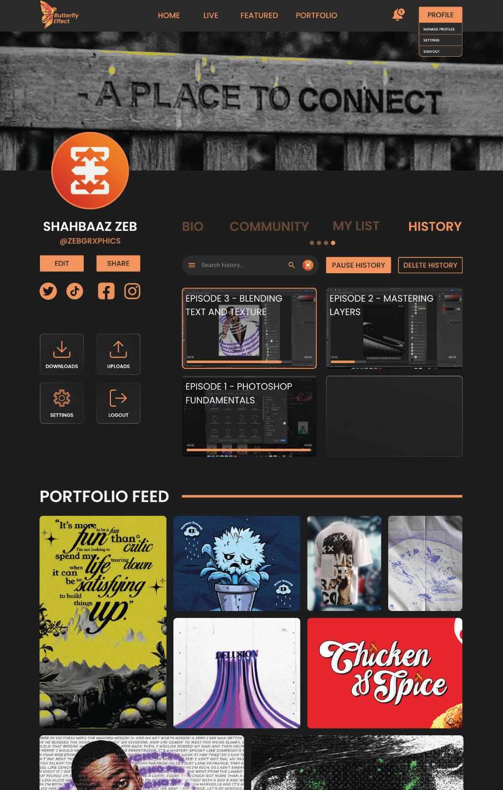
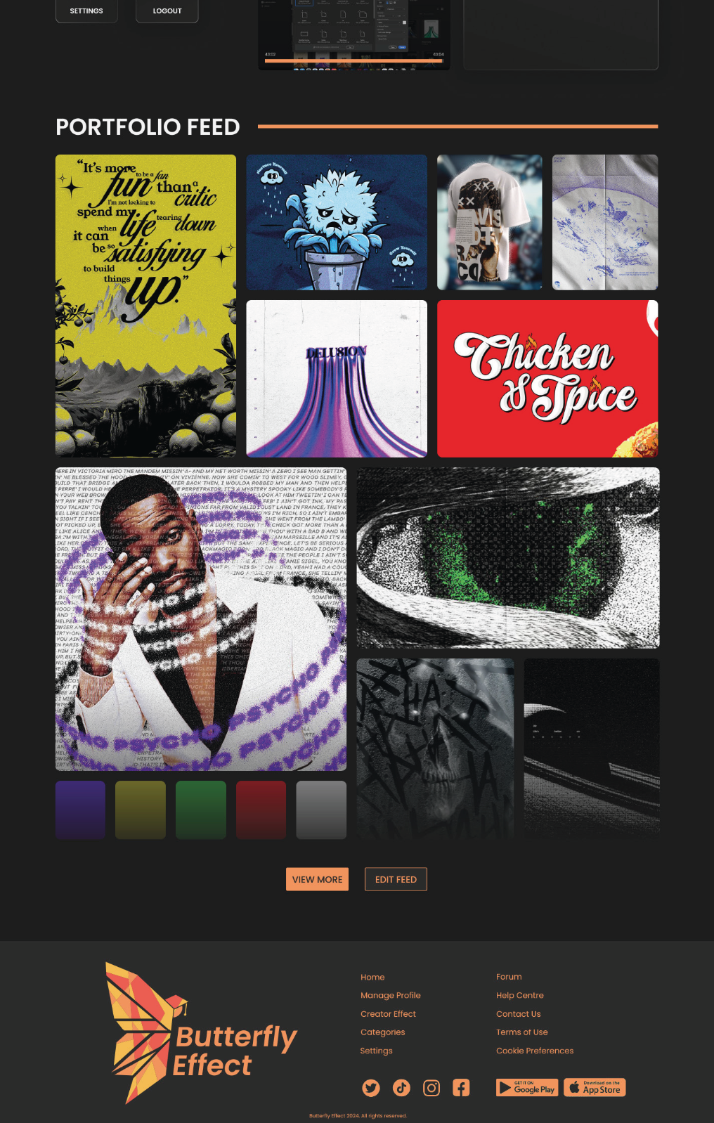
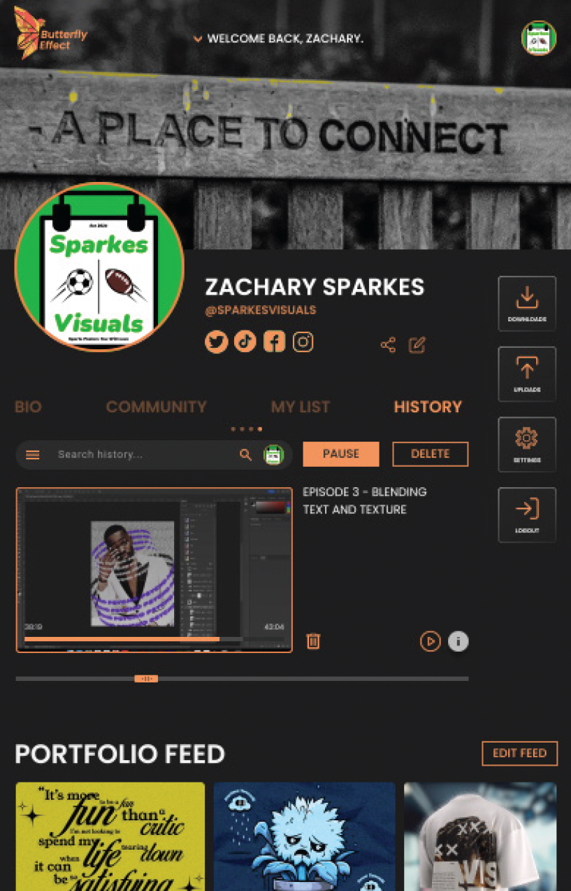
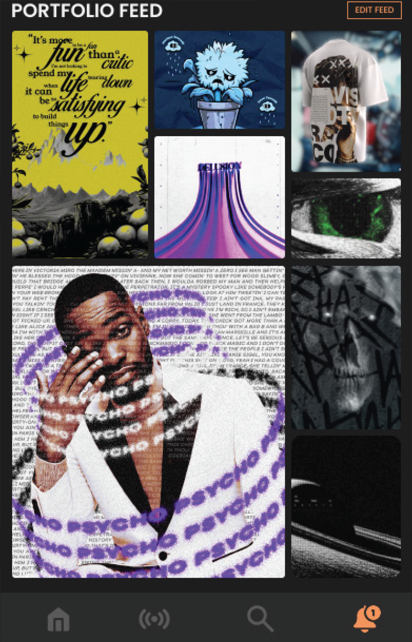
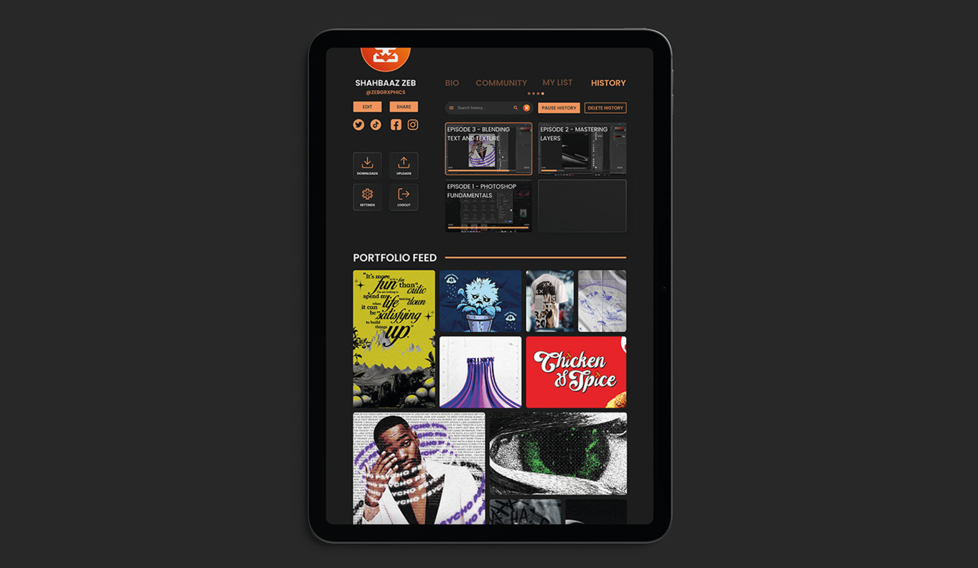
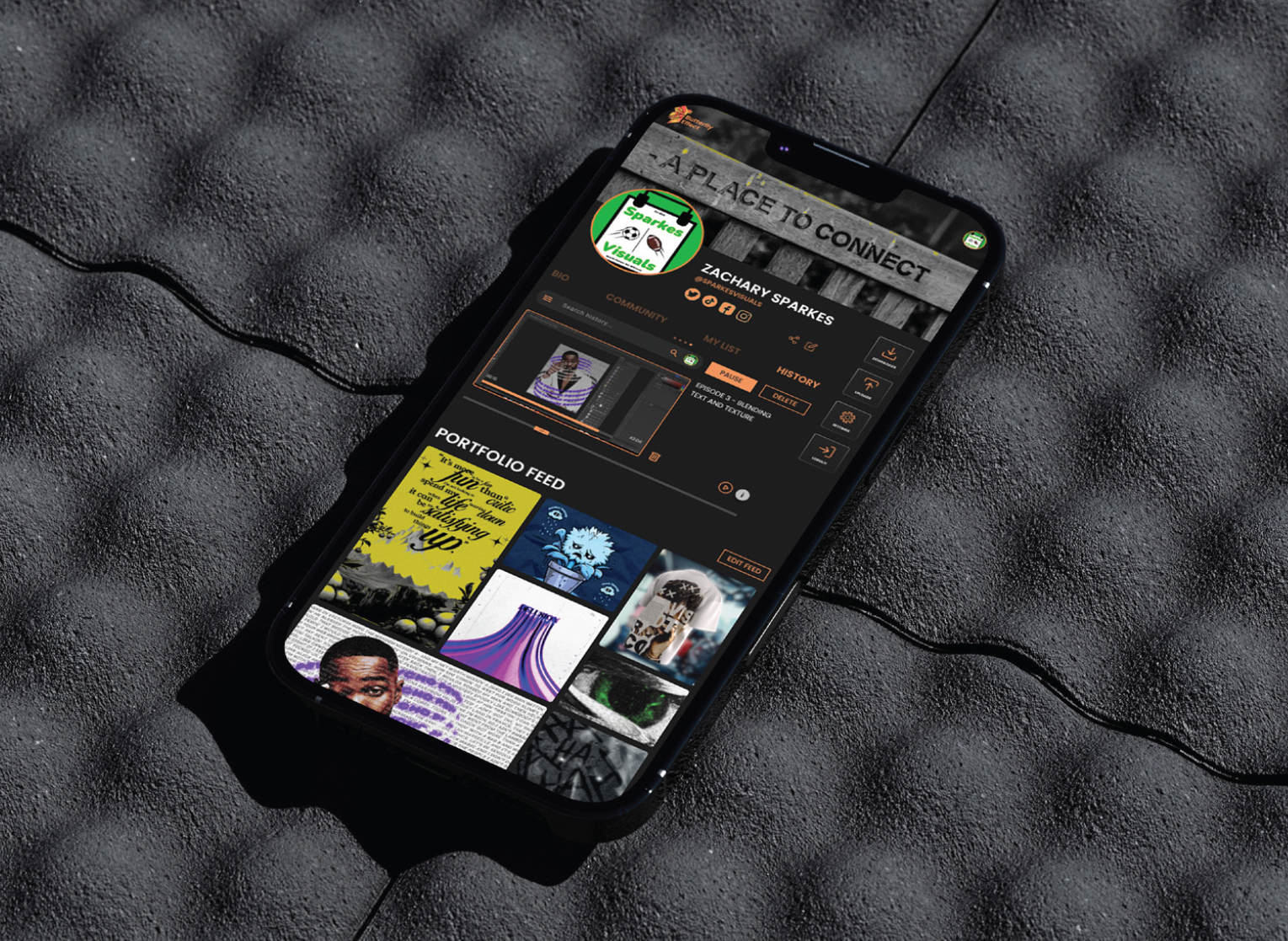
Website - Profile Page
Our profile page gives the user the opportunity to lookout their content as well as their downloads and history.
They get access to their portfolio feed where they get the quick look feature to make their experience on our website accessible and a satisfying encounter.
Various editing features and customisation are also available to users whom the account belongs too in order to shine through their own individual style and creativity.
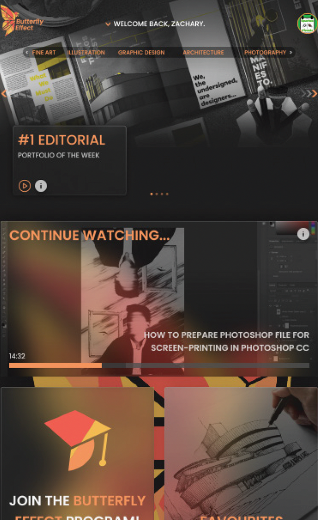
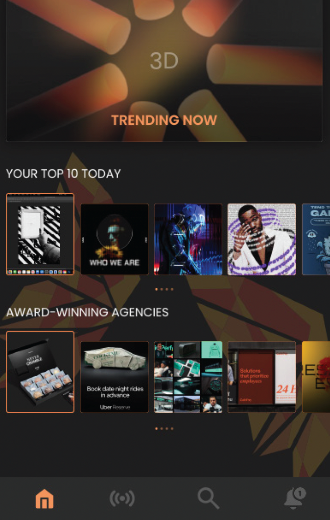
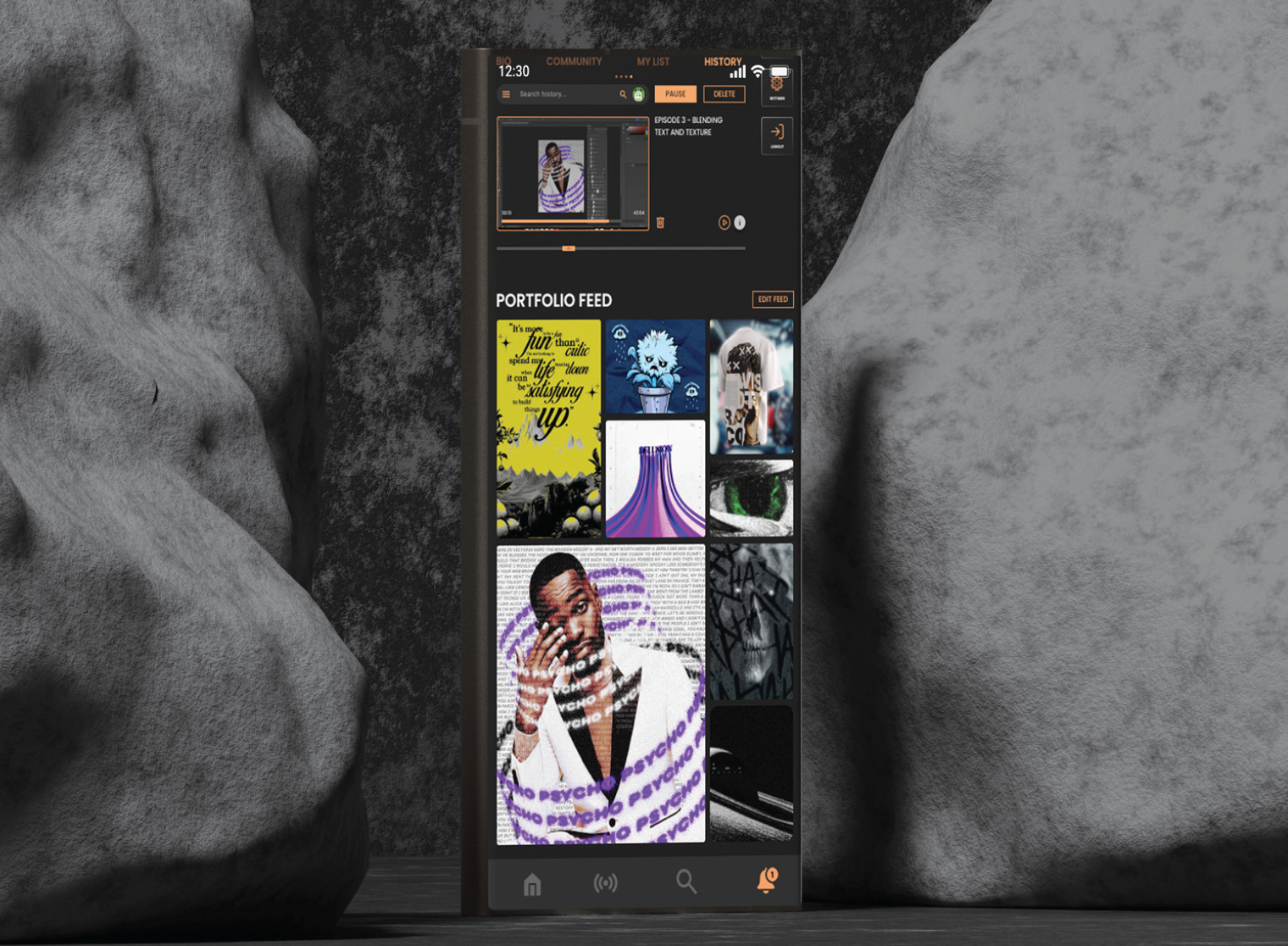
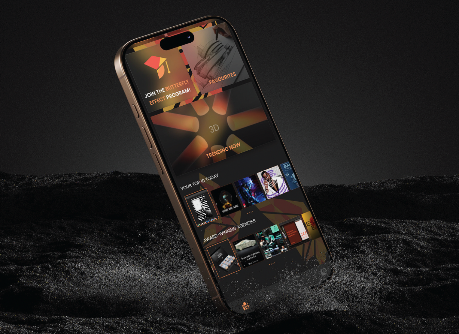
Mobile App - Homepage, Subject Page & Profile Page
Similarly to the webpage many of the same features are available in the mobile form, just in a simplified and easily compatible way.
The mobile layout due to the smaller screen size has a slightly different layout, although the use of glassmorphism and brand furniture is maintained to keep consistency between both web and app services. Allowing for a seamless transition between the two for the user.
Same features and use case as the web profile page, only altered to be made compatible for mobile devices. A key page navigation bar at the bottom allows for seamless and efficient user navigation through the app.
Homepage
Homepage
Subject Page
Subject Page
Profile Page
Profile Page
Butterfly Effect Webpage
Butterfly Effect Mobile App
Our Merchandise
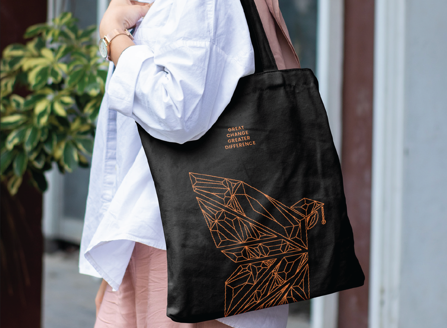
Tote Bag
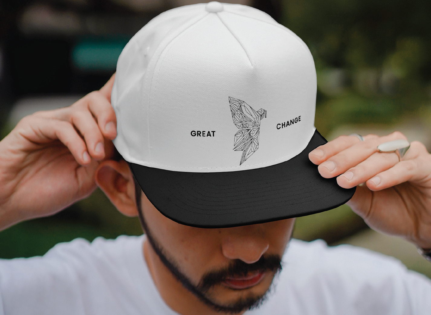
Cap
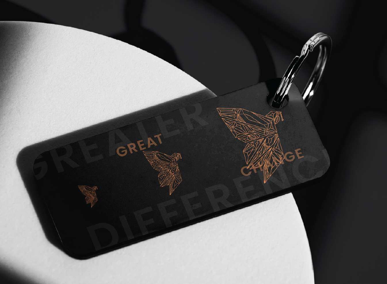
Name Tag
