Brief Overview:
The challenge is to create compelling promotional materials that showcase the spirit, mission and impact of The Women’s Social. The goal is to capture its energy and purpose, inspiring more women to join and ensuring the event’s continued growth.
The Team: Zachary Sparkes, Shahbaaz Zeb and Saad Fiaz
Our Solution:
We decided to narrow down and focus on aligning our re-brand to the values which we thought were the most valuable. Authenticity and meaningfulness were words which we used in our brand identity. The concepts of storytelling, empowering, creativity and inspiration are at the core our re-brand.
Main Style Inspiration
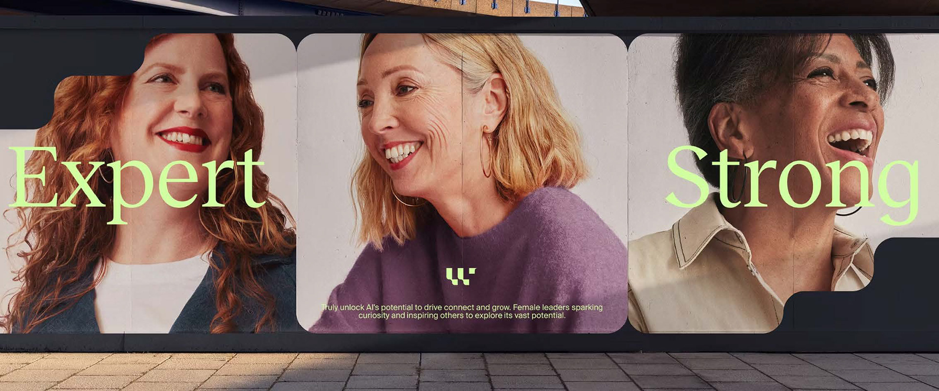
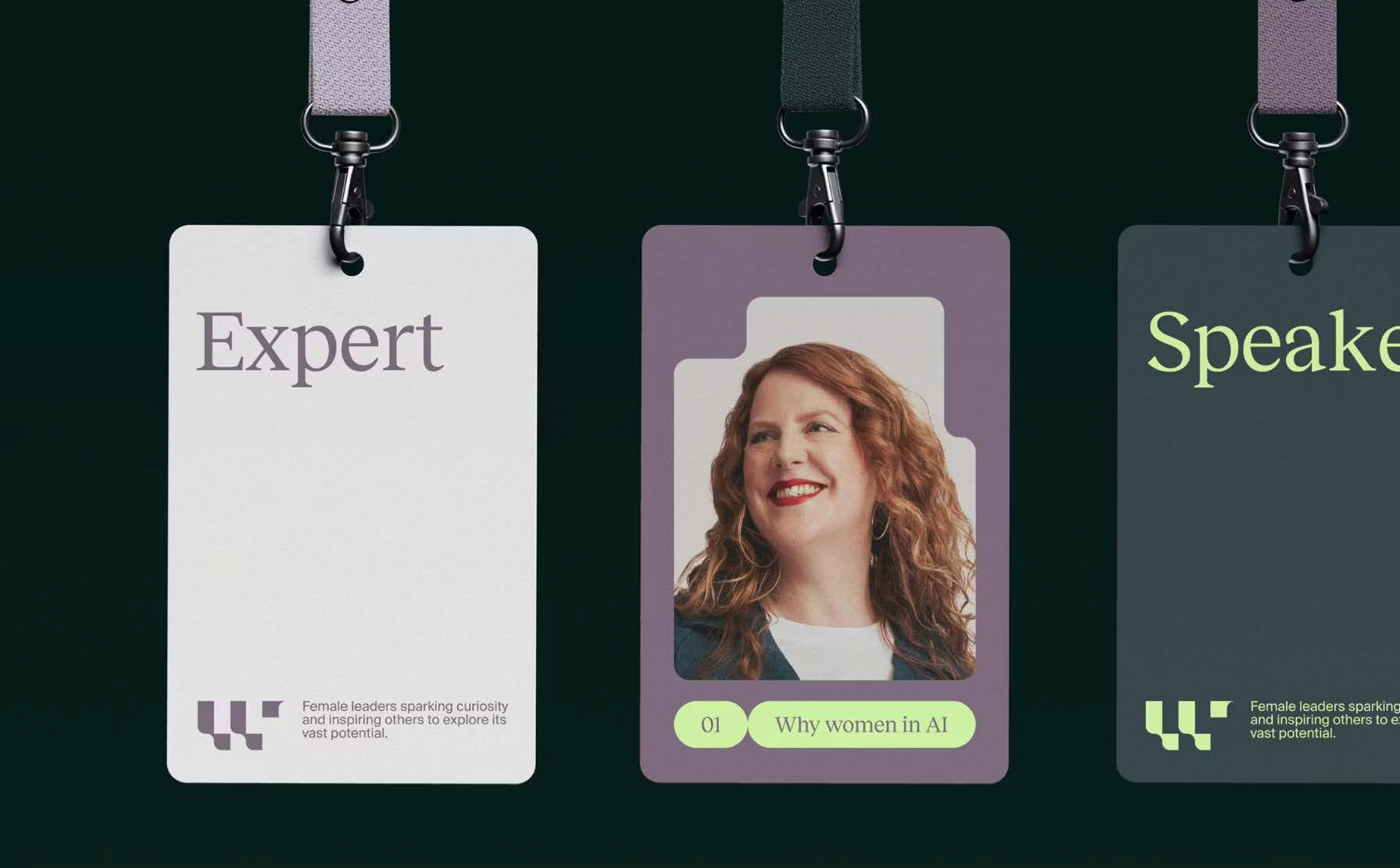
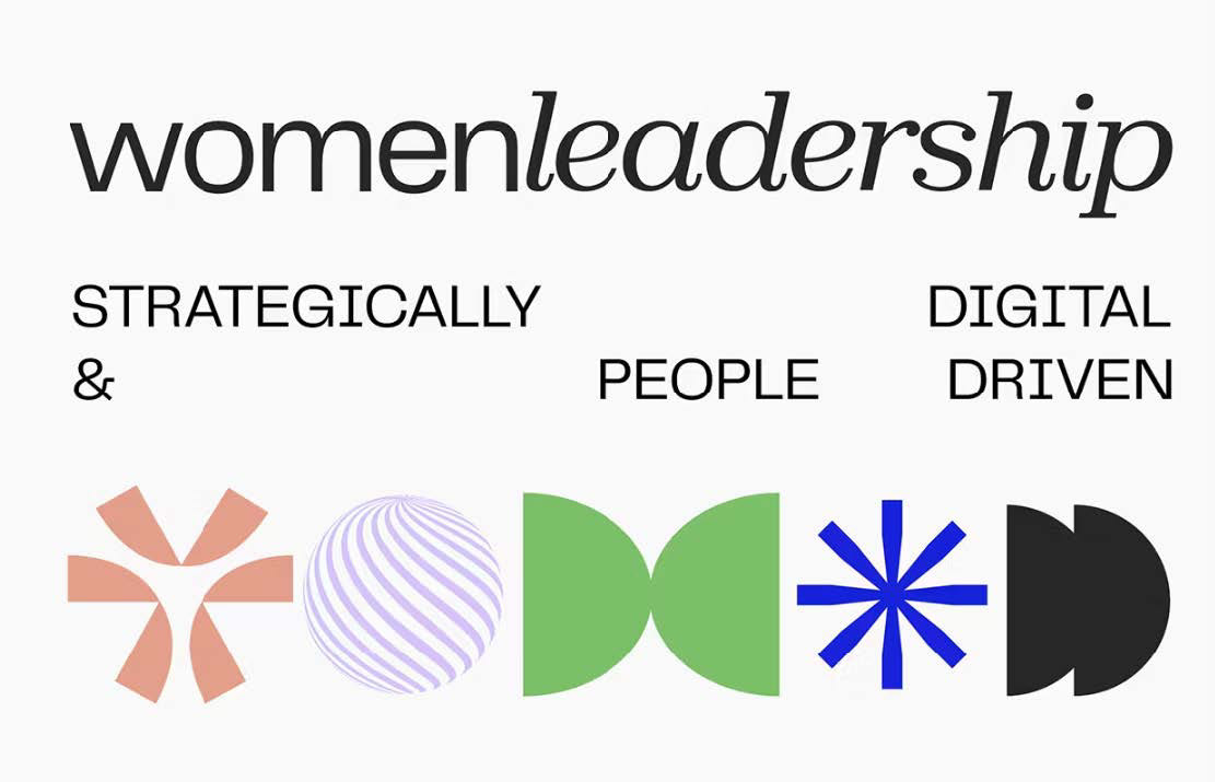
This is our main inspiration, the designs have a great use of typography and they only use 2 fonts, which is something we will do as it keeps design work more simple and less confusing. The use of photography is very prominent which is important for our branding as well.
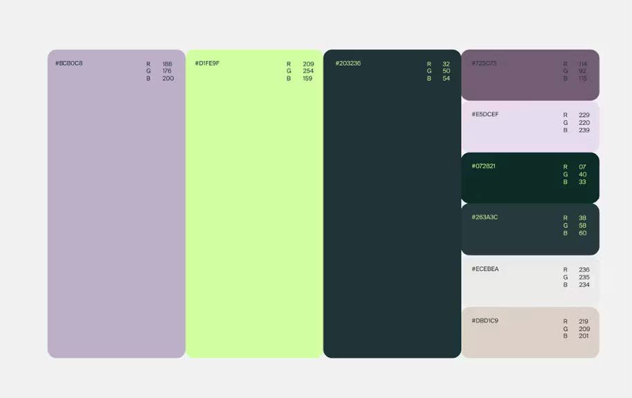
Colour Palette
For the rebrand the main colour was the purple. It worked really well with the original yellow colour which we decided to keep. The purple has a sophisticated look and is often associated with luxury, royalty and has a modern touch too. The dynamic of these colours makes them look contemporary and they balance each other out.





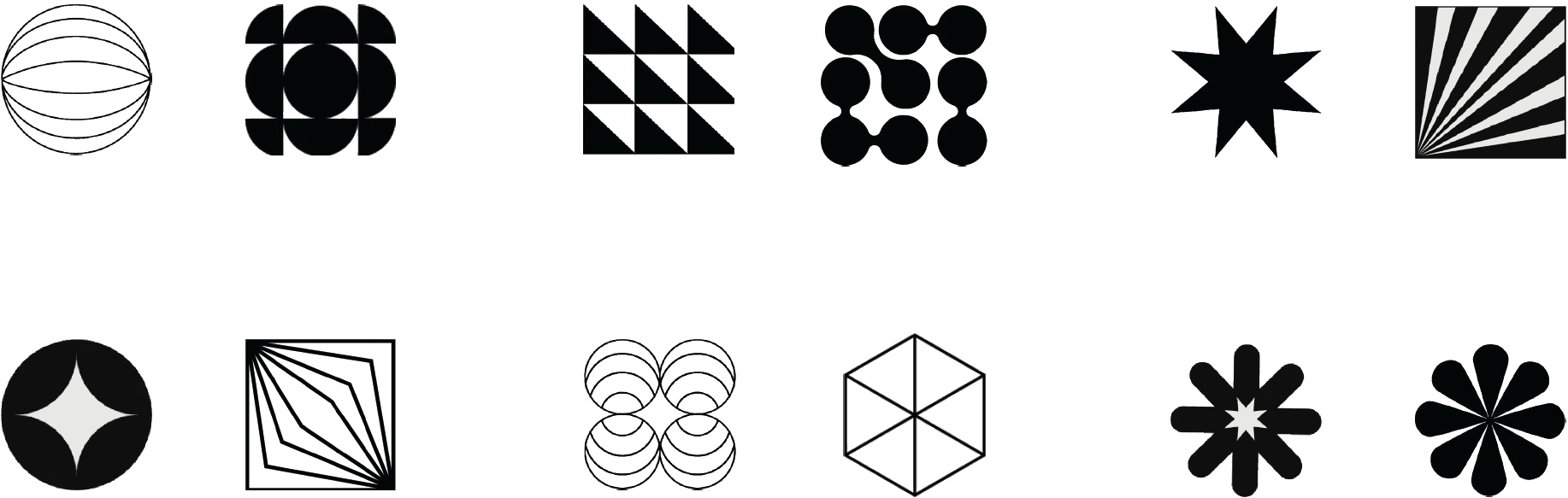
Brand Icons
ENGAGING, WARM, CREATIVE, EMPOWERING, SOPHISTICATED
Each icon comes under a wider theme, that we picked out and felt highlighted 'the women's social' as a brand, the icons visual link to the theme too.
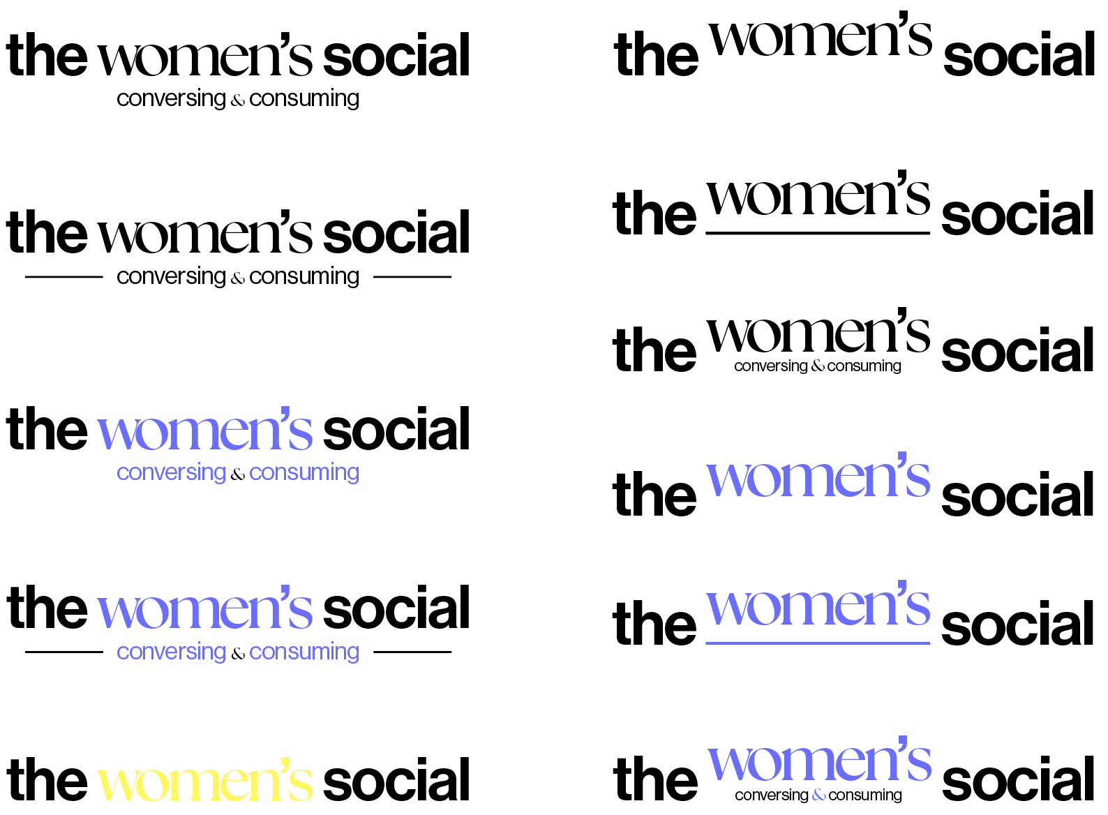
New Brand Wordmark
We wanted to create a more usable, versatile and aesthetic logo that could be used over all the brand, as the original logo is a bit large and doesn't always work. So we made this which implements our fonts and our purple colour. This wordmark was used throughout our branding and was key in maintaining the brand's identity. There are also variations of it in yellow and all black, which were useful for the motion graphics.
These variations include the full logo text, this were also used, but less as there wasn't much need for it. These could be a potential new logo design, replacing the original one, and this would be coherent and compatible with our re-branding.
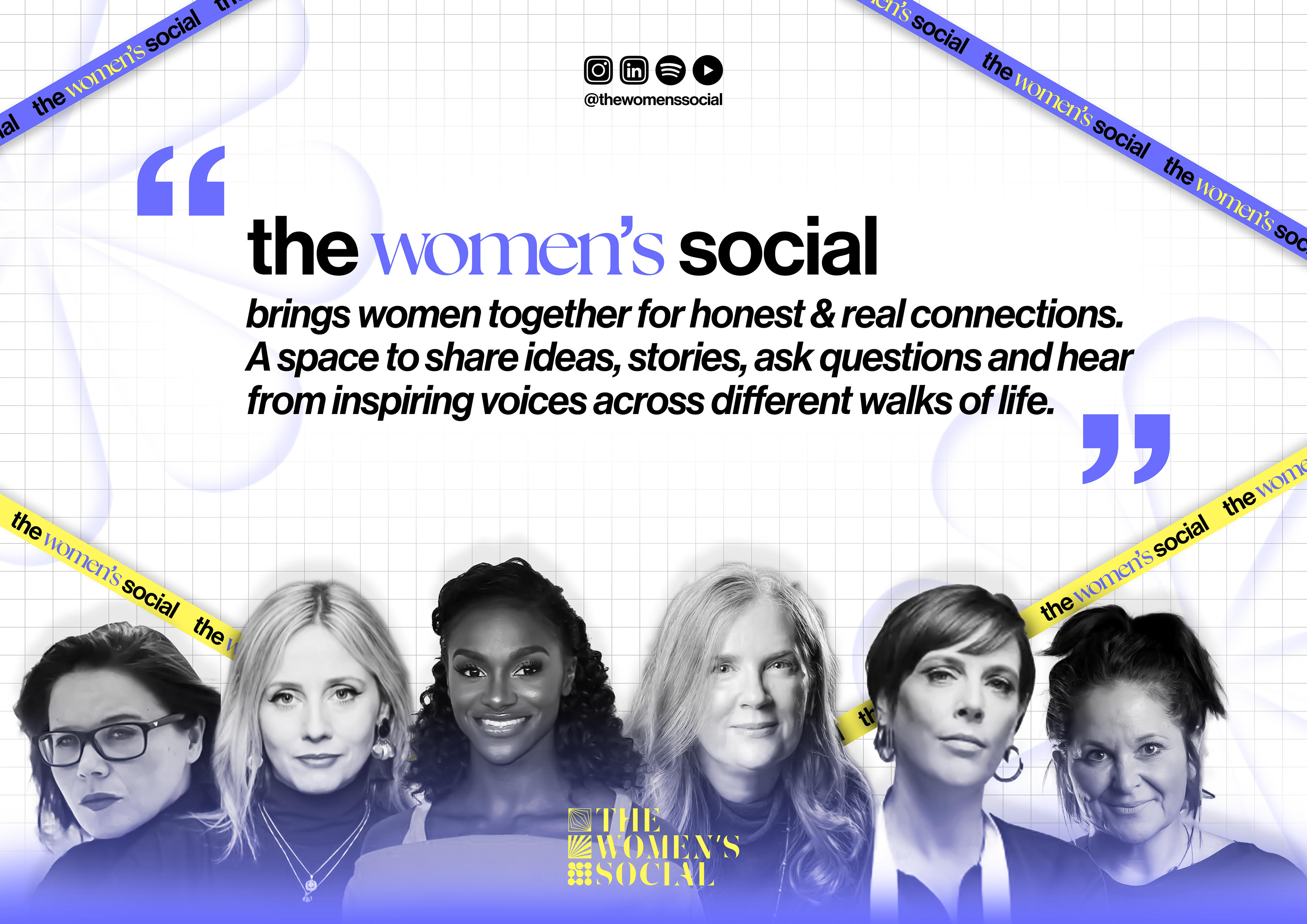
A2 Poster Design
The A2 poster is the main visual as it encompasses the core concepts and essence of the women's social, with a statement about the events and also collection of the guests that have been there. This poster also gave us the chance to show our re-branding a concise way with the new logo, our icons, banners and new style of black and white photography,
A4 eVENT flyer
The A4 flyer design provides a comprehensive outlook on the event taking place, this blueprint can be used for other events. The yellow and purple colours create a balance between stand-out information and elegant design. The gradient paired with the grid create cohesiveness and professionalism, which is important in design that aims to provide key information like this flyer. The back of the flyer is a nice and simple design using our new word mark.
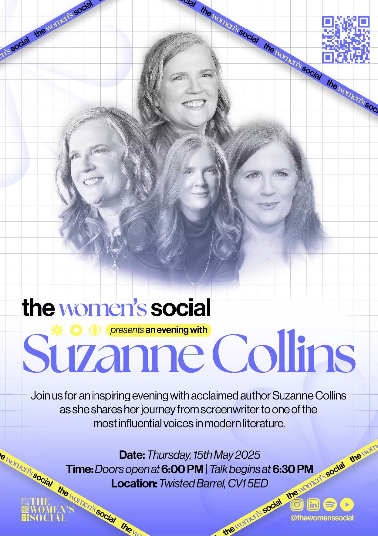
Front Side
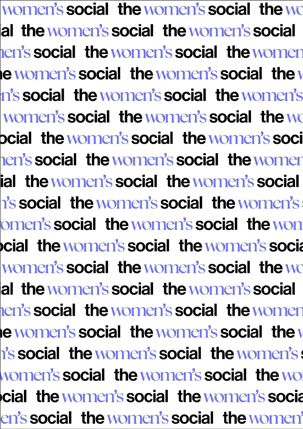
Back Side
Brand Motion Graphic
Our brand motion graphic is a stop motion animation showcasing our new logo type and all the visuals we have created in an energetic and simple video. The motion graphic nicely covers the whole brand in an engaging and professional way.
Social Media
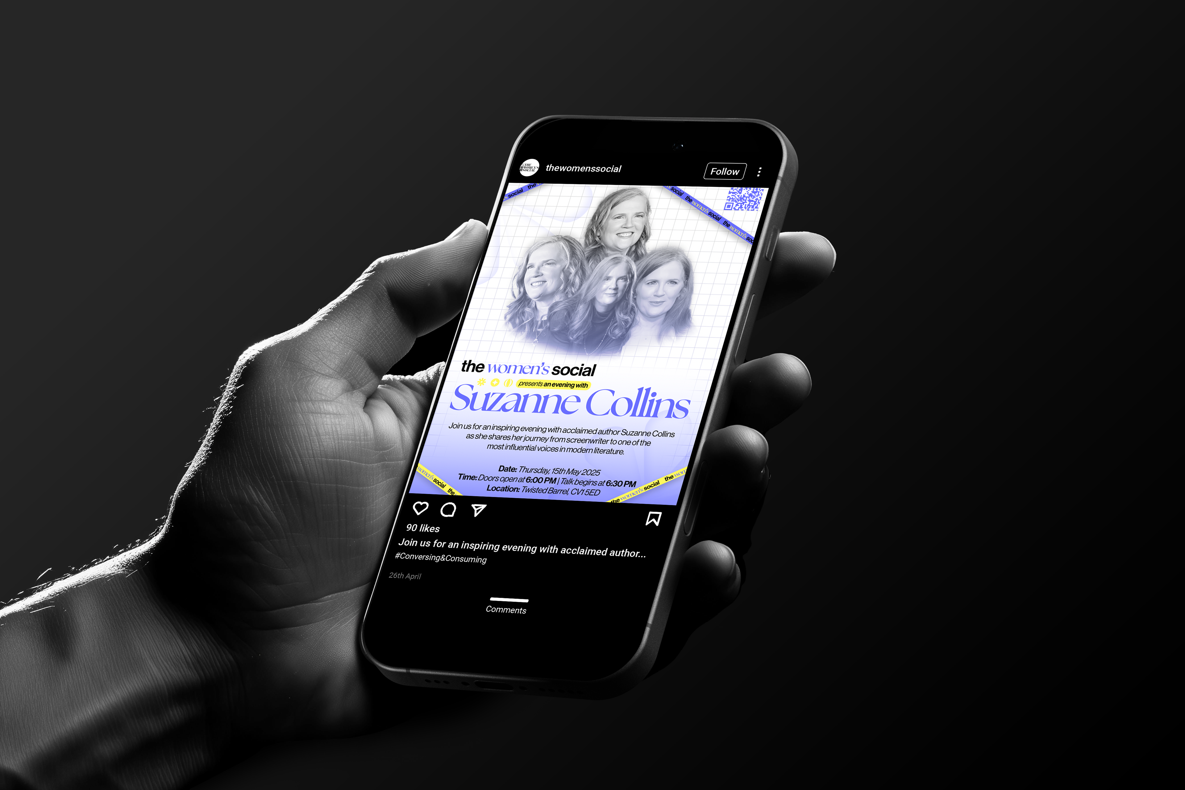
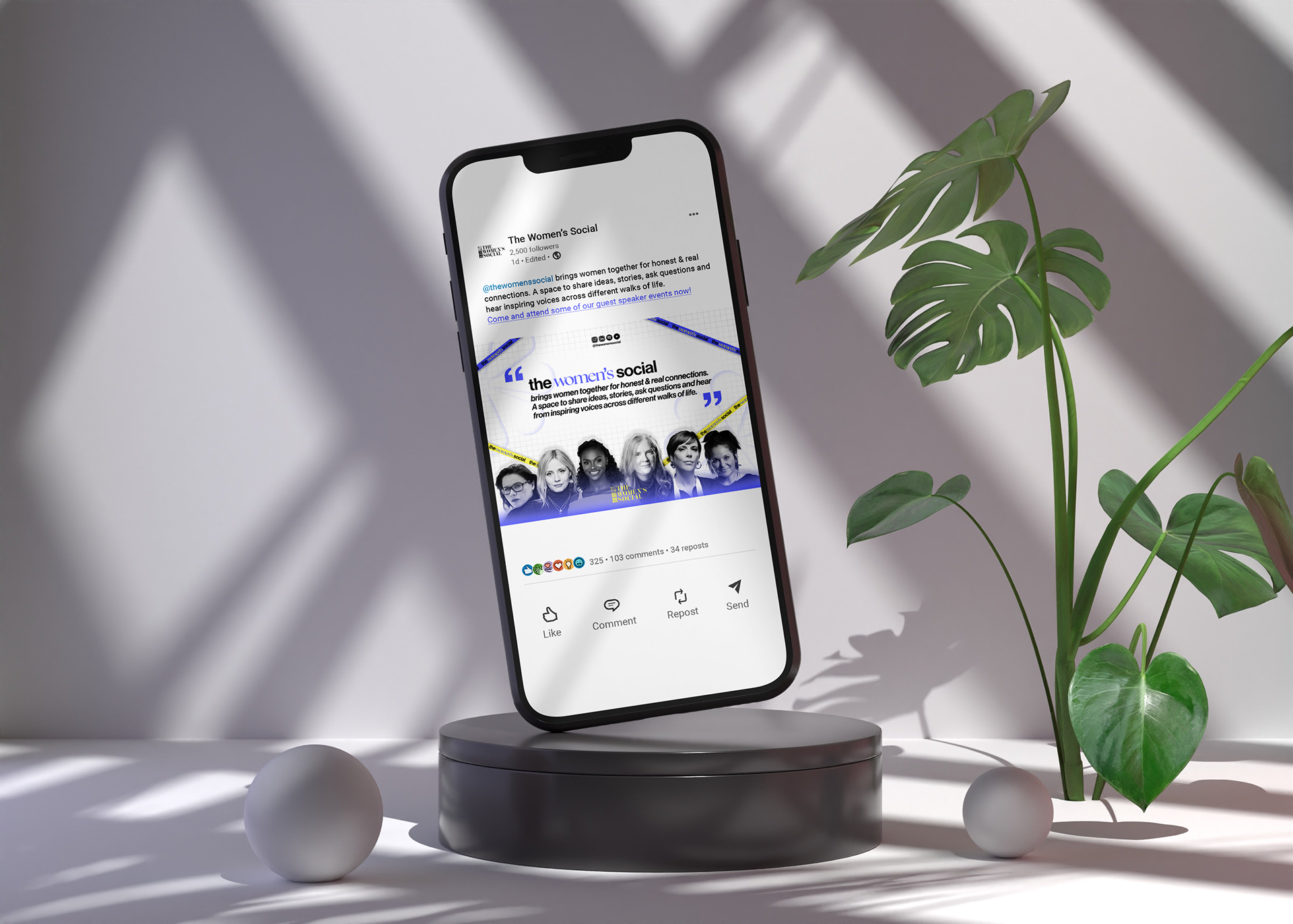
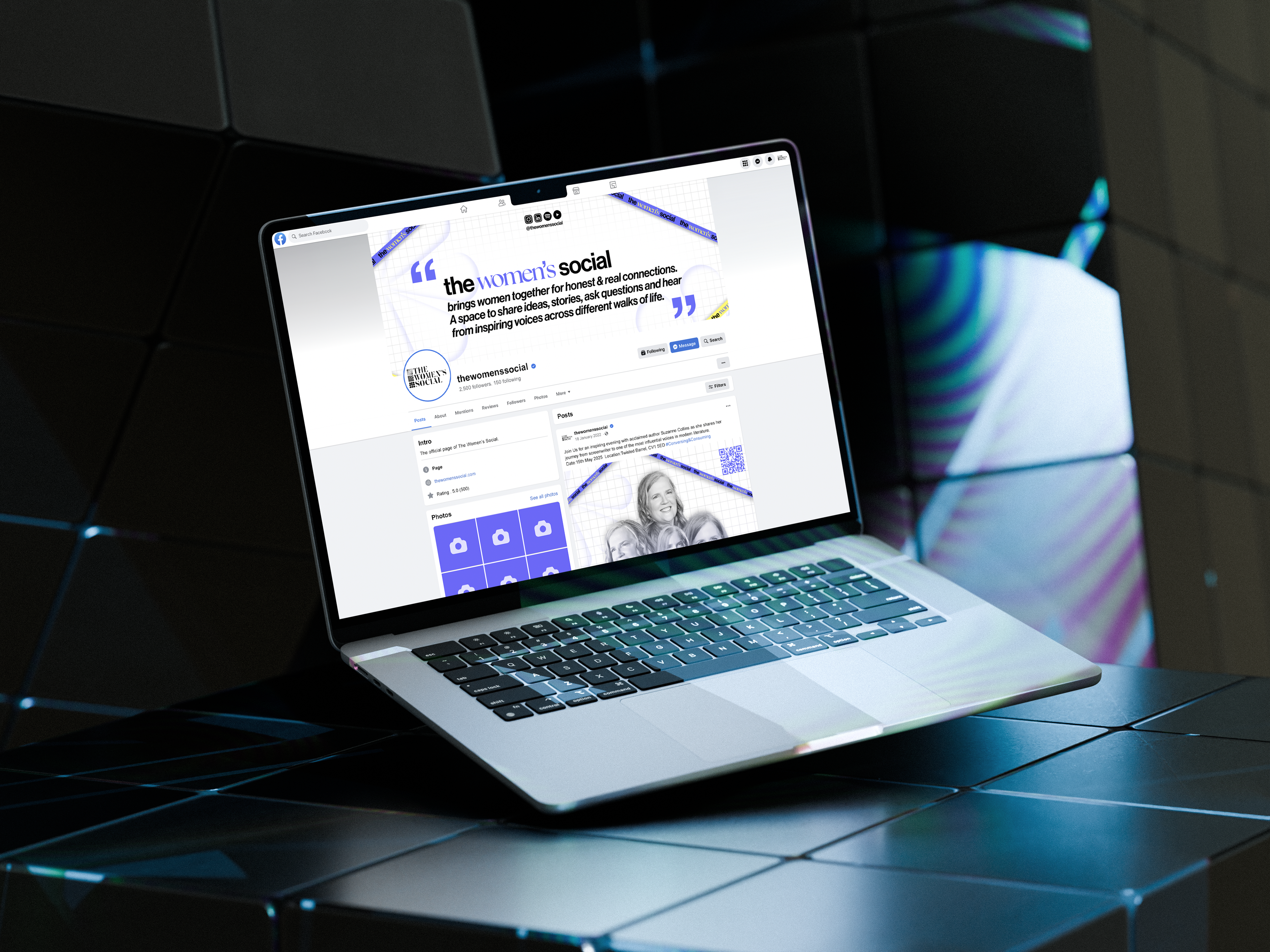
Our social media touchpoints, used mainly our posters as they were perfect promotional materials. We also created a main page for Facebook/LinkedIn page, that fits well with the brand, using the same colours and banners. The posts are eye-catching due to the unique composition and designs, which would help the message reach further expanding the brand audience.
Signage & Extra Promotion materials
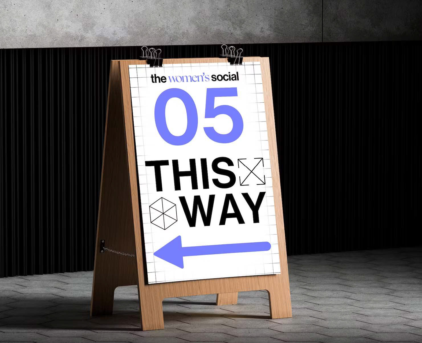
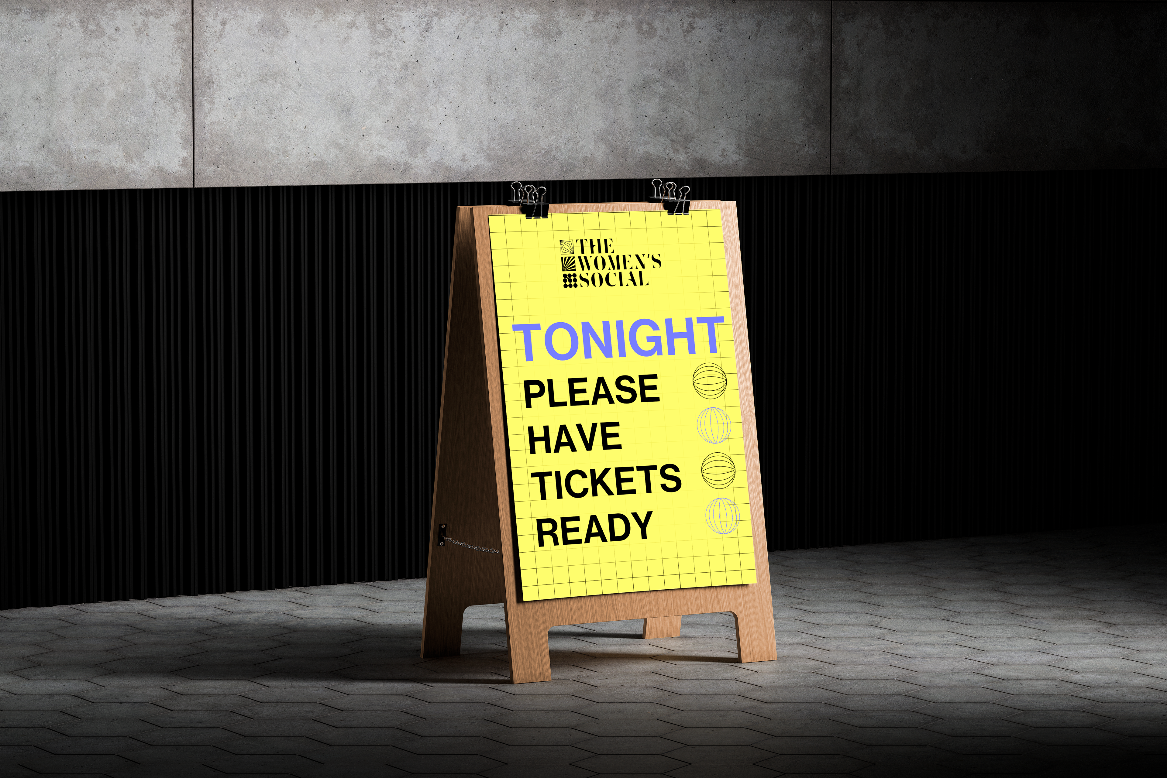
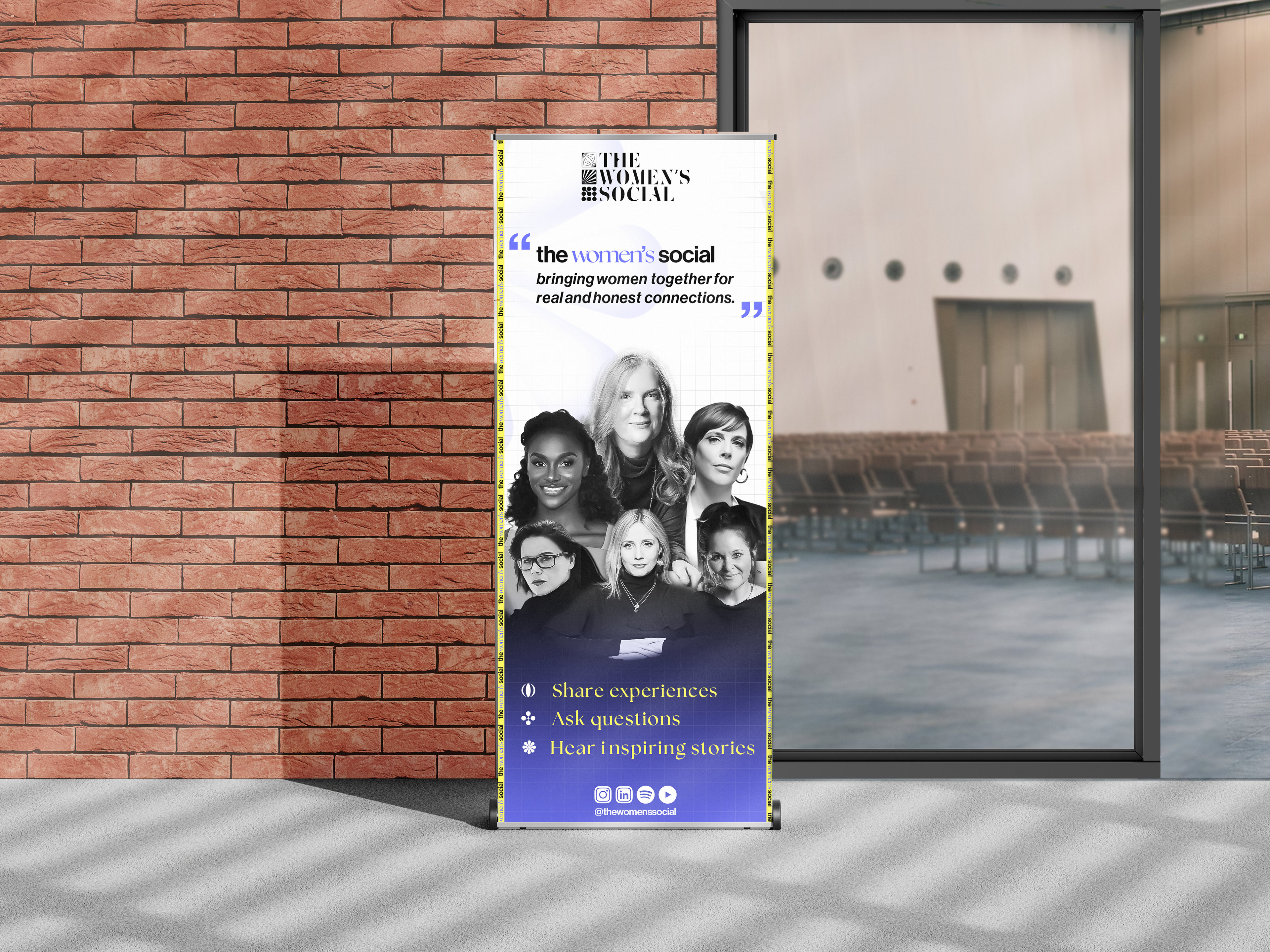
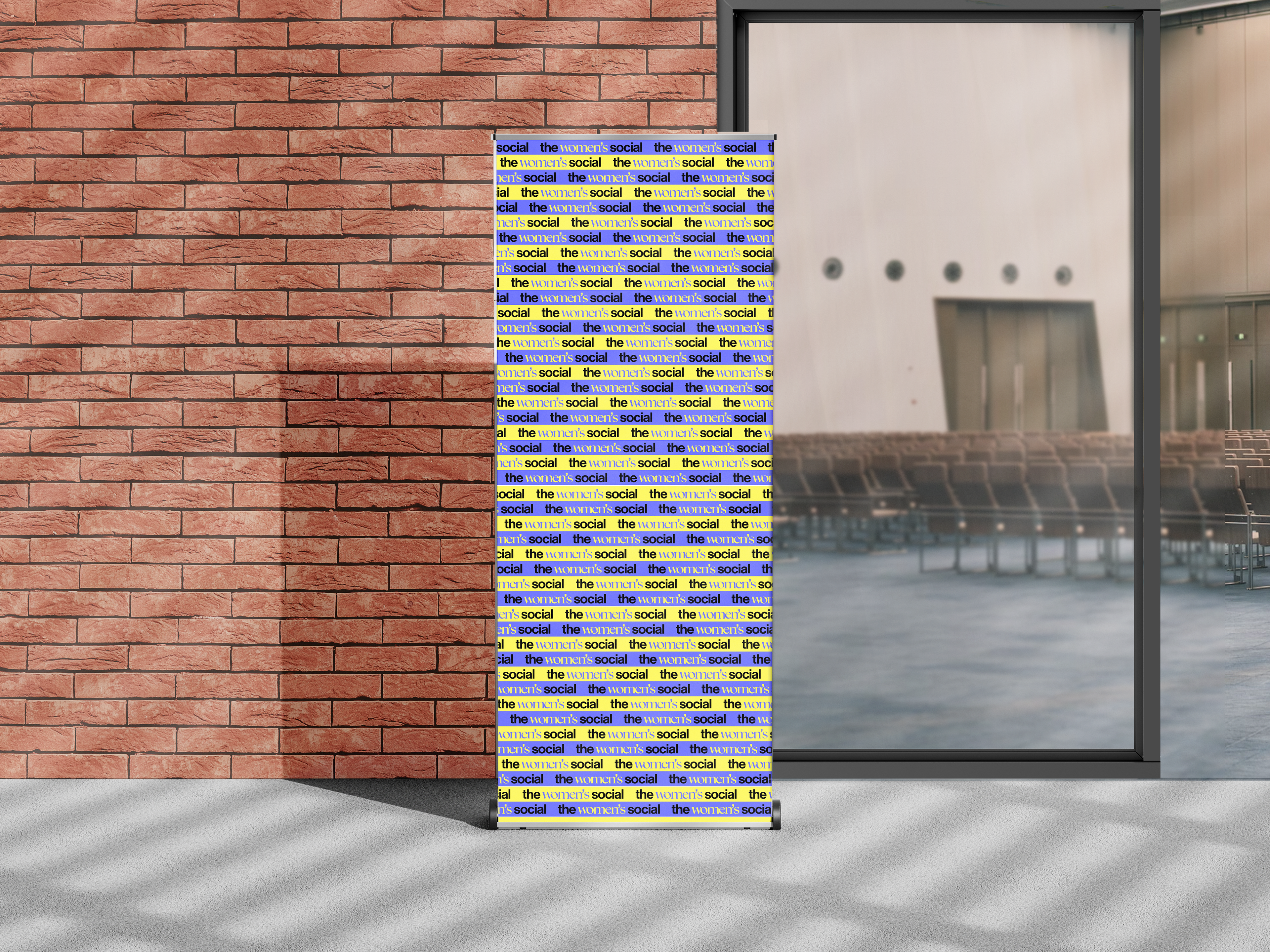
Variations of banners for promotion and simple ones to be placed on-stage, so when recordings and pictures are taken the brand is always visible and apparent. The way-finding is large, clear and bold, as it should be. The design has to be simplified but keep the brand's sophisticated and elegant nature, which it does really well.
Ticket Designs
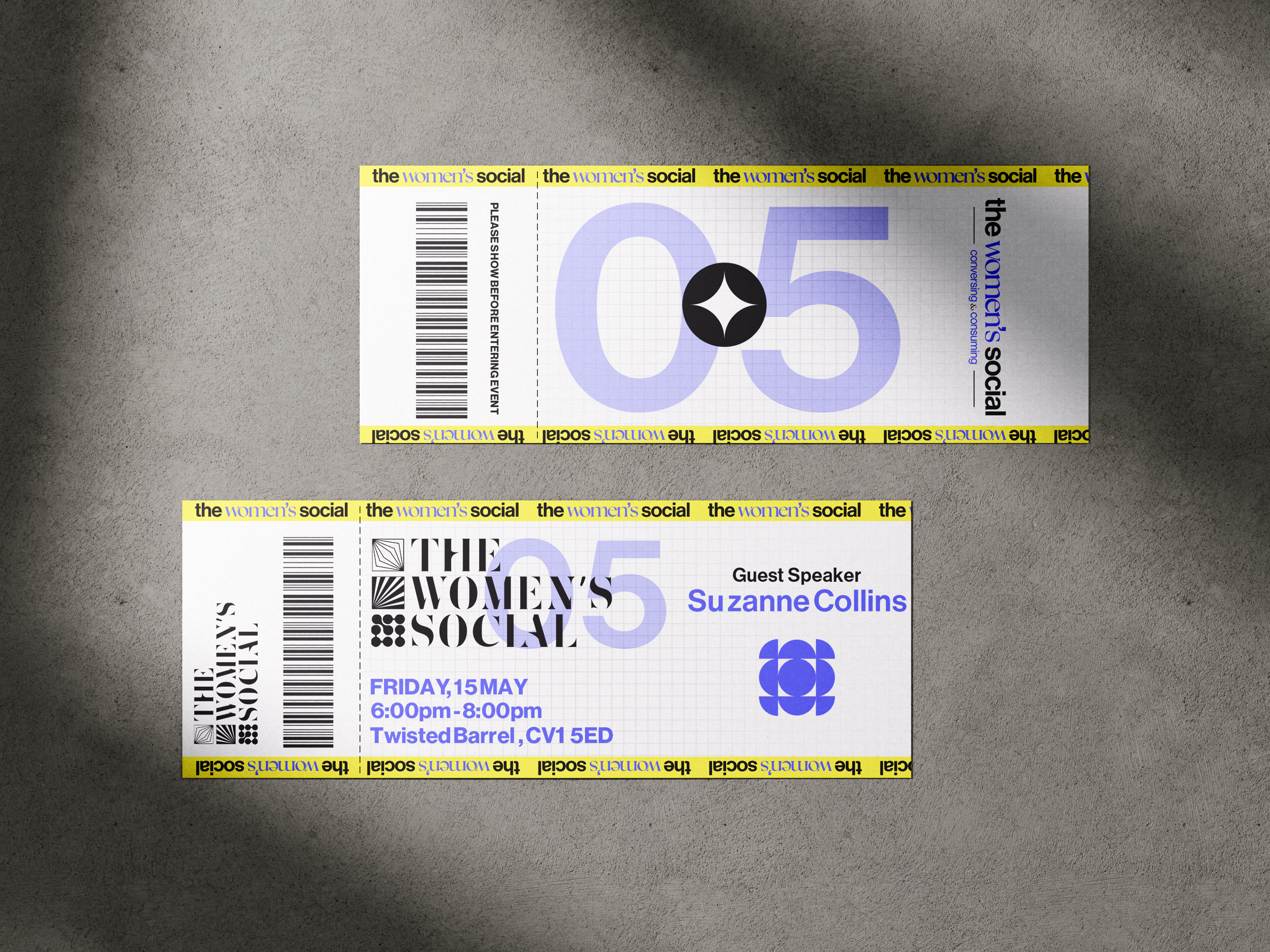
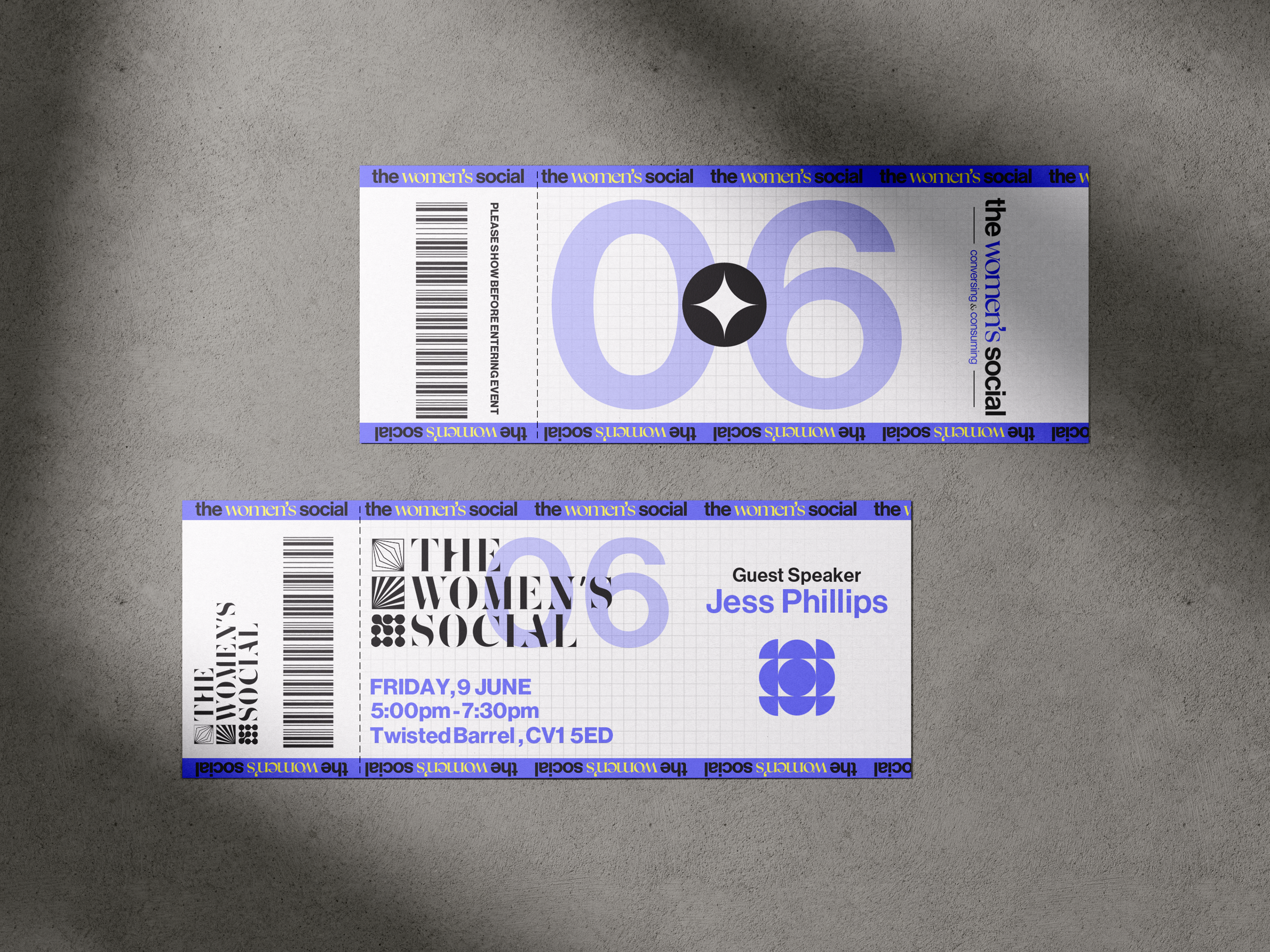
Although the events are free there is still a registration process and so we thought that tickets would be needed. This was a fun challenge as there is a few things to keep into consideration when making one, such as the ticket is snapped or cut off at an area, so we had to make sure that the logo and branding was visible at all times. The tickets also have a clean and complex design which is very aesthetically pleasing.
Q&A Cards
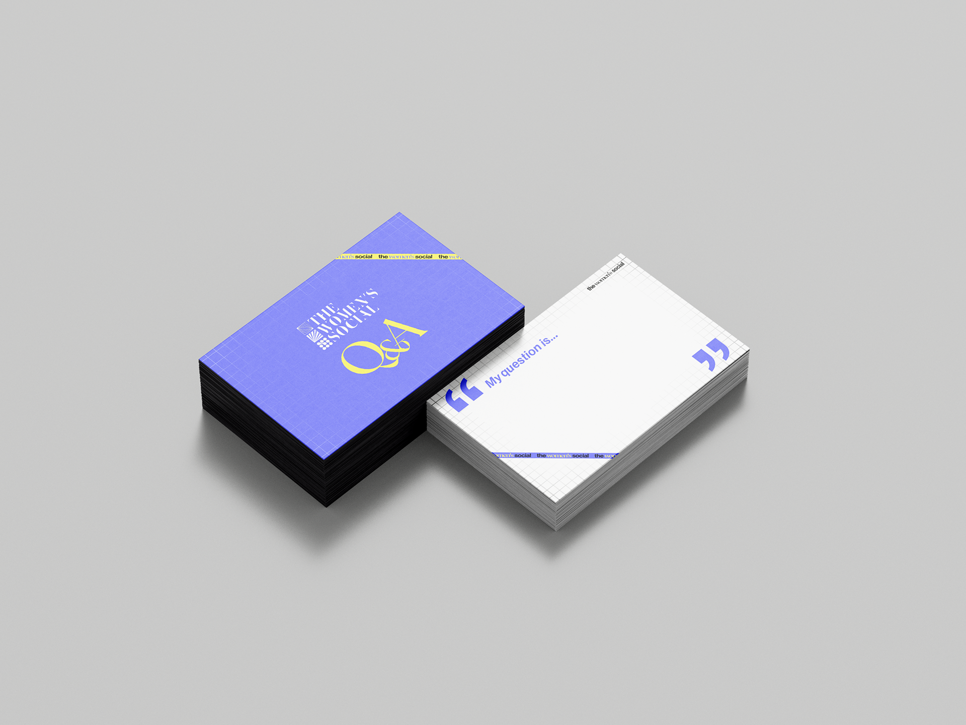
The women's social is a social event and that means frequent interactions and chances to ask questions, so we decided to create some Q&A cards where attendee scan write their thoughts and questions to be given to the guest.
The design has the prominent purple with the yellow to making a bold visual, with a simple white and purple on the other side, so there is space for writing questions.
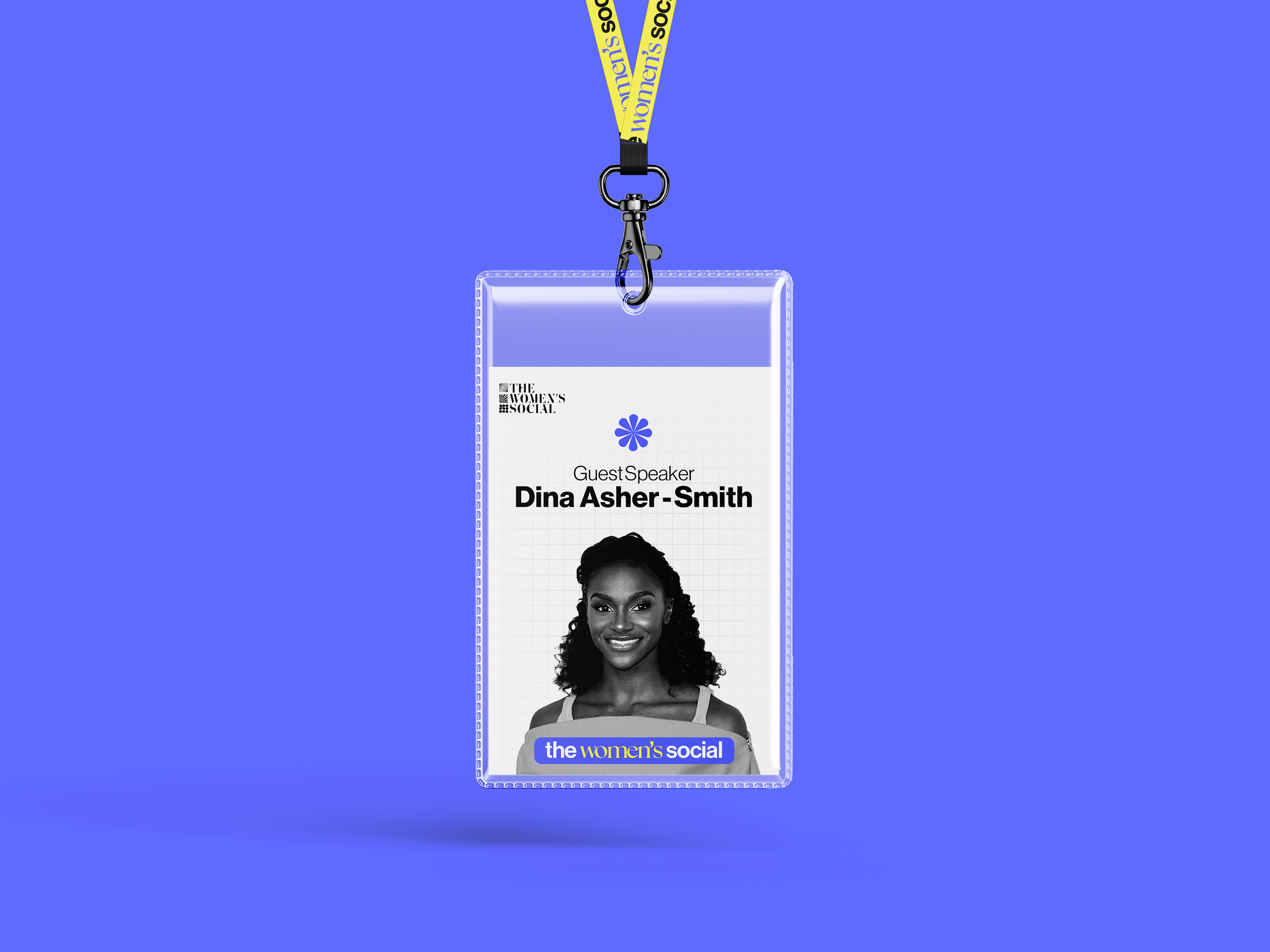
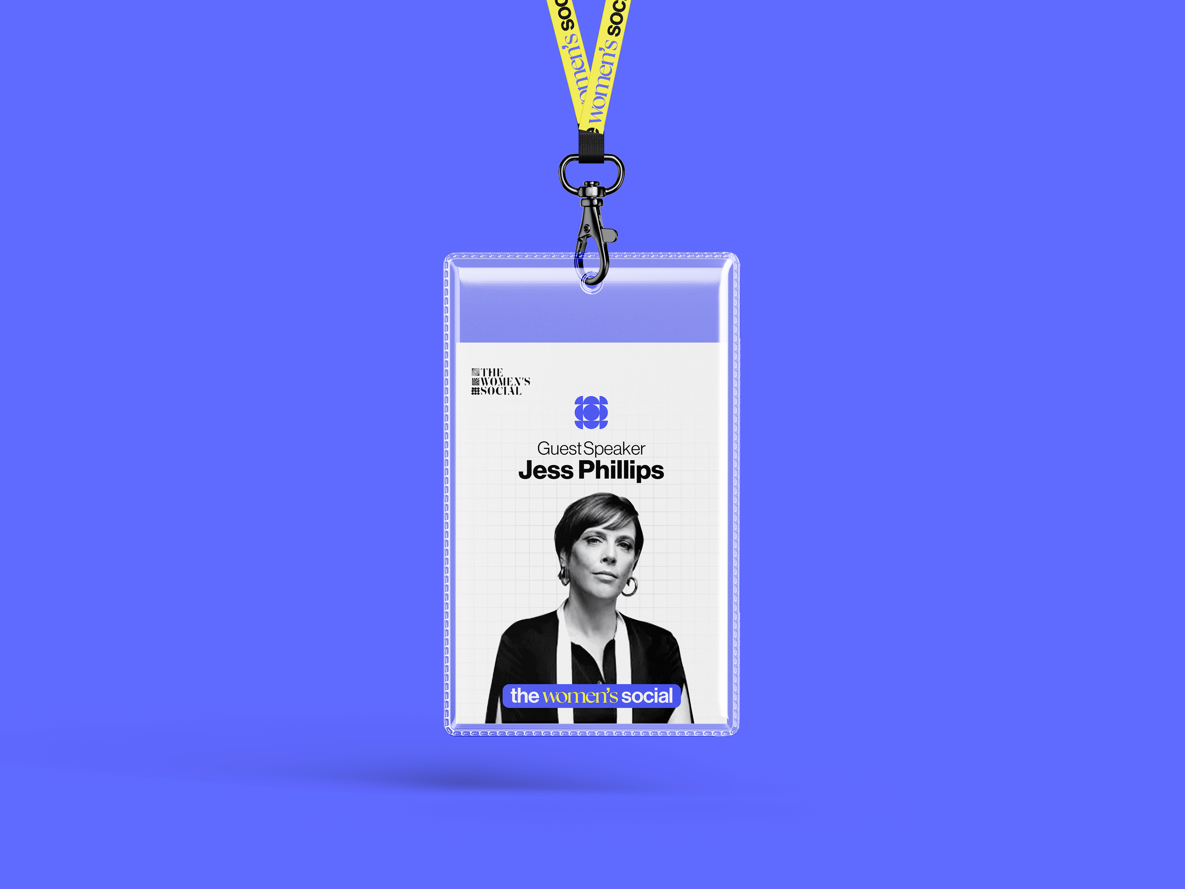
Brand Lanyards
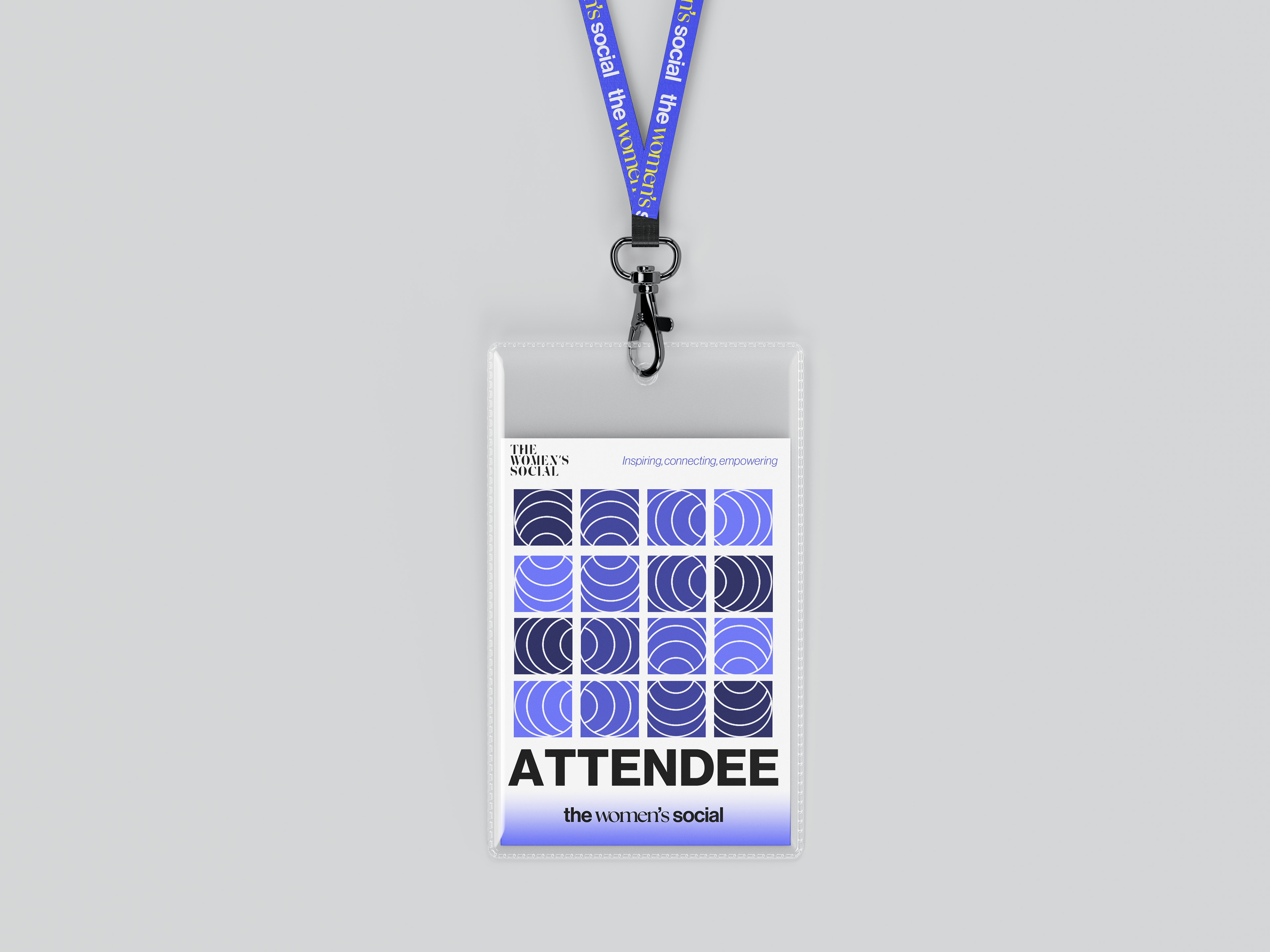
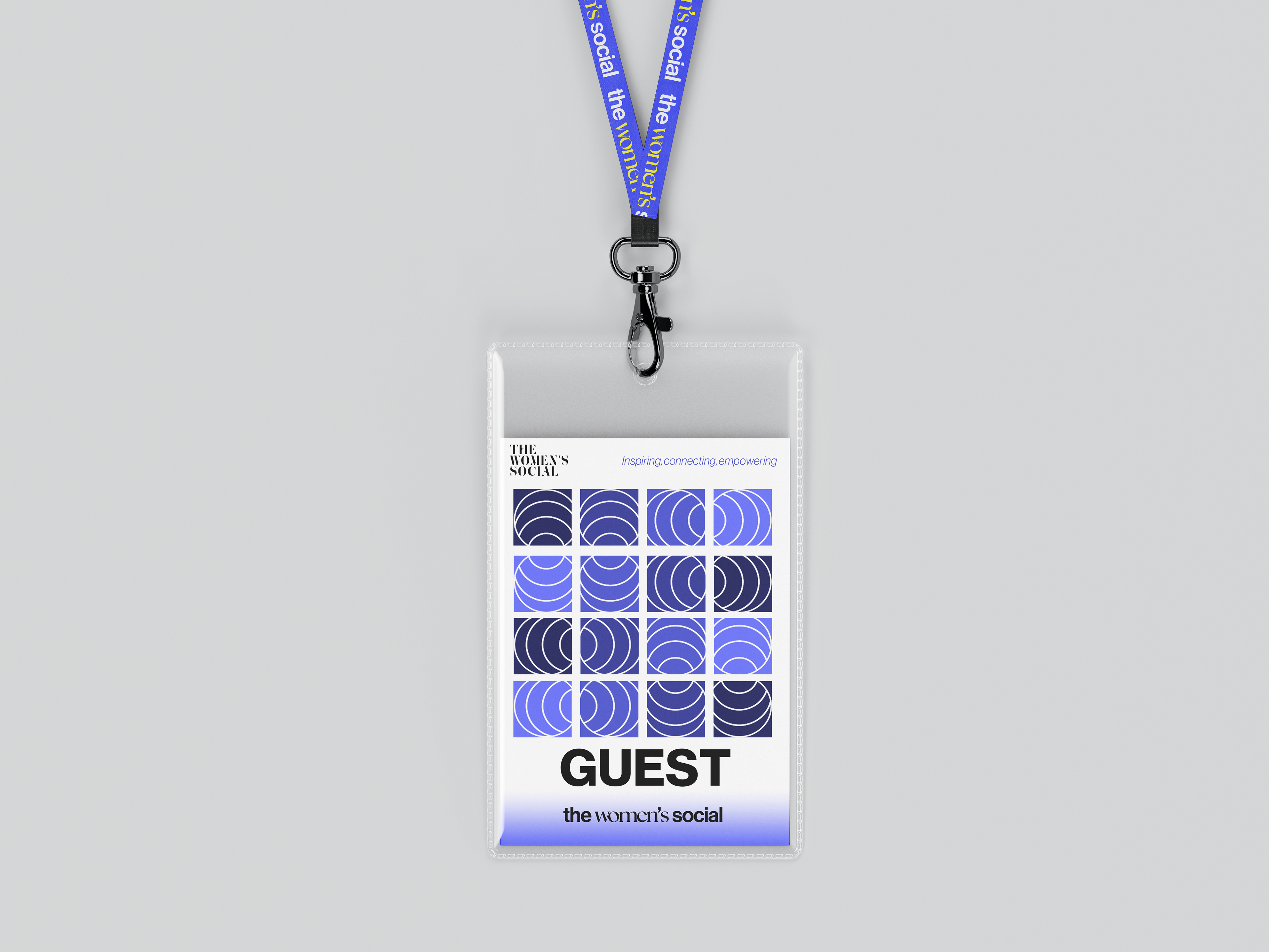
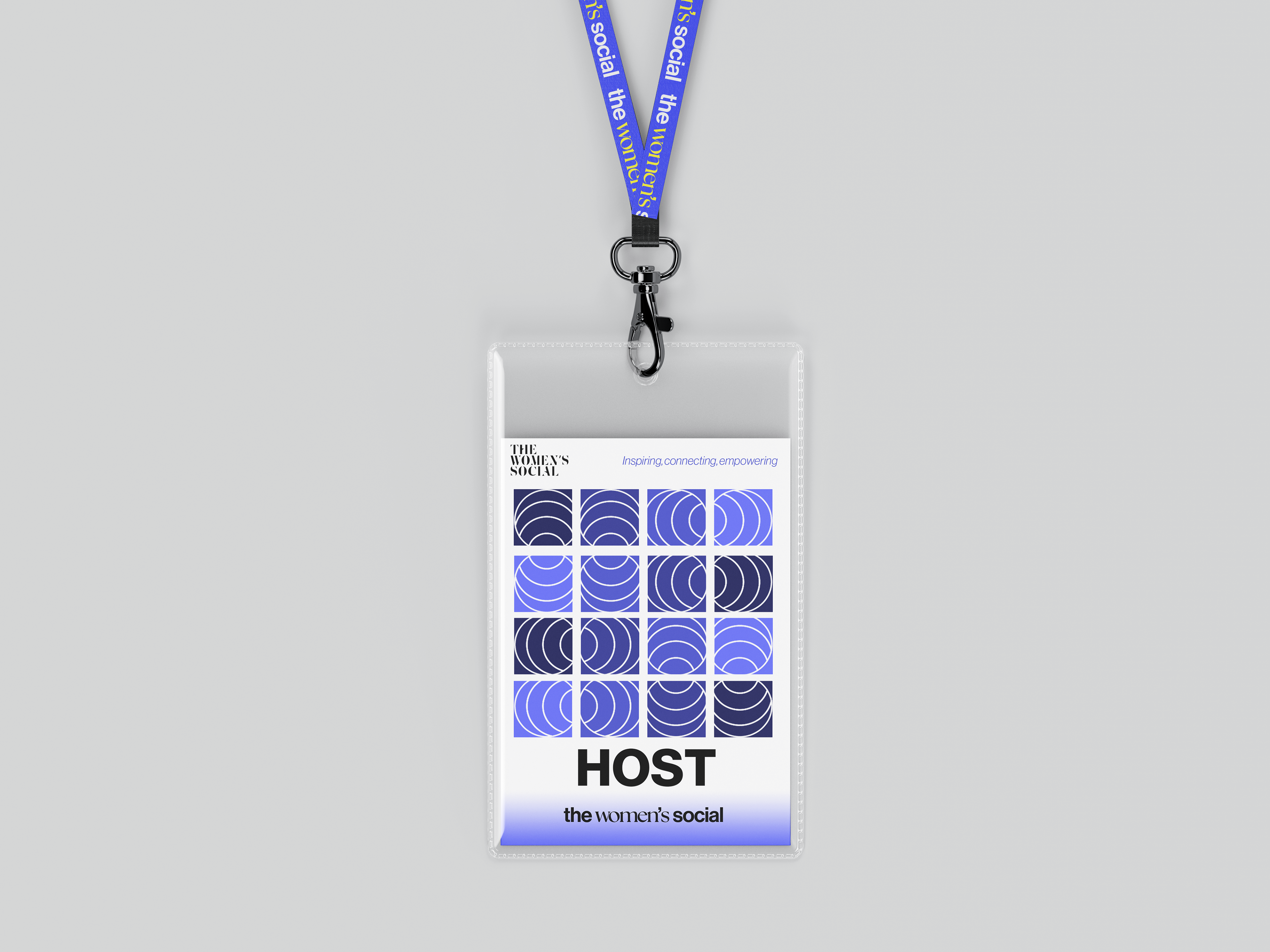
Different lanyards for different types of people attending. There are also specially stylised ones for the guest speaker to wear. Simple use of colour and icons make the design sophisticated yet easy to the eye and visually pleasing.
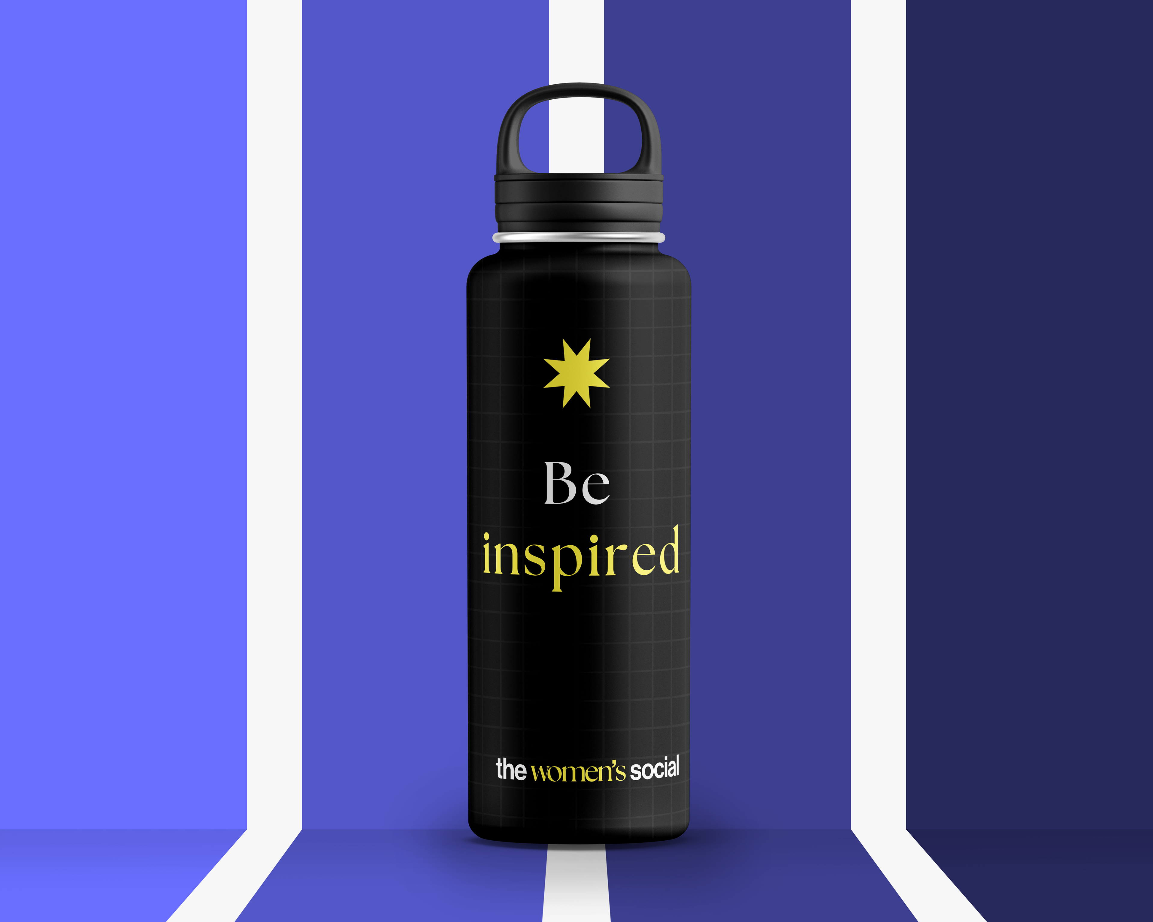
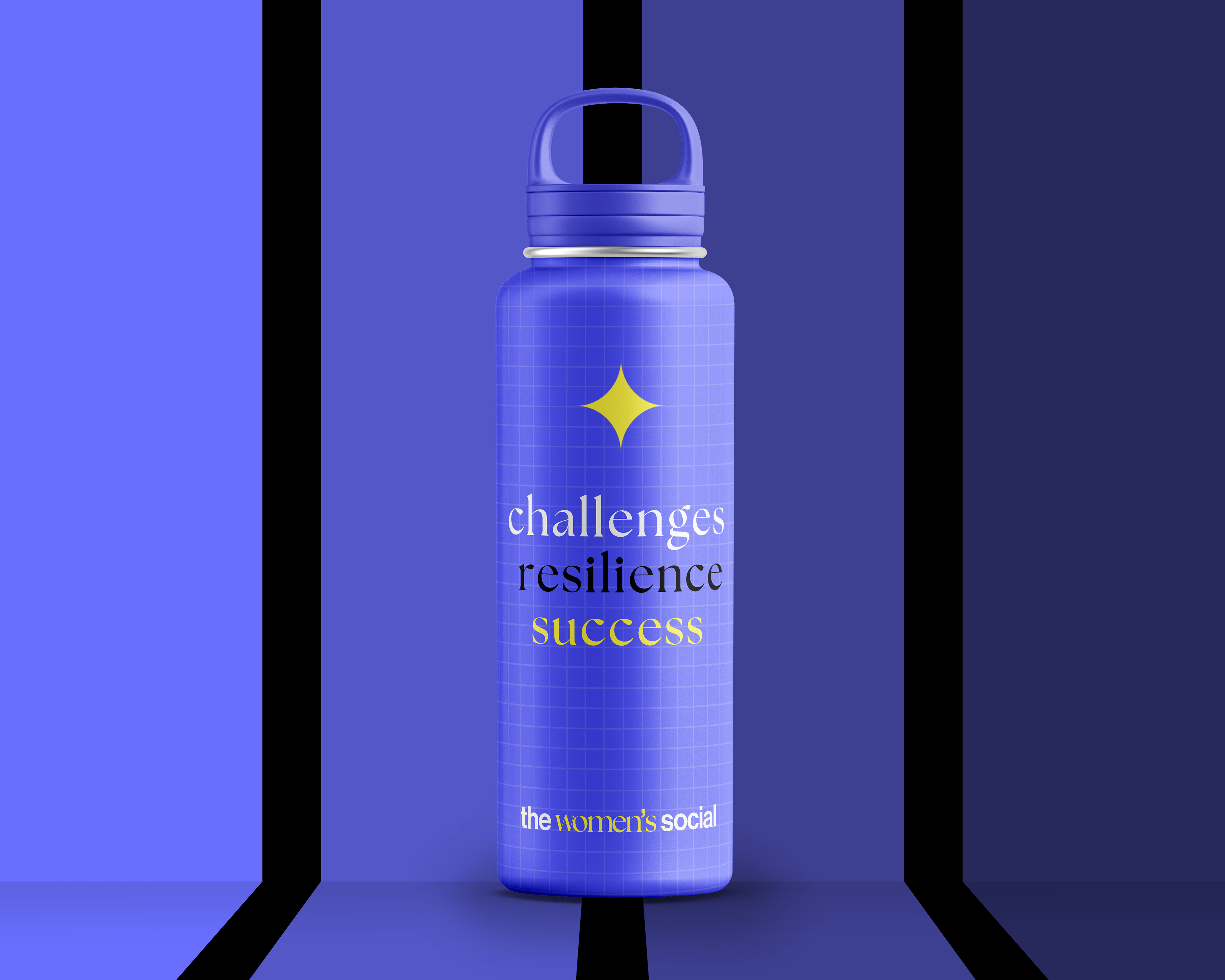
Bottle Designs
Beautifully made bottles, keeping consistent with brand visuals by using iconography and grid design. Water is supposed to freshen you and the bottles have inspirational and motivational text on them to keep you mentally and emotionally freshened, charged and happy.
Tote bag visuals
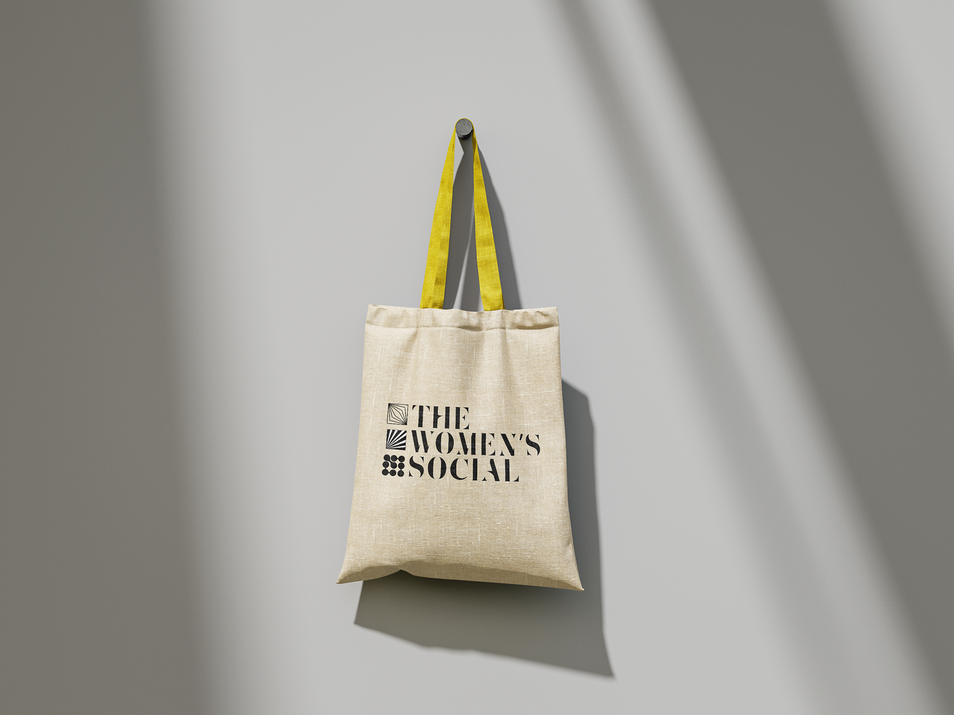
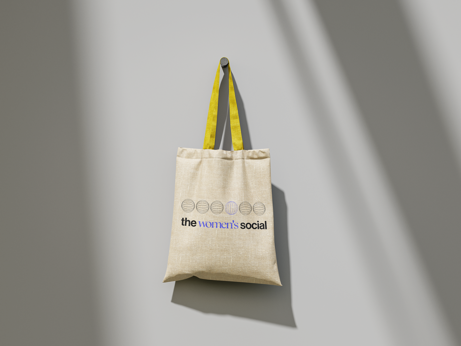
Alongside the bottles we added tote bags as part of the merchandise. The aim was to keep the organic and natural look and feel of normal tote bags, but we made the handles yellow so it looks like its part of the brand. The minimal look looks and works really well.
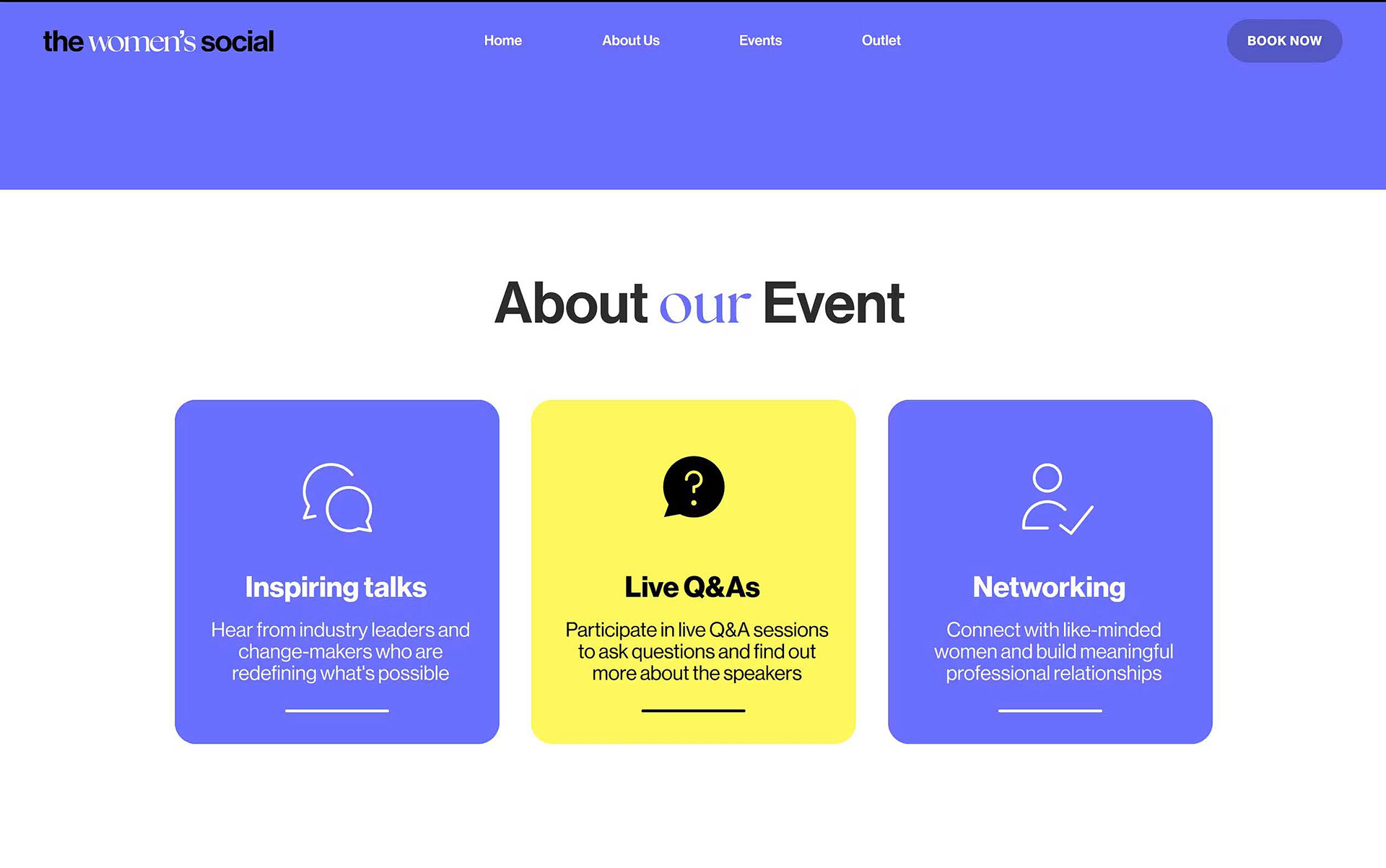
Website - Homepage
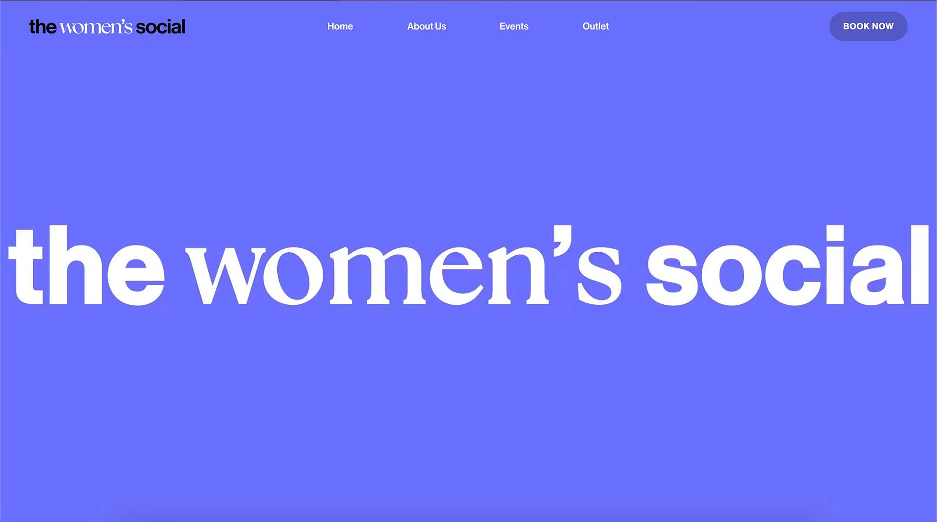
The website instantly hooks in the viewer with its dynamic and flashy motion graphic, this was important as the first thing we want people to see is the brand in an exciting way, so this was a good way of doing it. As you scroll down there is a simple summary of the events that take place and the boxes provoke interaction as they turn yellow when the being hovered over.
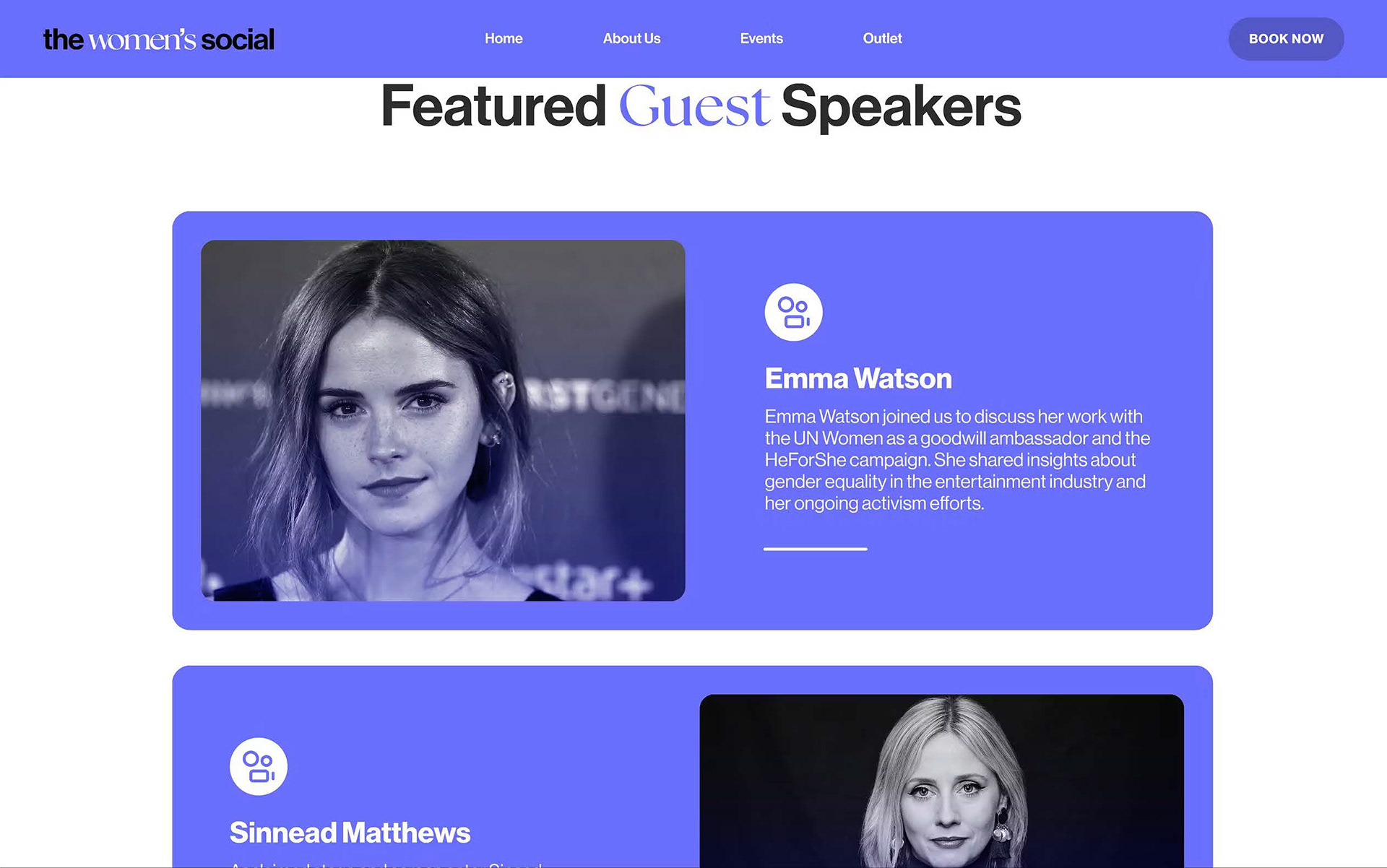
Website - About us
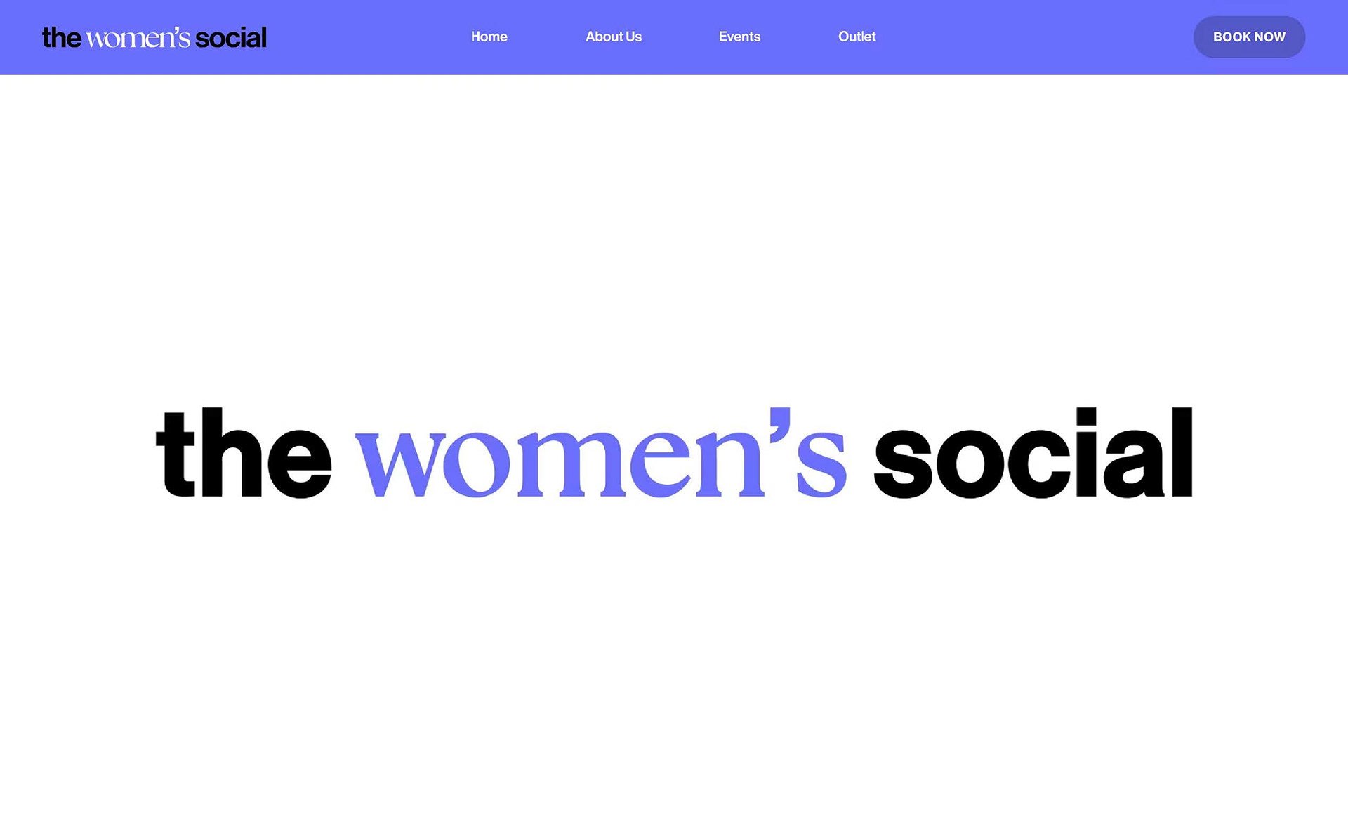
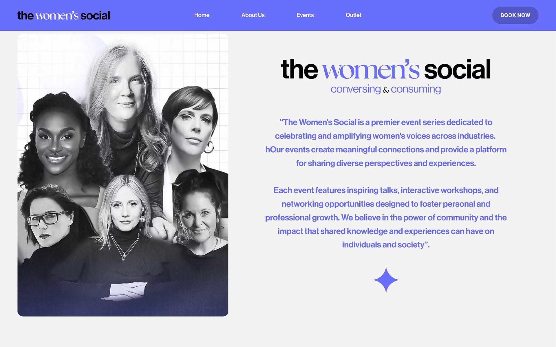
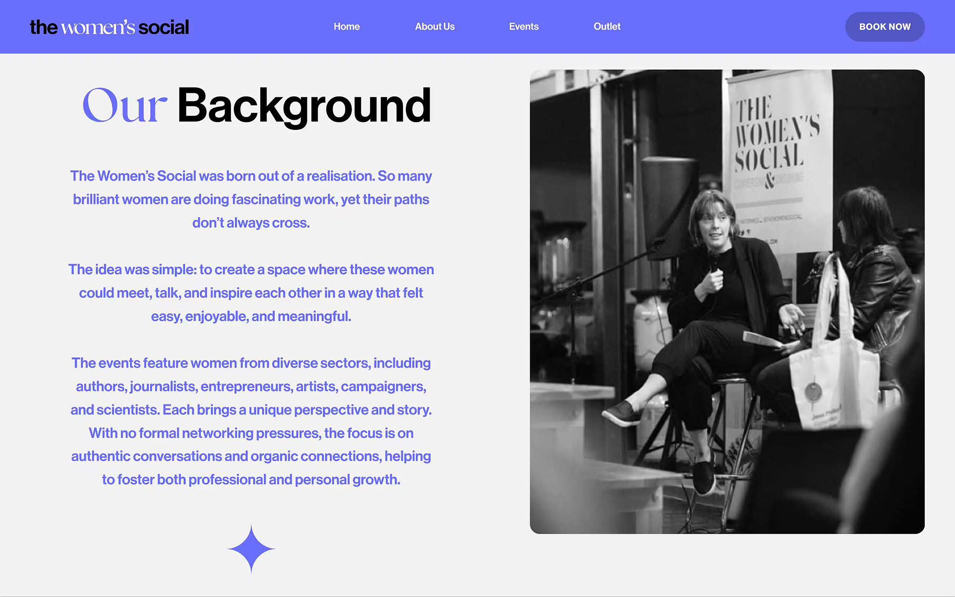
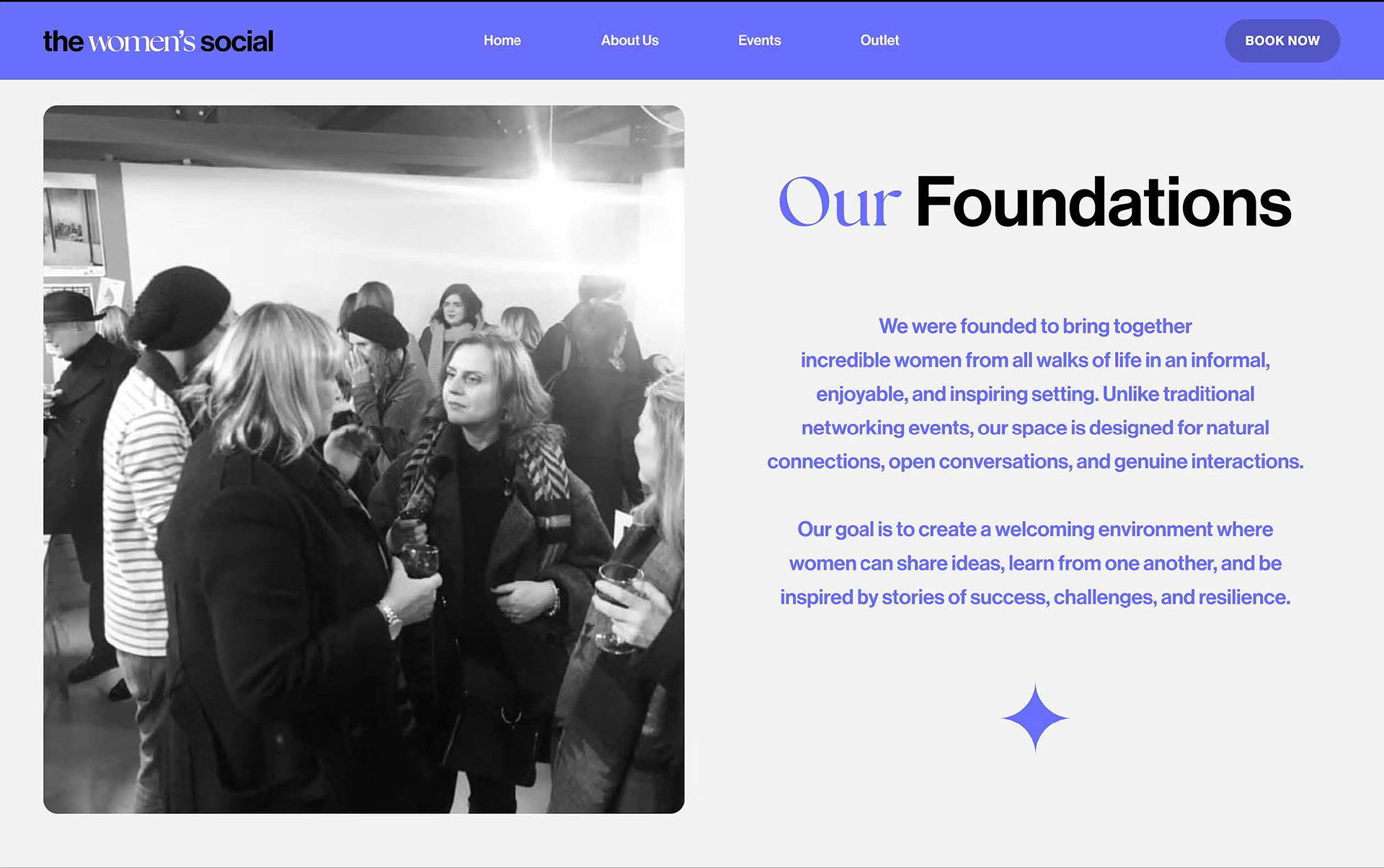
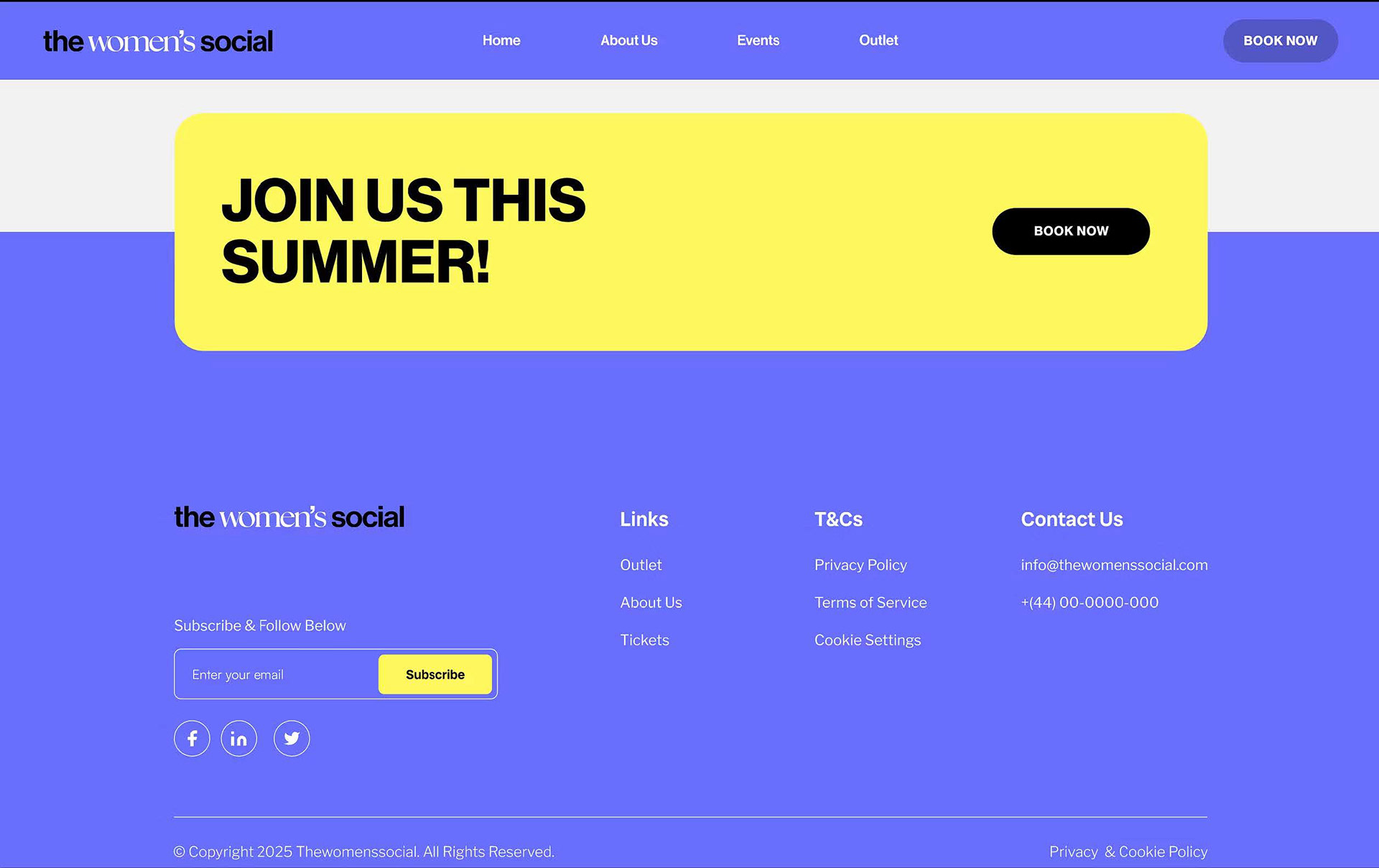
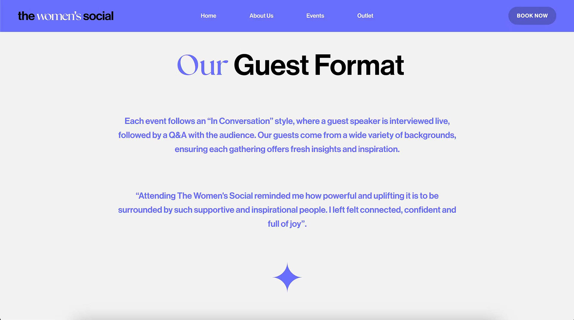
A key aspect in all brand websites is a page that tells everyone about them, their background and aims. We created simple pages that included photography from the events, this gives it a 'real' feel, as it shows interactions and socialising between people. The icons also create a nice division without breaking up the content too much, whilst maintaining a flow as all the pages link with each other.
Website - Events
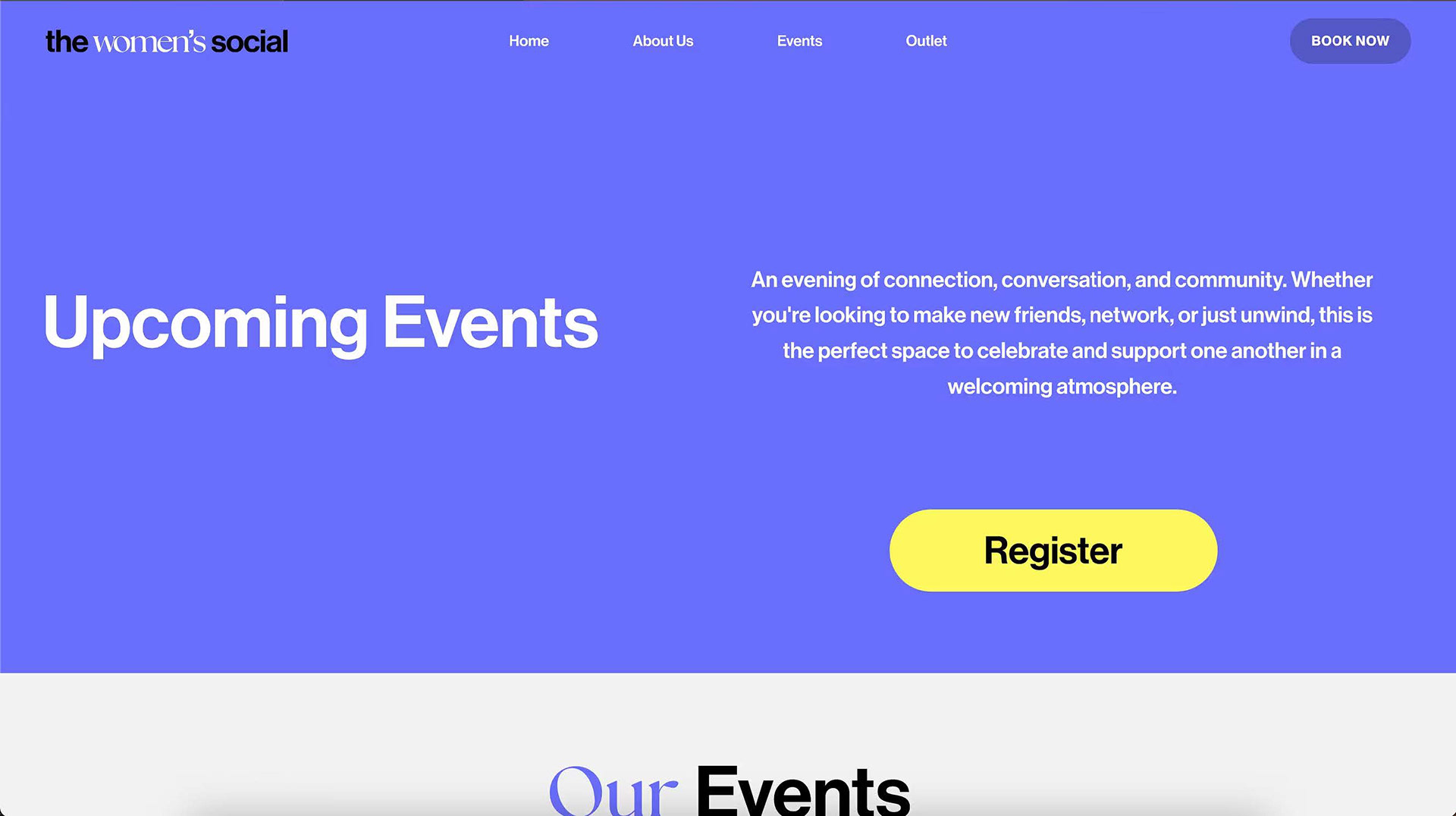
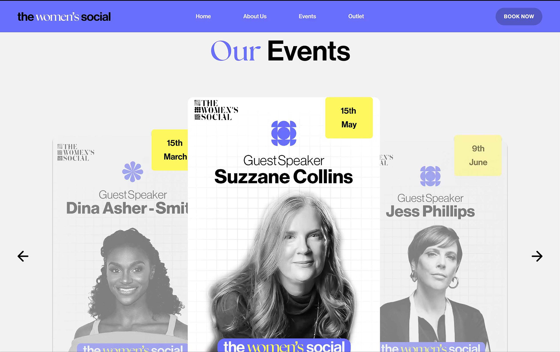
The events page is one of the most important pages and it will be the most visited page as all viewers will want to see the events and then book from there, so this had to bean interesting page. The 'upcoming pages' needs a bit of designing with some pictures and icons, but it aims to draw the viewers in and then direct them to the large and bold call to action.
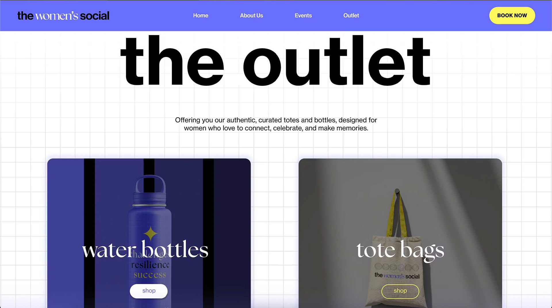
Website - Shop Page
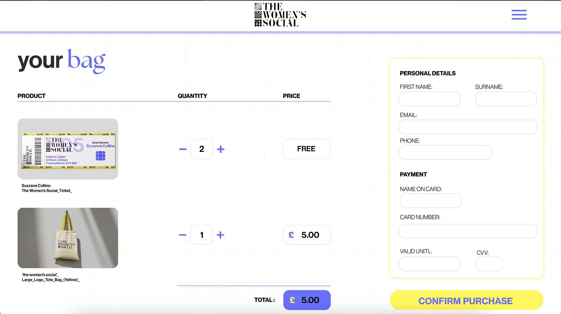
we had created merch to be sold at events and thought we could also use them to create an online shop. we wanted to create the feeling of a small stall selling a few items so we came up with the word 'outlet' which doesn't have a grand and corporate vibe. The outlet is split into categories of items rather than all items. as you click on a box you would be able to see all items in that category.