
Brief Overview:
The branding of the coffee shop aims to capture the essence of the location's rich heritage while aligning with the brand's welcoming and authentic tone of voice. The new branding should create a seamless blend between historical significance and a warm, approachable atmosphere that promotes wellbeing, community, and inclusivity.
The Team: Zachary Sparkes, Shahbaaz Zeb & Saad Fiaz
Key Deliverables:
• Refine logo concepts that capture the project's essence while aligning with the desired tone of voice.
• Develop a comprehensive brand kit that includes logo variations, colour palettes, typography guidelines, and usage instructions for different applications.
• Create mock-ups of the branding implementation, including website designs, merchandise samples, and way-finding signage.
Our Brand Story
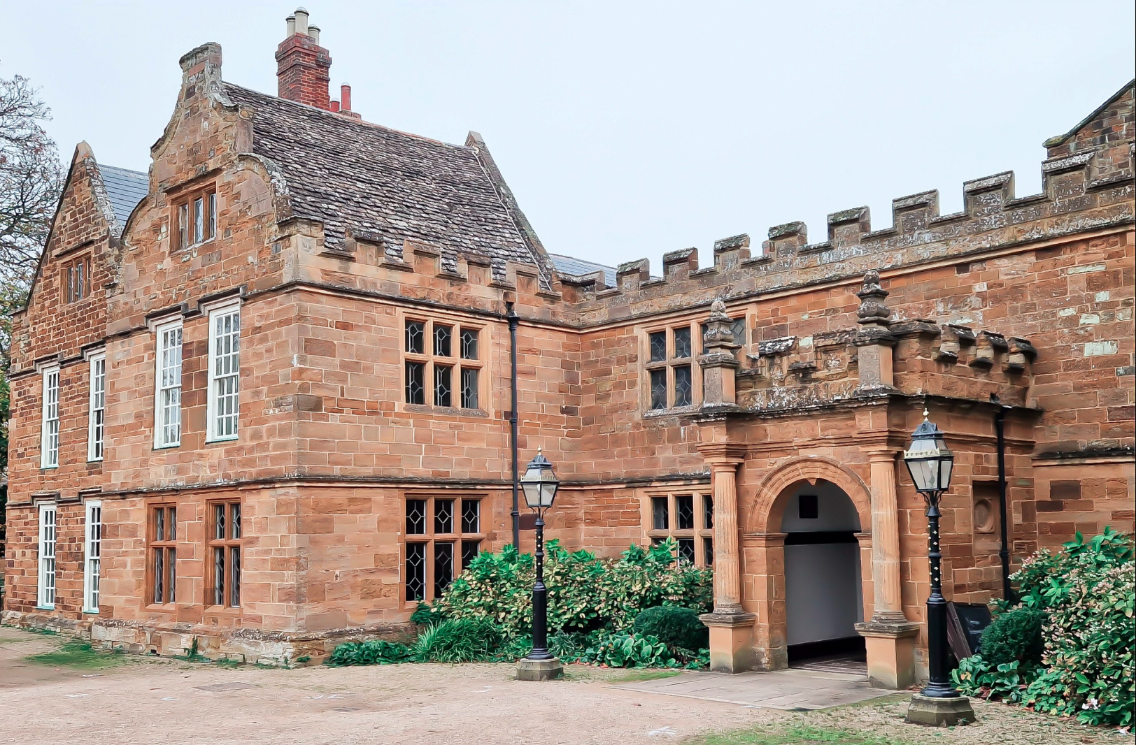
Nestled within the historic grounds of Delapre Abbey, Solace & Co. offers more than just coffee; it's a sanctuary where heritage and community meet.
Inspired by centuries-old heritage and tranquil gardens, Solace & Co. embodies the Abbey's spirit of welcome, wellbeing, and connection.
With a warm, inviting atmosphere, Solace & Co. celebrates Northampton's vibrant history while fostering a space for inclusivity and mindfulness for all who pass through.
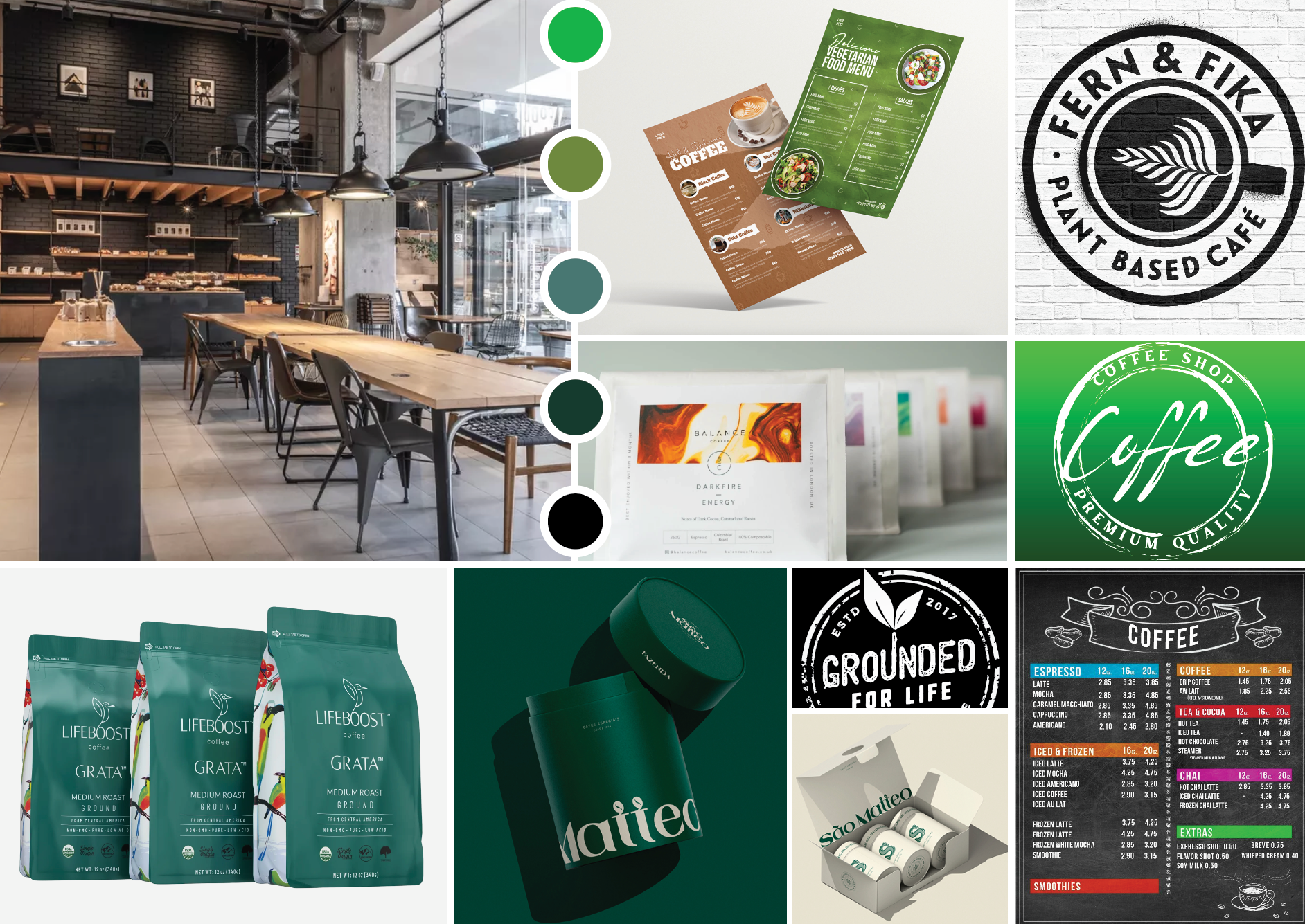
Location & Design Research
When researching and exploring current and active cafe branding we chose to specifically focus on ones which had a prominent word mark and typeface used consistently throughout their identity and various brand touch points. This inspiration was then used to form the ideation and creation of our own brand identity.
Some photography taken when visiting the Abbey to use as further branding inspiration. The Eleanor Cross (bottom right) and its historical significance became the key focal point for building a narrative for the final cafe brand. The flowers and other greenery also became an extension for brand assets and material.
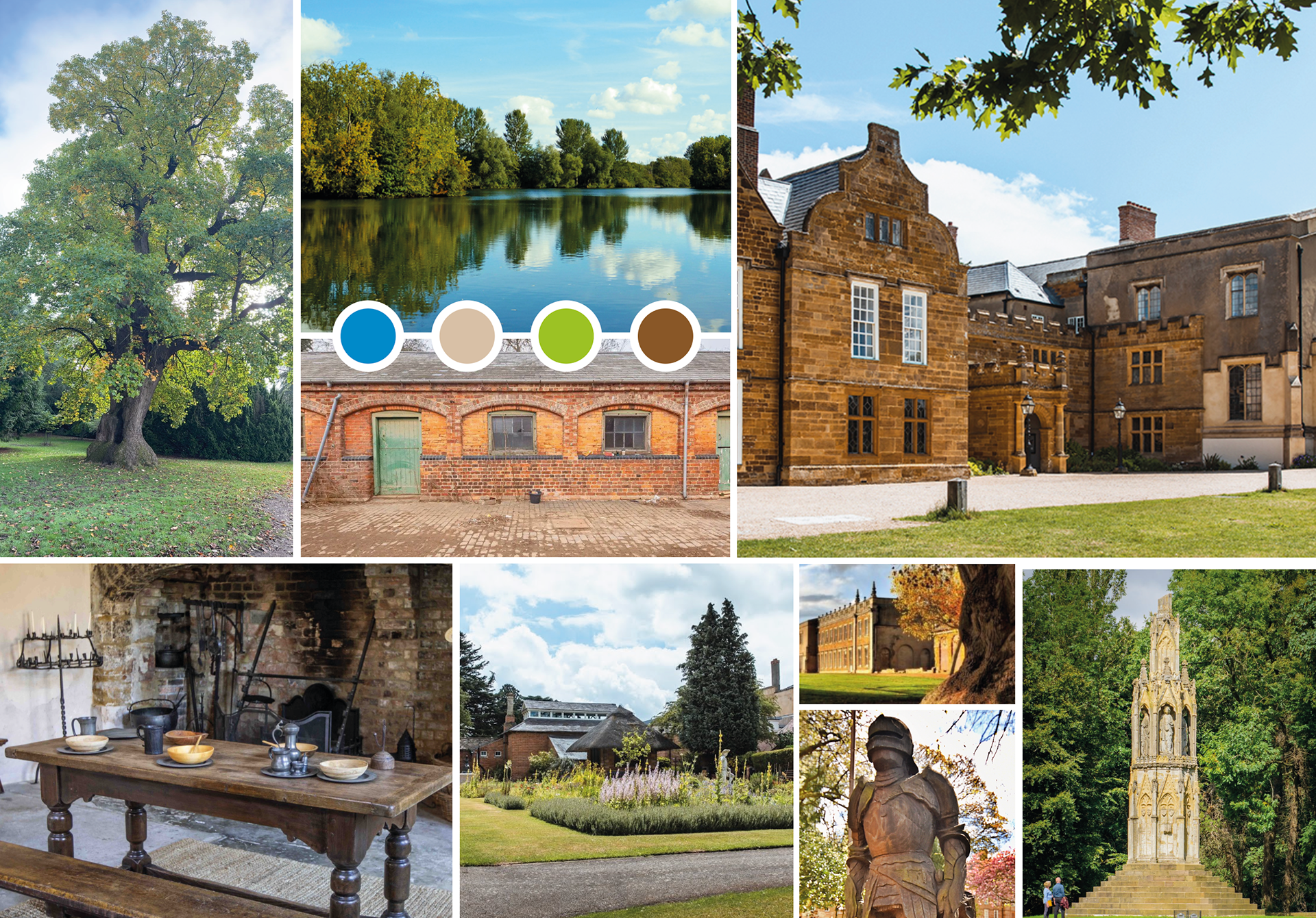
Location Photography
Design Inspiration
Logo Outcomes
The logomark conveys values of community, growth and comfort through its simple and geometric structure. The circular shapes symbolise community where each individual plays a role i.e each circle together makes up the logo mark. The use of circles is also a strategic choice as circles are natural and organic feeling shapes found in many areas of nature.
The simplicity and clarity convey an inviting & trusting atmosphere that aligns with Solace & Co.'s focus on community and comfort. The bold, clean typeface speaks a contemporary edge which is where the future of the Abbey is headed. The kerning of the letters have been kept quite tight in order to further convey a feeling of community.
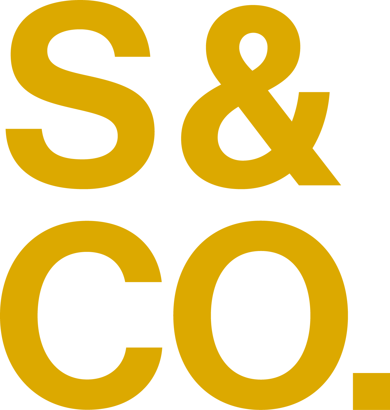
Primary Logo


Secondary Logo
Stacked Logo
Icons


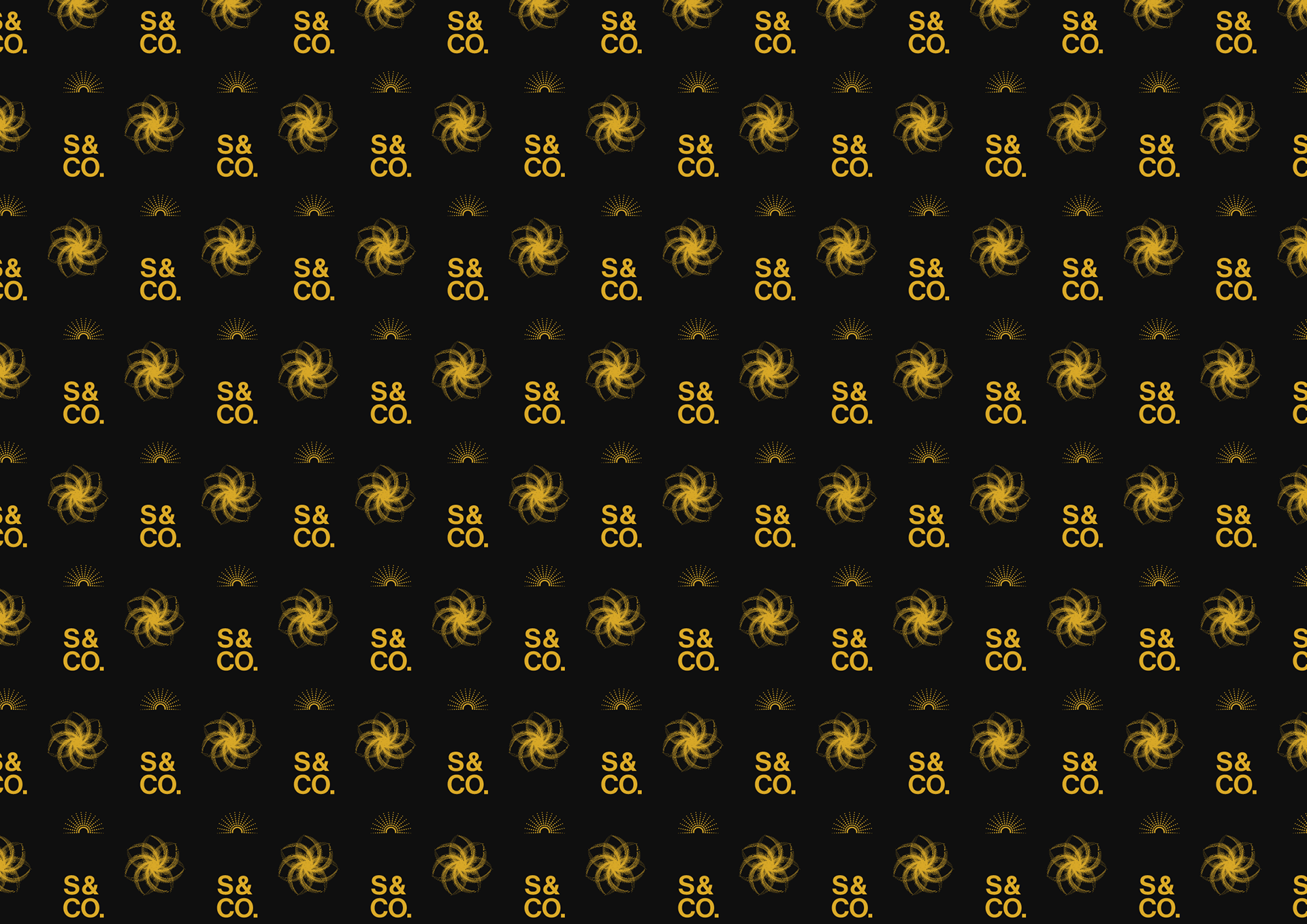
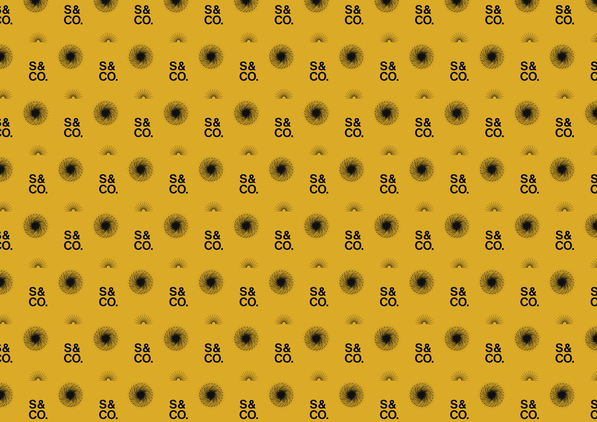
Brand Patterns
Our Menus
We ended up with 2 menu designs, these would be found on each table in the cafe, and not only be nice to look at but easy to read. This menu is very clutter-free, with information in a clear font spaced out to give each item its own space. The headings in a clear, clean and large font in a different colour mean that they can be seen the moment the menu is opened, which allows ease and comfort for the customers.
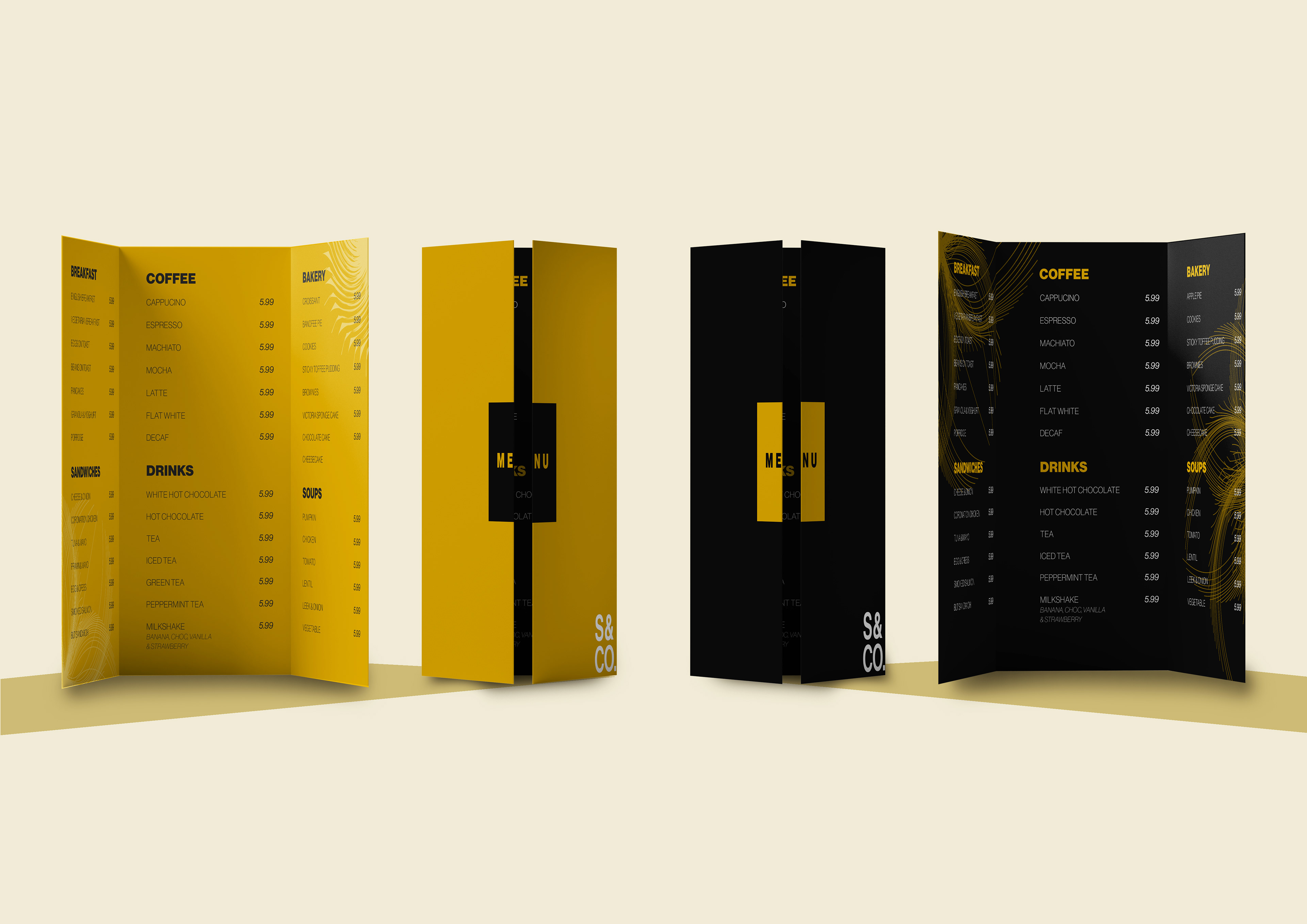
Main Menu
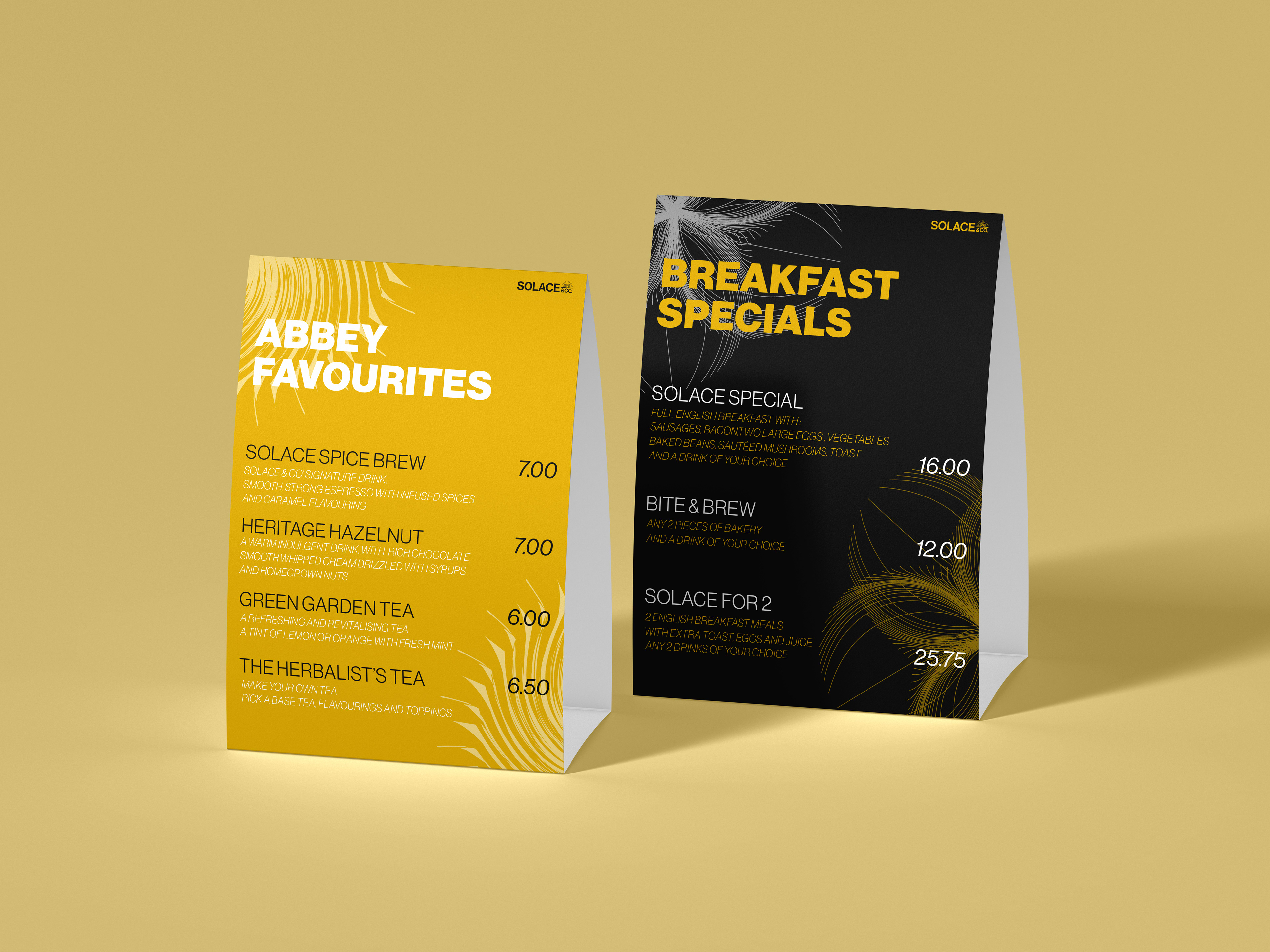
Favourites & Specials
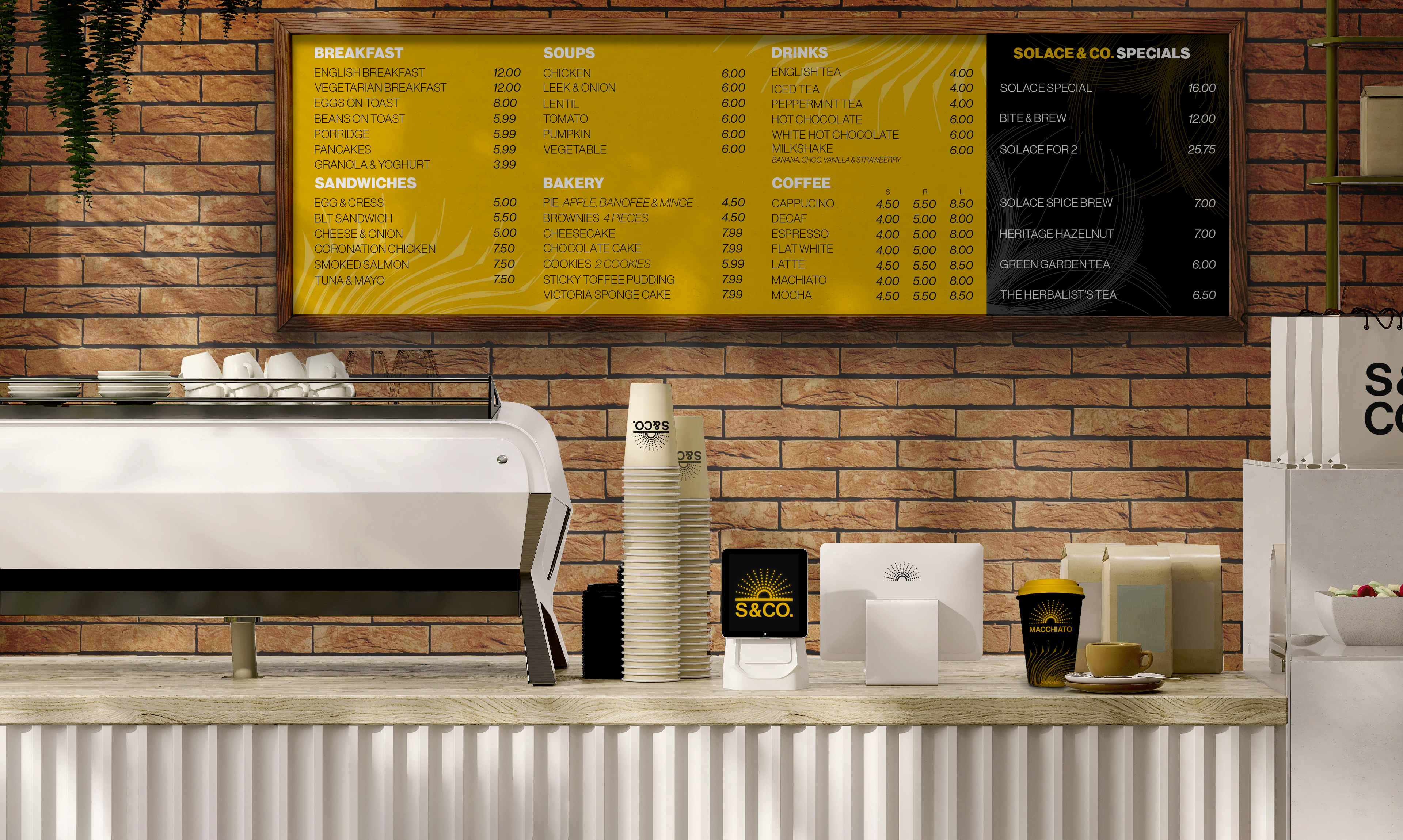
Our Menu Board
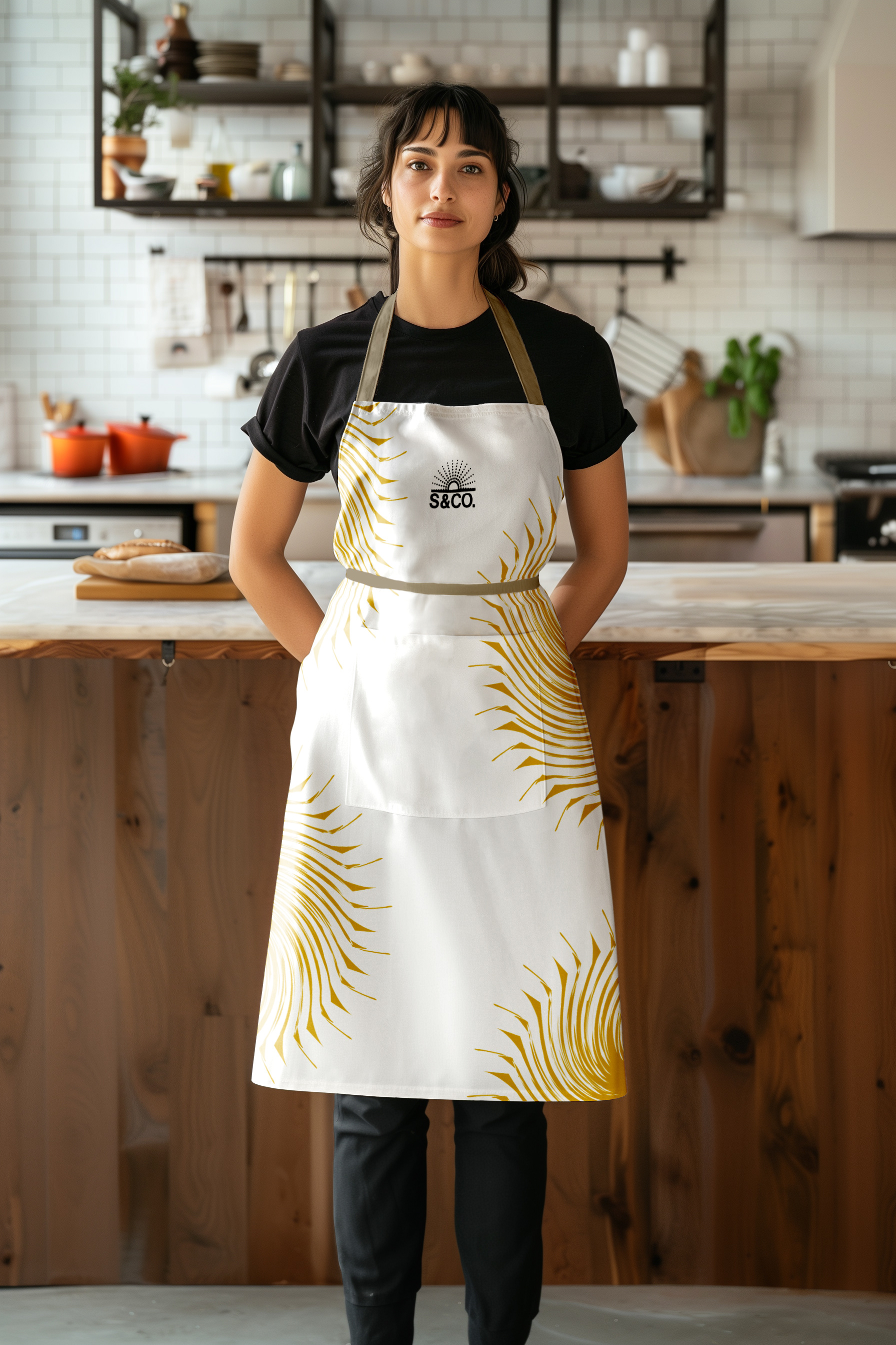
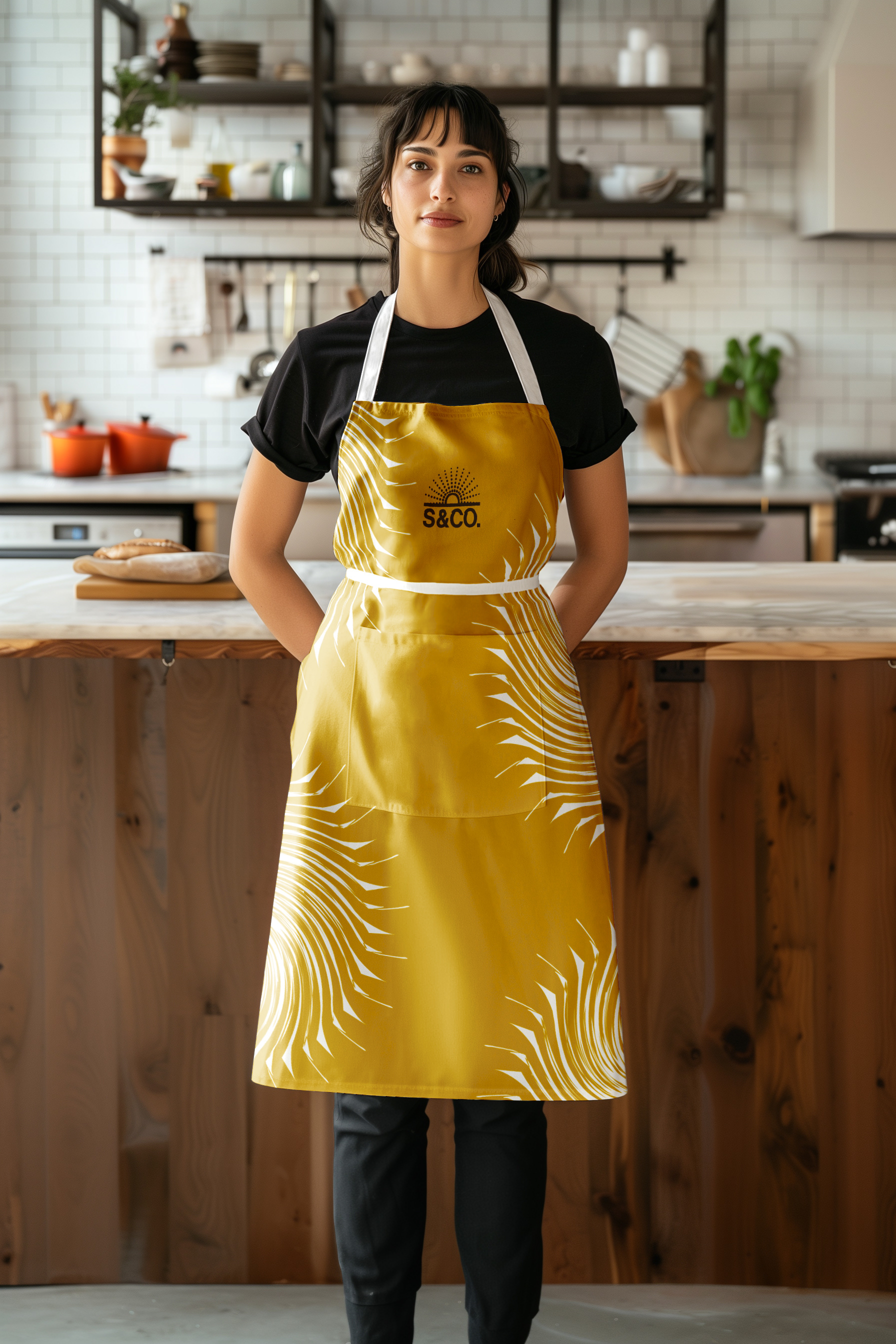
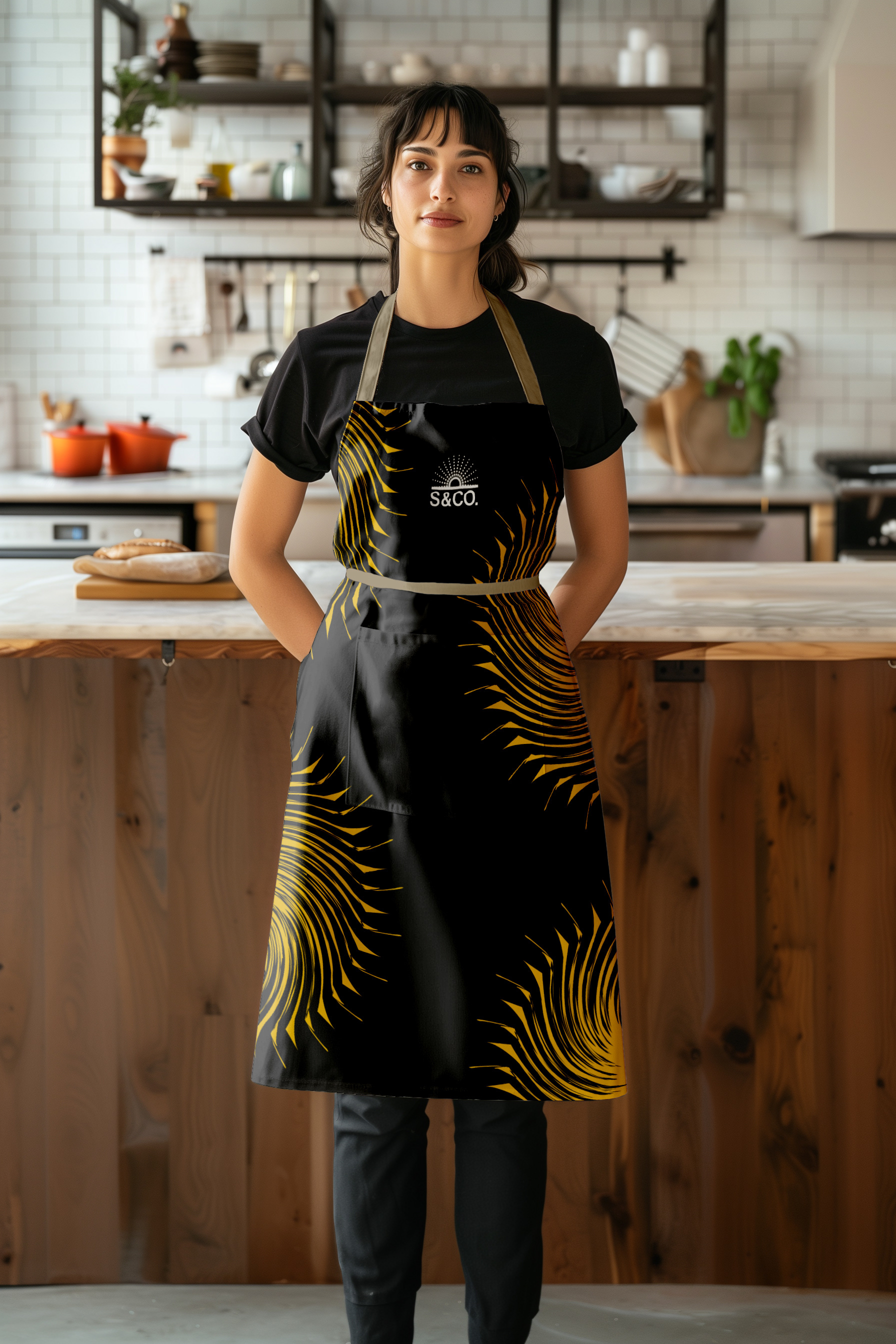
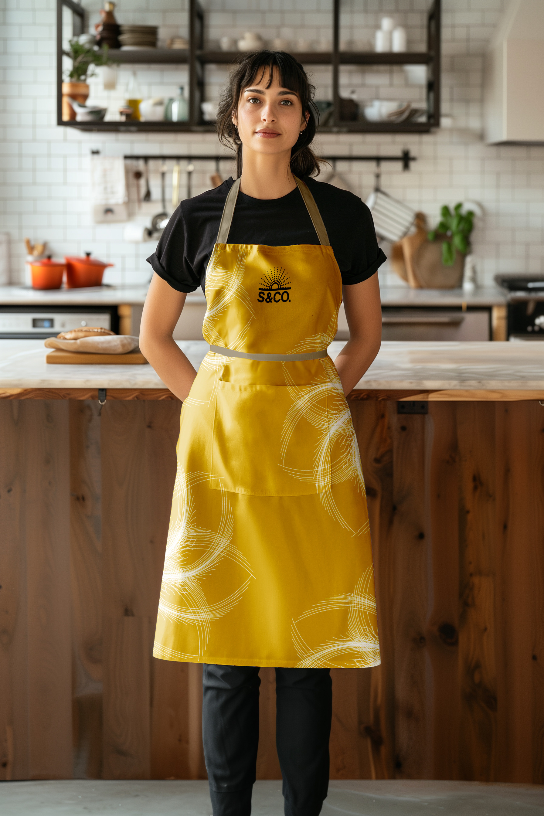
Brand Aprons
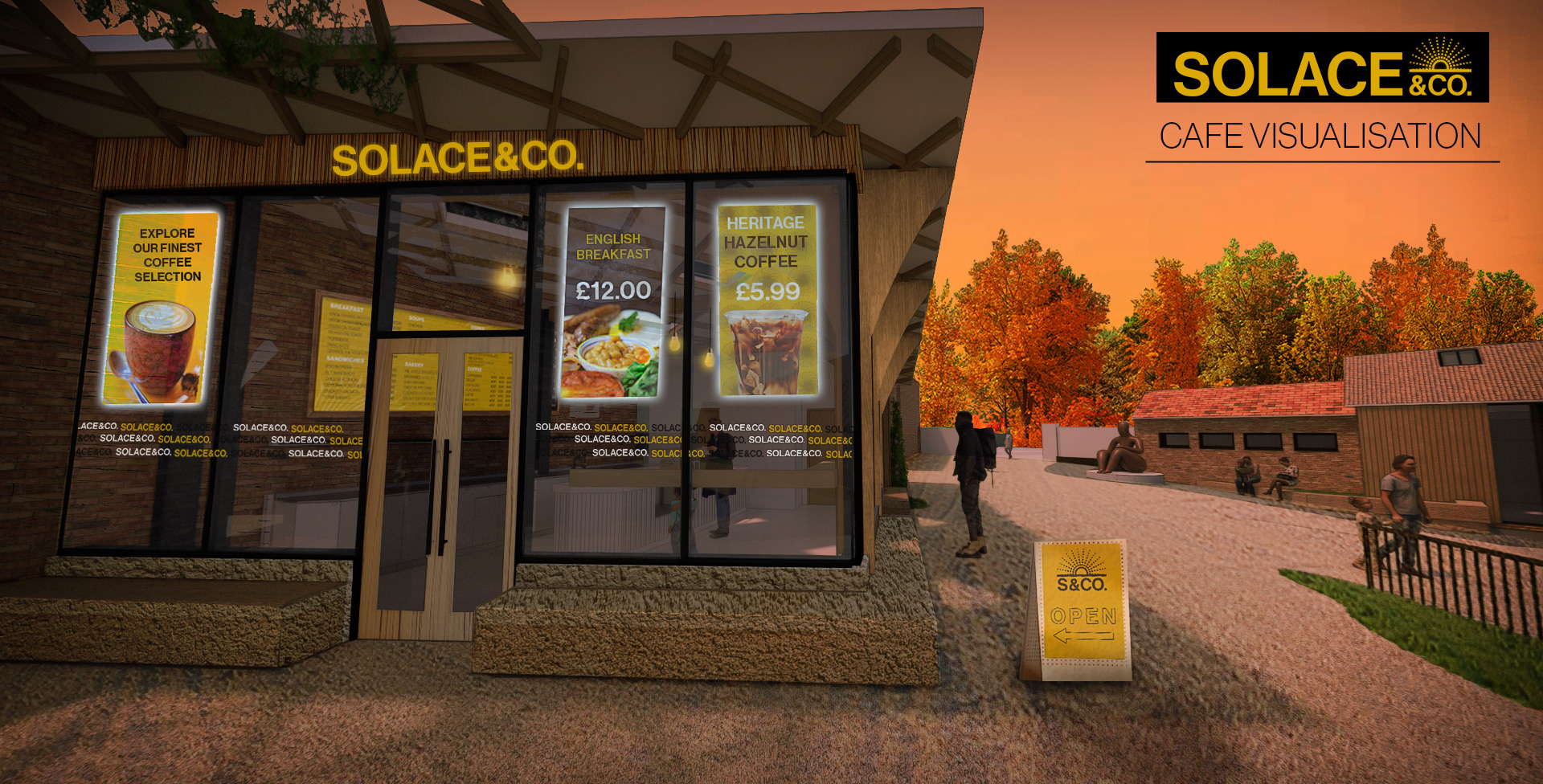
Cafe Visualisation
This is a 3D visualisation of the Solace & Co. cafe, using 3D concept images provided by the clients. This was an ambitious task, but really fun as it gave us a glimpse of what the cafe could look like with our branding.
The warm lighting, posters on the outside and signs pointing to the cafe create a welcoming and warm atmosphere, which provides solace and comfort throughout the colourful seasons of the cafe. The challenge was getting the perspective right and keeping the outcome high-quality as the original image was very low resolution and blurry.
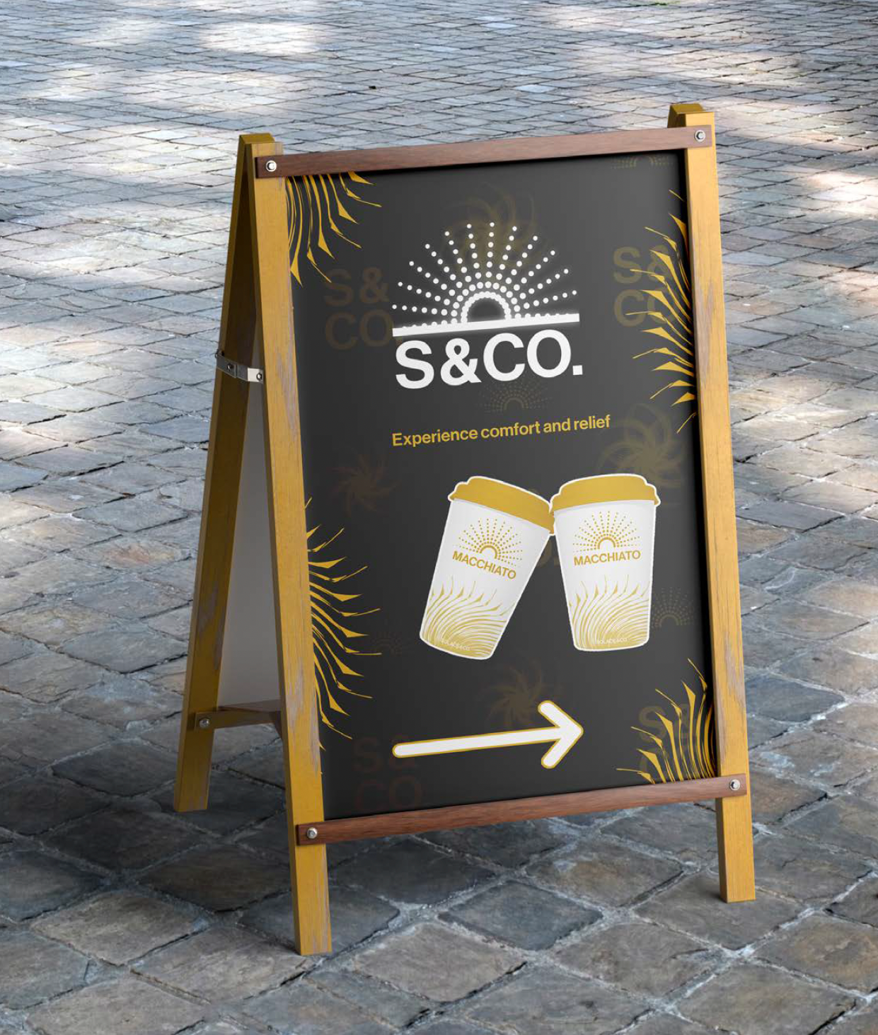
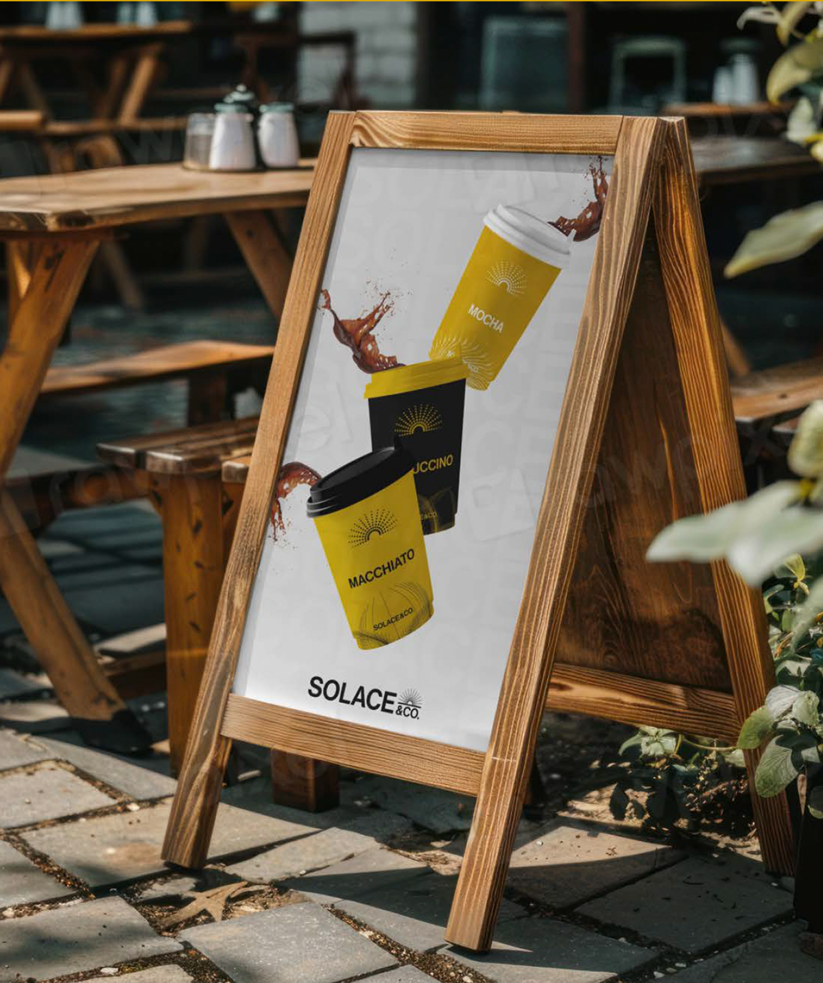
Solace & Co. Signage
Our signage shows the realistic aspect of our brand visuals. Our specific design on our signs portrays the practical communication through our creative identity. We wanted our signage to show you the floral patterns and extra brand furniture. In addition to that, the colour scheme and playful imagery were used to create that comforting and inviting feeling.
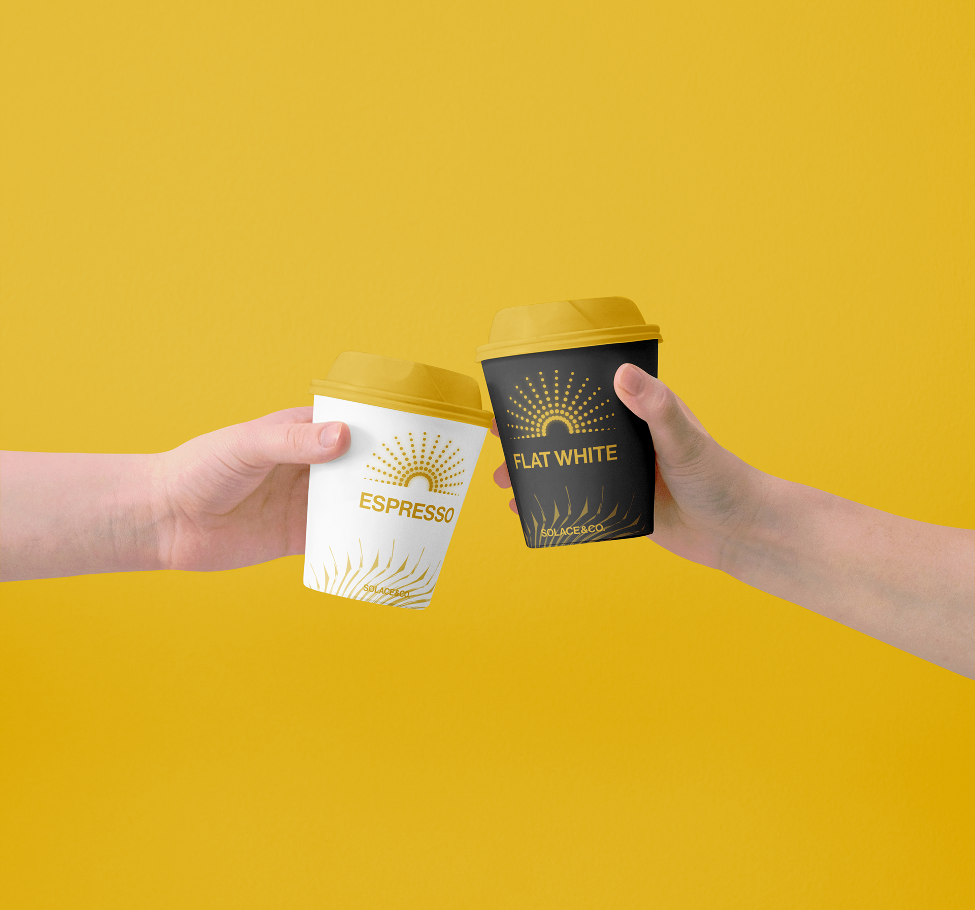
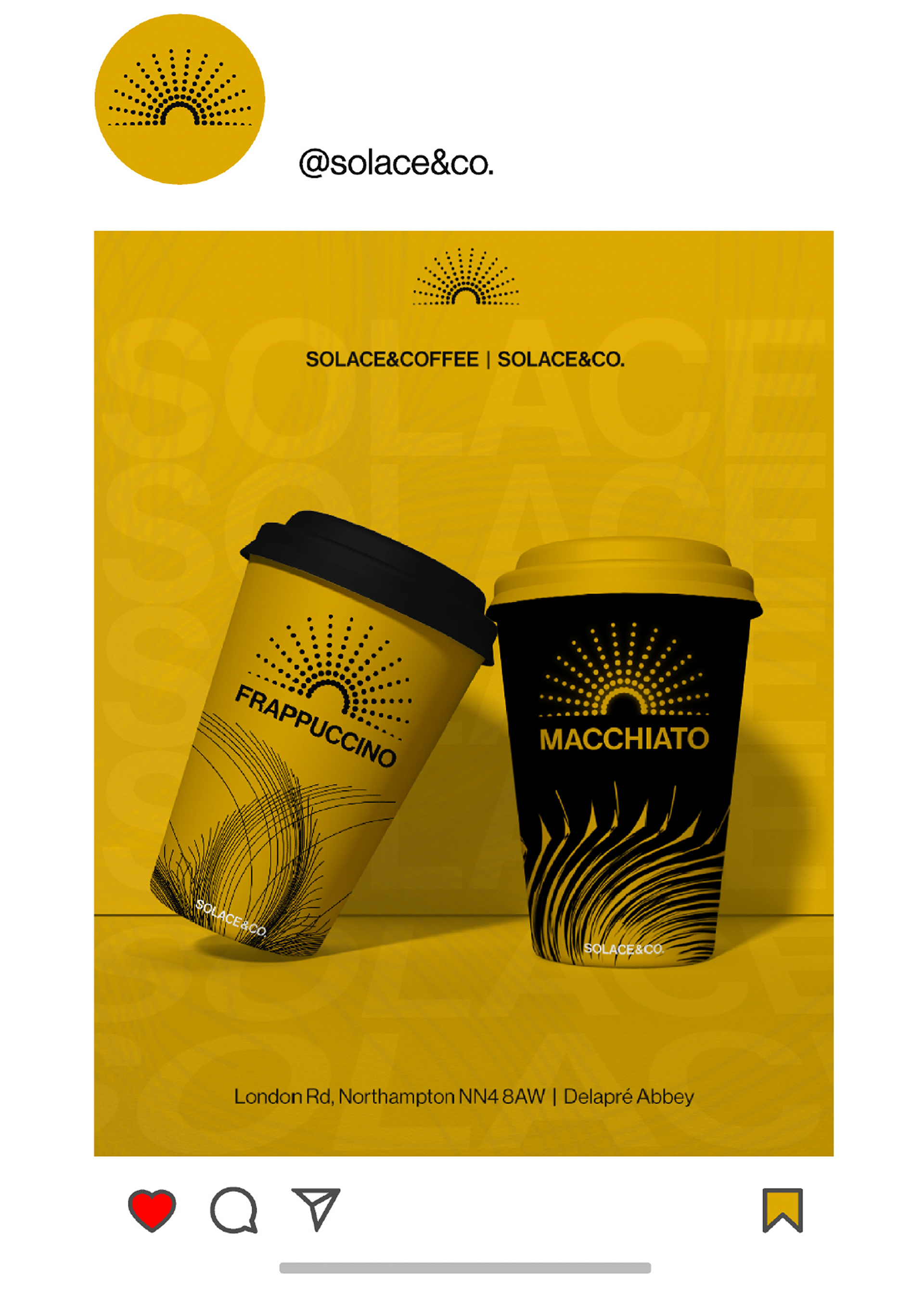
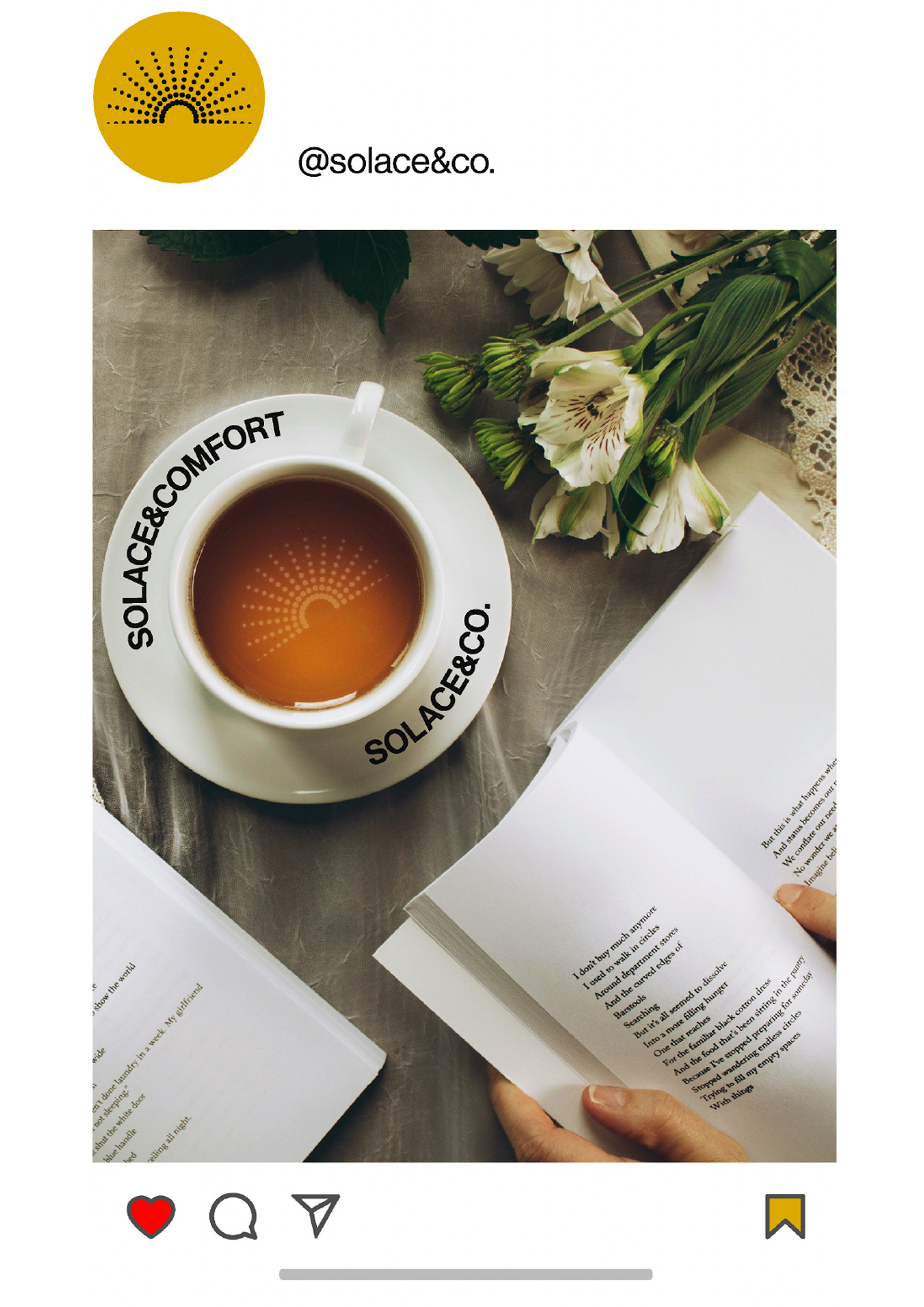
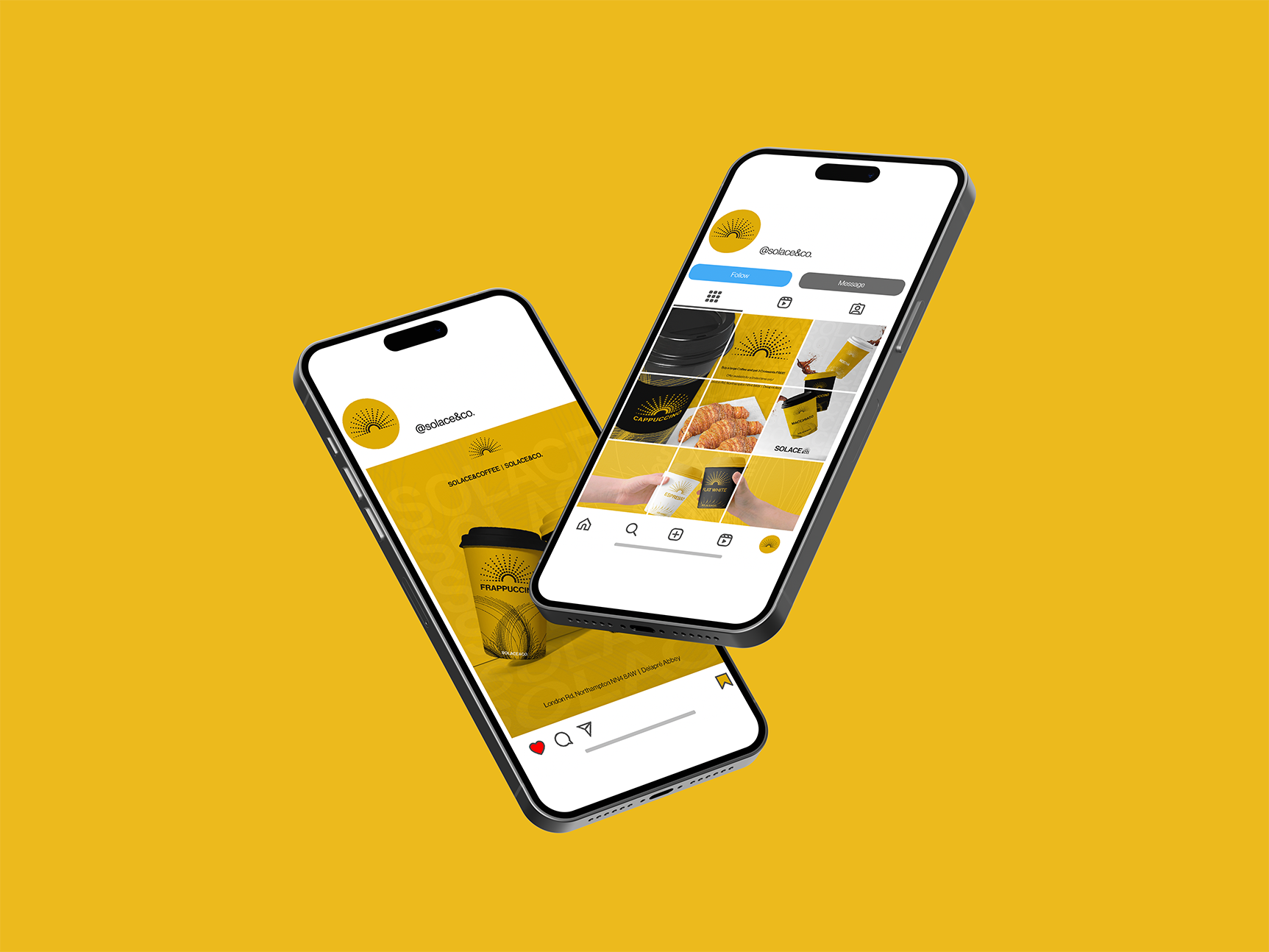
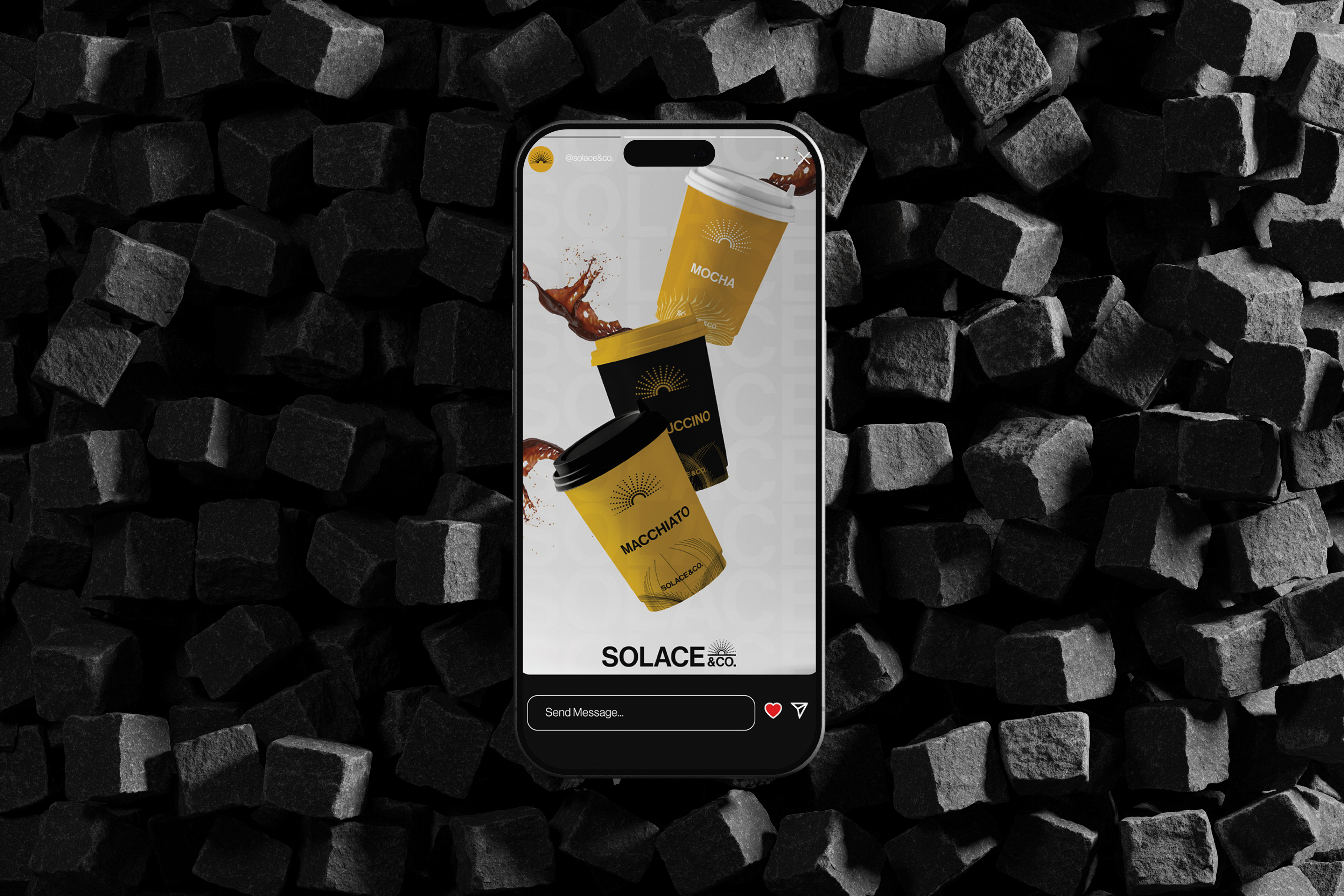
Packaging & Social media
Our packaging and social media gives you and us an alternative way to communicate our ideas through our illustrations and various designs. In our posts online, we wanted to show you purpose of going to Solace & Co. and why our values and visuals stand out. As well as producing three examples of our Instagram posts, we also wanted to show the grid layout and how our social media would look at a different angle or view.
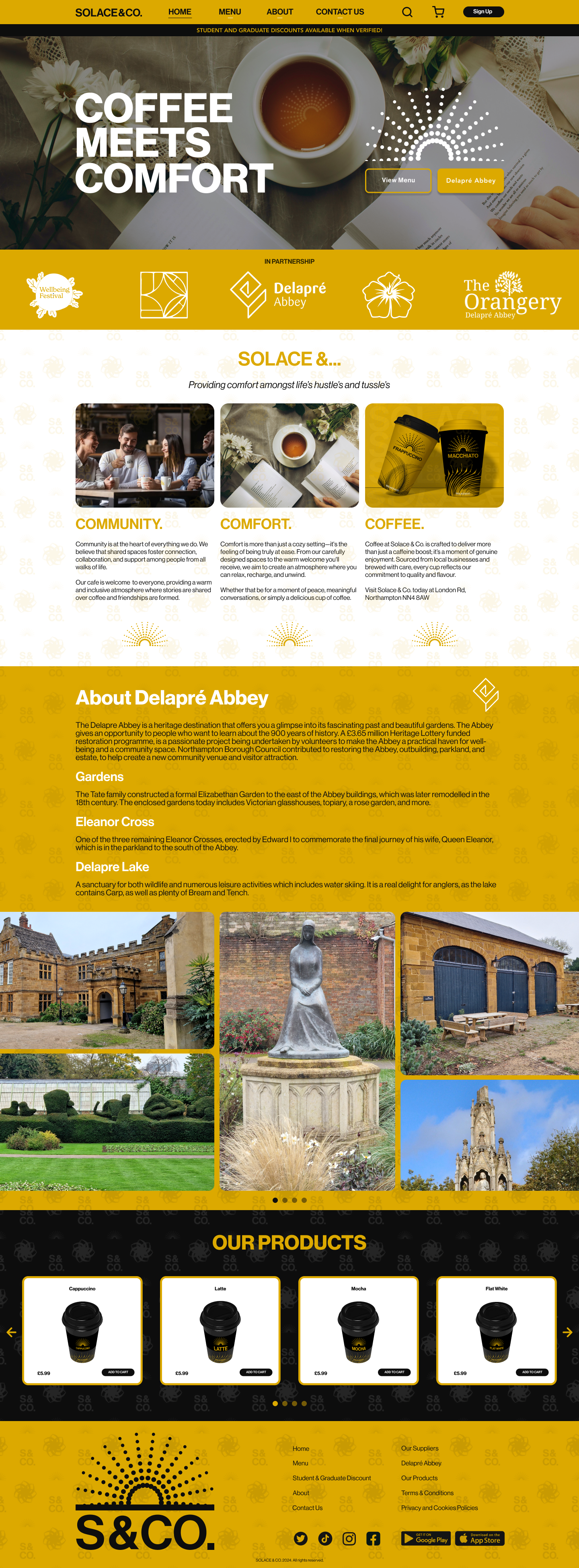
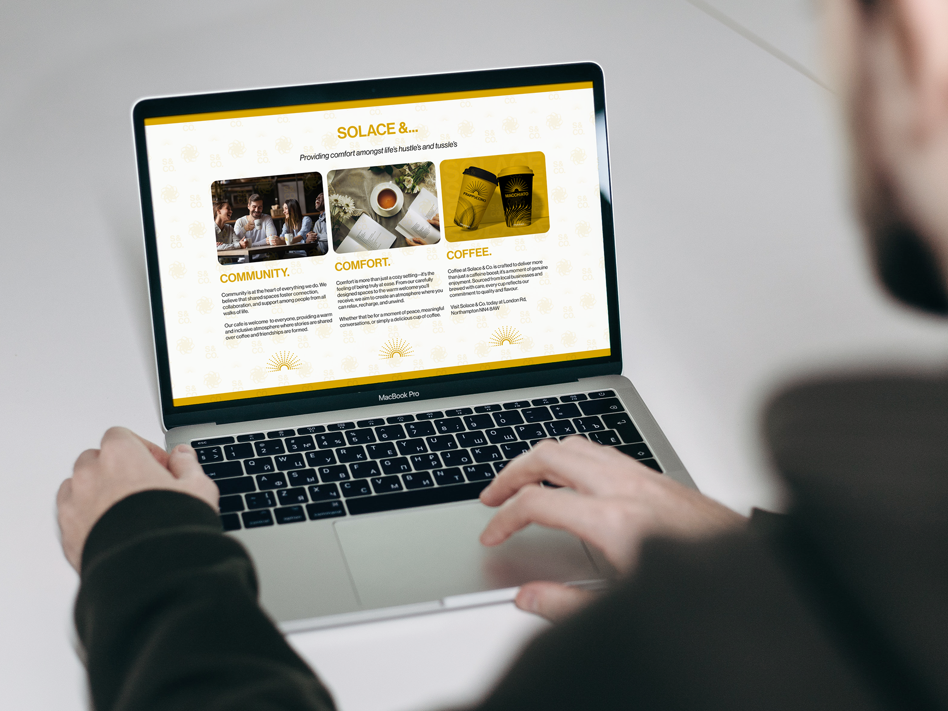
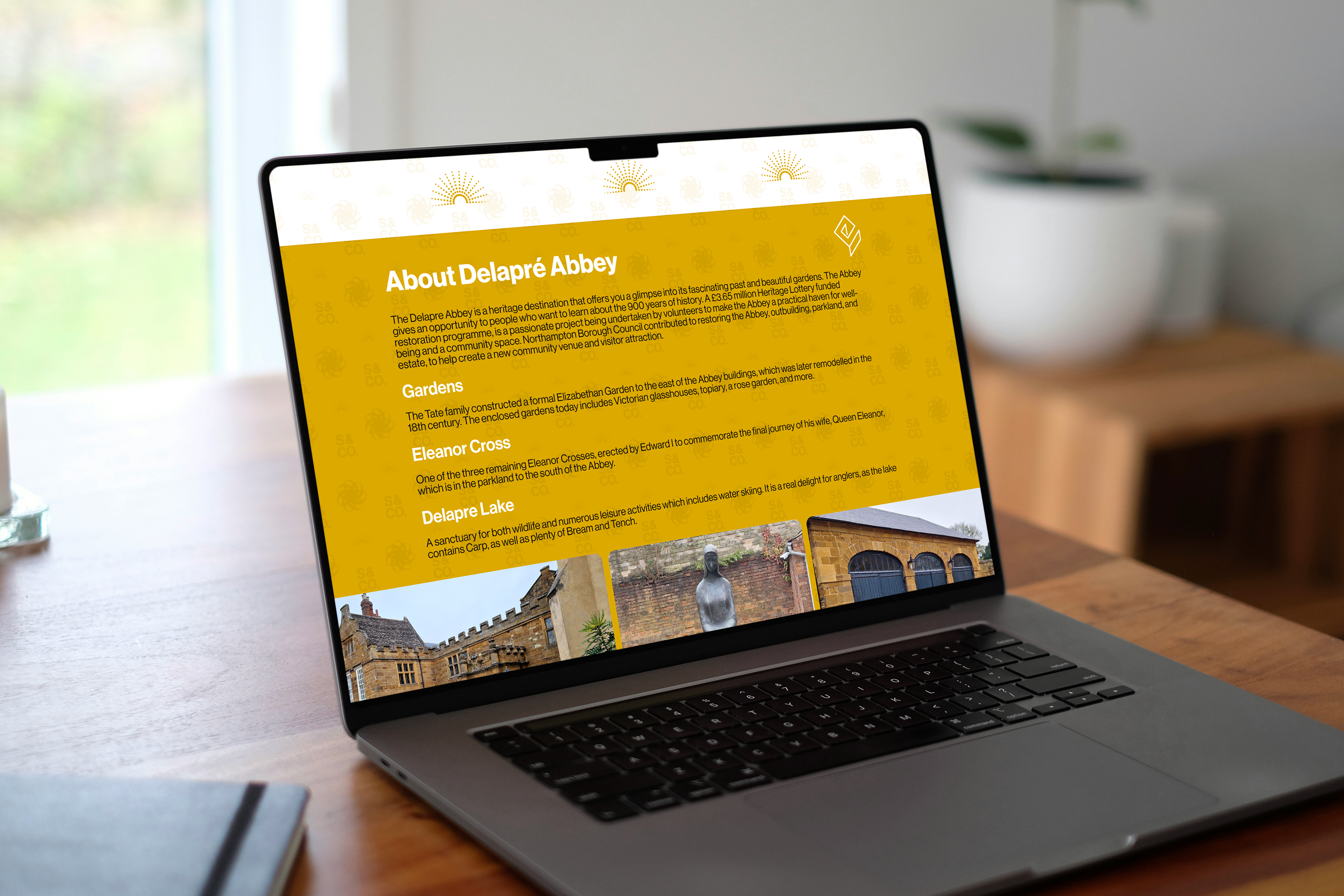
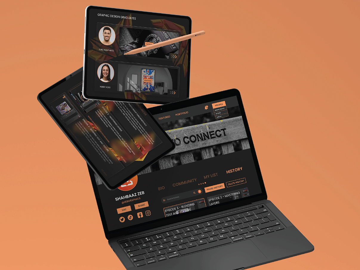
Our Webpage
The webpage gives you the opportunity to access more information about us, especially what we value. The site gives you useful tools to access, for example, information about our brand, the menu and how to contact us via our social media.
Our homepage contains knowledge and details about the history of the site. In the middle of the site, we included some photographic imagery that we took at the Abbey ourselves. This is because we wanted to show what is interesting and unique about the area.