
Brief Overview:
A 2022 sleep survey conducted on university students by My Student Halls outlined an endemic problem in the UK. The survey found that 19% of university students in the UK had an average sleep time of less than five hours each night, and 46% of the participants rated their sleep as fairly-bad or bad.
My Solution:
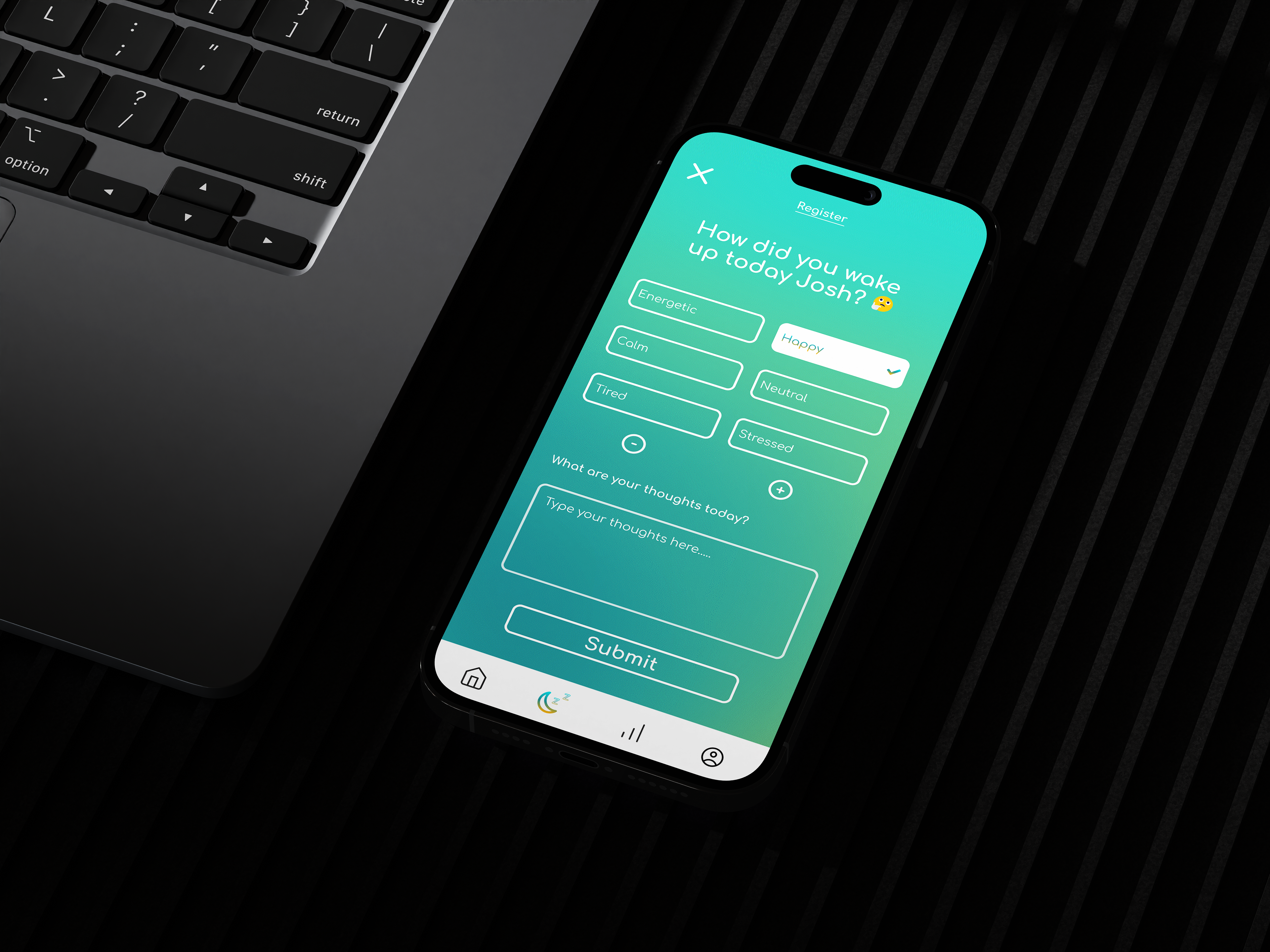
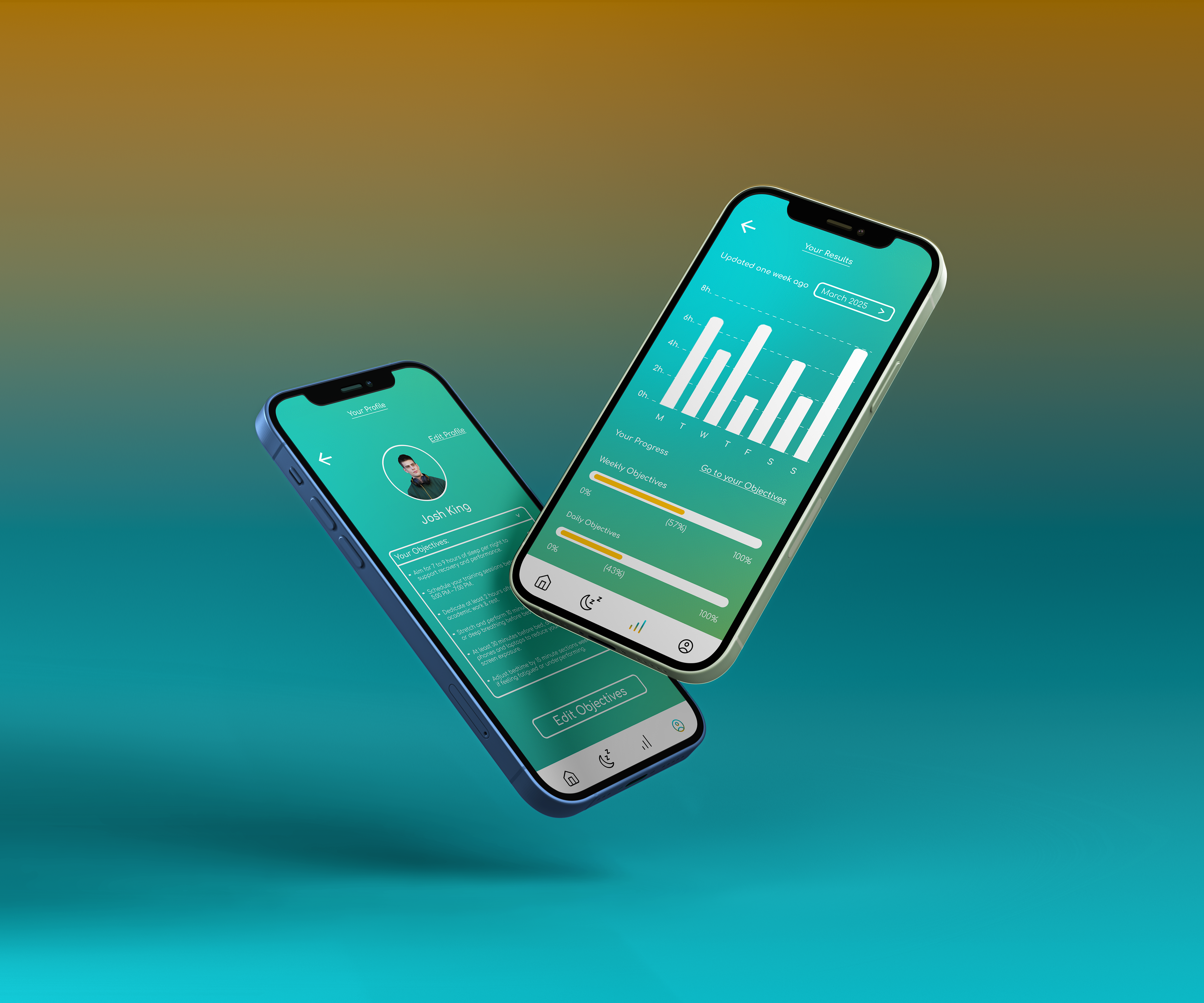
NapFlow provokes better sleeping habits for students via UI/UX and motion design. The app allows the user to track their emotions when they wake up as well as the overall progress of how much sleep the user gets. Every user has their own unique and personal experience from their own objectives they can edit and set.
Key Research Summary
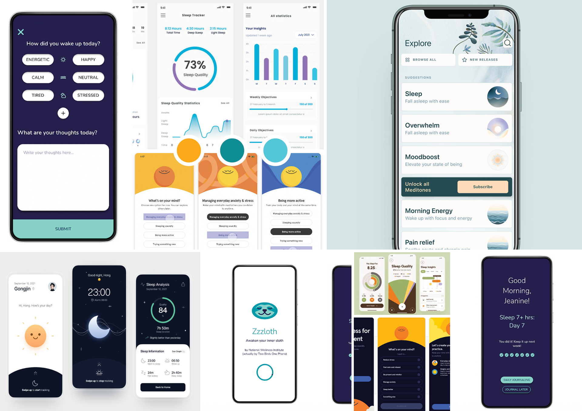
I was generating images about an app design that would relate to a sleep awareness format. My idea was based around stopping students going to the gym at late nights and sleeping instead. The student could do the exercise in the morning or during the day after a good night rest.
Overall, the research really helped my thought process when visualising how my app interface would look like.
Wireframe Development
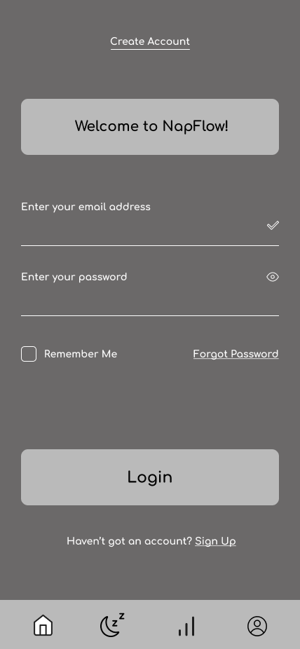
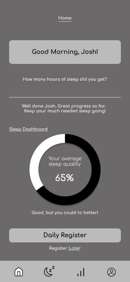
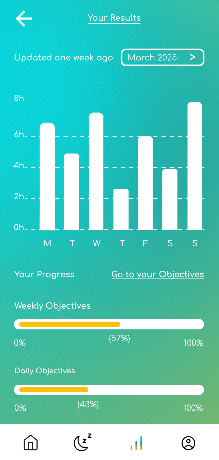
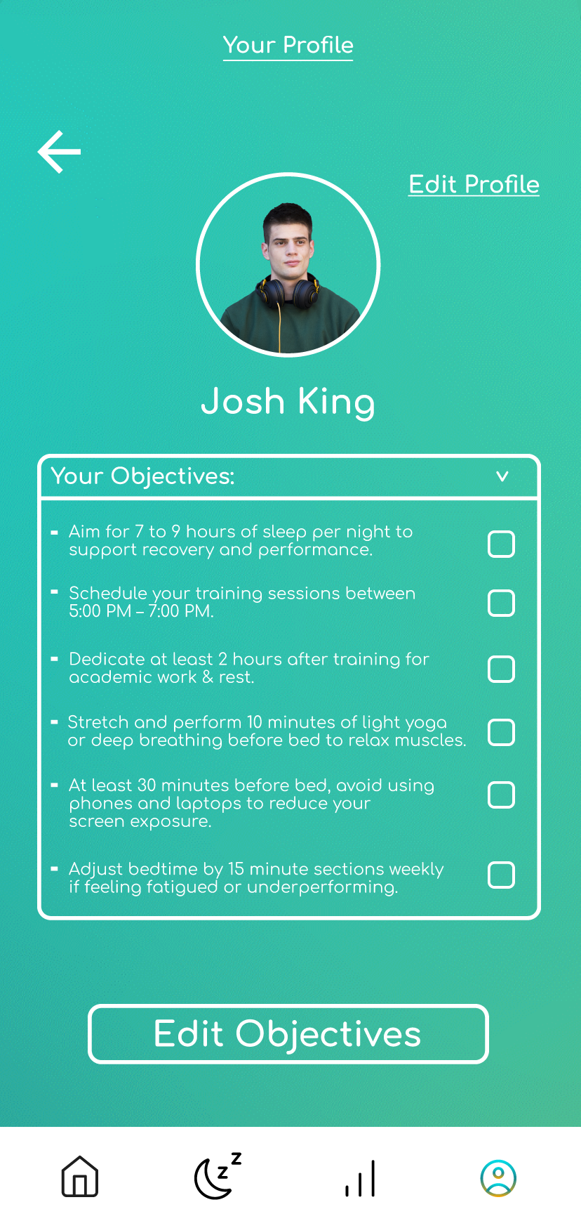
I wanted to get the refined structure in all of the wireframes before advancing to the stage of adding the colours and styling. I made some minor changes that weren’t picked up in a critique session. For example, the progress bars I changed to make them animate. In addition, the objectives panel of the profile page, operates as a drop down menu as well, in the aim to boost the interactivity and the user experience.
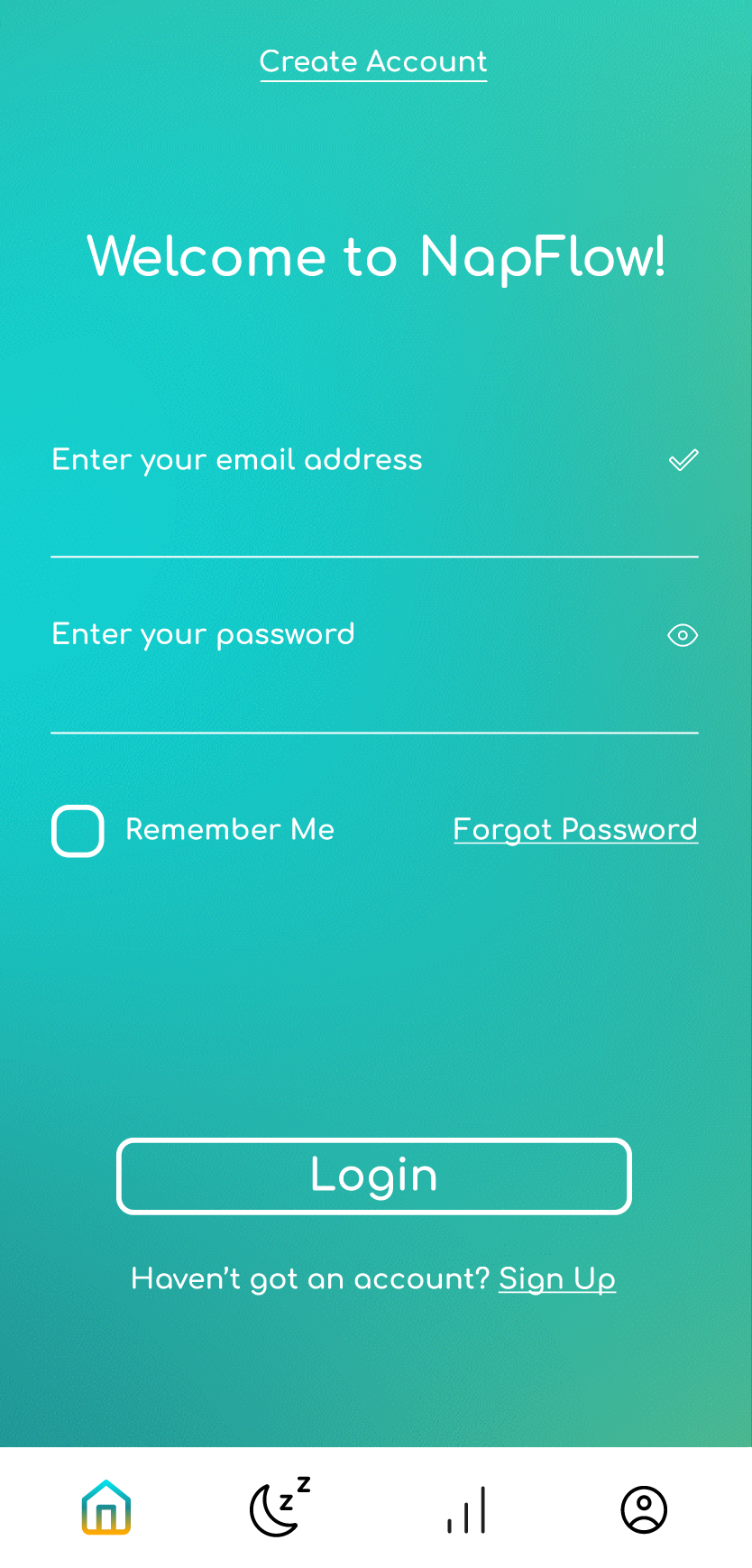
Login
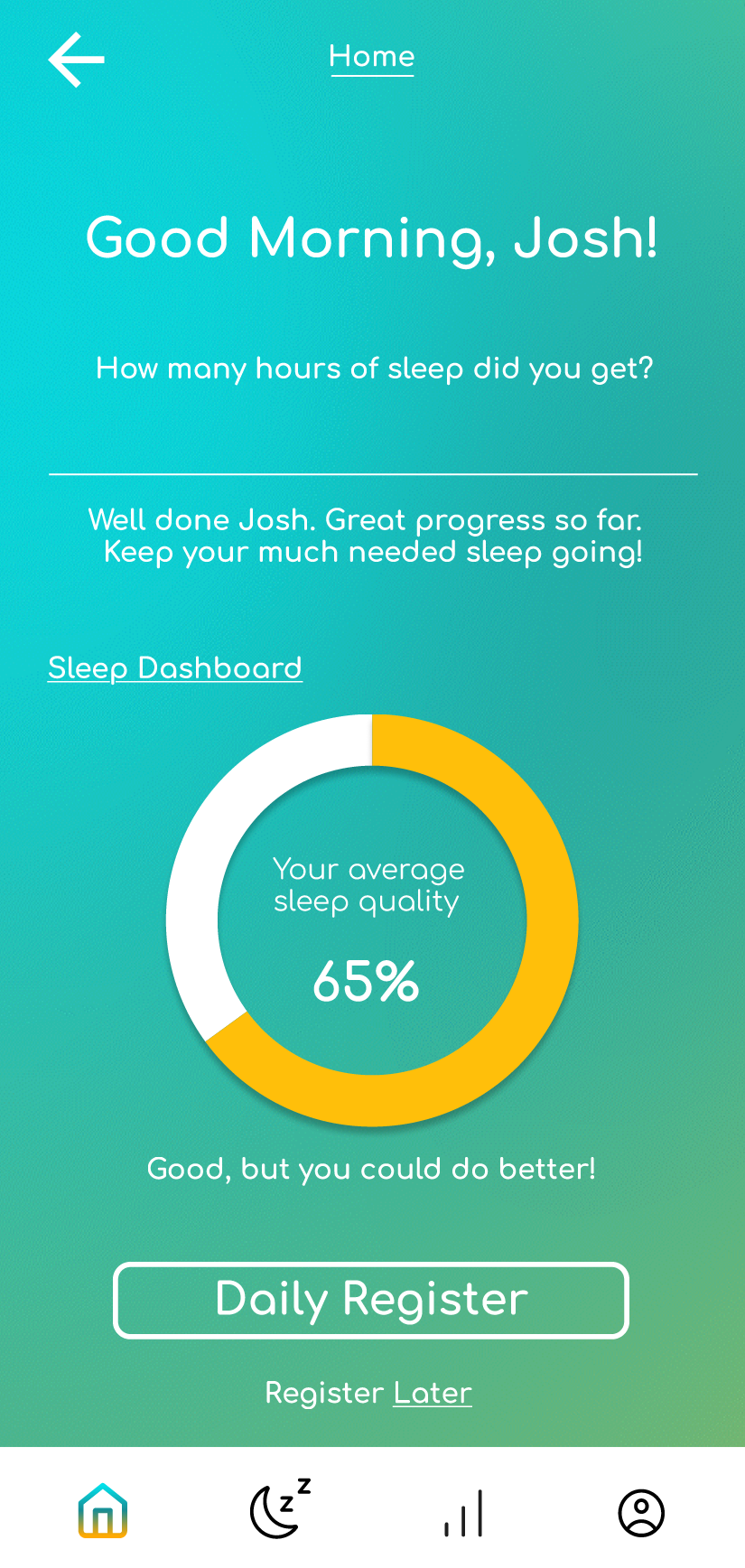
Home
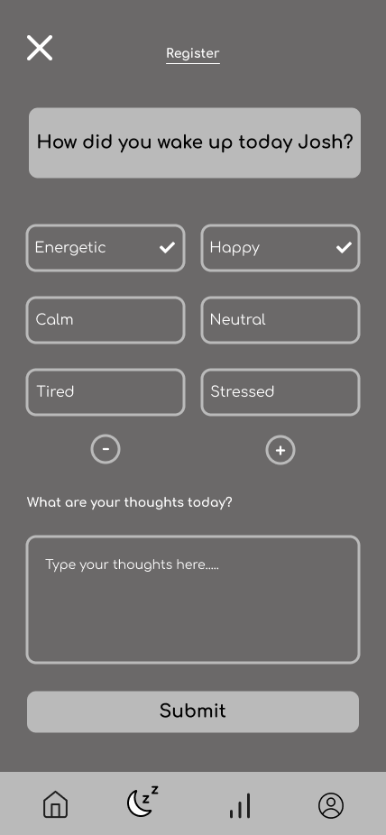
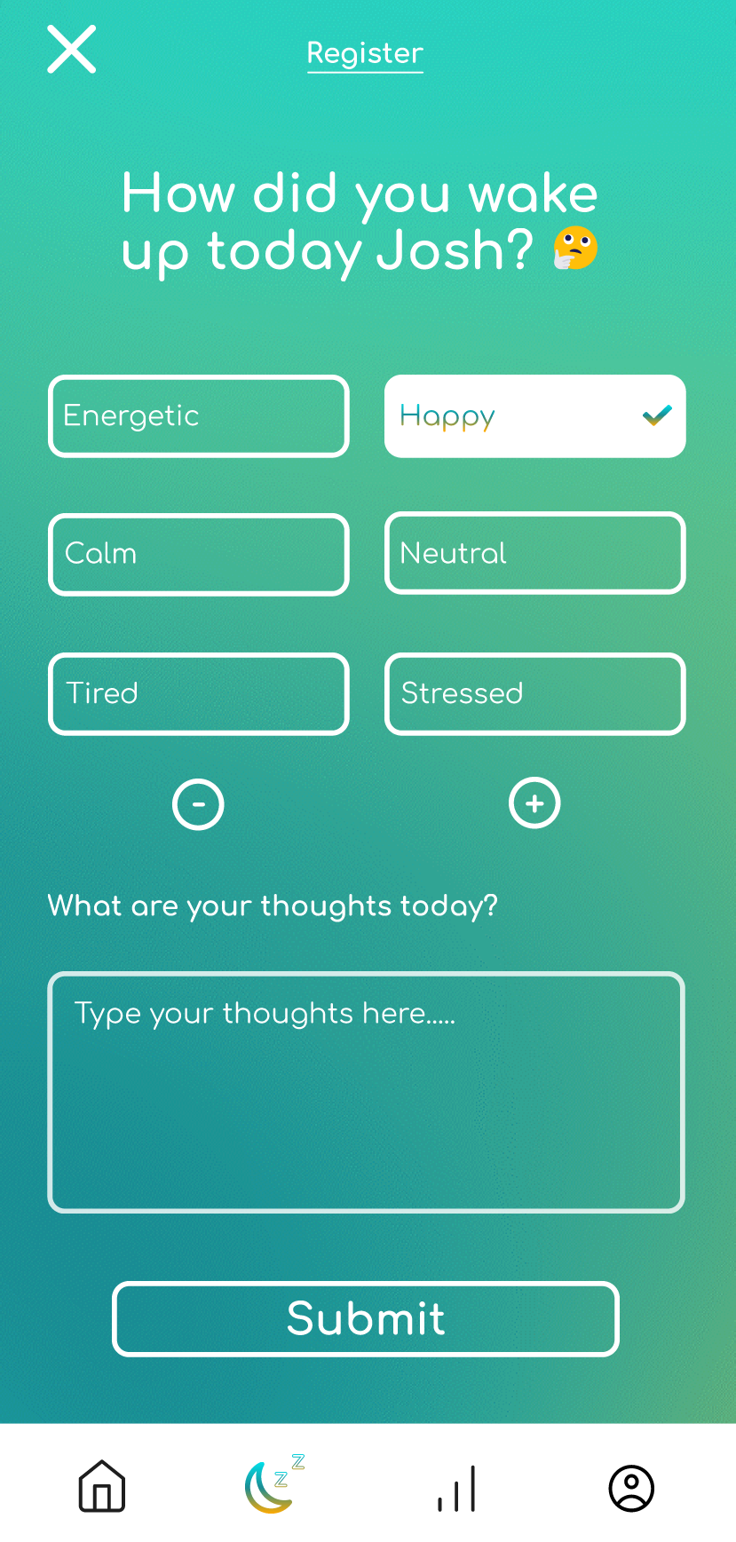
Daily Register
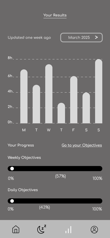
Results
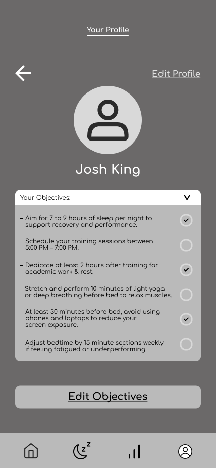
Profile
Font & Colour Choice
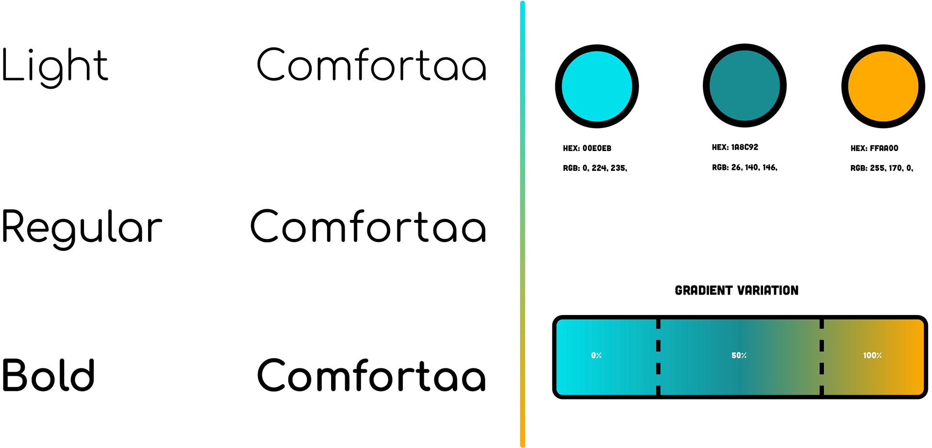
I picked the typeface "Comfortaa” because the font displays fun and engaging connotations. I thought this would go perfect with my app because I want to encourage students to use this app through the aesthetic appeal.
I decided to choose the dark green and the cyan because I thought they worked successfully together in the gradient. I chose the orange as part of the colour way because I wanted a colour to stand out and positively link with the darker colour.
Icons & Buttons Overview
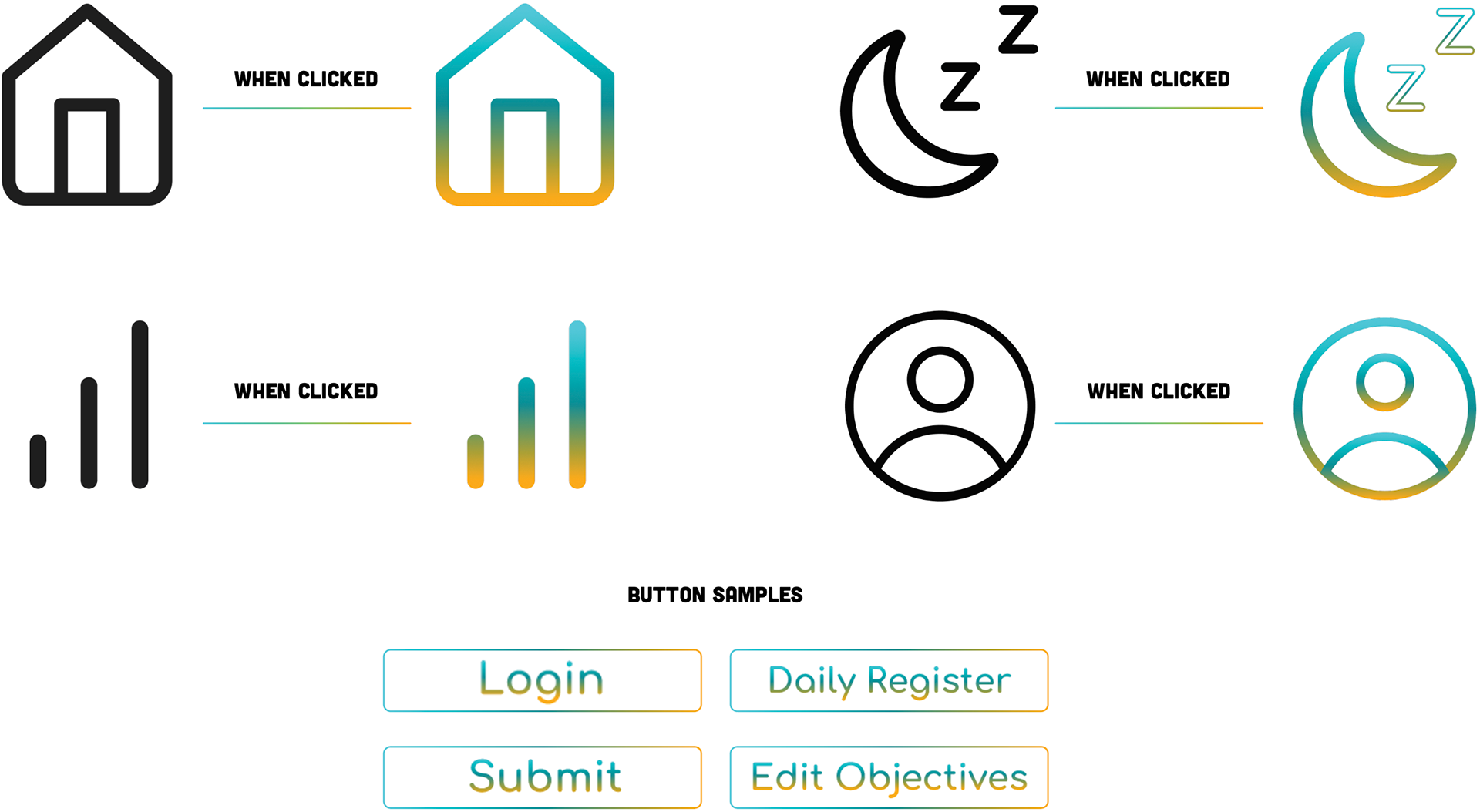
I created icons from my homepage to interact because I wanted to engage the user and look aesthetically pleasing. The gradient for the user goes right the way through the whole interface with the additions of the buttons as well.
The buttons are interactive, when the user hovers over the tool. The button will go from a no fill white stroke to a white button with the gradient stroke on the type. That is on all of the buttons to keep the consistency right the way through across the whole of the app’s interface.
The App Interface
Napflow contains the personalisation factor to create a unique user experience. For example, the people can put in how they are feeling after they have woken up. This will then add to their own results and profile page. Overall, the styling has a consistent use of the motion elements in the background to create a soothing visual, connecting to promoting better sleeping habits for students.
login
home
daily register
results
profile
Napflow In action
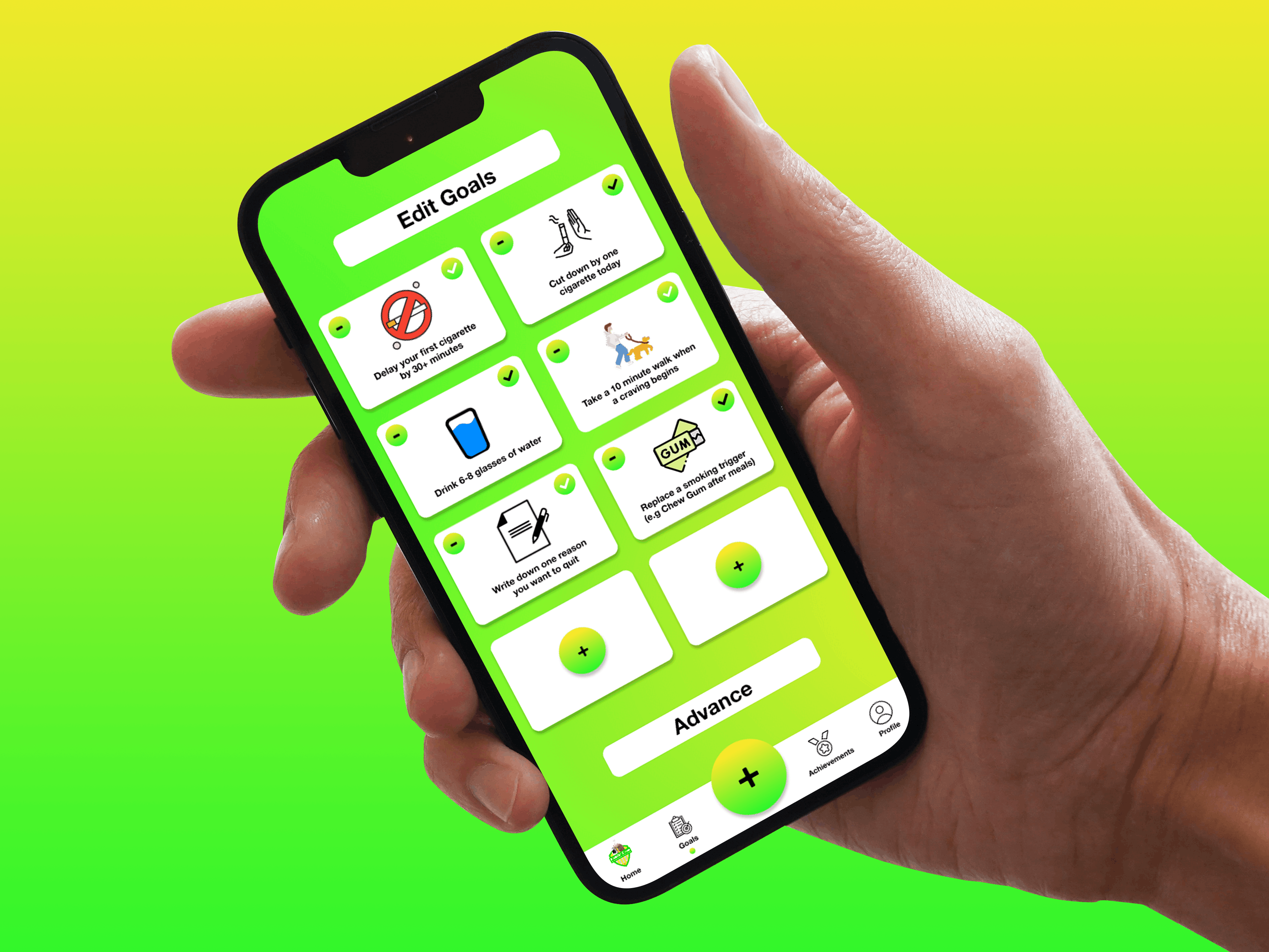
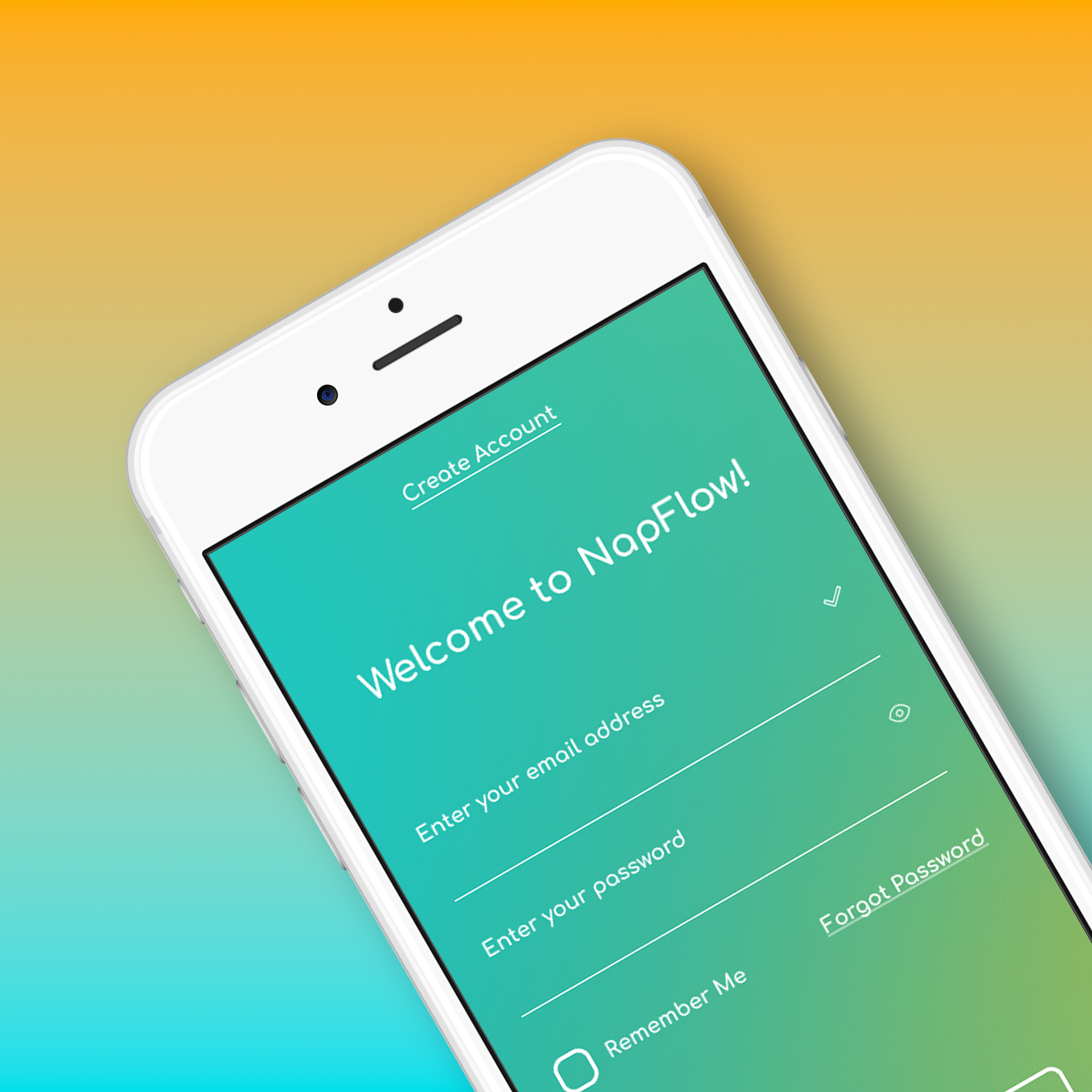
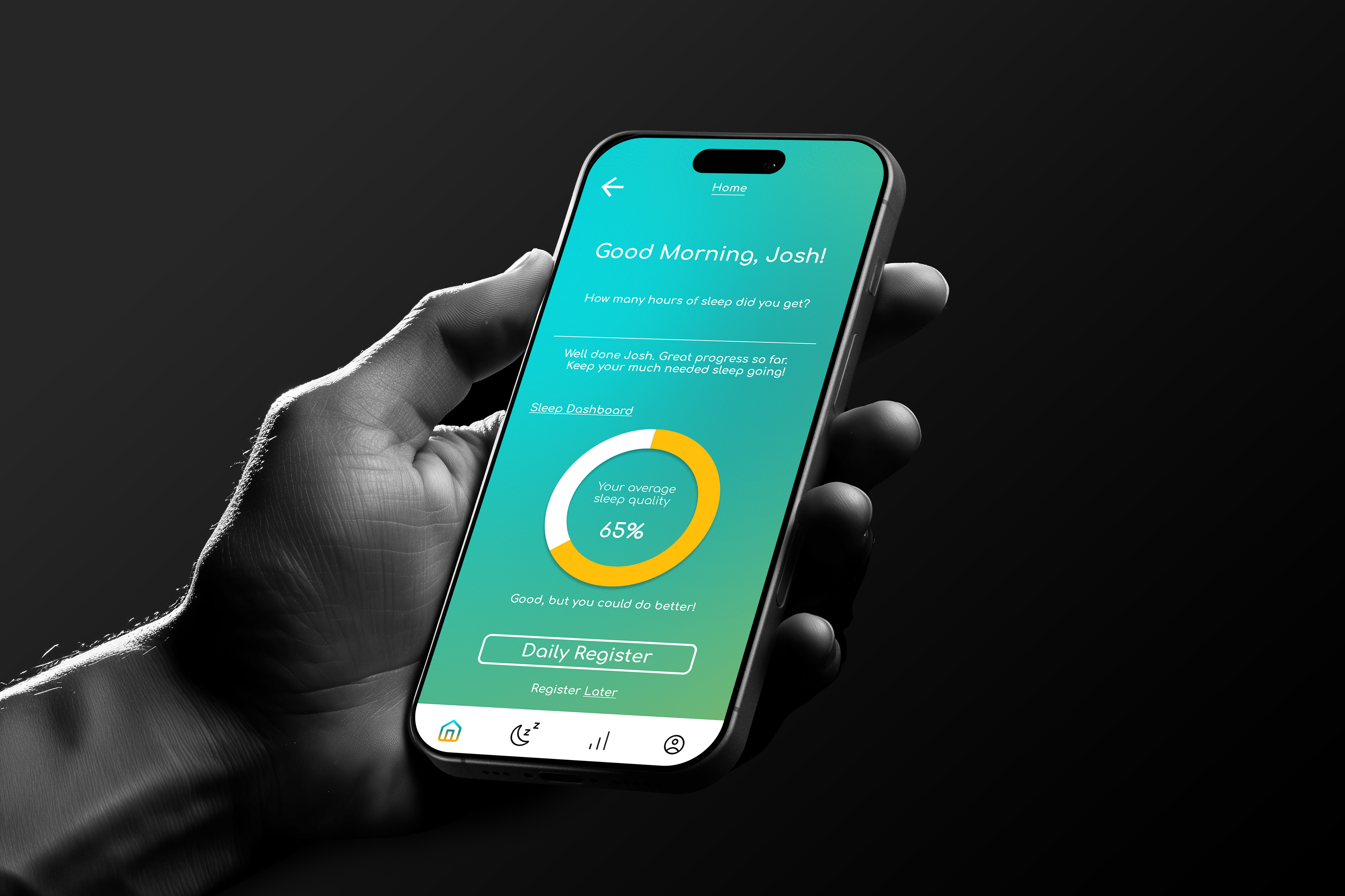
The login page at angle shows the playful aspect with a sneak peek into the general visual styling of the app. Some of the other examples show a human would be involved because I wanted to boost the human interaction within the app and I think it’s really important to show the primary use of NAPFLOW. The other design has a different style to the mockup which reinforces the friendly and warm environment a student needs to commit to better sleeping habits.
App Walkthrough