
Brief Overview:
I was told to Re‑brand a community organisation or venue. I should Show how the new brand identity will be applied and consider the best ways to promote what they do.
Ideally choose one that means something to you,
although it could be somewhere that you discover through your own research.
although it could be somewhere that you discover through your own research.
My Solution:
My solution was to give Swindon Harriers a new brand identity. The local athletics club which I was a part of for eight years, makes the project a personal one.
I aim to represent with the visuals is to promote the athletics club for sponsors, to be part of the fund that supports the track being resurfaced. This is important because the track hasn’t been updated in 25+ years. If this doesn’t happen, then the club would lose their competition license, meaning they would have to compete elsewhere.
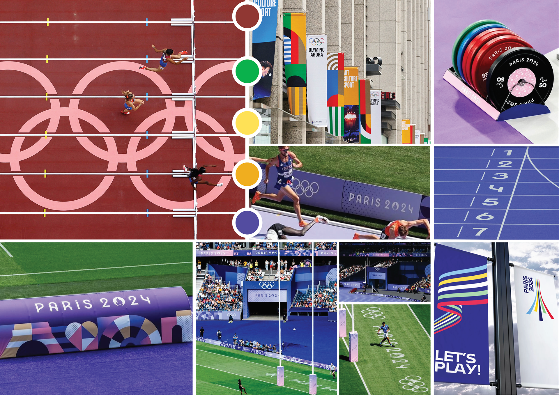
Olympic Branding Inspiration
I looked into the Olympic branding because I wanted to take inspiration from the official aesthetic of athletics. I was intrigued to see how they showed off the sponsorship and their own logo on track. In regards to their logo, I will definitely take some inspiration from the Eiffel tower look with the font choice.
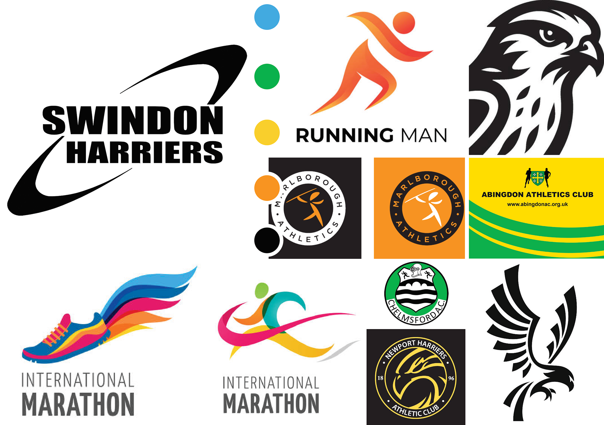
Competitor Research
I researched a wide range of local competitor’s that were around the region of the Wessex area. I wanted to show what the original Swindon Harriers athletics logo was like compared to rivals with rivals using lots of colour. I include some images of the Harrier bird because that could be something I would be intended in implementing into the logo design.
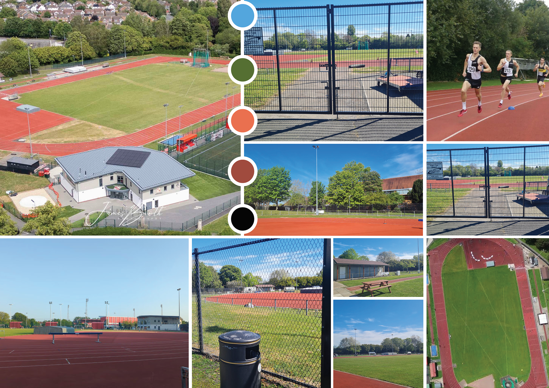
Personal Insights & Photography
I gathered a mixture of photography that I took and images that were researched to get me more of an idea on the location. The image on the right are runners in the Swindon Harriers kit with the black and white colours showing how distinctive the kit can be, compared to other local clubs.
Logo Sketches & Ideation
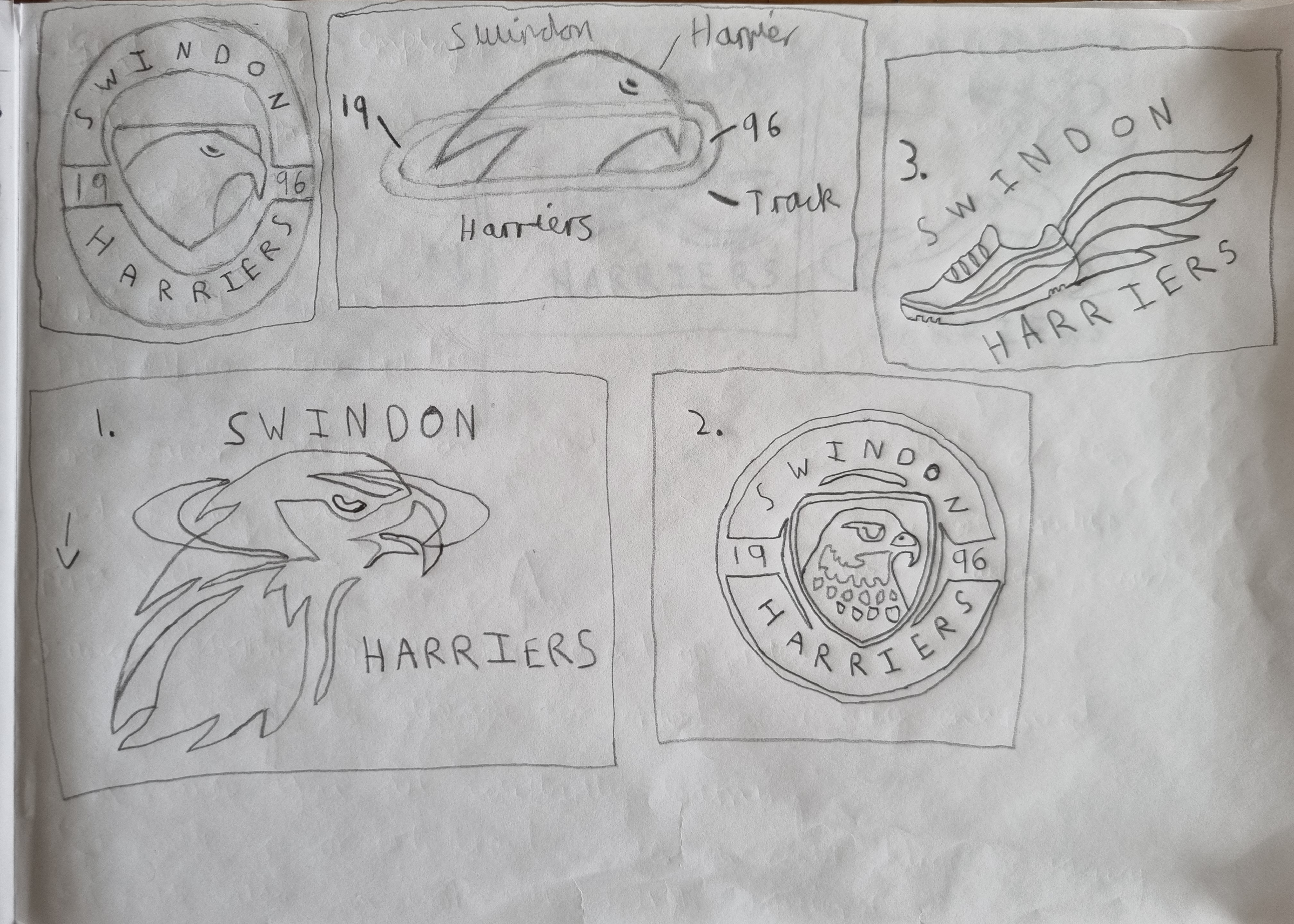
I created the first batch of rough sketches to formulate some ideas for the rebrand. I was needing to decide whether I go for a logo with a circle as the badge or take elements from the original logo and implement them instead. I did like the idea of the harrier being in the logo because that is visually appealing and I needed to take into account that the logo needs to look good on merchandise as well.
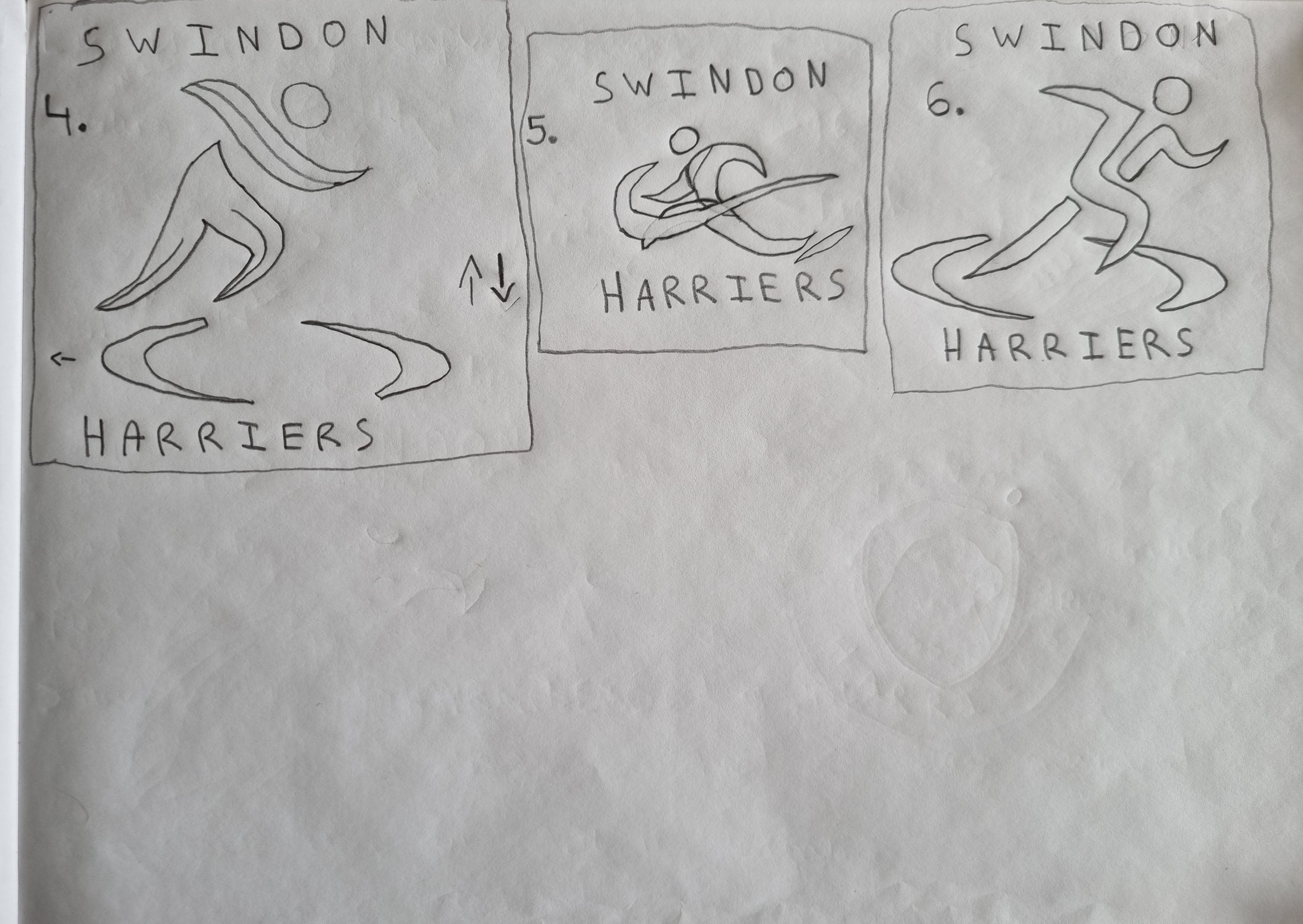
In the second part of my sketches, I took some inspiration from my early parts of research and used the runner instead of the harrier. I was interested in seeing how that would look because sports logos always need to look dynamic and show movement. Throughout my thought process thinking about how the logo will would look on a piece of clothing.
The logo outcomes
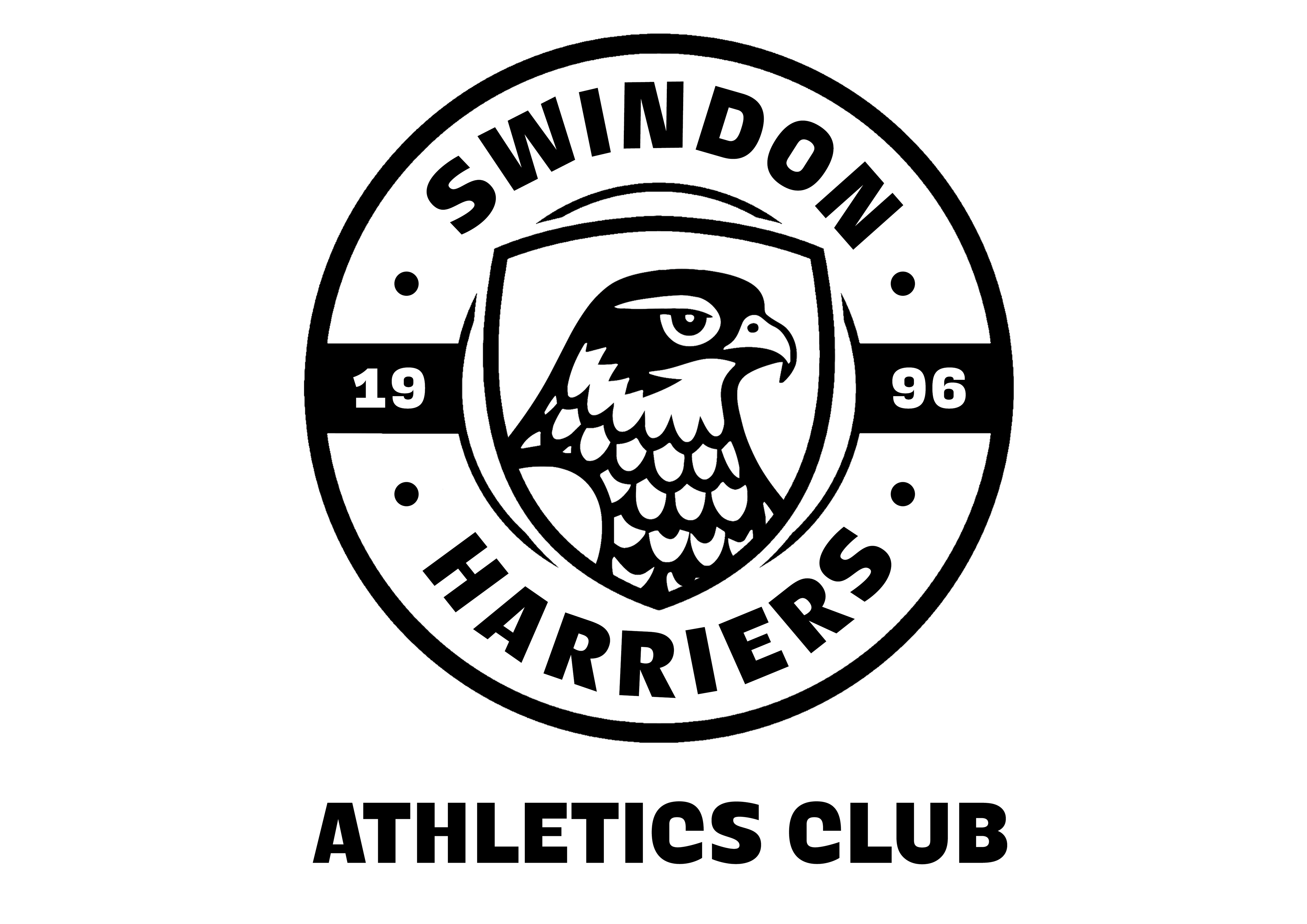
I took the feedback onboard from peers and went with the logo that doesn’t include a ribbon because the logo would have too much going on in a confined space. As you can see, I’m fully committed to the black and white variations of the logos because I think this best suits the clubs current and future brand vision.
Black Logo

White Logo
Brand Merchandise
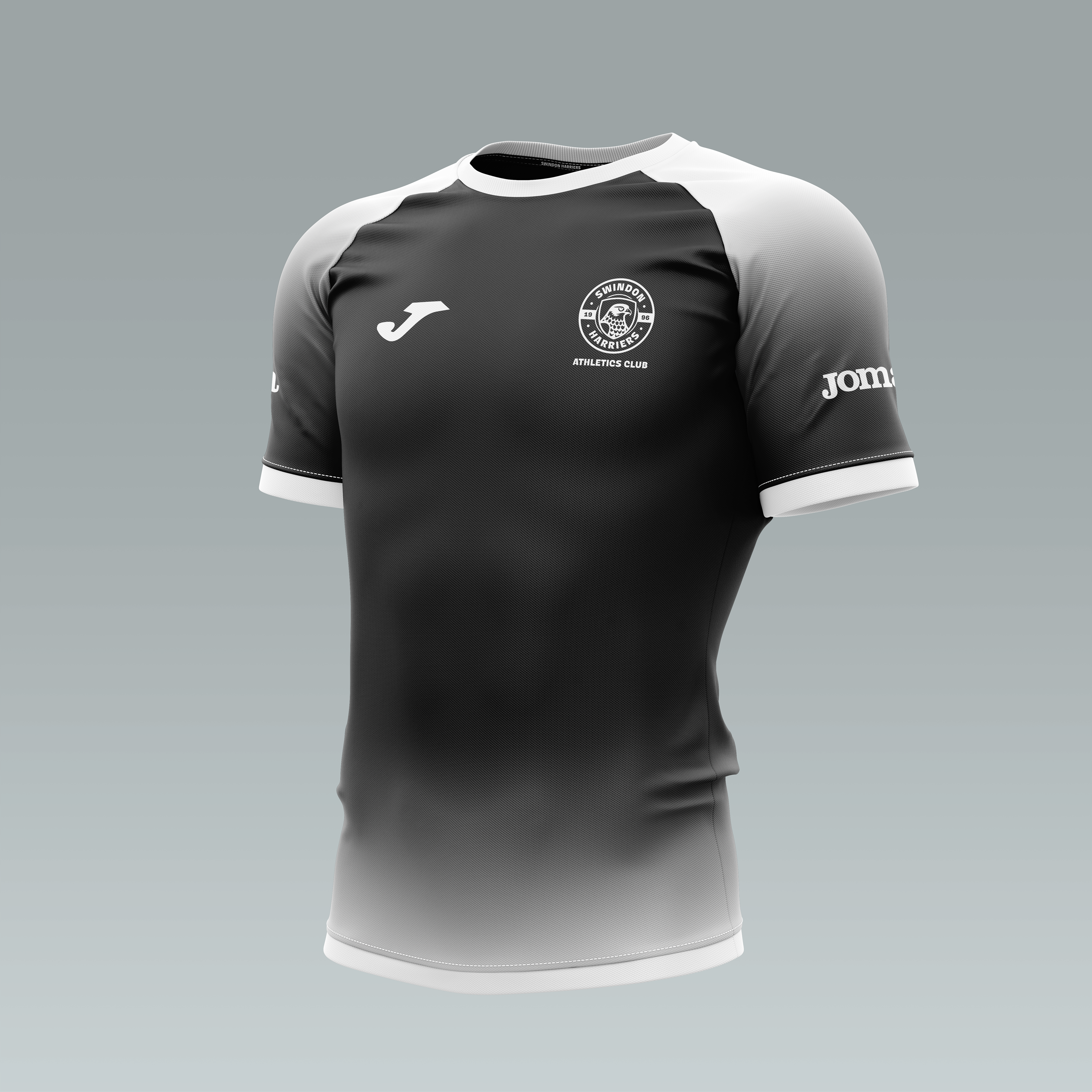
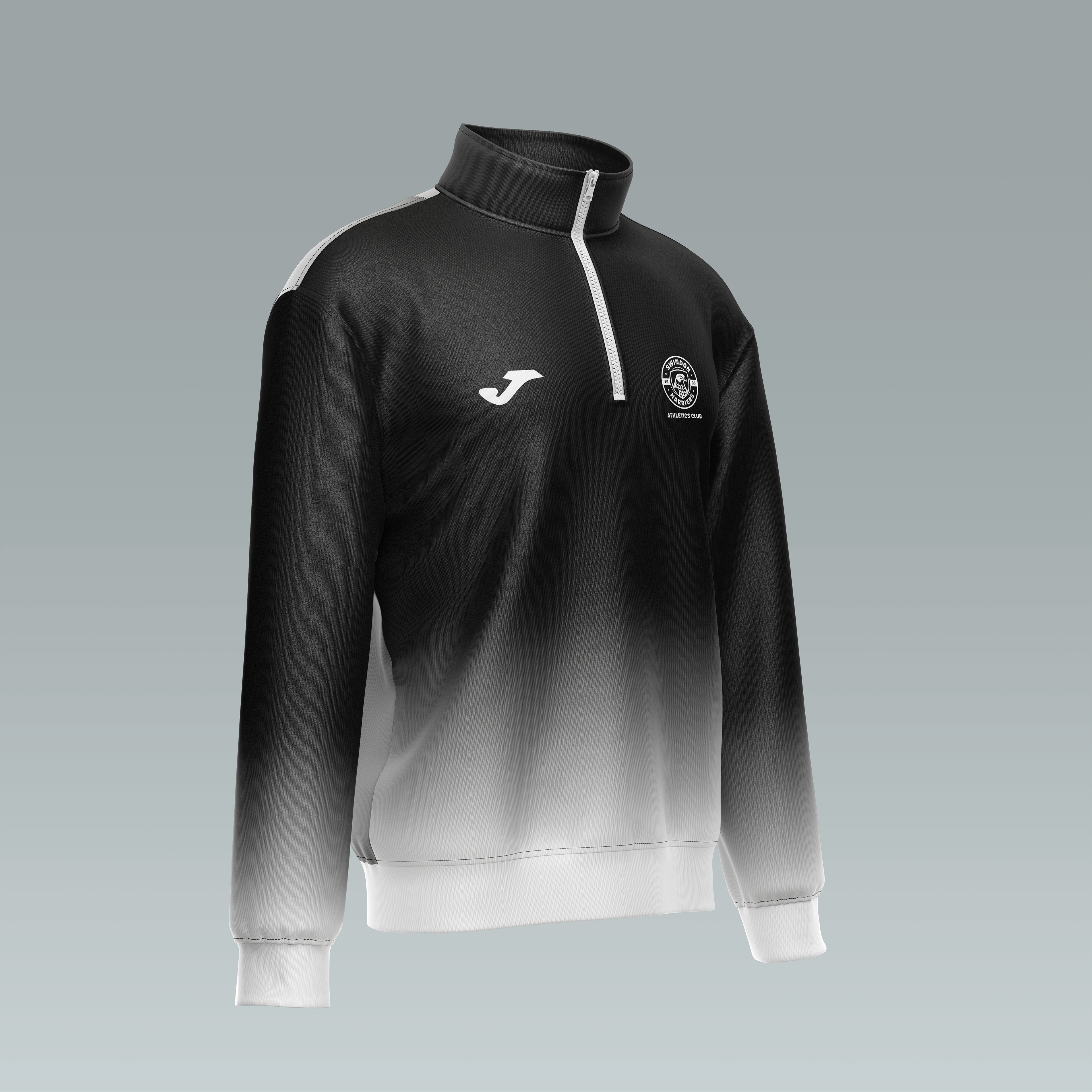
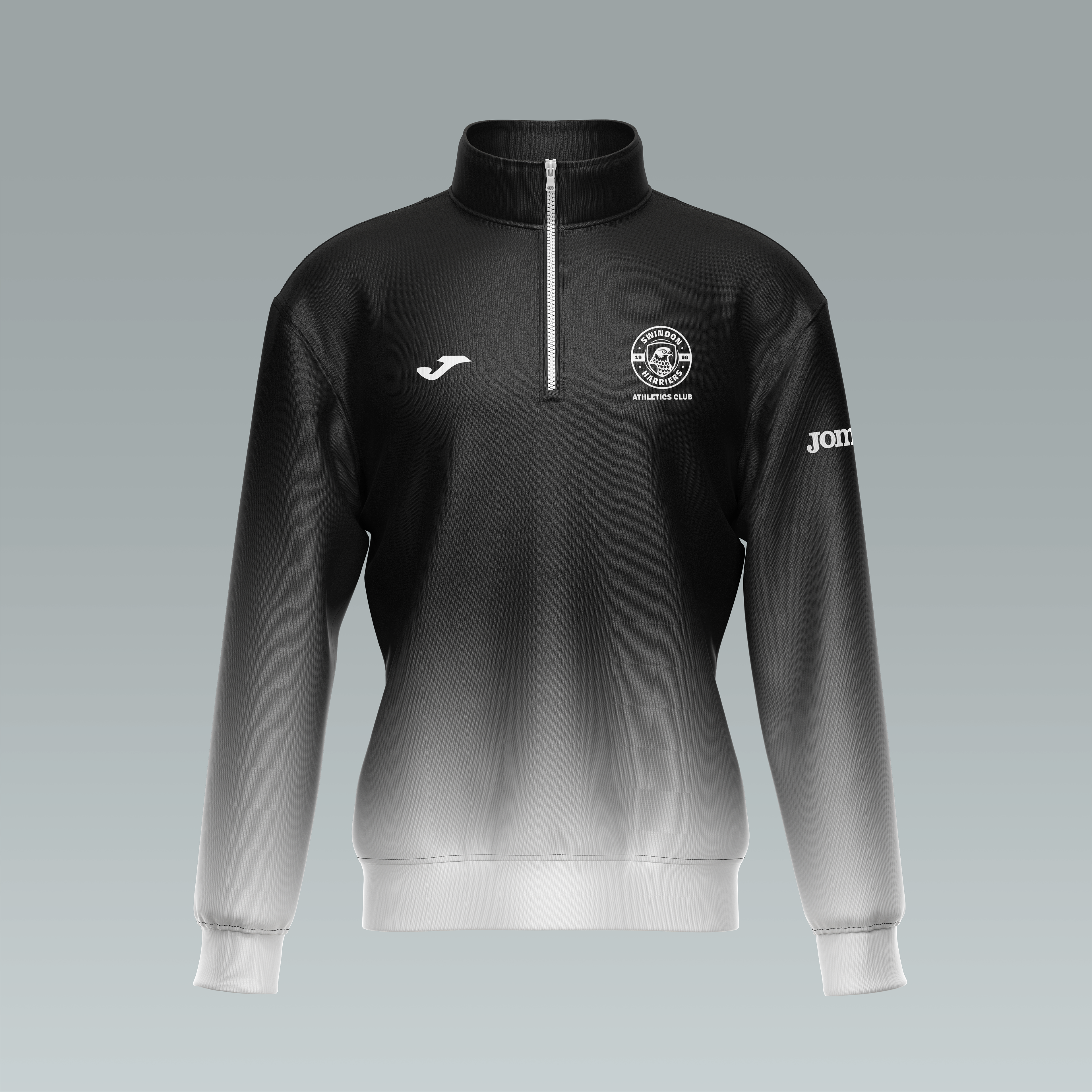
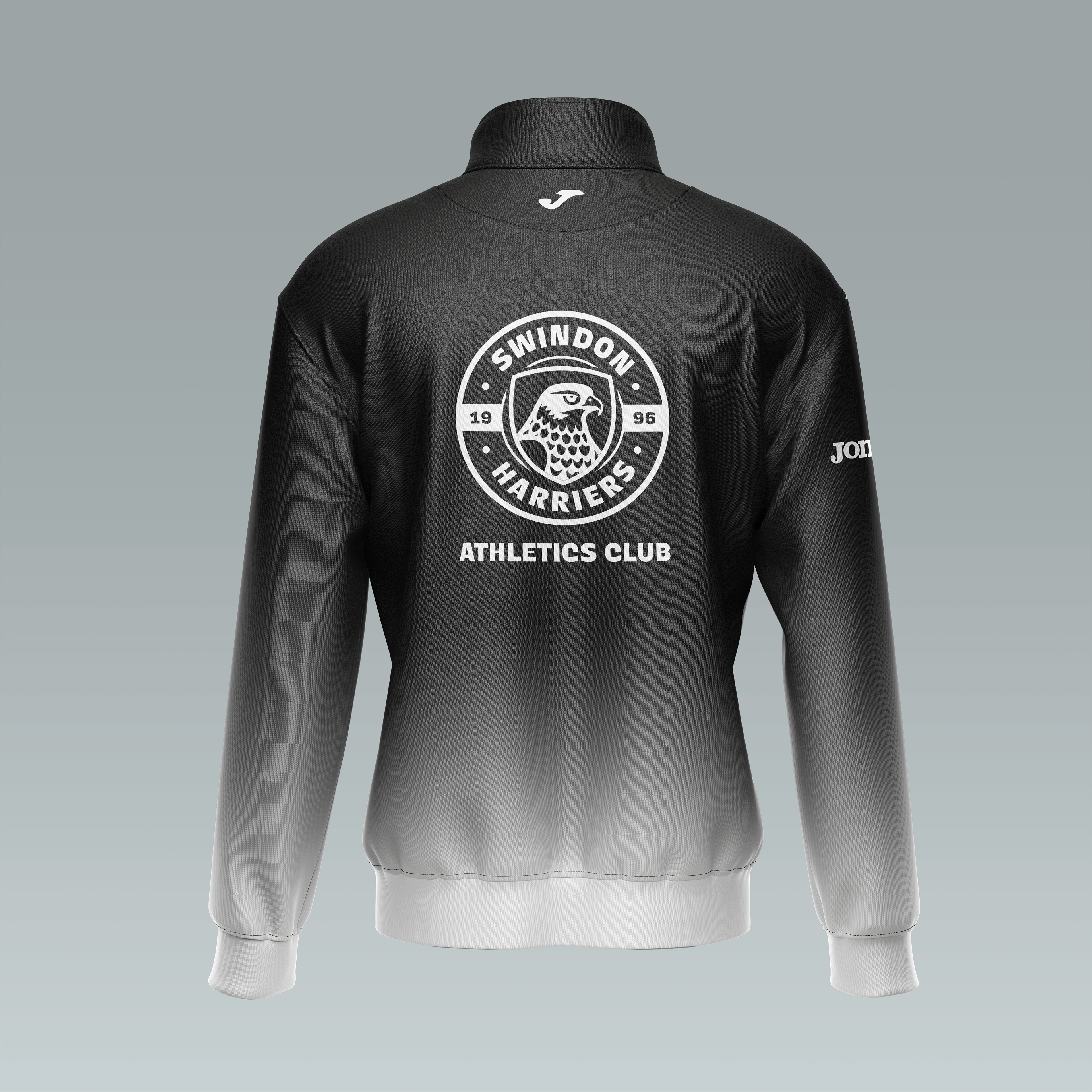
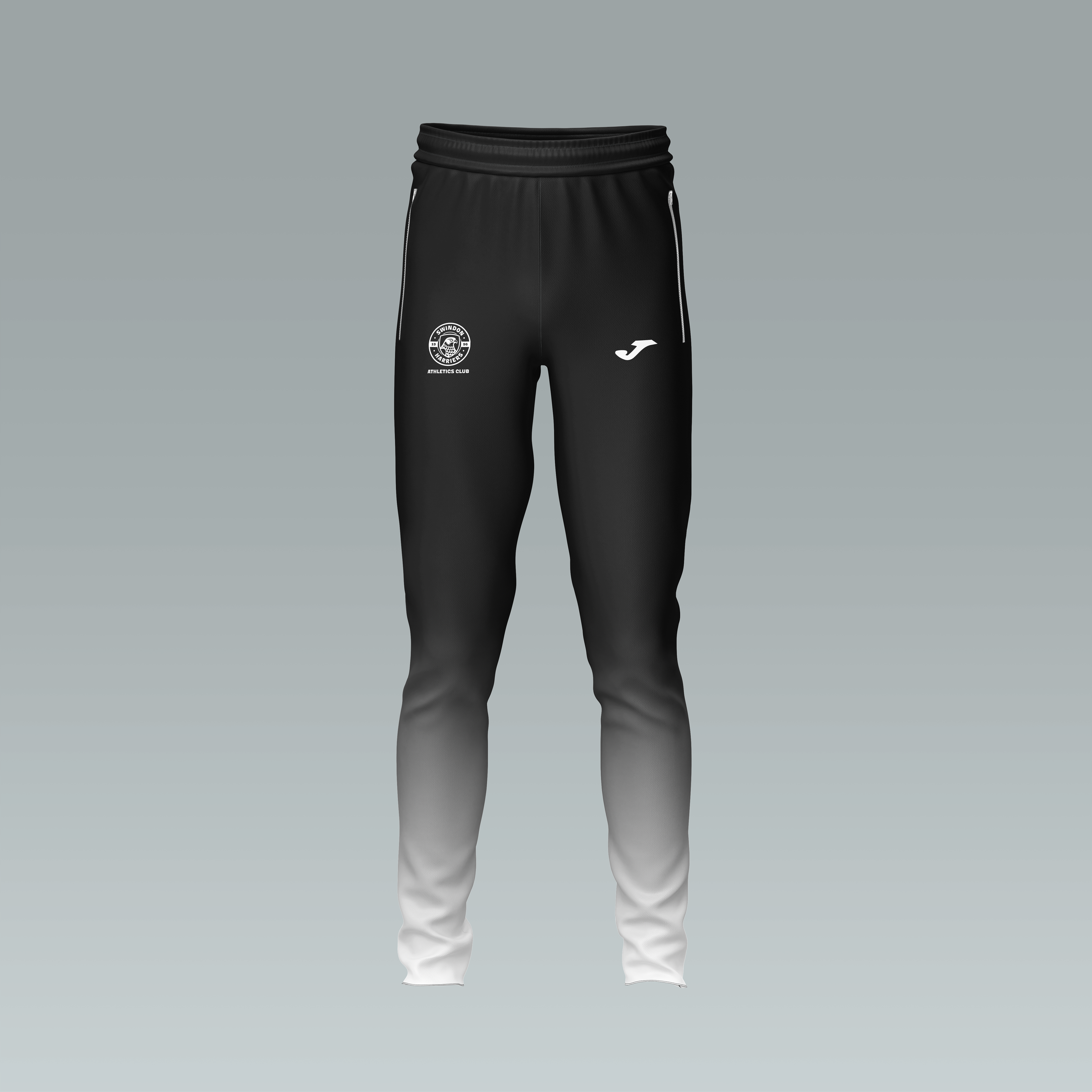
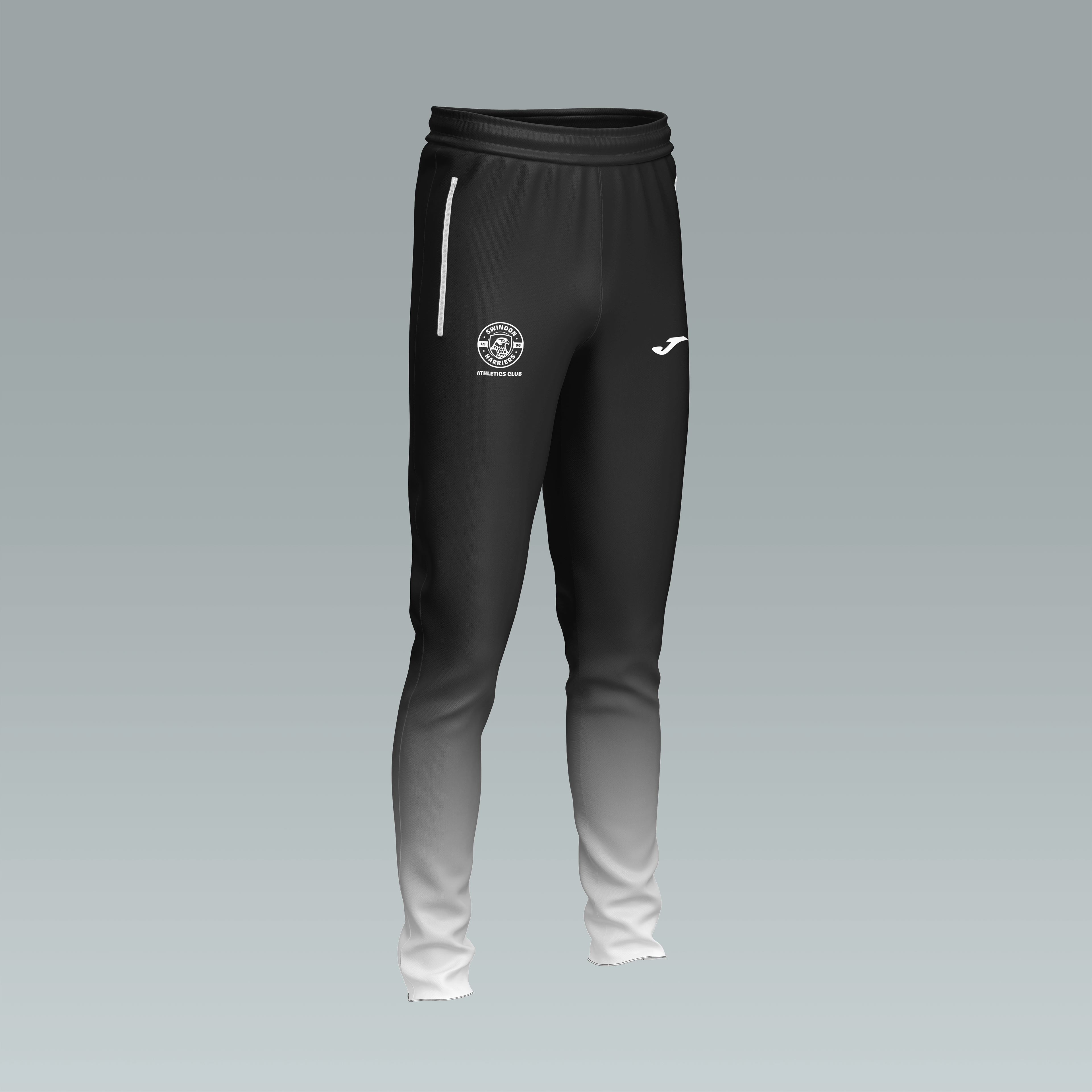
I went for the design direction of the gradient style because the refreshing element of the rebrand makes the clubs merchandise just stand out a lot more, than they previously did. I added not only Joma’s logo but their wordmark as well to provide that extra quality and realism. I gave both the hoodie and top the same design style because I wanted to keep that consistent aesthetic throughout the brands identity.
Training Top
Training Fleece
Training Fleece
Training Fleece
Club Trousers
Club Trousers
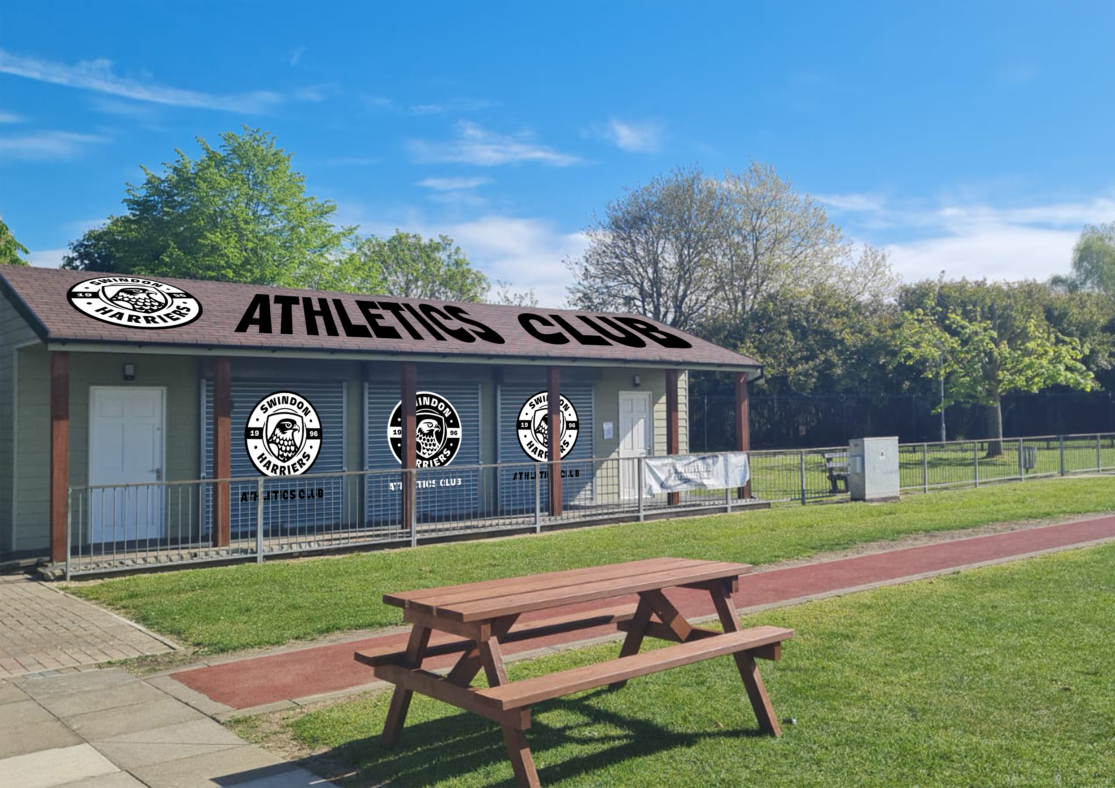
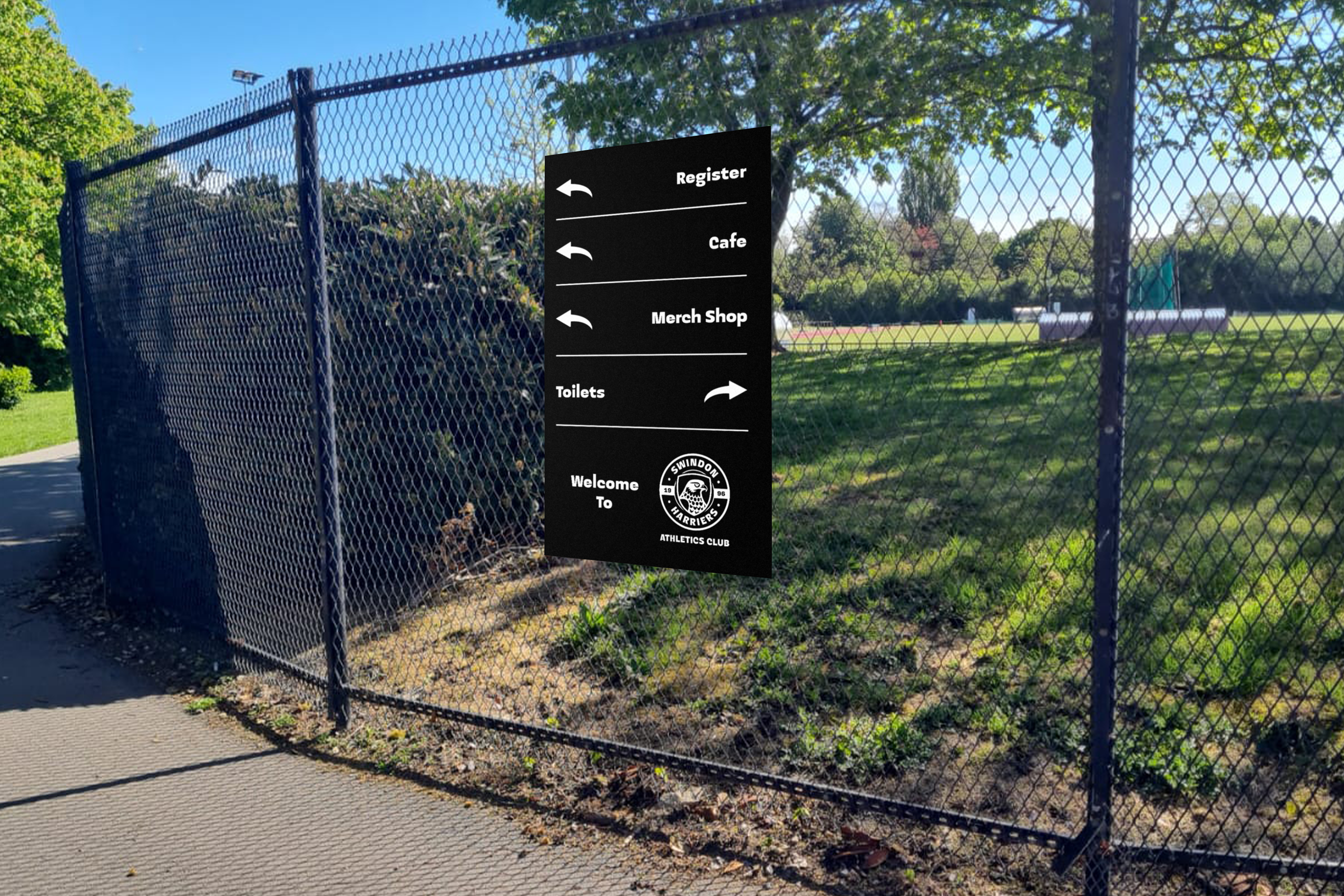
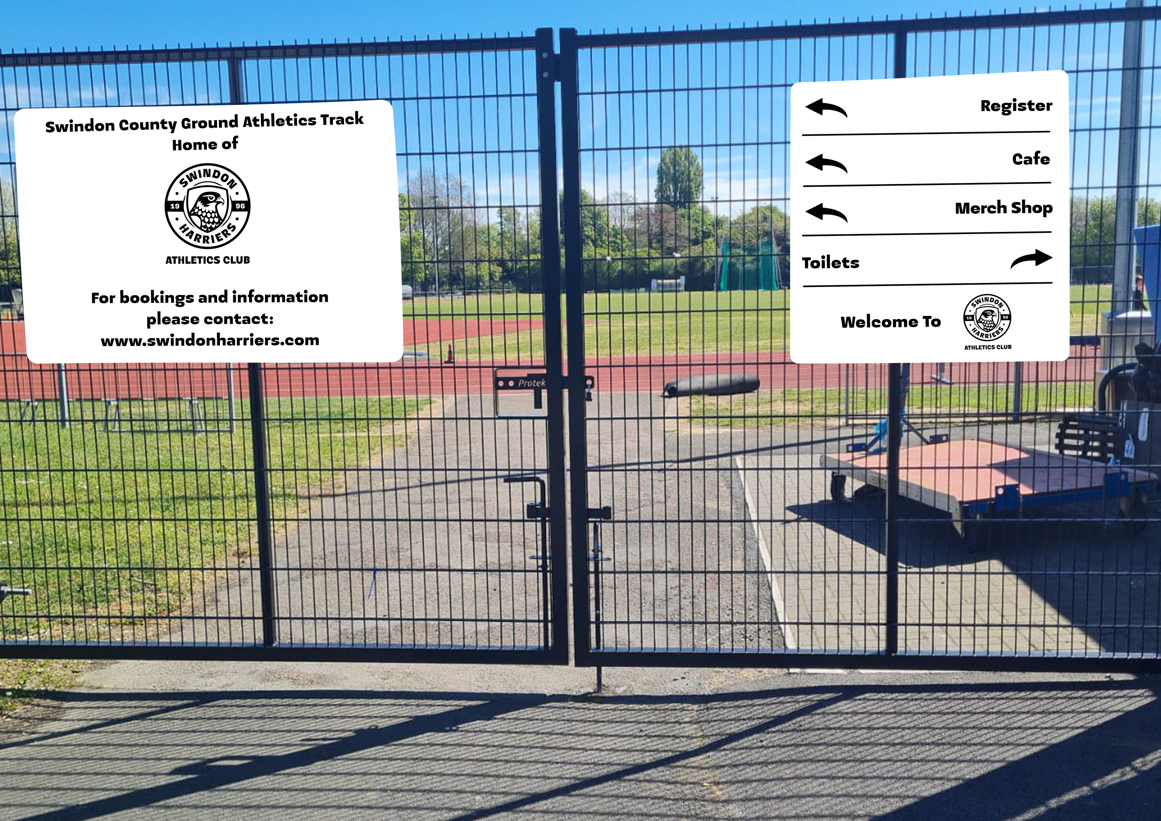
Club Signage
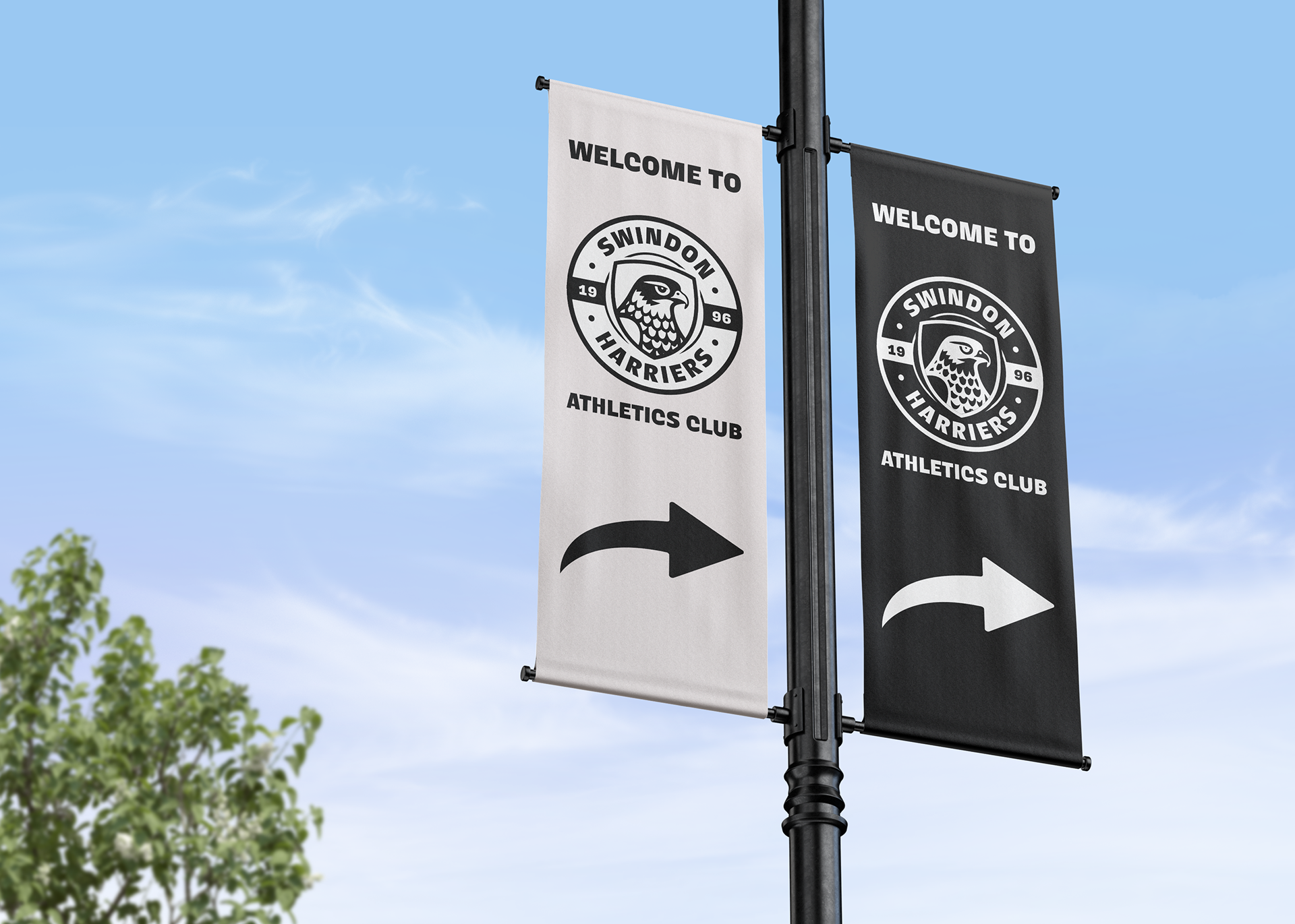
Advertisement Banners
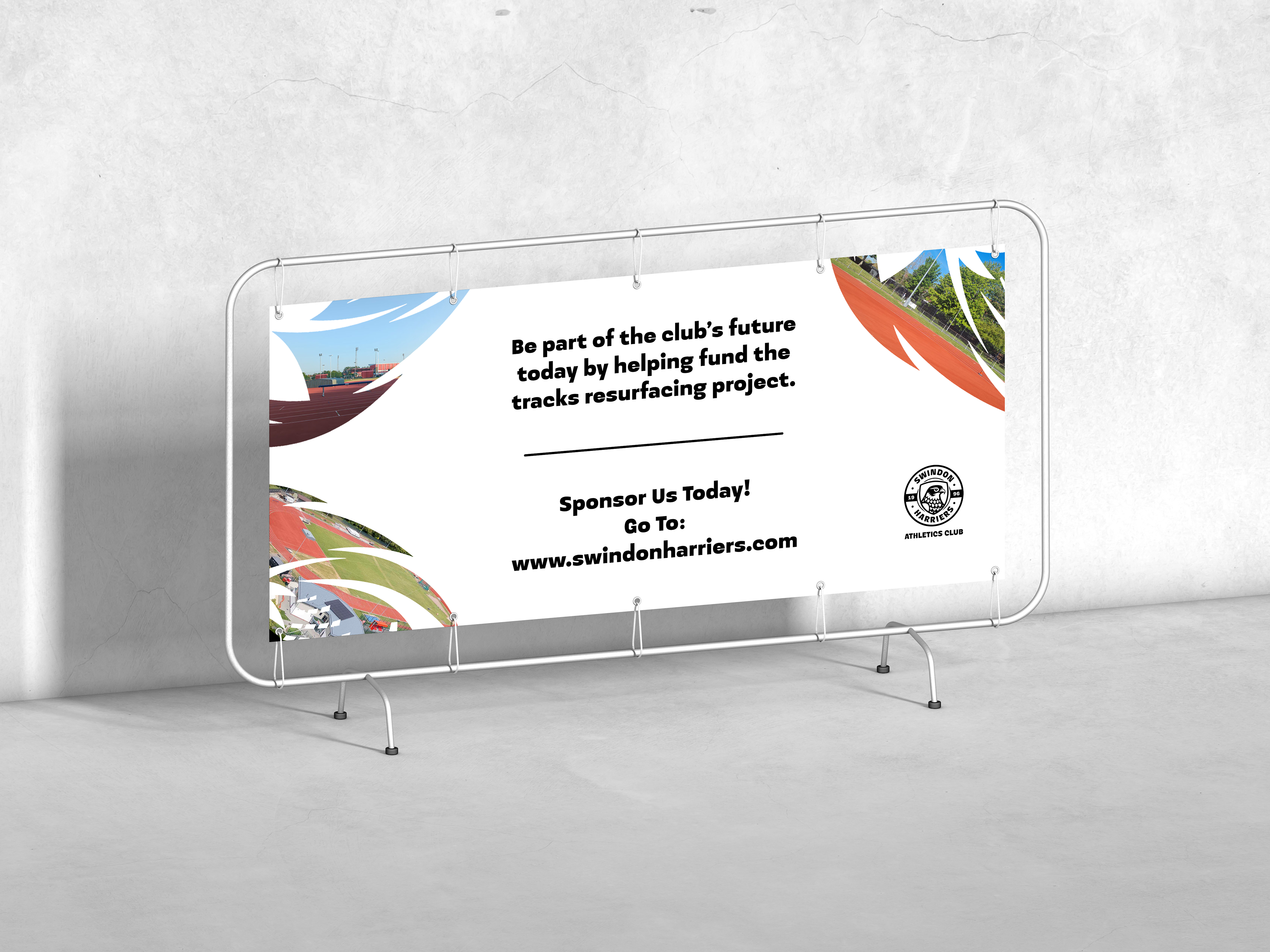
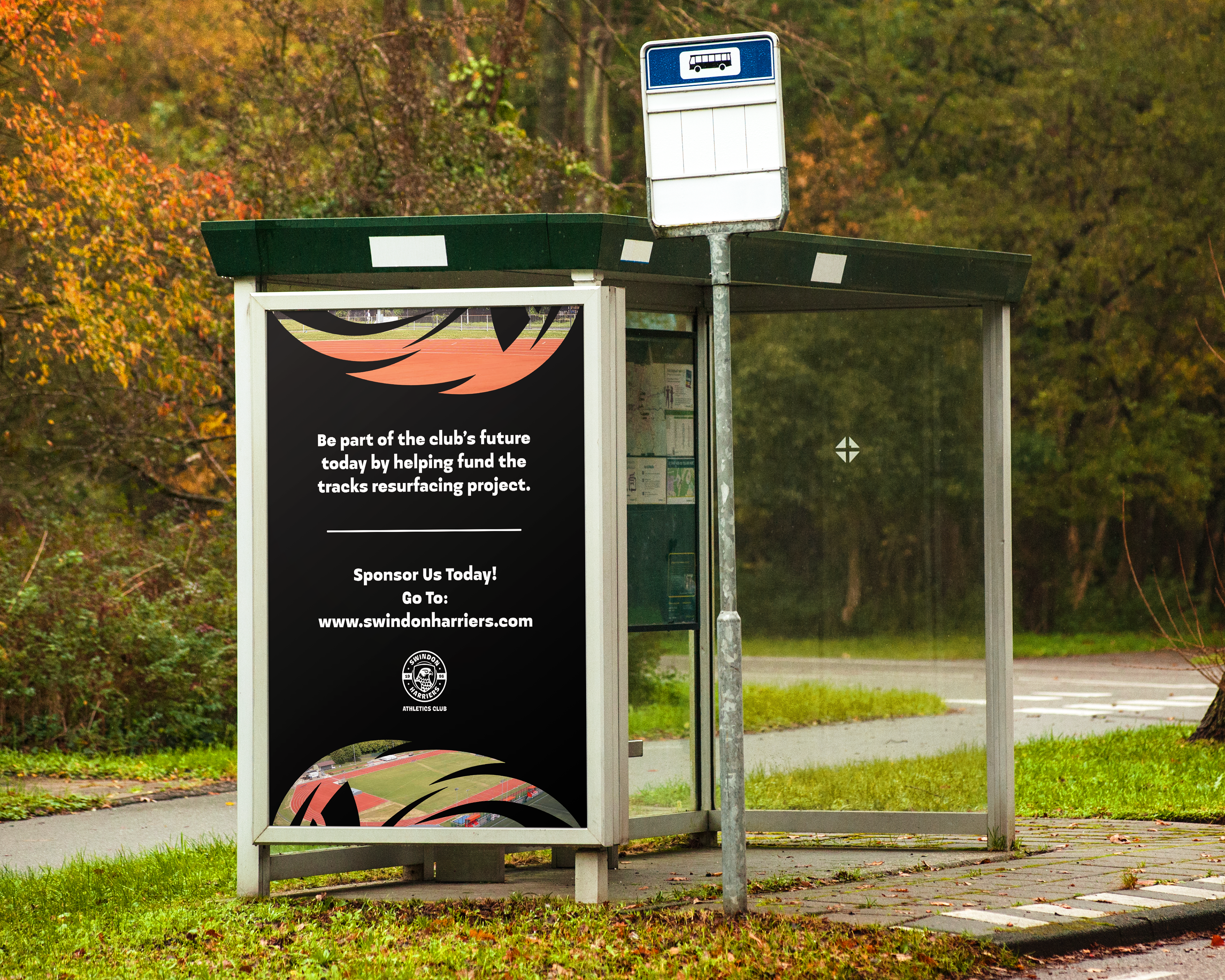
The banners add to the communication of the problem that the club is trying to solve. The call to action guides the audience to the website, where they can get in contact for a potential sponsorship and be part of the club’s resurfacing of the track.
Around the edges of the banners, there are photography masked inside the illustration of a harrier. This is because the imagery of the bird is visually appealing and a clear design identity for the athletics club.
The Club house Design