
Brief Overview:
Every football team contains a creative visual identity to engage the fans of football and acts as the team’s individual representation. The identity is the platform and the symbol for the team’s visual and design history. The visuals in football can tell the story of the location or the link to the unique heritage of the team.
You need To inform and engage fans about the background and the evolution of design in football.
My Solution:
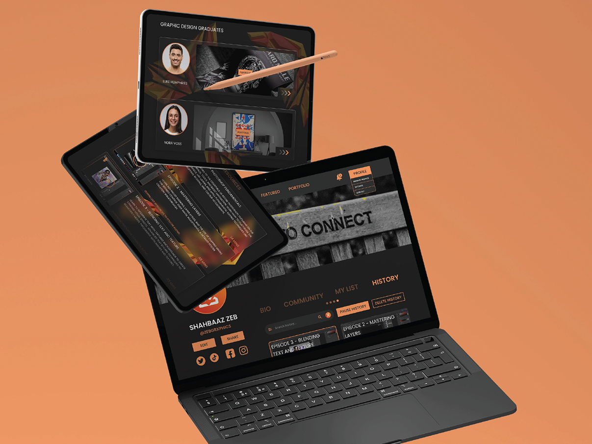
My plan is to create An interactive space or experience for football fans. This will include Additional promotional materials for my interactive platform, for example Banners, Flyers and Leaflets.
The work will show the trends for design in football, Address the creation and the future of aesthetics in football, and Include examples with the use and meanings of design in the sport.
Exhibition Research
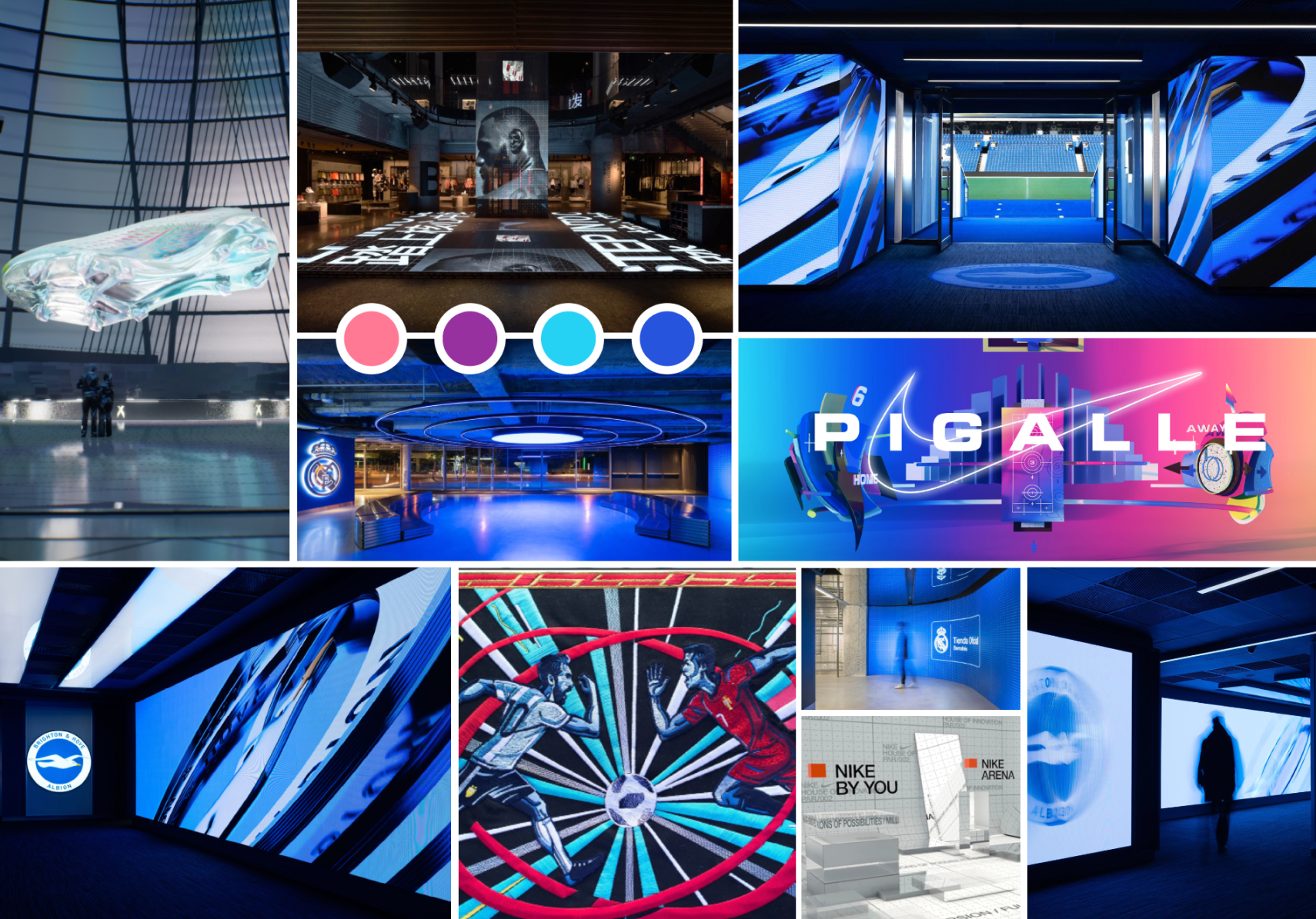
I created a series of mood boards that represented the different areas of design in sport. For example, Apps, Video Games, TV and an actual exhibition from other mainstream brands.
The brands would be Nike, Adidas and various other individual clubs. I collected the different moods in which the design was represented and got some quick design avenues to progress the project.
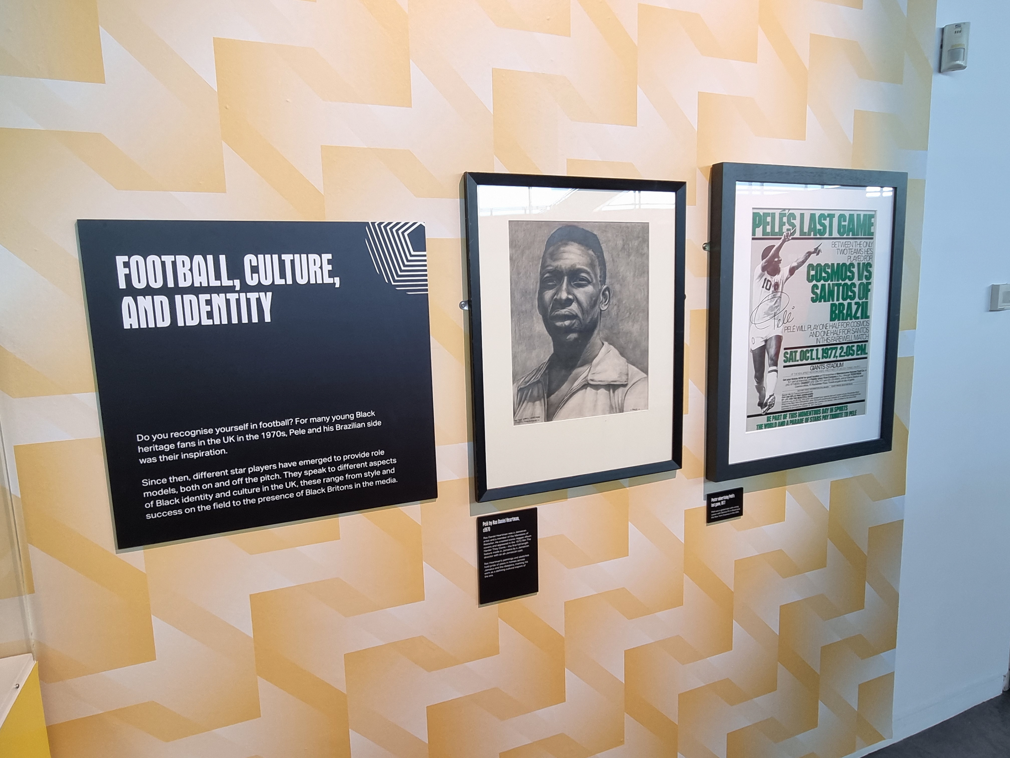
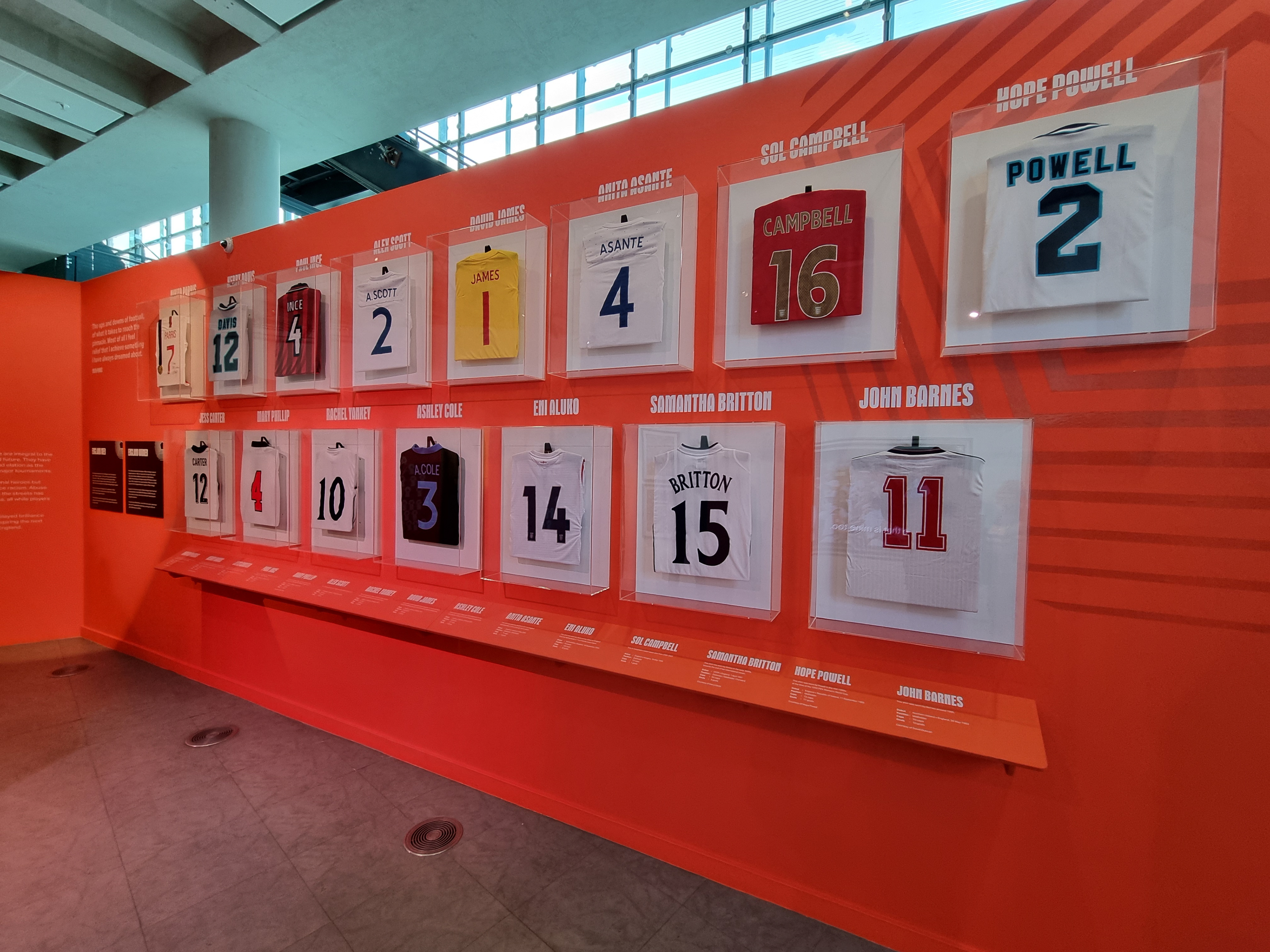
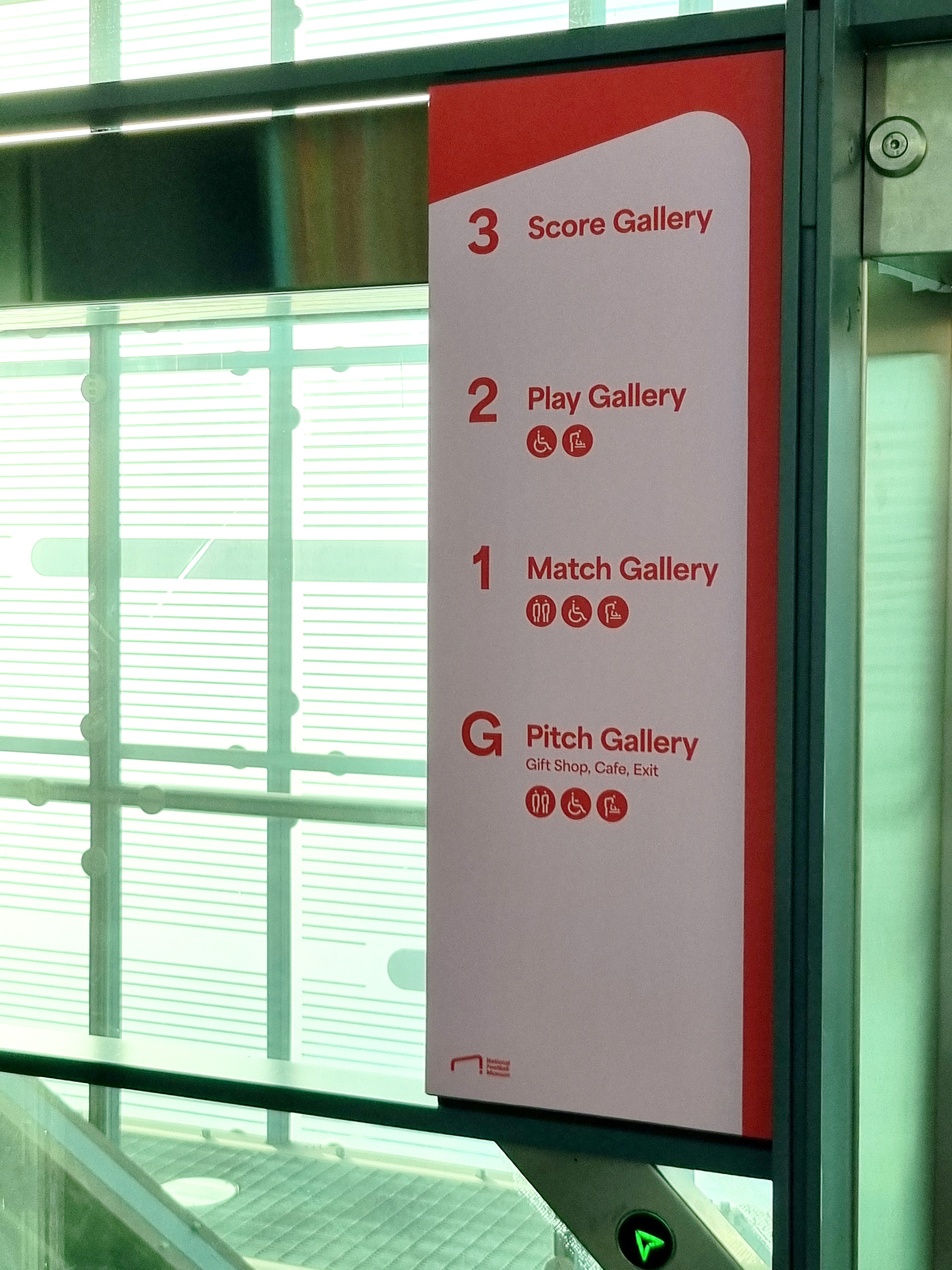
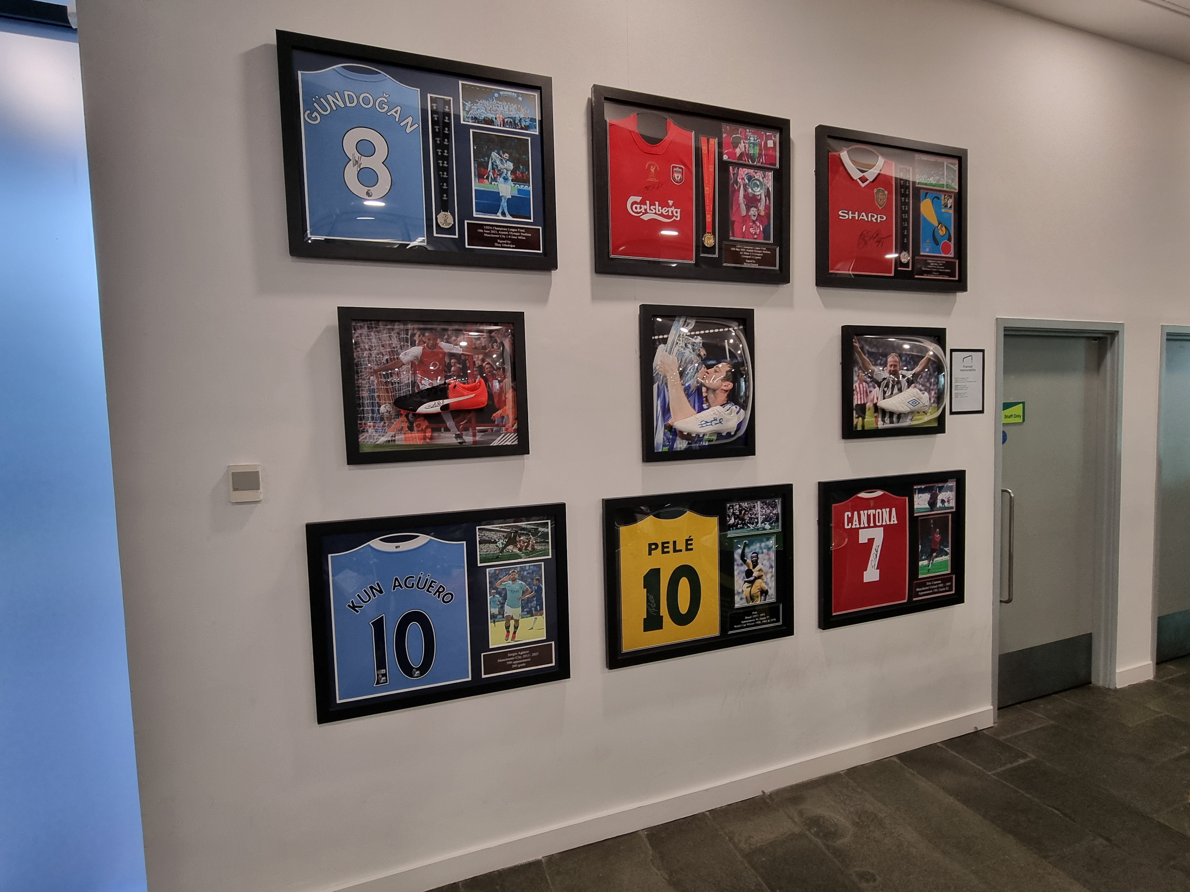
National Football museum photography
I’m using the National Football Museum as a case study because they have the largest collection of design memorabilia in England and the representation is exactly what I’m looking at for my project. What is more substantial is these images are photos that I took myself as I felt going to an actual exhibition would benefit me and my project.
Hayden Bone Case Study
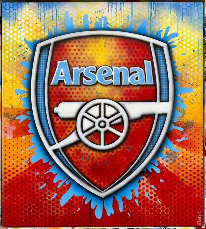
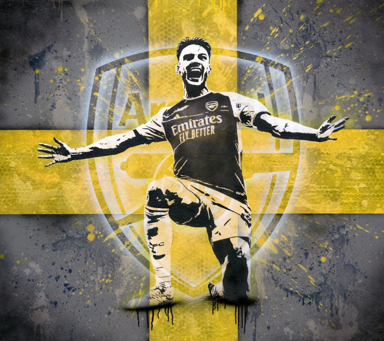
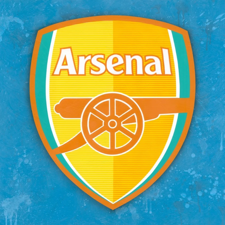
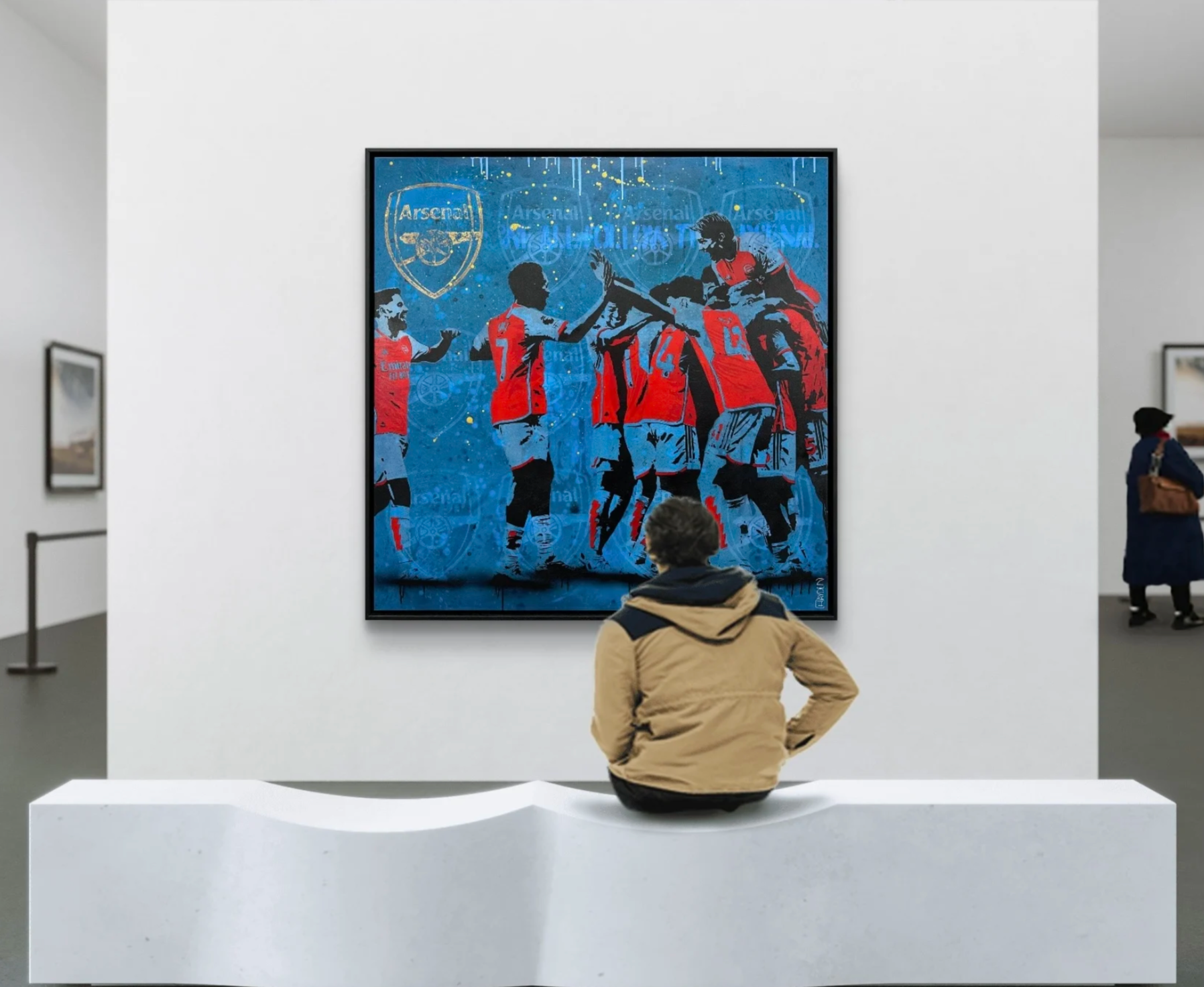
I looked at individual artists who collaborated with football teams. Hayden Bone is a fine art designer who made work for Arsenal Football Club. From a pop art style to a graffiti one, Hayden Bone grabbed my attention when talking about the evolution of the World Cup posters. I obtained useful information from a small article on his website, which is helped me grow my ideas for my poster section in my exhibition.
Colour Scheme choice
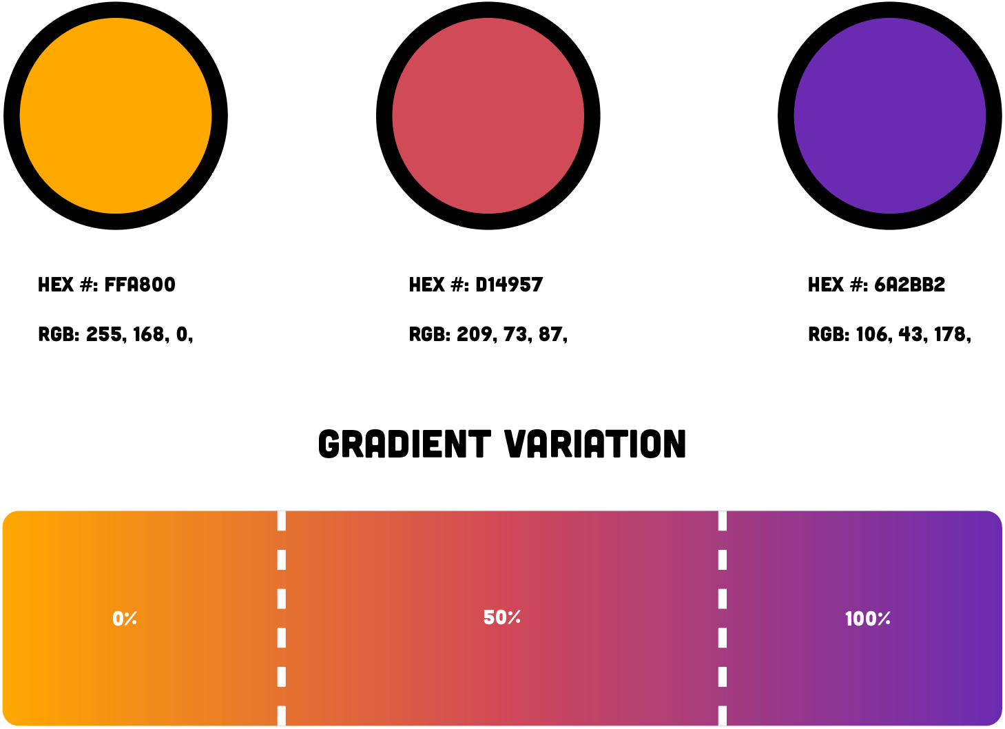
I wanted to establish a colour scheme and start to plan out the layout and ideas for my logo designs. In terms of the colours, I wanted to use a warm, fun and engaging theme that would attract fans to come in and explore the exhibition space. In order for that to be successful, I created an orange and purple gradient that mixes in with a light tone of pink. This opens up opportunities for wayfinding or the general name and tagline within the logo.
Typography Overview
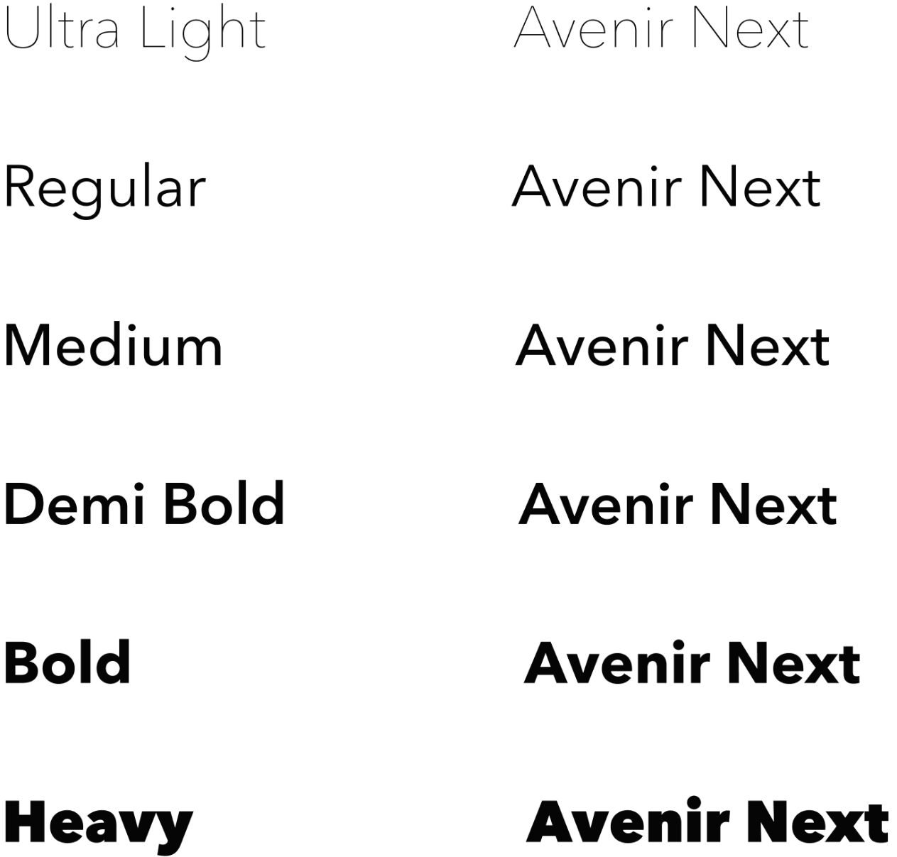
when analysing the type for football clubs or sports logos, they always have a clean and consistent font. When linking back to football, this helps out the legibility of the names on a football shirt, especially for double barrel names. I took inspiration from that through the font called “Avenir” which successfully represents my name and tagline that I chose earlier in the design process.
Finalised Logo Design
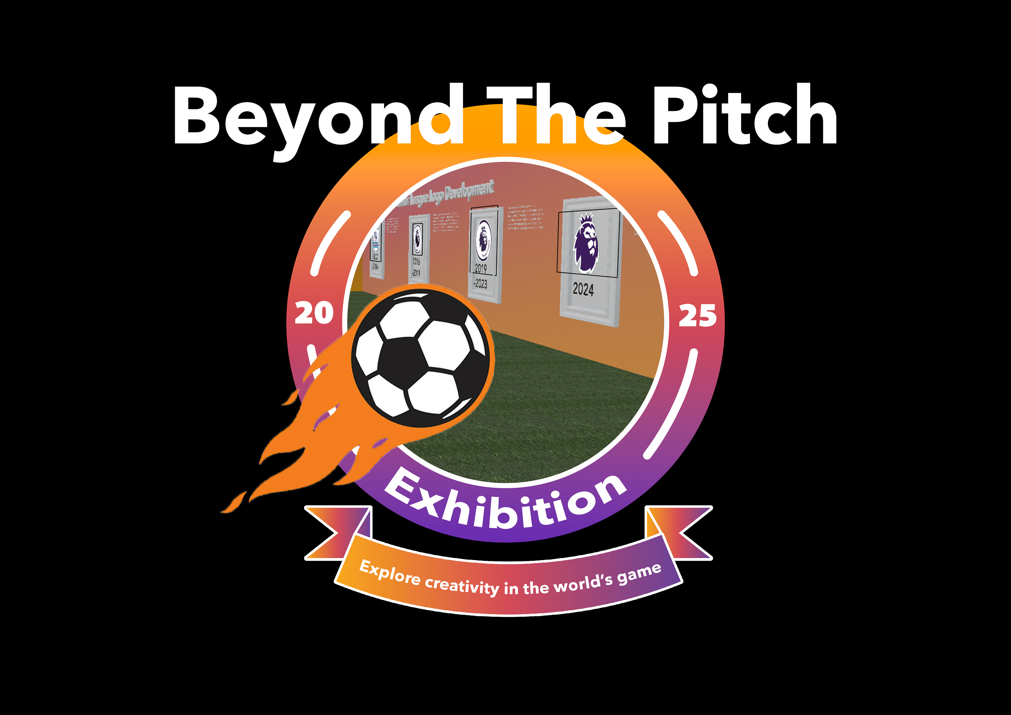
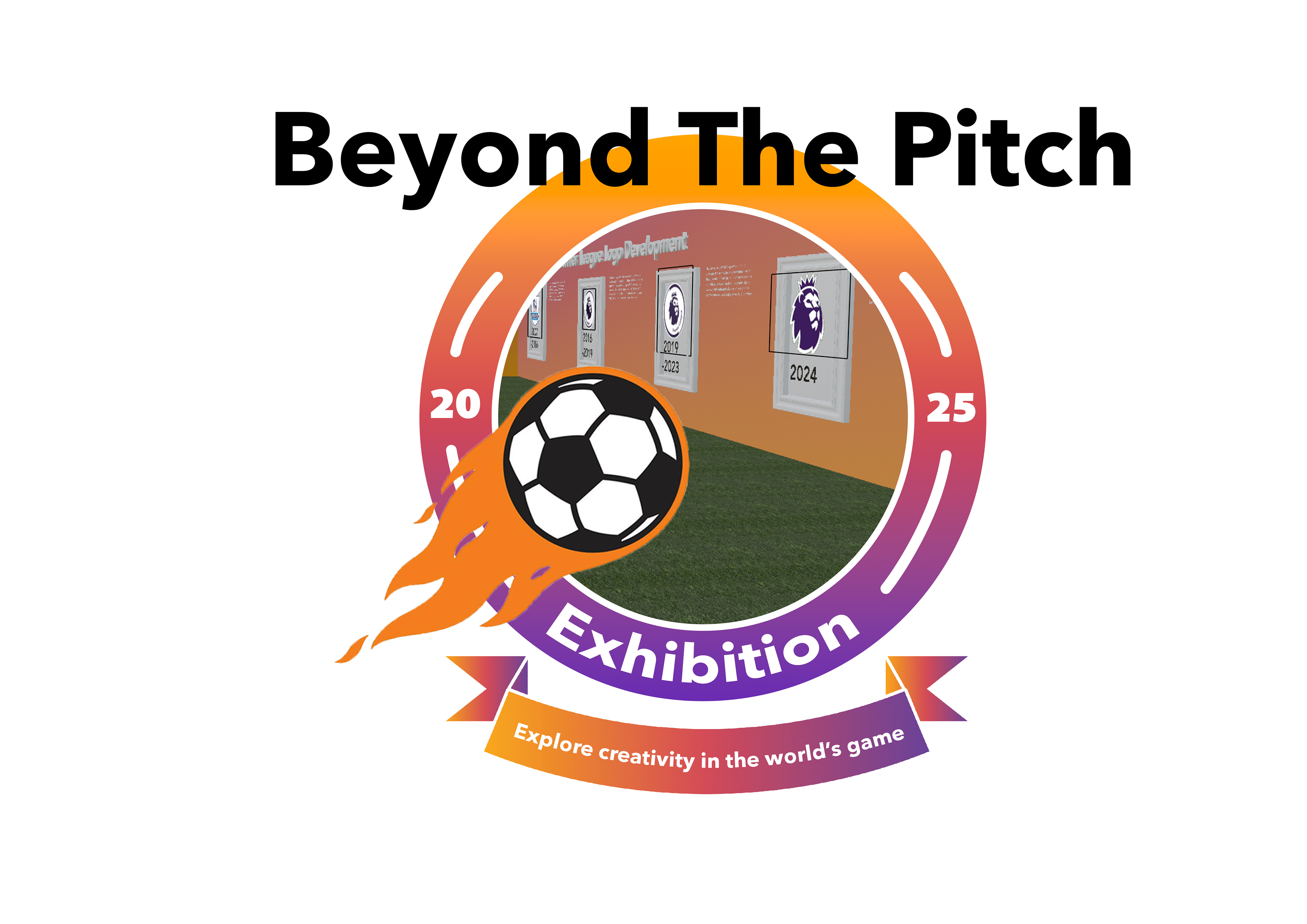
I made a logo that took inspiration from an actual football crest because that is part of a section within my exhibition. I thought it was a good idea to link the idea around the logo to the exhibition because of the special design connection to football. The crest as the logo gave me the opportunity to include the tagline and the name within the logo, so the visuals have synergy with the exhibitions overall identity.
Promotional Materials
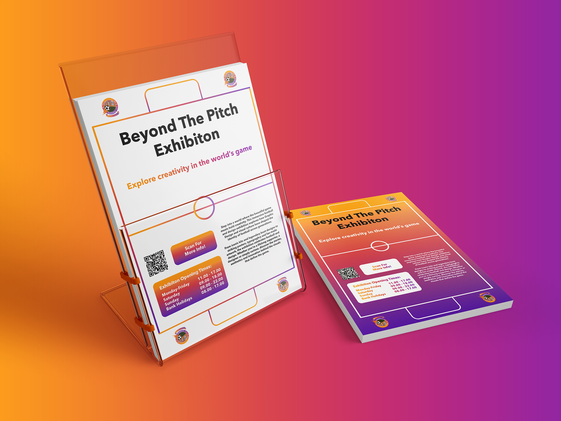
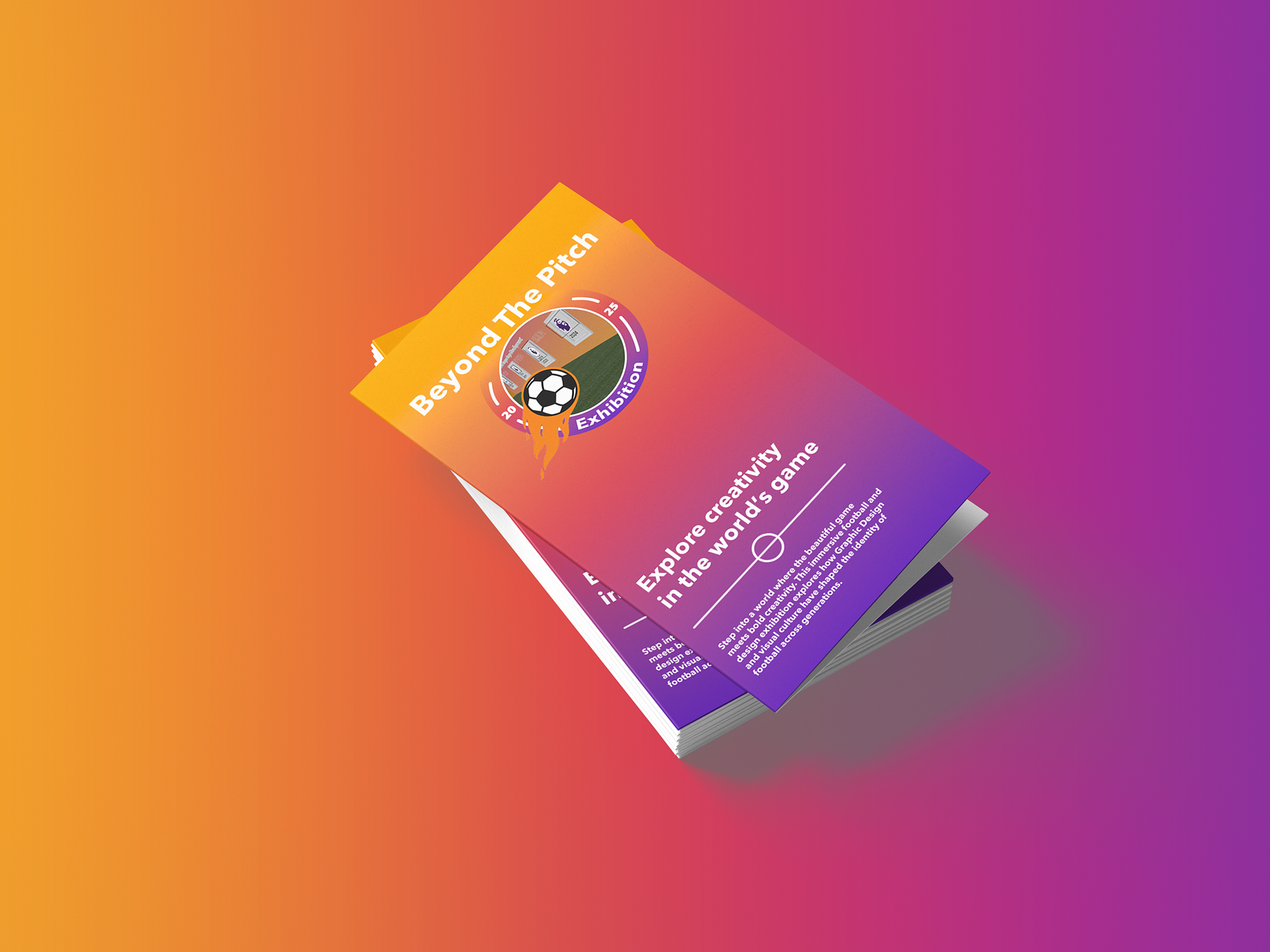
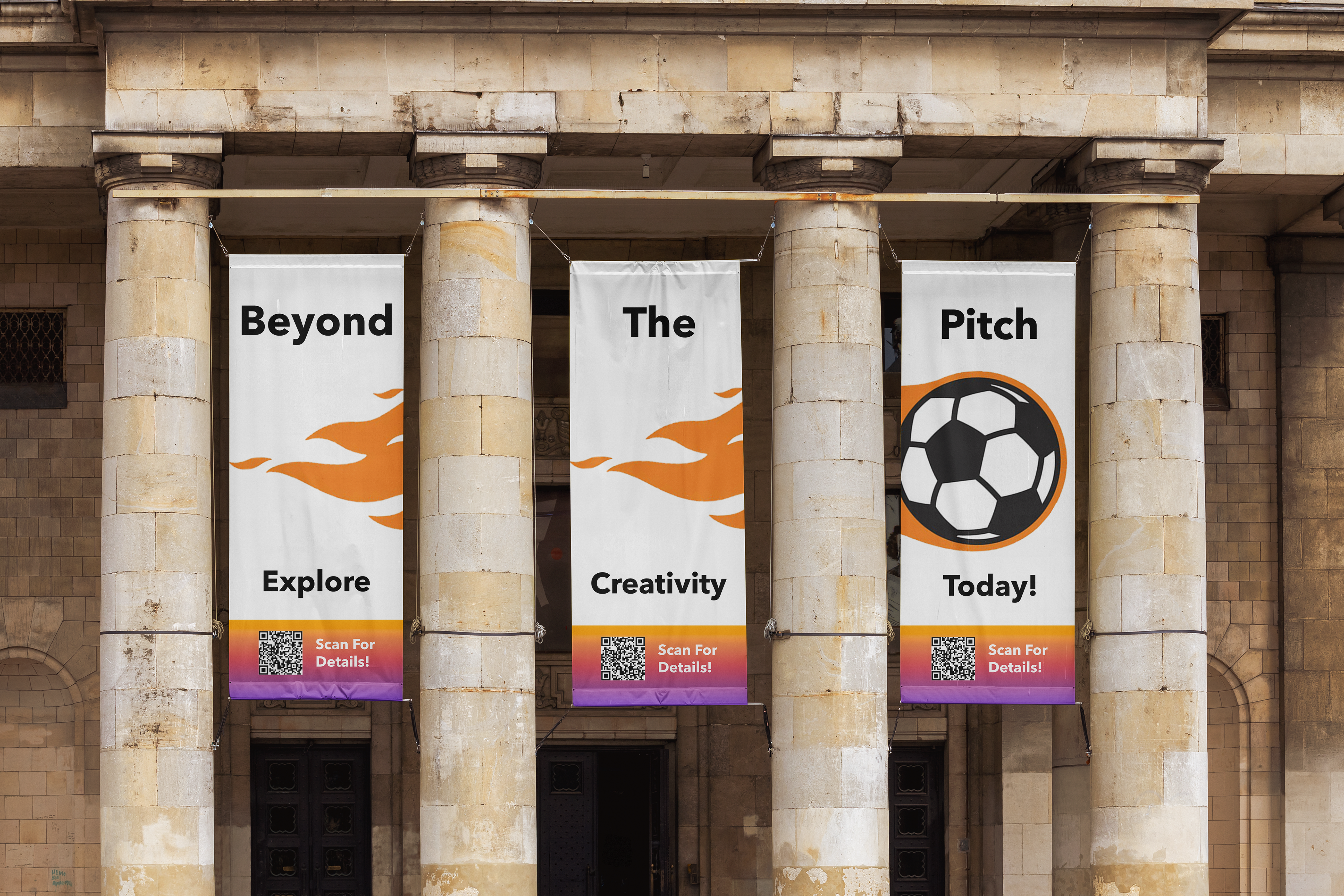
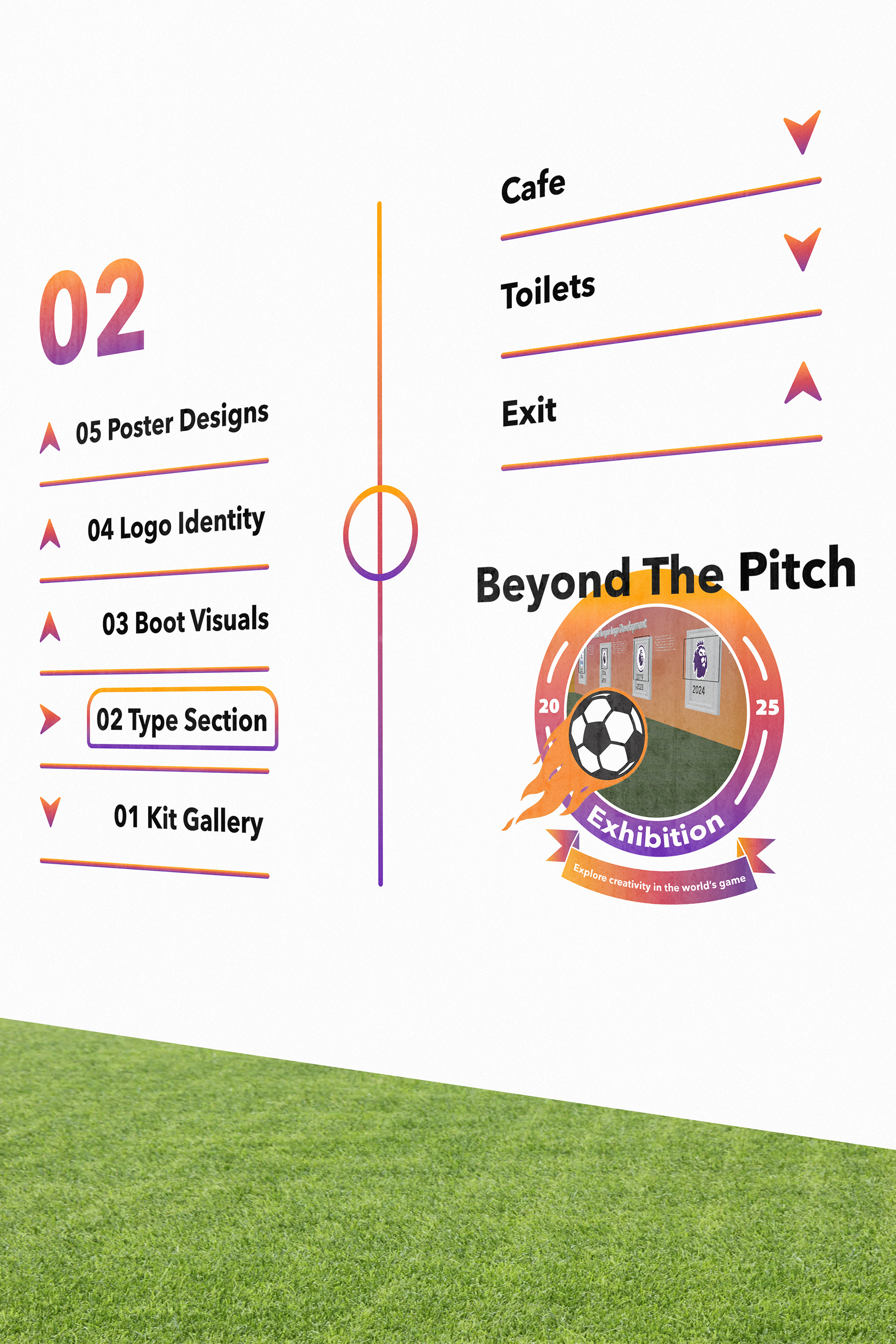
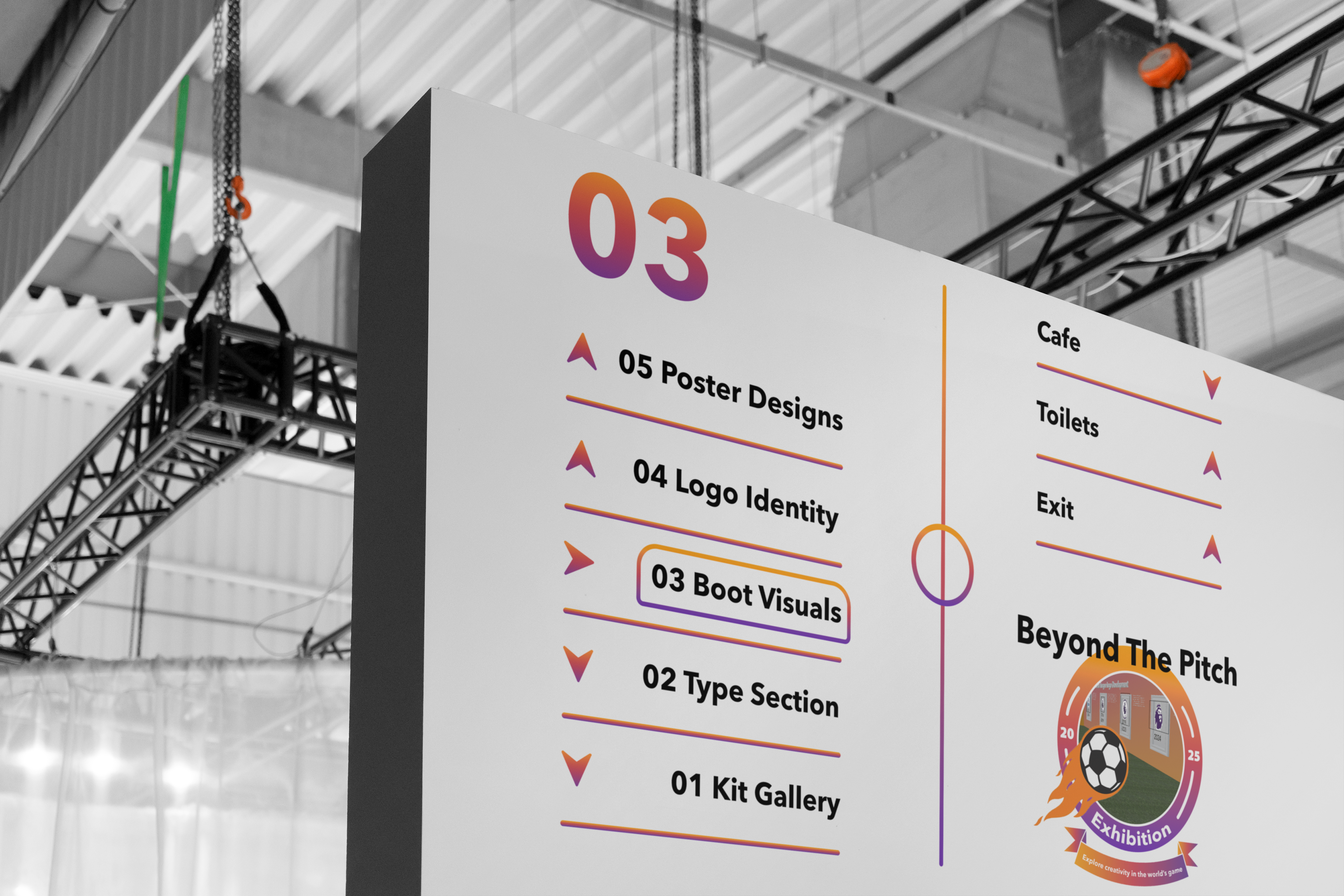
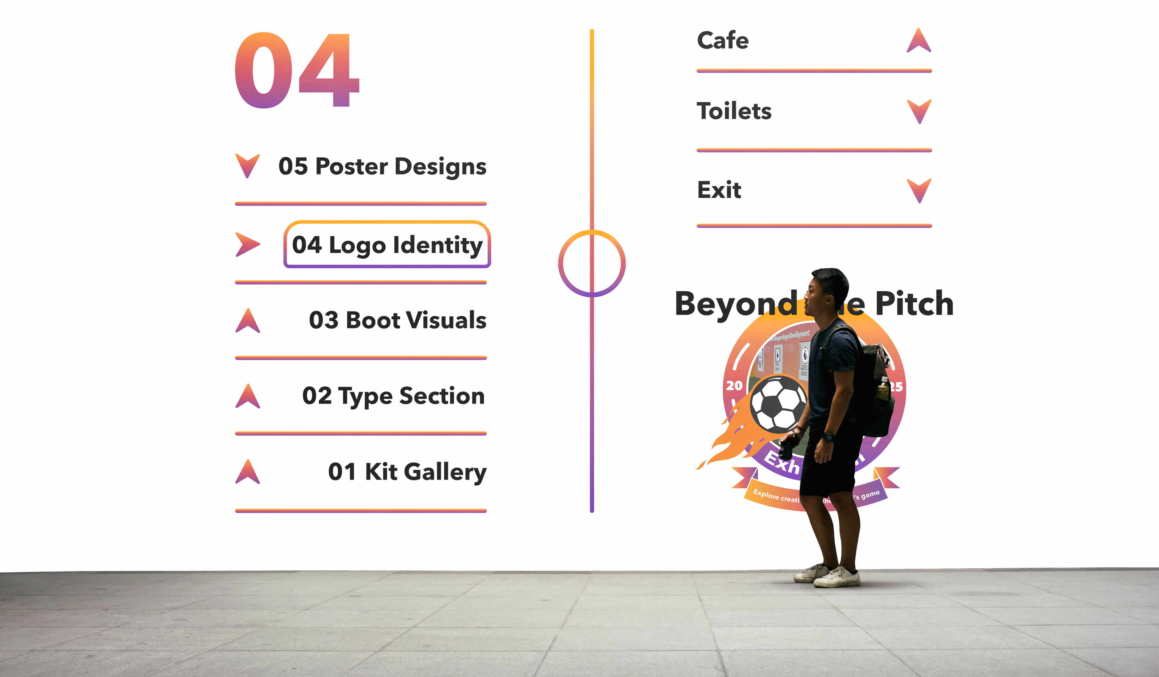
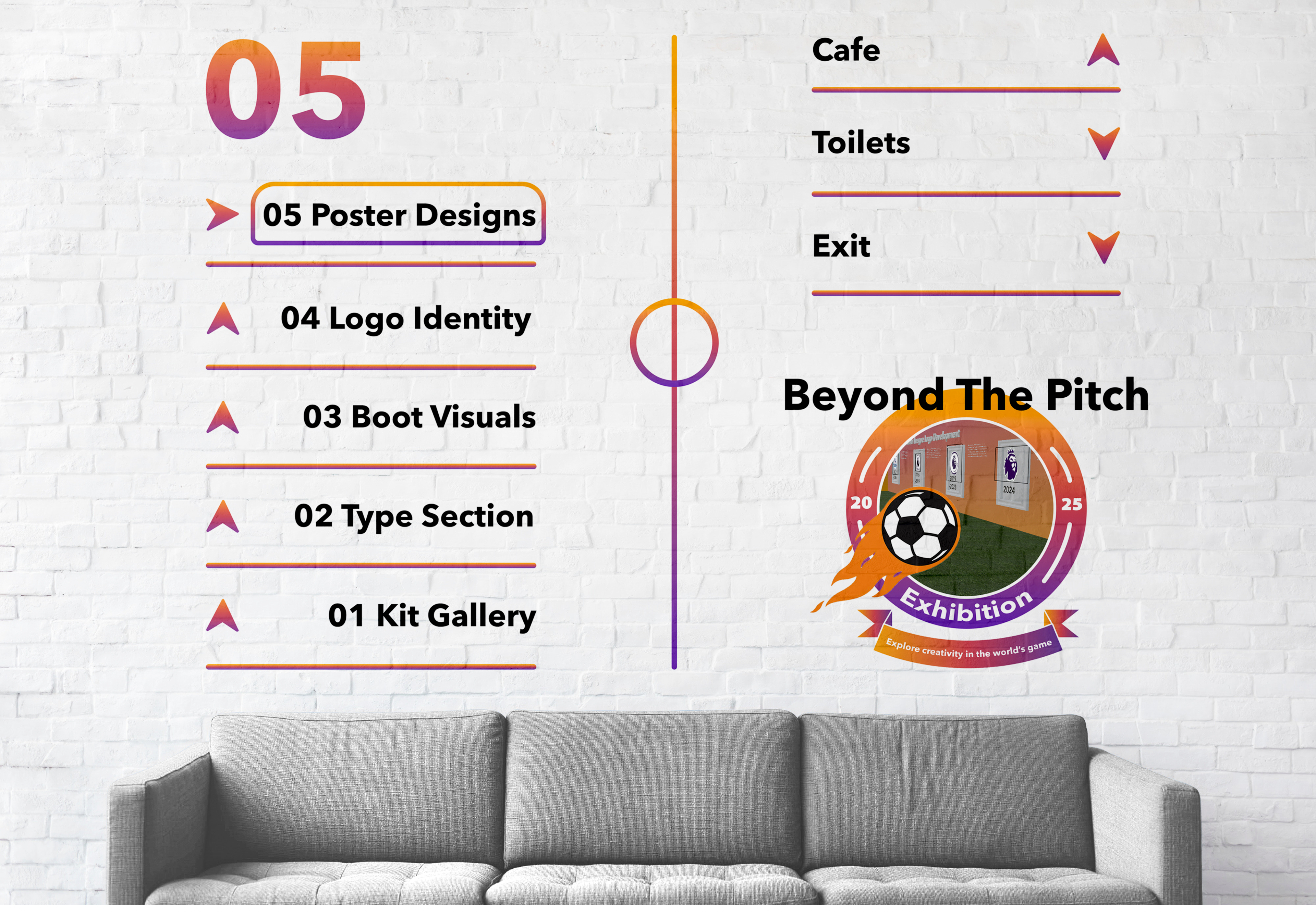
Exhibition Signage In Action
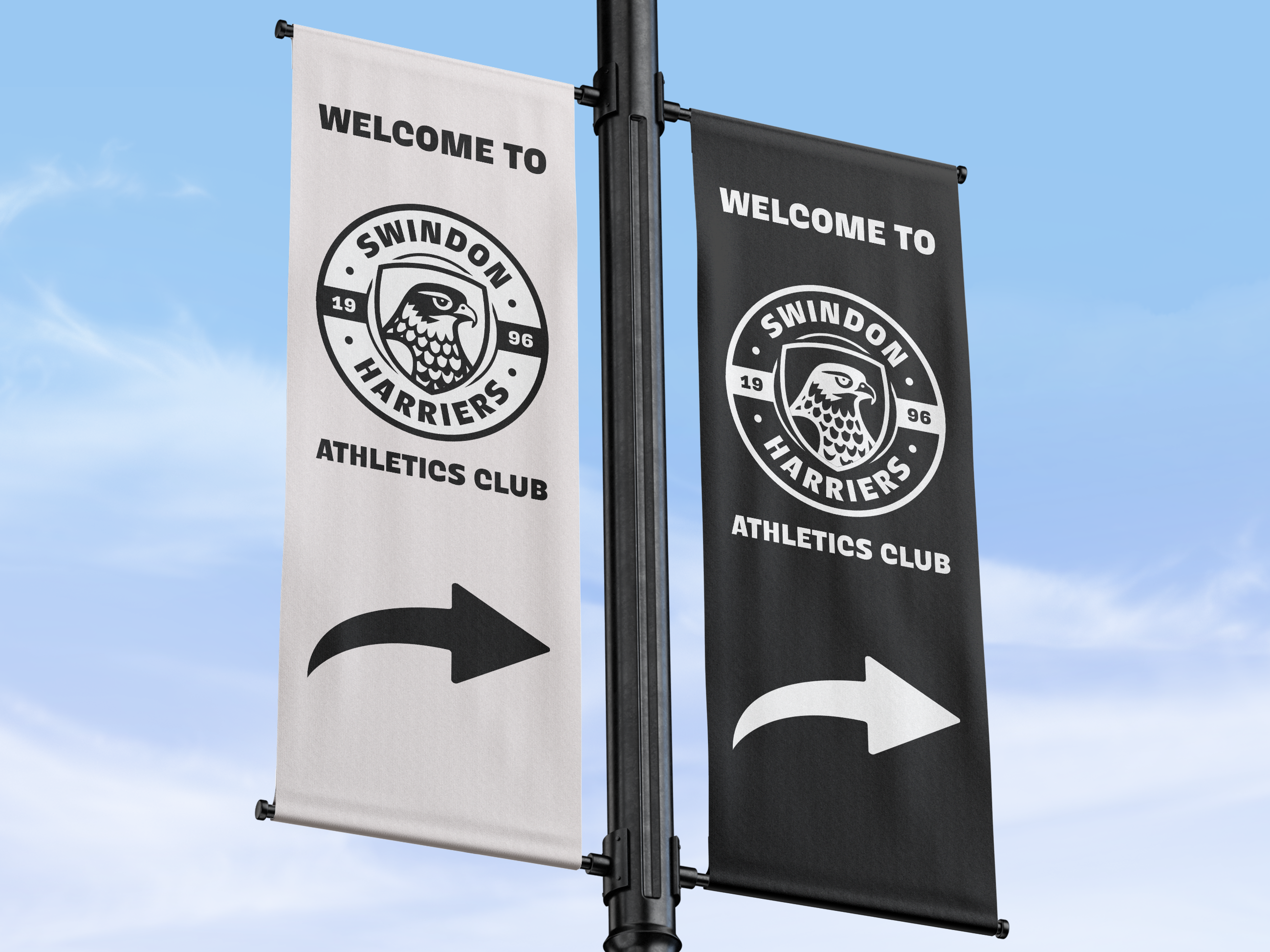
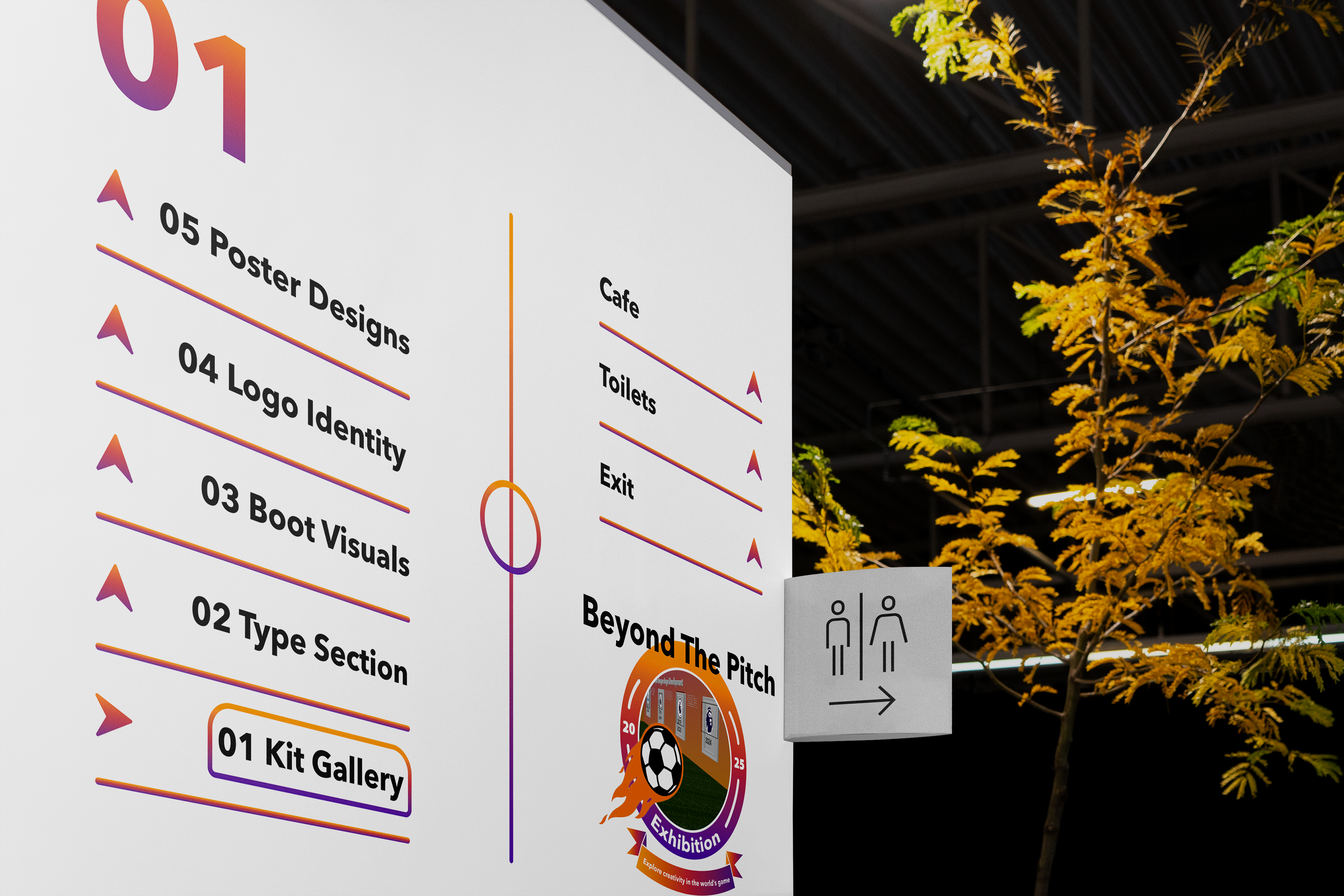
the layout of the signage, I used the photos I took at the National Football Museum as visual research. The visual research helped because I used that as inspiration for the structure of my own wayfinding. The signage then allowed me to create the key sections I needed for the general structure in the exhibition. Overall, I found the wayfinding gave me flexibility in the architecture phase because I managed to produce boards as the signs, to create a better fan and user experience.
Exhibition Development
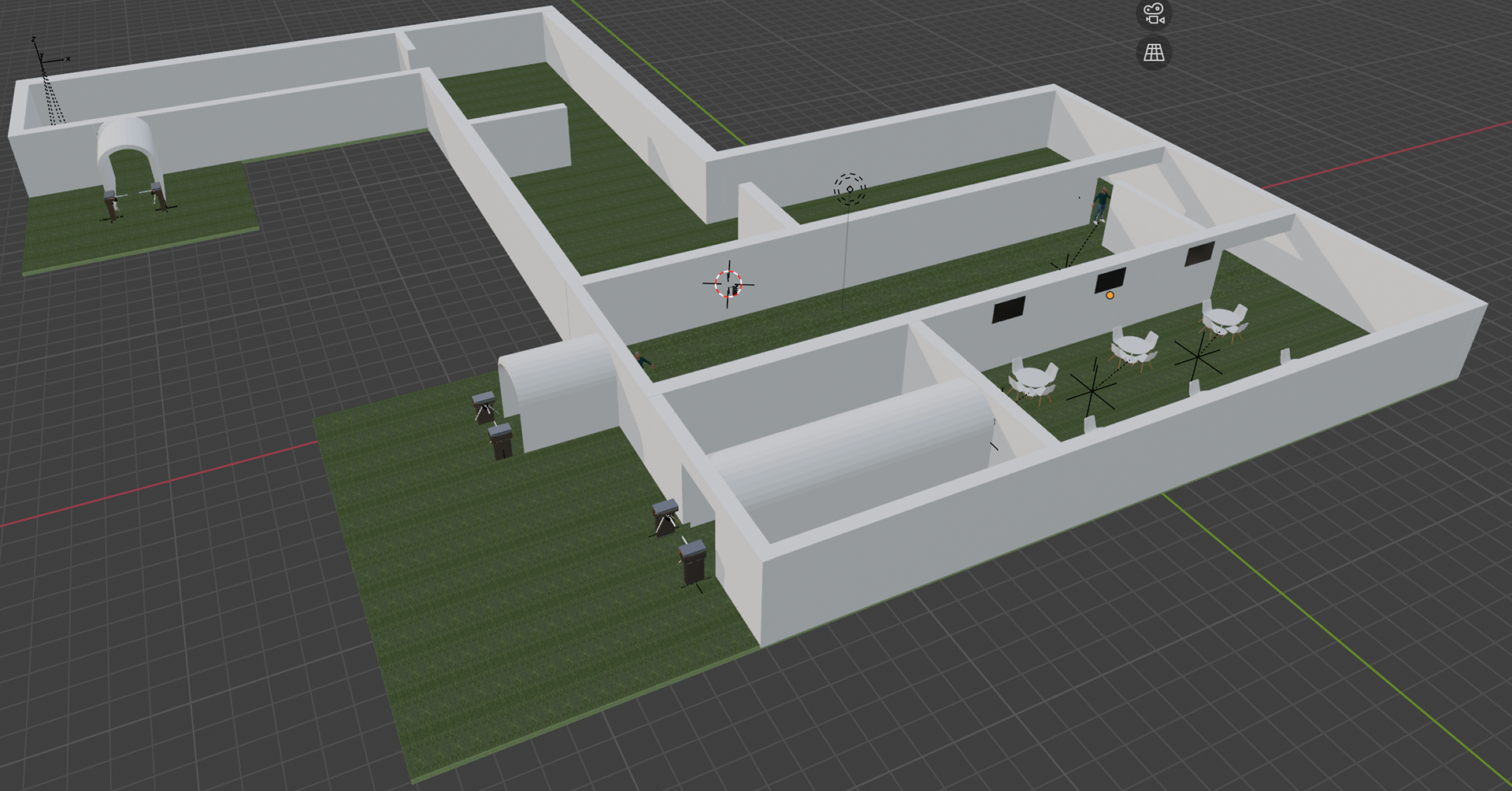
I began to make the basis of the five sections including the café, entrance and exit. Next was the start of the frames and the content being included in the space. At this stage I was putting figures in to provide that realistic aspect to the experience. I was adding my materials into my exhibition with the flooring being artificial grass to create that authentic football experience.
Football Exhibition Visual (Entrance)
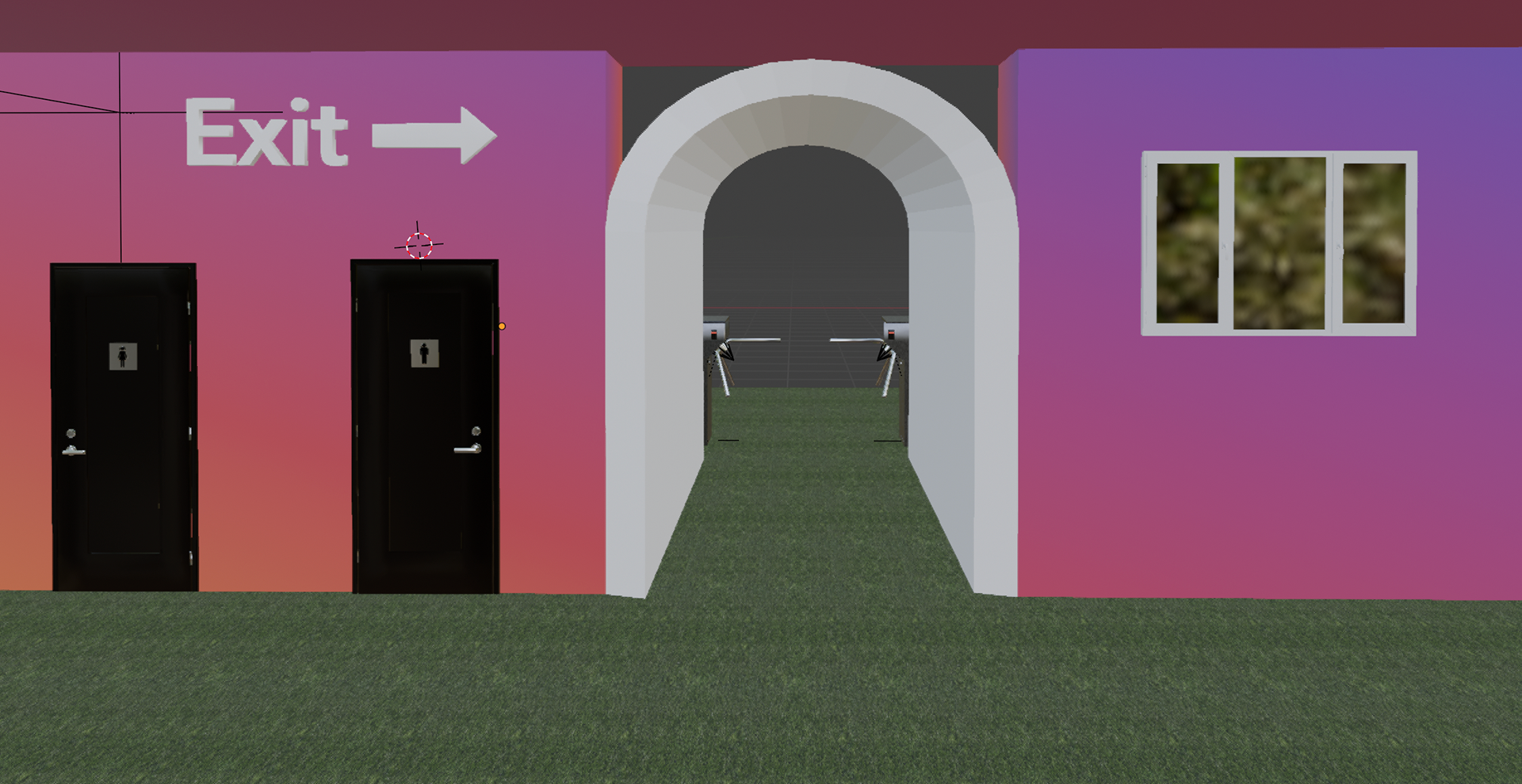
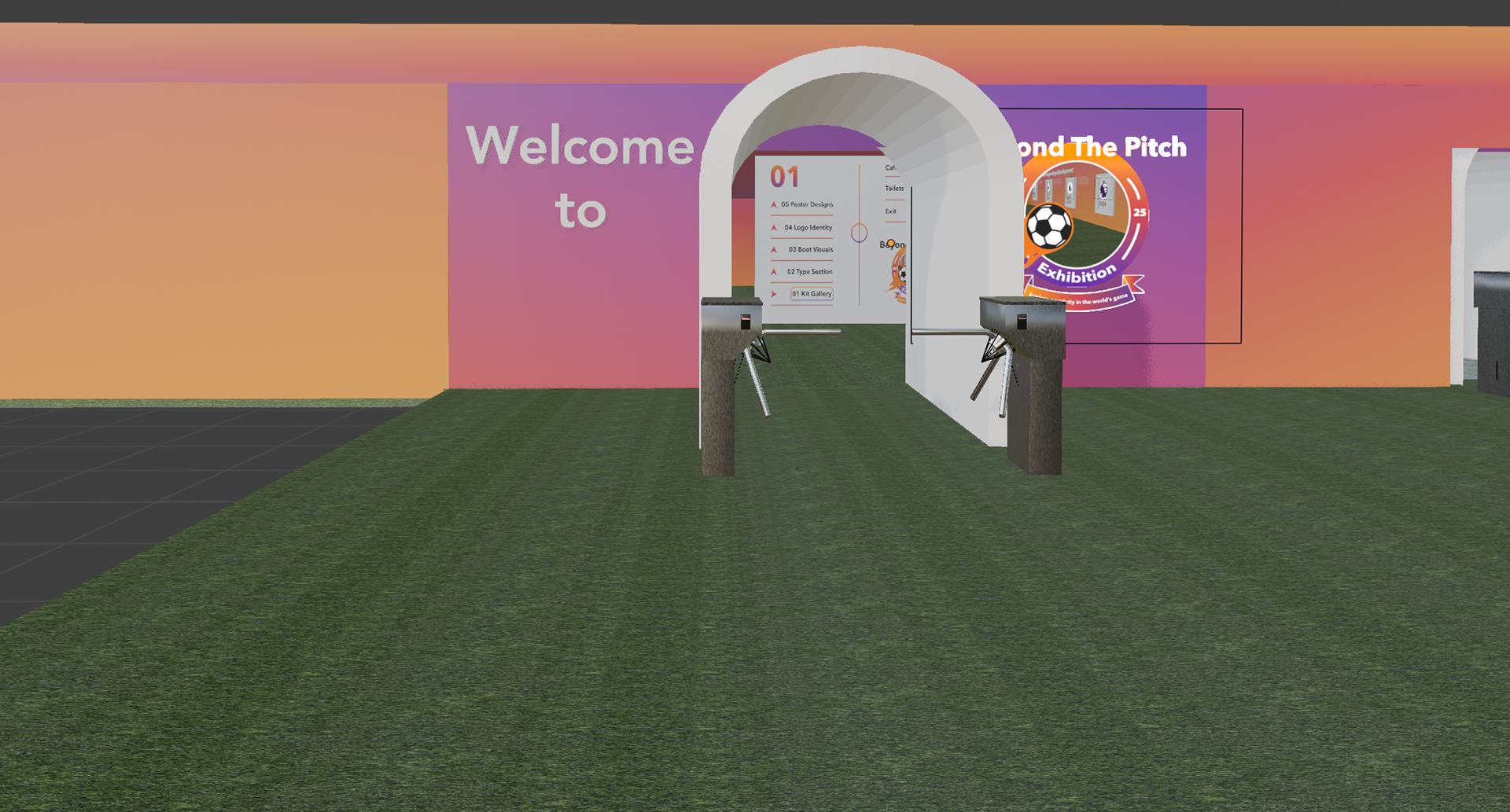
The entrance area of the exhibition consists of the logo and the welcome sign. As the designer, I value this very highly because this is the first thing fans will see when going into my space. From the earlier inspiration of the National Football Museum, I took the turnstiles and the tunnel concept with the aim to make the fan experience more authentic.
Football Exhibition Visual (Kit Gallery)
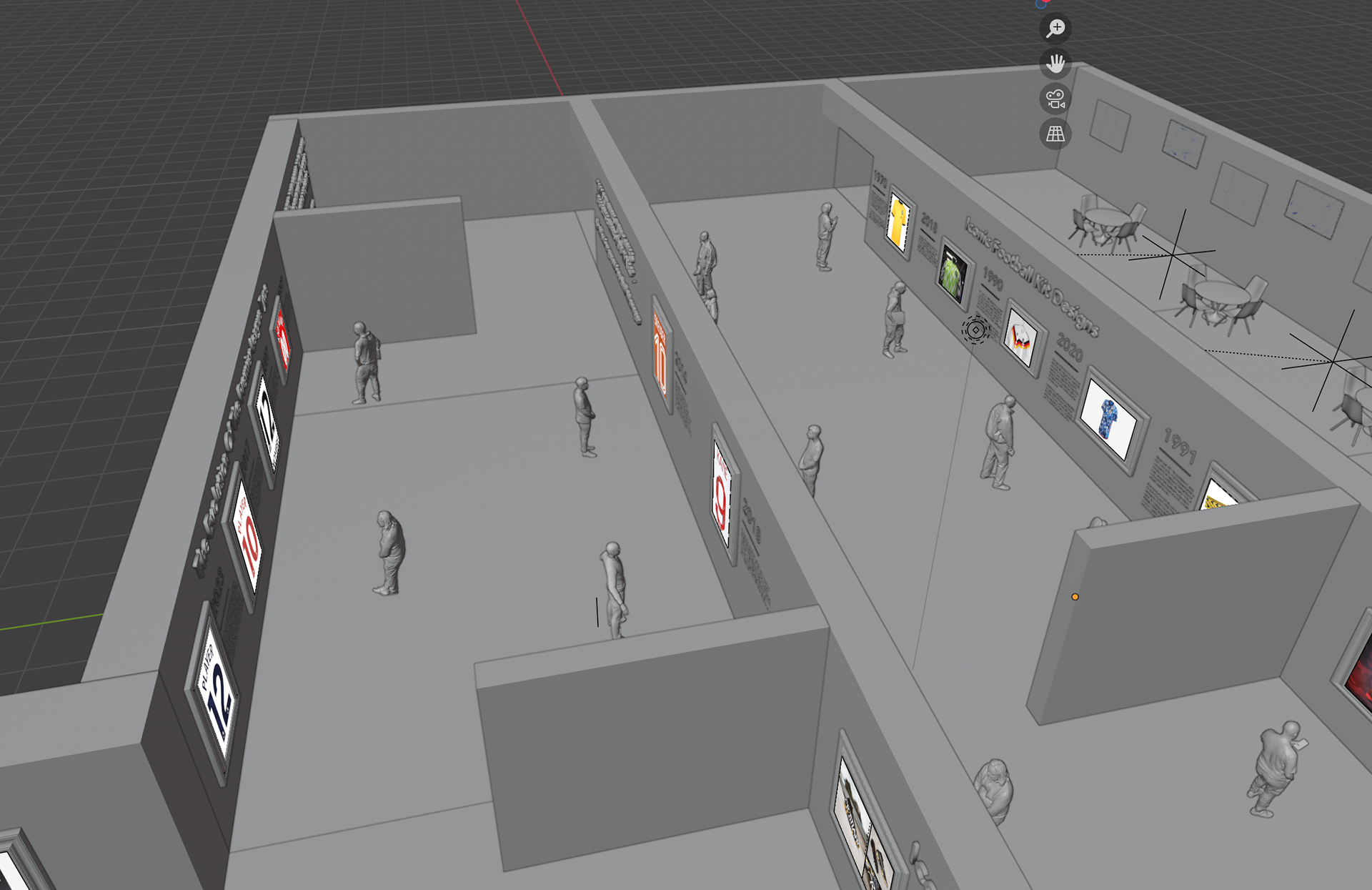
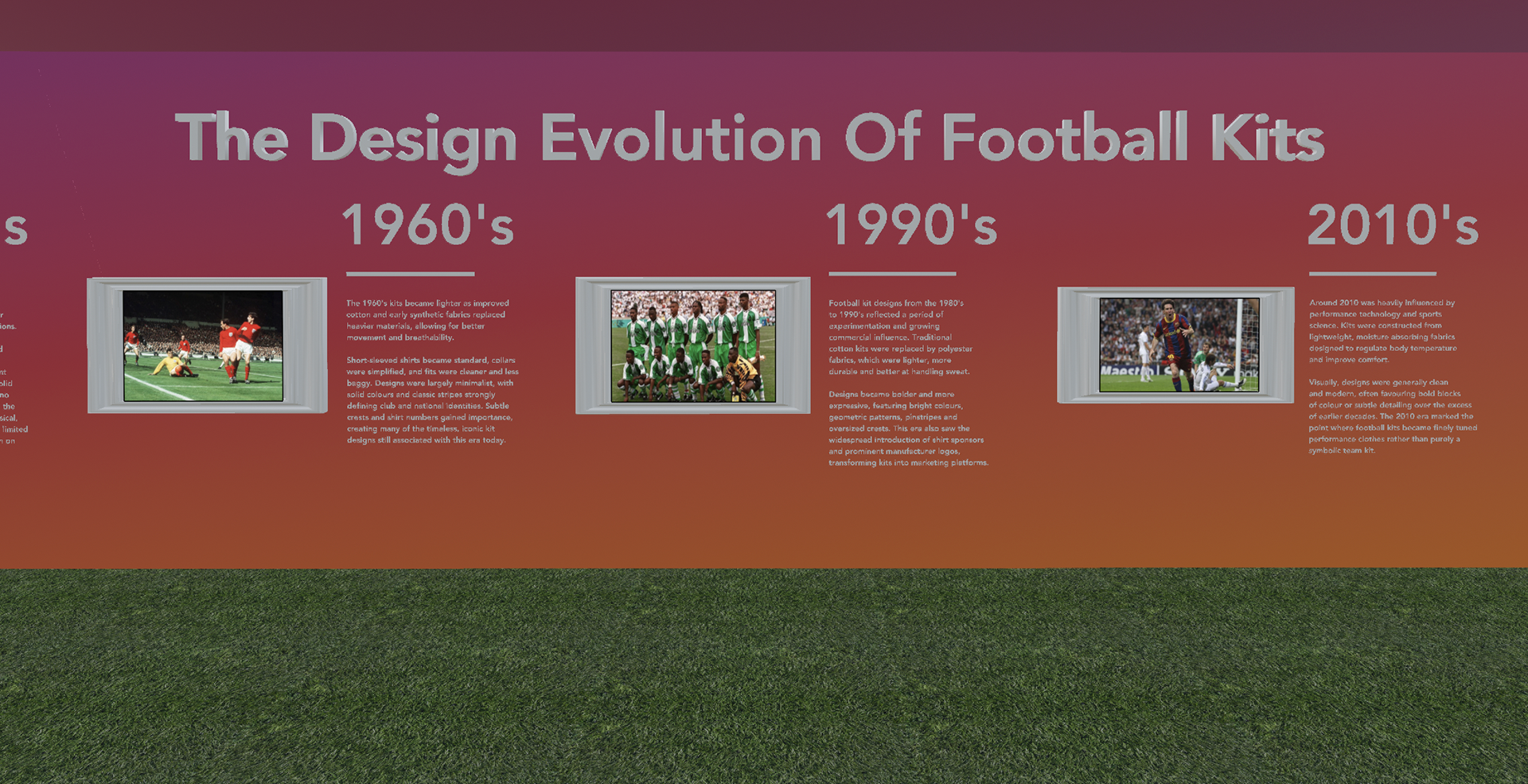
The kit gallery is the first main section of the exhibition that fans will see when they enter. It’s a mixture of fan made shirts, unique designs and the overall development of football kits overtime. The unique kits represent the iconic look and meaning behind a special goal or a wild tournament that brings back the nostalgic feeling among the older audiences.
Football Exhibition Visual (Cafe)
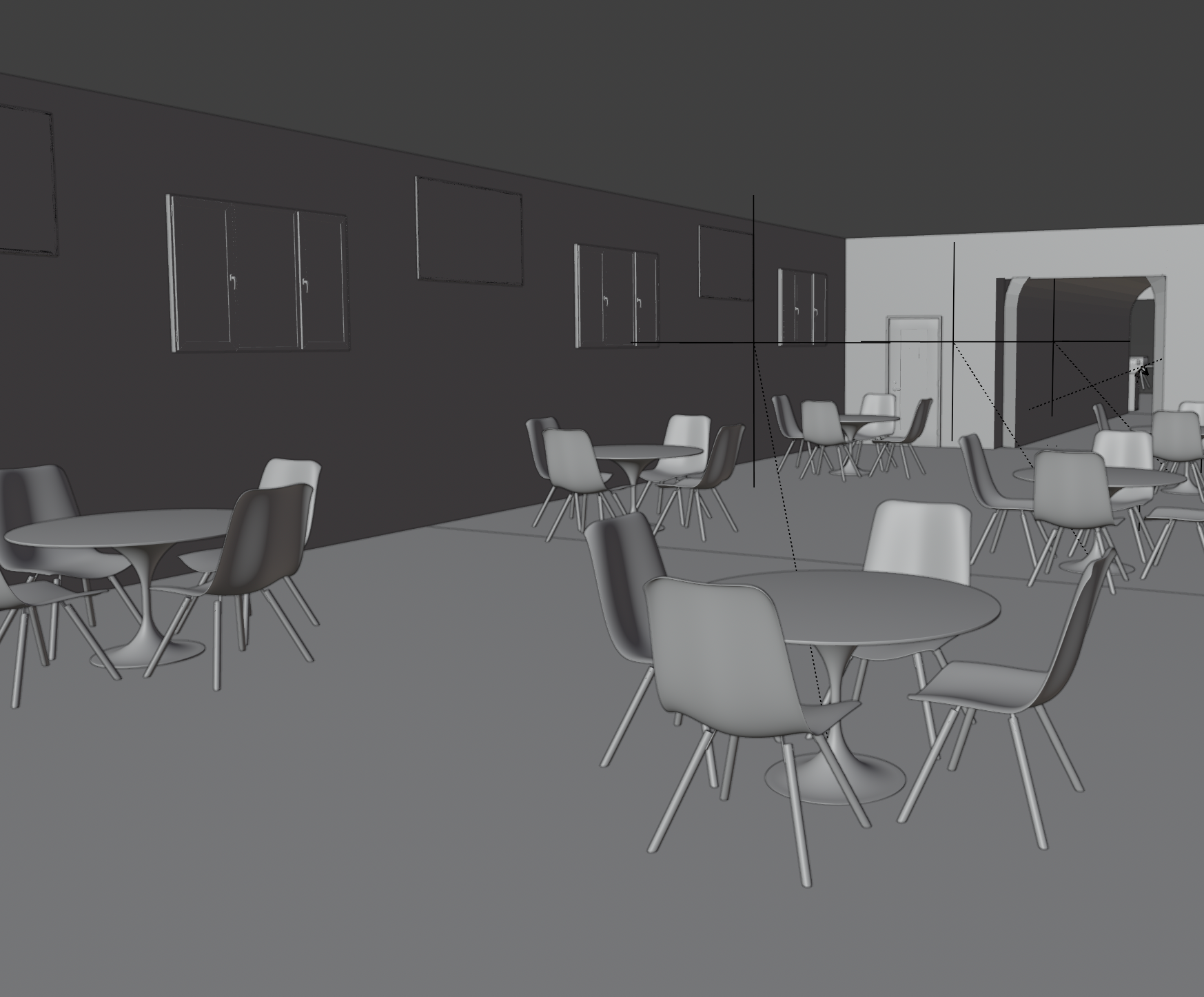
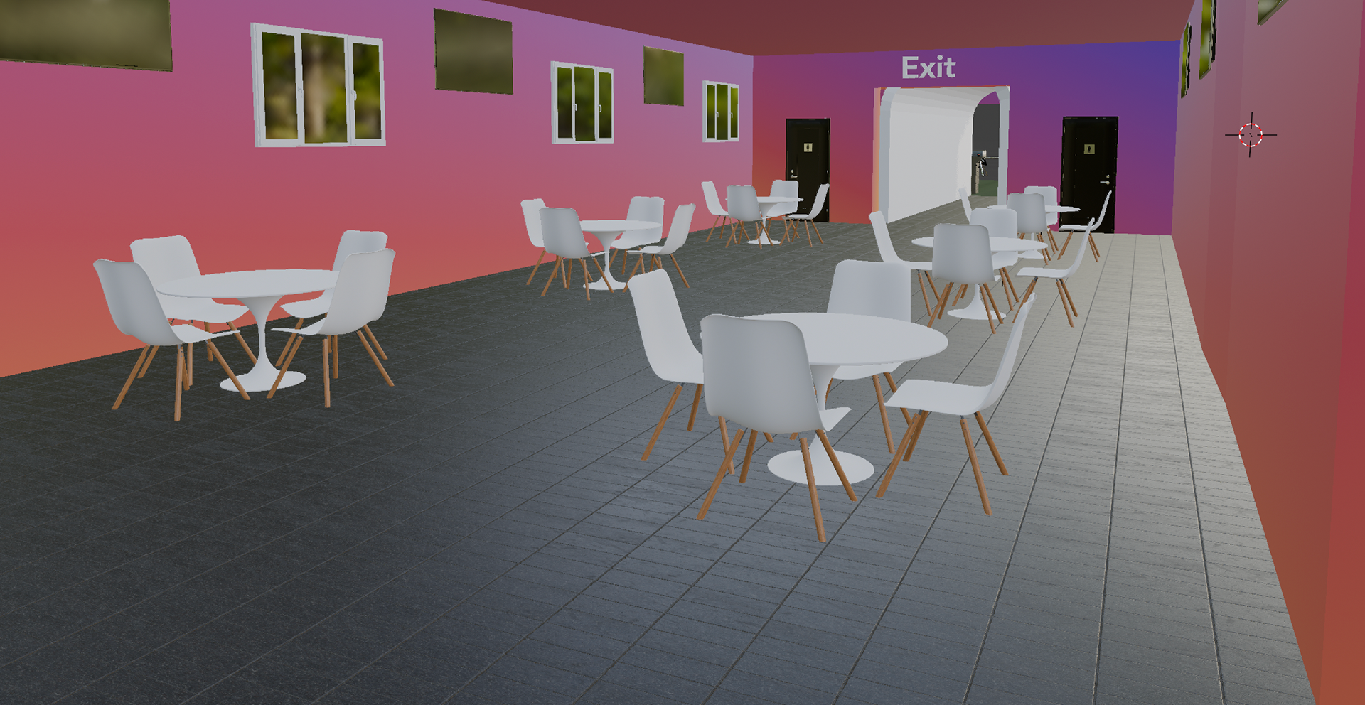
I wanted to show the café area because the cafe brings that realistic aspect and felt like that would be a good idea. This shows as a designer, I wanted to cater for many of the different fans’ needs rather than just the five key design areas. I included TV screens because that is very common at bars and pubs where football can be watched, so I thought it was important to make that link.
Football Exhibition Visual (Type Section)
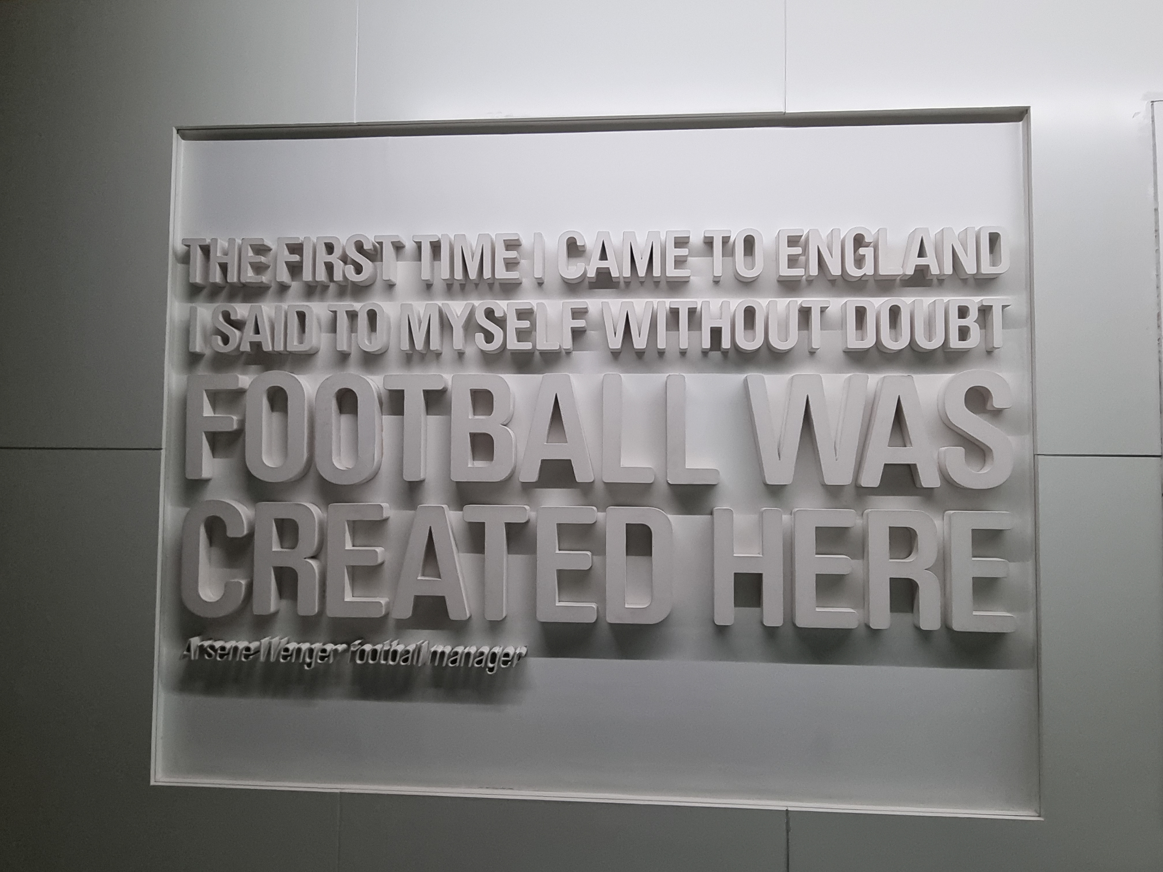
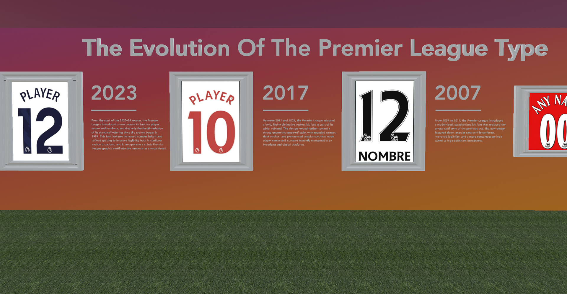
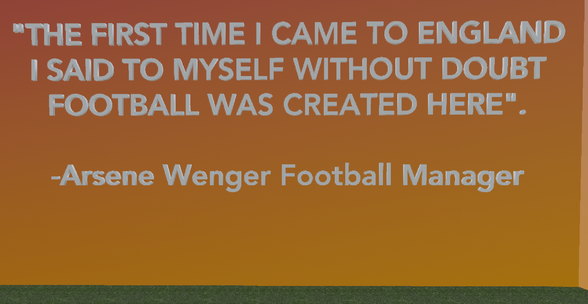
The type section includes the evolution of the font in the Premier League as well as special quotes from popular football mangers. For example, Arsene Wenger and Sir Alex Ferguson. I made their quotes 3D like they were coming out of the walls because I got inspiration from the National Football Museum of the quotes having key representations.
Football Exhibition Visual (Boot Visuals)
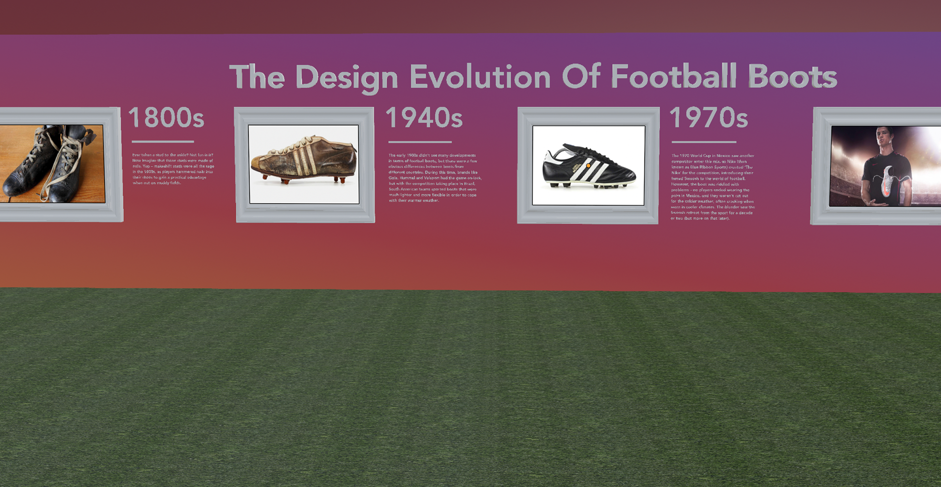
The Boot Visuals covered the design evolution from the very start of a football boot to later on brands like Adidas and Nike having their affect in the industry. From my athletes branding research, football boots became a massive part with players like Ronaldo partnering with Nike and Messi collaborating with Adidas. We saw a real growth in that area, not just the material or visual side of the shoes.
Football Exhibition Visual (Logo Identity)
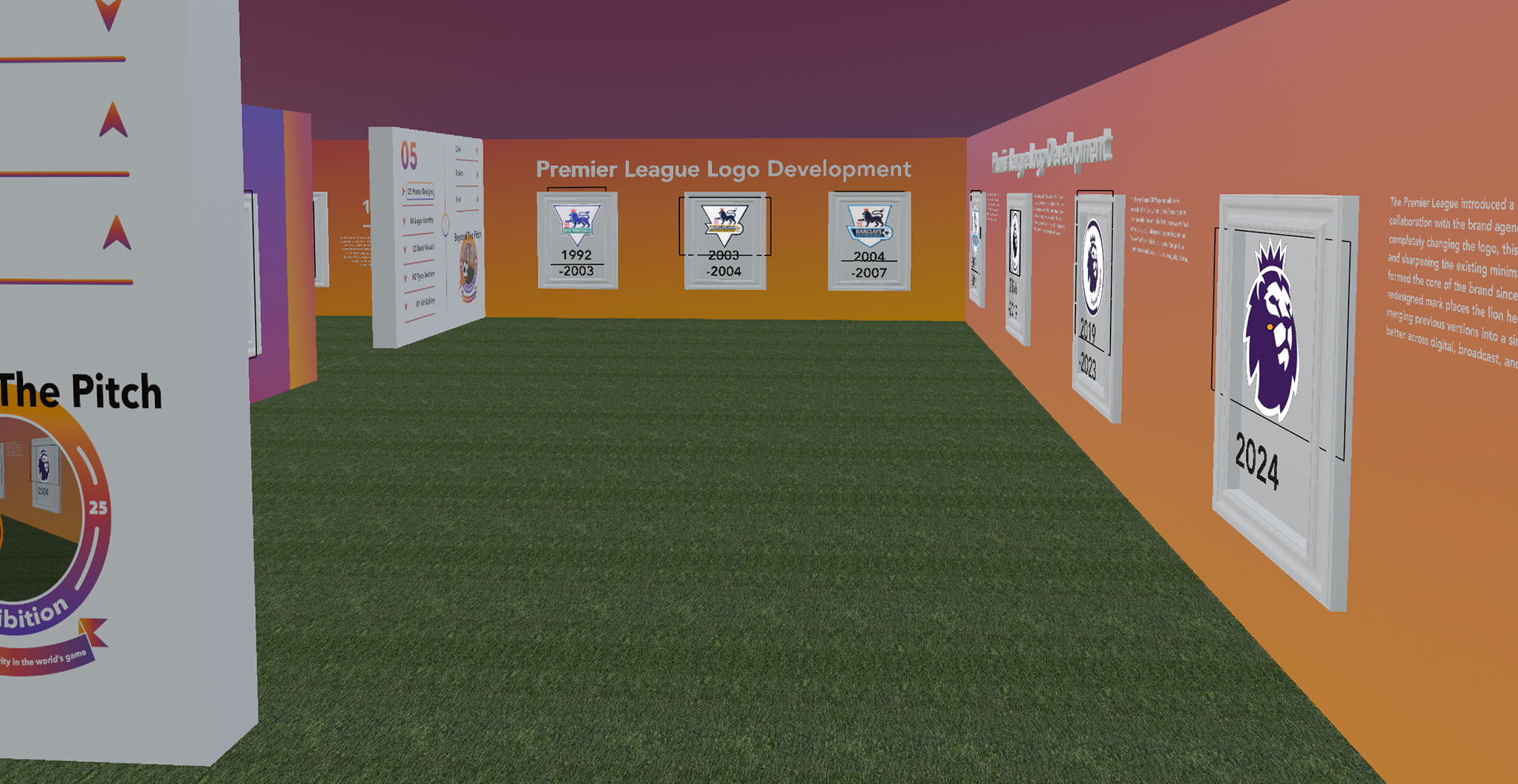
The Logo Identity was all about the development and many unpopular rebrands of football clubs. For example, in 2017 Juventus changed their long standing logo from their iconic shape and representation to a simplistic all black “J”. As much as the rebrand was very unpopular, the changed logo still stands today. When looking at the evolution of logos, I could clearly see the minimalistic and simple design route was taken by many football clubs around Europe.
Football Exhibition Visual (Poster Designs)
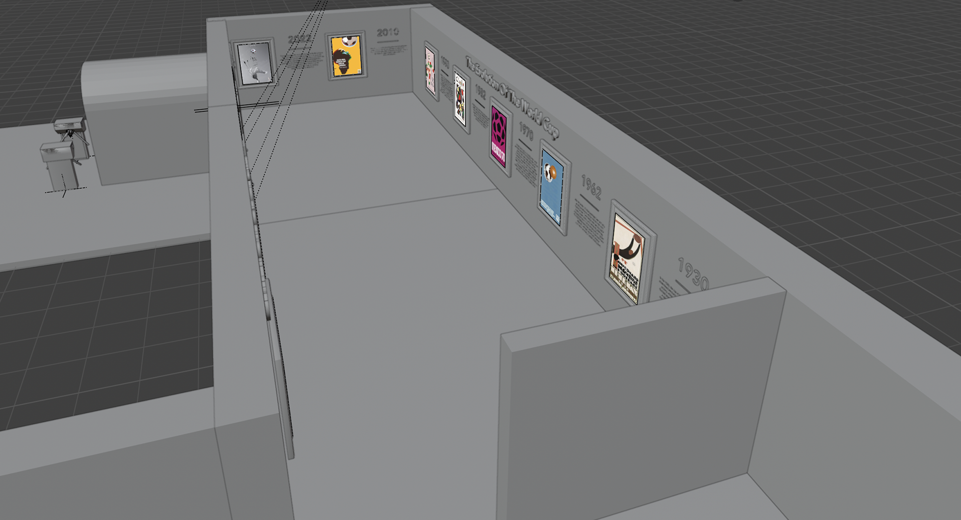
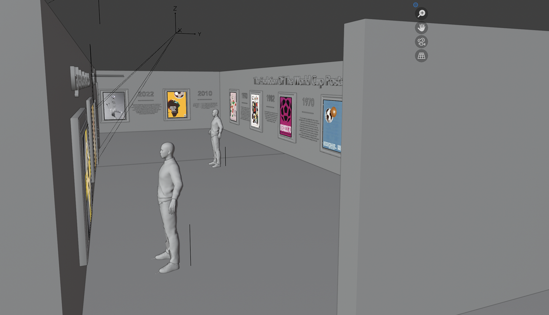
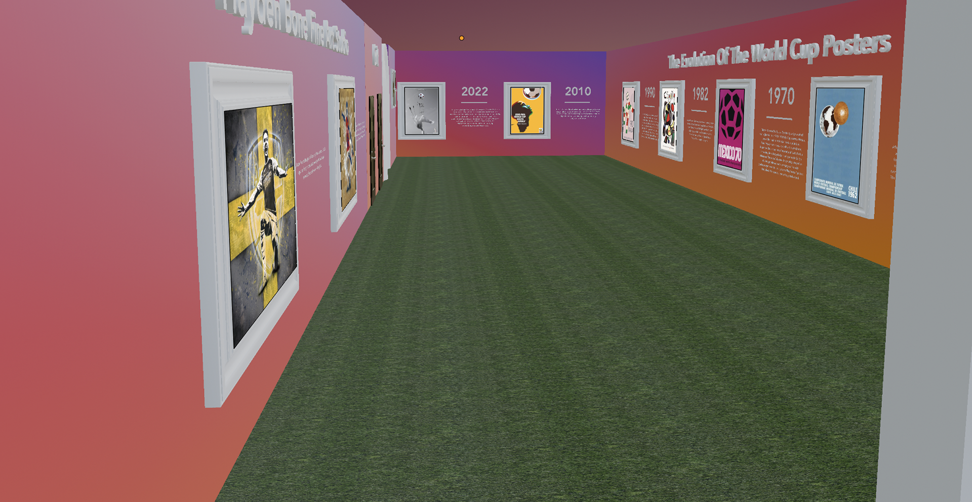
Finally in the last design section of my exhibition, the Poster Designs was crucial in this space. This is because of how iconic the meanings of the posters are. In addition, I wanted to see how an event was promoted through the design of a football poster. This is why I included the World Cup posters because they dramatically change every four years with the same aim of promoting their hosted competition. This section also includes one of my case studies “Hayden Bone” who produced work for Arsenal, with a mixture of Fine Art and Graphic Design.
Football Exhibition Visual (Exit)
The exit I felt was important to include because this signifies the end of the fans experience in the exhibition. In addition, this concludes the designers journey in the creation of the space. To reinforce my design intentions, I continued to add the football tunnel and the turnstiles at the exit as well as the entrance, to really fulfil the true football fans experience.